Root Gallery & ART[s] Gallery Simone Jansen at North Sea Jazz Art Fair
Exciting News! 7-9 July Root Gallery will be part of the Rotterdam Contemporary Art Fair; an exclusive art fair in the midst of the North Sea Jazz festival!
Root Gallery and ART[s] Gallery Simone Jansen will co-curate an exciting exhibition with the works of Lisette Schumacher, Karen van de Vliet, Jan Theun van Rees, Sanne Terweij and Isaac Monté. The artworks range from photography to sculptural works and paintings, fusing different styles and techniques.
Entering the exhibition you will encounter an impressive kinetic art installation by Freerk Wilbers. Which one is to be determined, so keep an eye out on our website and social channels!
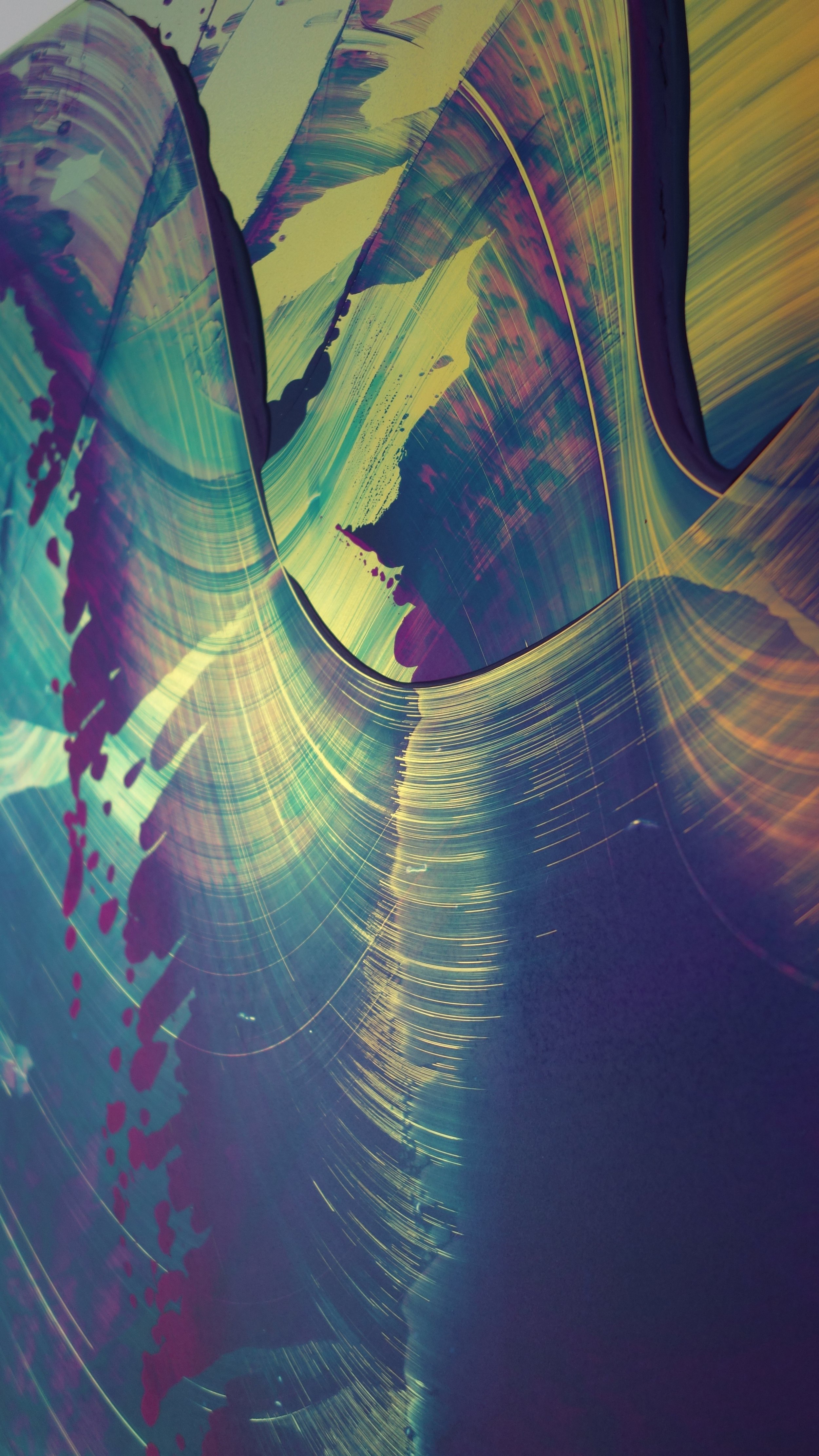
Lisette Schumacher will showcase new artworks from her Mirroring and Novel Trailing Reflection series in various sizes. Lisette’s works result from research into the physical qualities of architectural places and in-depth research into materials and techniques to be able to visualise her observations. In this case she was inspired by the endless reflections of the sun on glass and water at the Stahl House in LA (designed by Buck Stahl and Pierre Koenig). The results are colourful, reflective, dimensional artworks who never look the same.
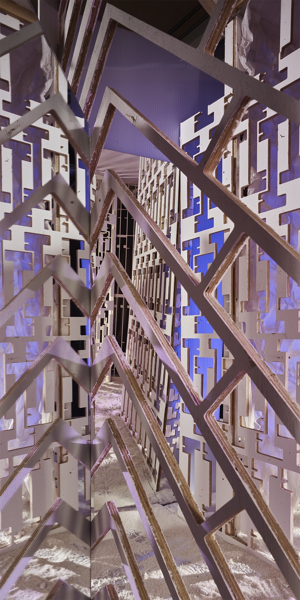
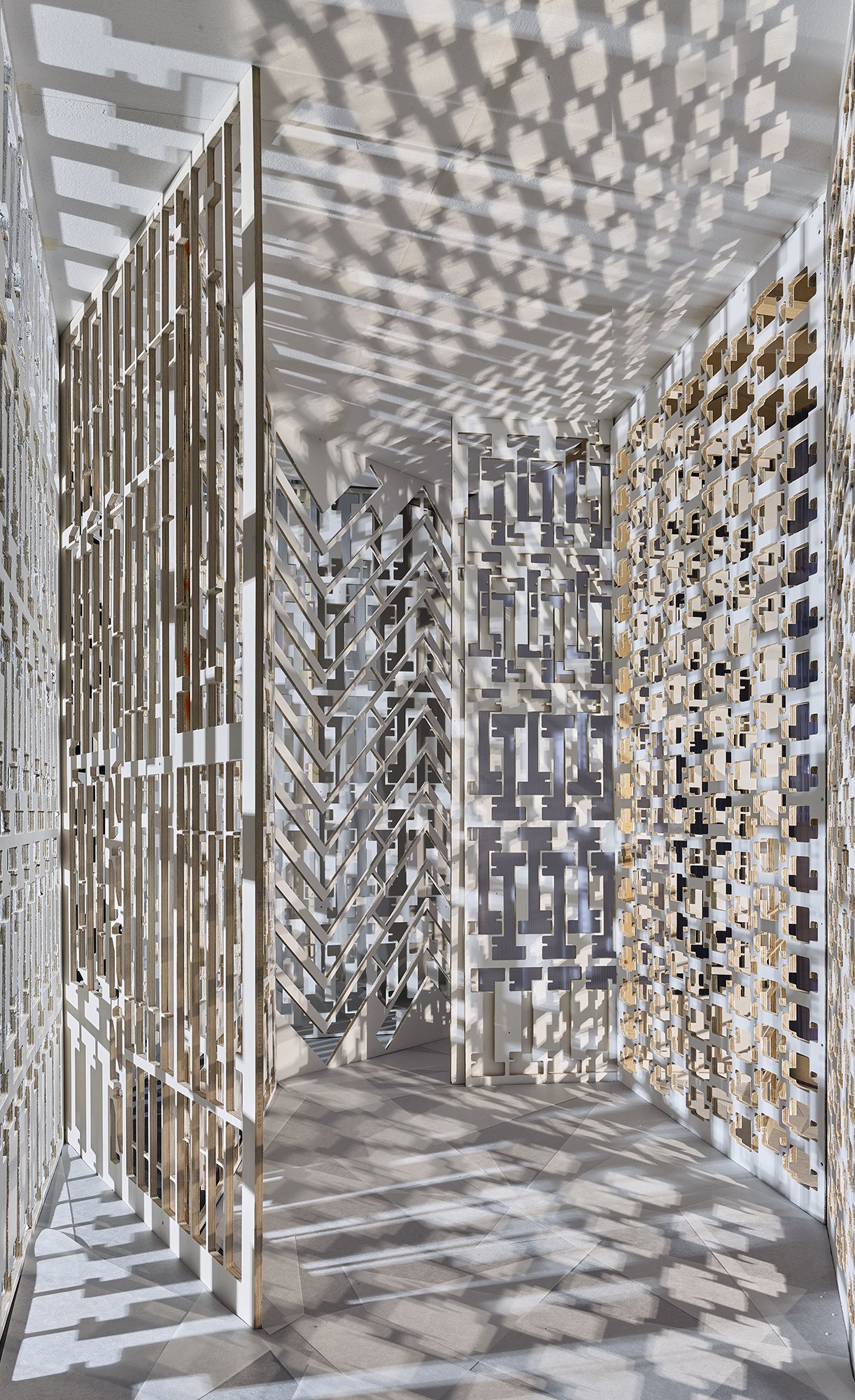
Jan Theun van Rees will be showing a work from his Perforated Spaces series. For the creation of this series he constructs his own spaces, his own versions of a new, not yet existing reality. A certain spatial quality is visualised by constructing a space with the sole purpose to photograph the result. With his art, Jan Theun focuses on the appearance of space as an image, the perception of that (visualised) space in relation to the space that surrounds us.
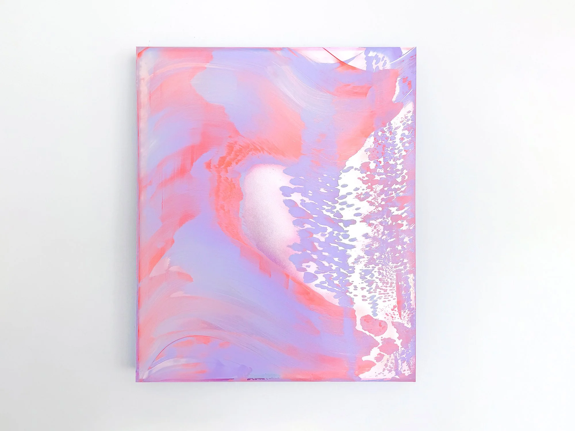
By Lisette Schumacher
60 × 50 x 6 cm, 2026
Mixed media
From the series Coachella views
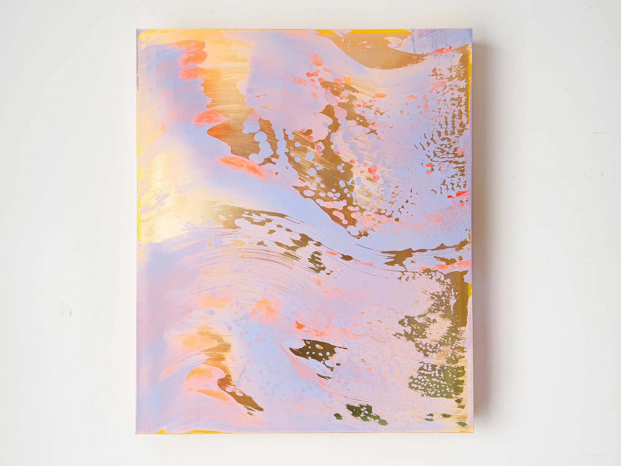
Lisette Schumacher brings coral pink and soft lilac together in Coachella Views XIII. Large, fluid forms are interrupted by a finely patterned area that appears to disperse across the right side of the composition. A pale central opening creates depth, as though a distant light or landscape is briefly visible between the surrounding colours.
The work originates in Schumacher’s observations of the Coachella Valley, where intense sunlight, wind and distance continually alter how the landscape is perceived. Here, that experience becomes an atmospheric composition that feels both open and enveloping. The restrained palette makes the work easy to live with, while its subtle visual shifts continue to reward close attention.
This work will be shipped within the Netherlands and Belgium at no additional cost, securely and with tracking.
By Lisette Schumacher
95 × 80 x 6 cm, 2026
Mixed media
From the series Coachella views
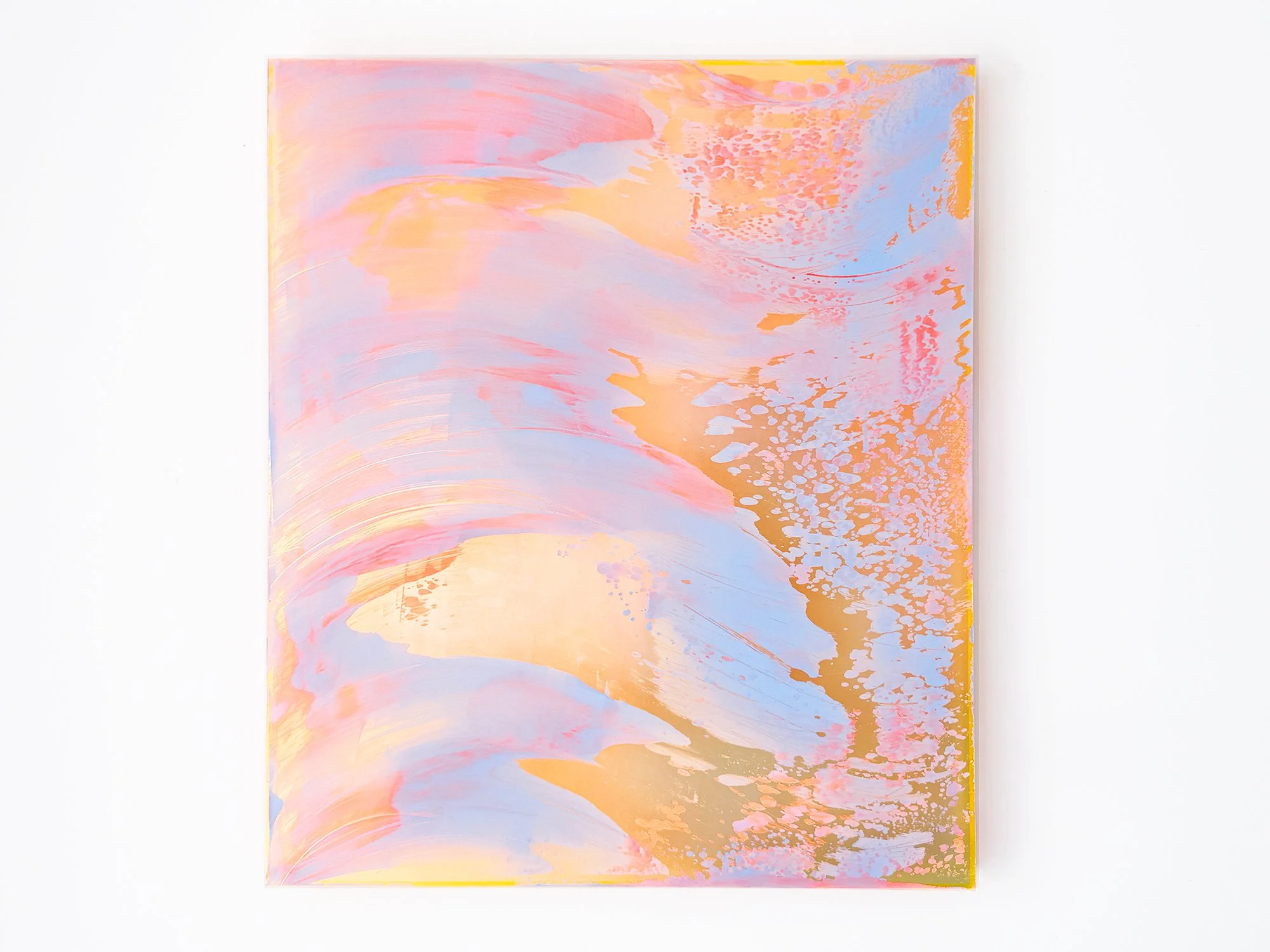
In Coachella Views XII, Lisette Schumacher translates the shifting colours of the California desert into an expansive abstract composition. Pale blue, peach and pink move across the surface in broad, sweeping forms, while warmer golden areas appear between the layers. Finer patterns along the right-hand side introduce contrast and draw the eye further into the work.
The painting was inspired by Schumacher’s journey through Palm Springs, Cathedral City and Desert Hot Springs. Rather than depicting the landscape directly, she captures the experience of colour changing across the Coachella Valley: open, bright and never entirely still. Its generous scale gives the work a strong presence while the nuanced palette keeps the composition balanced.
This work will be shipped within the Netherlands and Belgium at no additional cost, securely and with tracking.
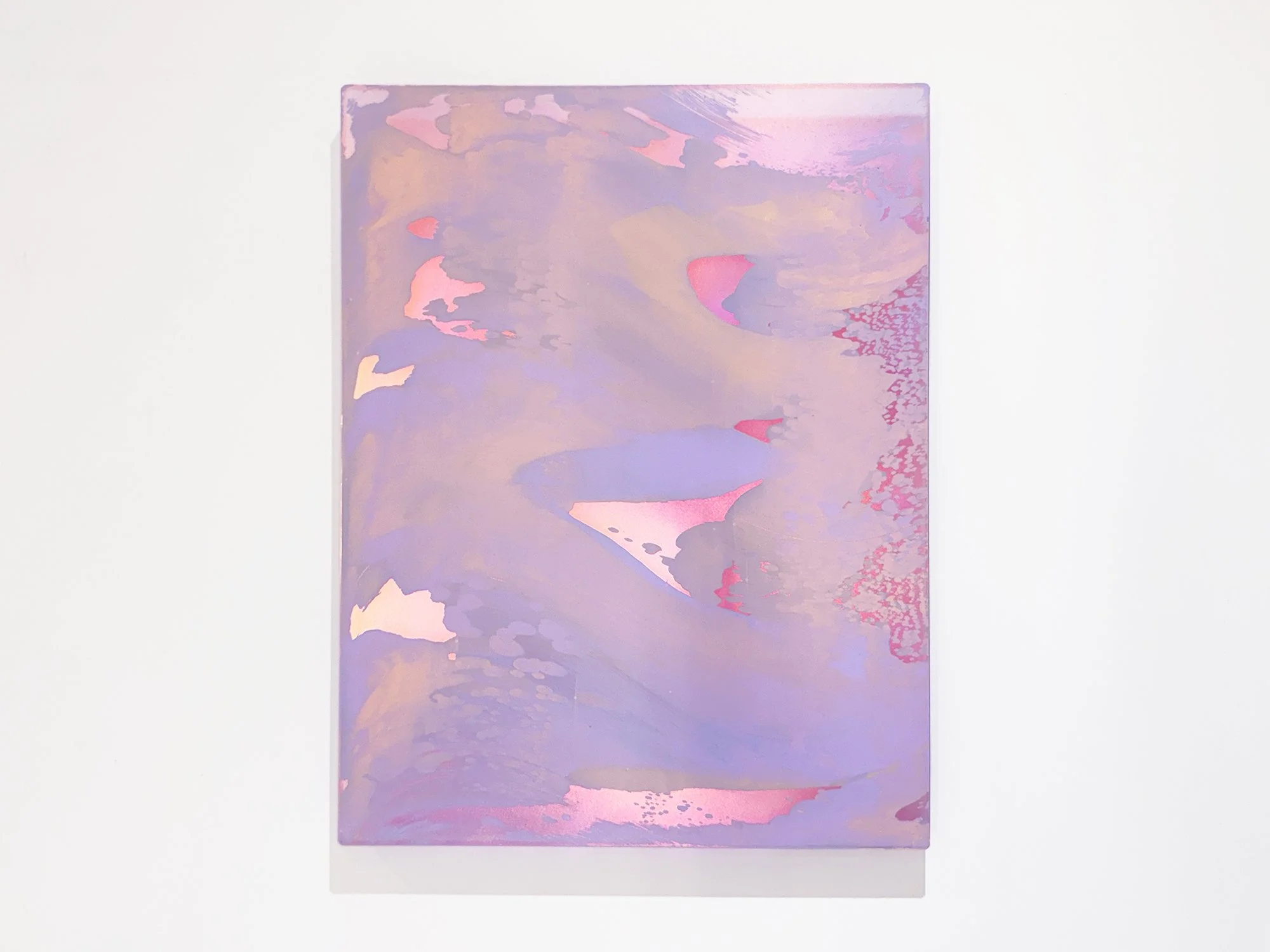
By Lisette Schumacher
60 × 50 x 6 cm, 2026
Mixed media
From the series Coachella views
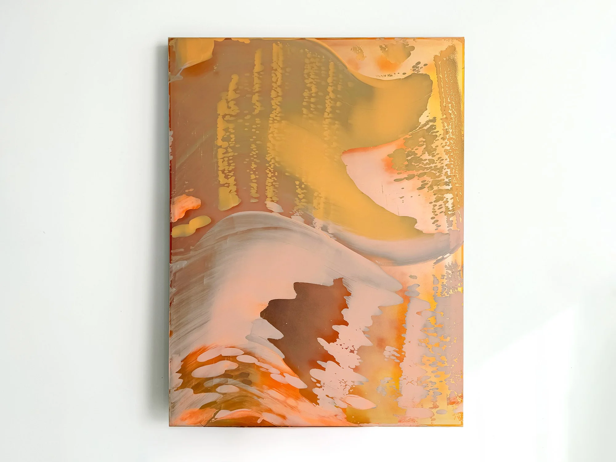
The desert landscapes surrounding Palm Springs are known for their clarity of light and wide horizons. During her visits to the Coachella Valley, Lisette Schumacher experienced how dramatically the atmosphere can shift throughout the day.
Bright sunlight, wind and the vast openness of the desert create a landscape in constant transformation. Colours appear to intensify, fade and re-emerge as the sun moves across the valley.
Schumacher approaches these observations through an intuitive process in which colour and gesture develop gradually across the surface. Soft layers of pink, orange and yellow pigments move across the painting like shifting light fields, occasionally interrupted by reflective passages that recall flashes of sun across the desert terrain.
The composition reflects Lisette Schumacher’s ongoing interest in how landscape, architecture and atmosphere influence the perception of colour. Rather than presenting a fixed view of the desert, the work captures the sensation of light moving through space.
This work will be shipped within the Netherlands and Belgium at no additional cost, securely and with tracking.
By Lisette Schumacher
120 × 100 × 5 cm, 2026
Mixed Media
From the series Desert Modernism
Desert Modernism II continues Lisette Schumacher’s exploration of the Coachella Valley, shifting towards a more fluid and atmospheric approach.
Rather than referencing architecture directly, the work unfolds through movement across the surface. Pigment is guided, displaced and allowed to settle, creating soft transitions, layered transparencies and subtle variations in tone.
Warm desert colours - yellow, sand, orange and brown - dissolve into cooler greys and pale pinks. These transitions echo the changing light conditions Schumacher experienced in Palm Springs, where colour is never fixed but continuously shaped by its surroundings.
The painting is built through a direct, physical process without the use of brushes. This results in a surface that remains active: marks soften, edges dissolve and layers become visible depending on light and viewing distance.
Desert Modernism II is less about structure and more about perception. It captures a moment that feels in motion, where colour, surface and light interact over time.
As a large-scale work, it brings a quieter but immersive presence to a space, particularly in interiors where natural light can move across the surface throughout the day.
Delivery within the Netherlands and Belgium is arranged in consultation, either in person or securely shipped.
By Lisette Schumacher
120 × 100 × 5 cm, 2026
Mixed Media
From the series Desert Modernism
Desert Modernism I is part of a series developed after Lisette Schumacher’s visit to Palm Springs and the Coachella Valley in early 2025. Central to this body of work is the iconic Frey House II, designed by Albert Frey.
Rather than depicting the architecture directly, Schumacher translates the experience of the house and its surroundings into colour, material and composition. The work reflects the tension that defines Desert Modernism: a precise architectural language set within a vast and unpredictable natural landscape.
The painting is built through a physical, hands-on process. Pigment is applied, shifted and reworked directly on the surface, without the use of brushes. This results in a layered image that changes subtly depending on light and viewing distance.
Warm desert tones - brittle bush yellow, sand, brown and muted orange - are set against cooler blues referencing sky and water. These contrasts echo the visual experience of the Coachella Valley, where snow-covered mountains meet a sunlit desert environment.
While rooted in a specific place, the work moves beyond architecture. It captures a spatial condition: being both inside and outside at once, where structure and openness exist in balance.
As a large-scale painting, Desert Modernism I holds a strong physical presence, particularly in spaces where light and architecture are part of the experience. Its surface continues to shift throughout the day.
Delivery within the Netherlands and Belgium is arranged in consultation, either in person or securely shipped.
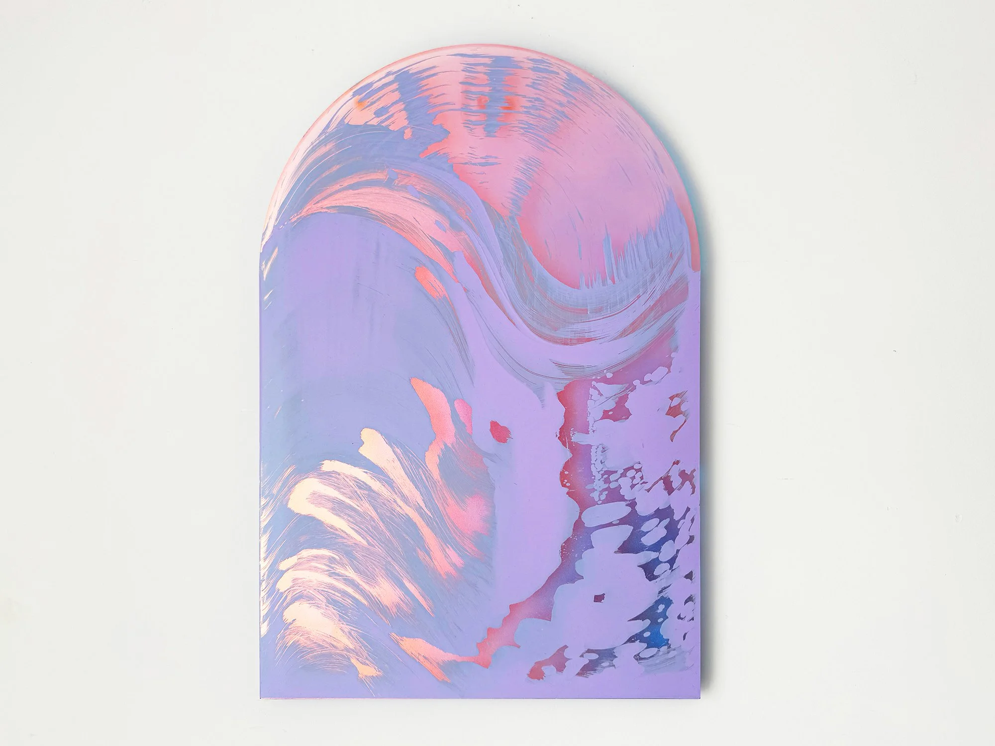
By Lisette Schumacher
50 × 35 × 0,8 cm, 2026
Mixed Media
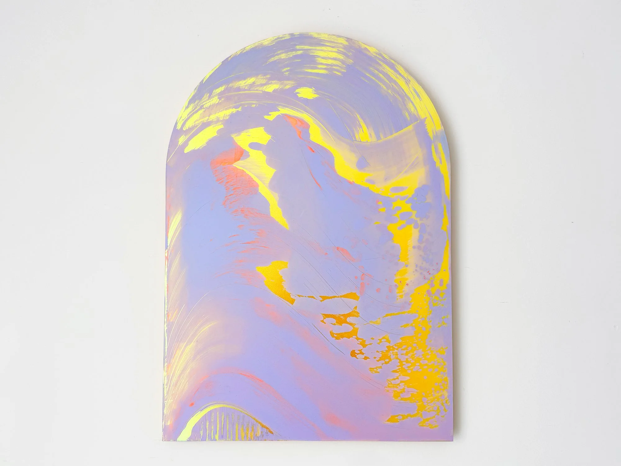
Lisette Schumacher’s Arch series is based on the architectural form of the arch, a structure with origins in Roman engineering and later developments in Renaissance architecture.
In Arch III, this form is translated into a painting that carries a lighter presence. The curved format still defines the composition, but the softer tones allow the work to sit more quietly within a space, shifting the arch from a structural reference to a spatial gesture.
Delivery within the Netherlands and Belgium is arranged in consultation, either in person or securely shipped.
By Lisette Schumacher
50 × 35 × 0,8 cm, 2026
Mixed Media
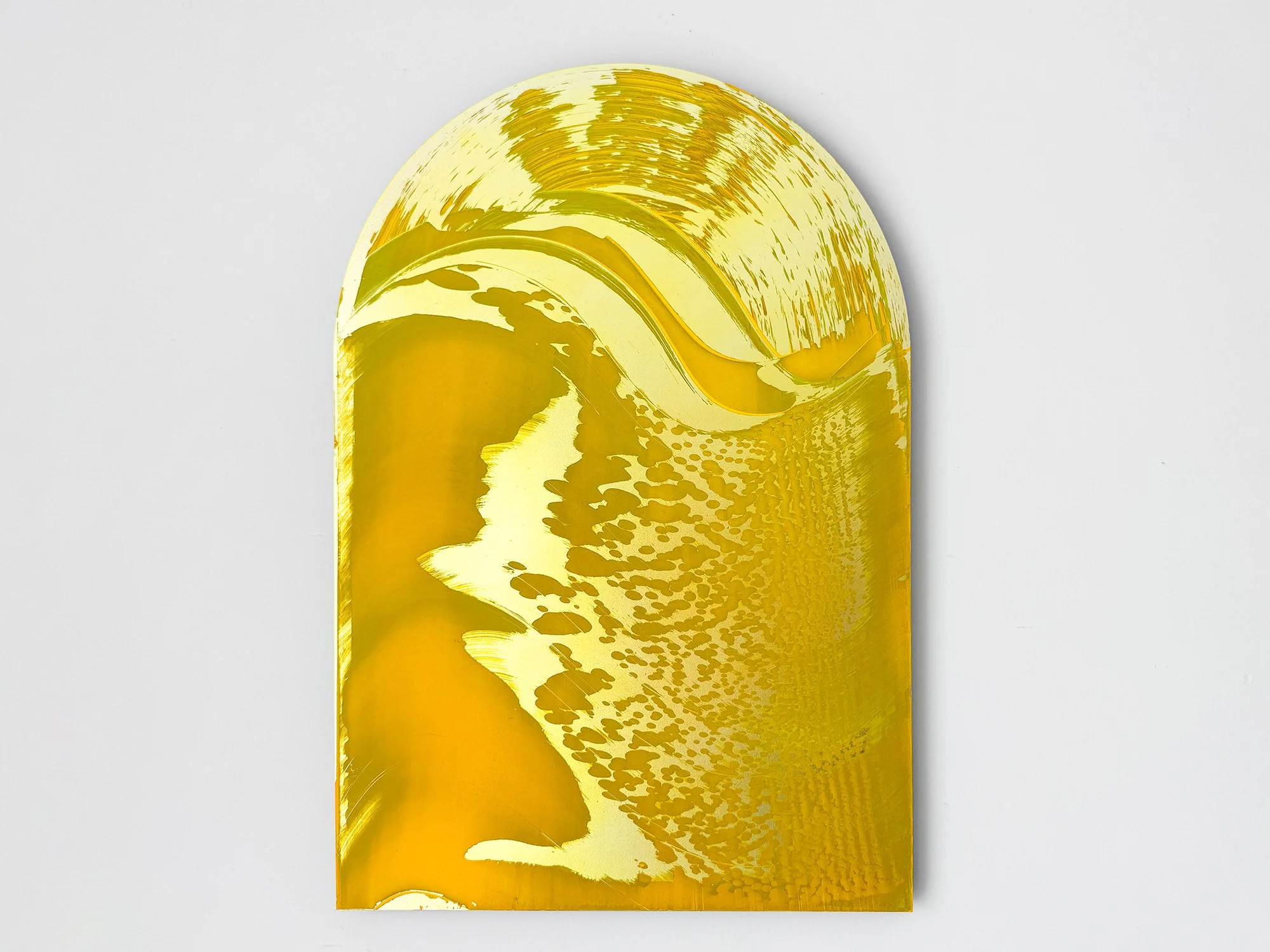
For this series, Lisette Schumacher works with the shape of the arch as a framing device. Historically used in Roman and Renaissance architecture to construct and articulate space, the arch is no longer structurally necessary in contemporary building methods.
In Arch II, the form is reintroduced within the painting as a visual structure, shifting its function from construction to image.
Delivery within the Netherlands and Belgium is arranged in consultation, either in person or securely shipped.
By Lisette Schumacher
50 × 35 × 0,8 cm, 2026
Mixed Media
In this series, Lisette Schumacher uses the shape of the arch to frame the image. The arch originates from Roman architecture, where it functioned as a structural element in large civil and public buildings, and was later refined in Renaissance palaces and courtyards.
In Arch I, this architectural form is translated into a painting format, where the curved contour defines the composition and introduces the arch as a symbolic rather than structural element.
Delivery within the Netherlands and Belgium is arranged in consultation, either in person or securely shipped.
By Lisette Schumacher
87 × 57 × 2 cm, 2025
Mixed Media
In Dawn, Lisette Schumacher continues her exploration of light and perception. Each work captures the fleeting transitions between night and day, where colour and reflection seem to shift with every glance. The soft gradients and translucent layers evoke a sense of calm and movement at once, an abstract translation of the changing light that defines the early hours.
Delivery within the Netherlands and Belgium is arranged in consultation, either in person or securely shipped.
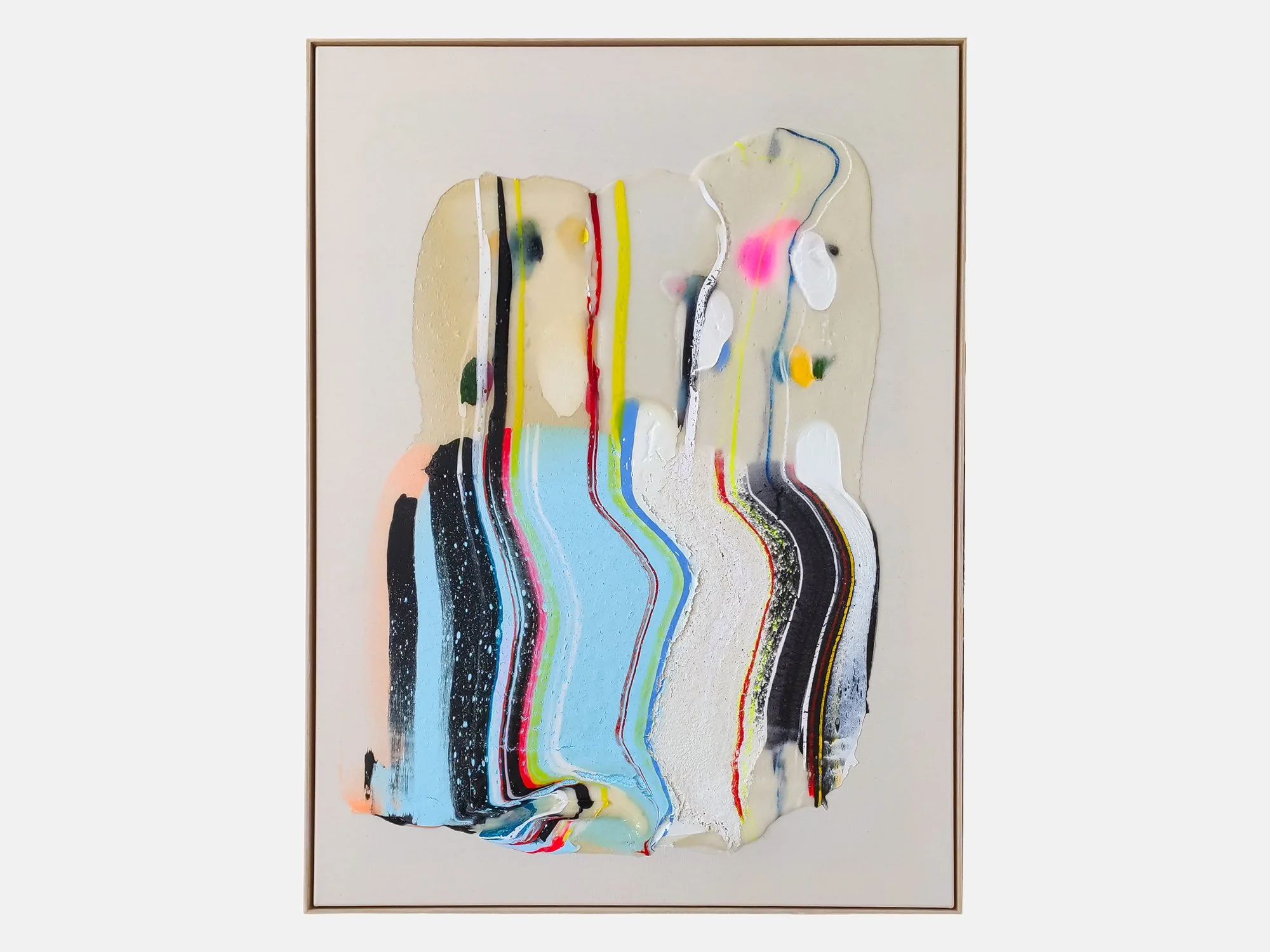
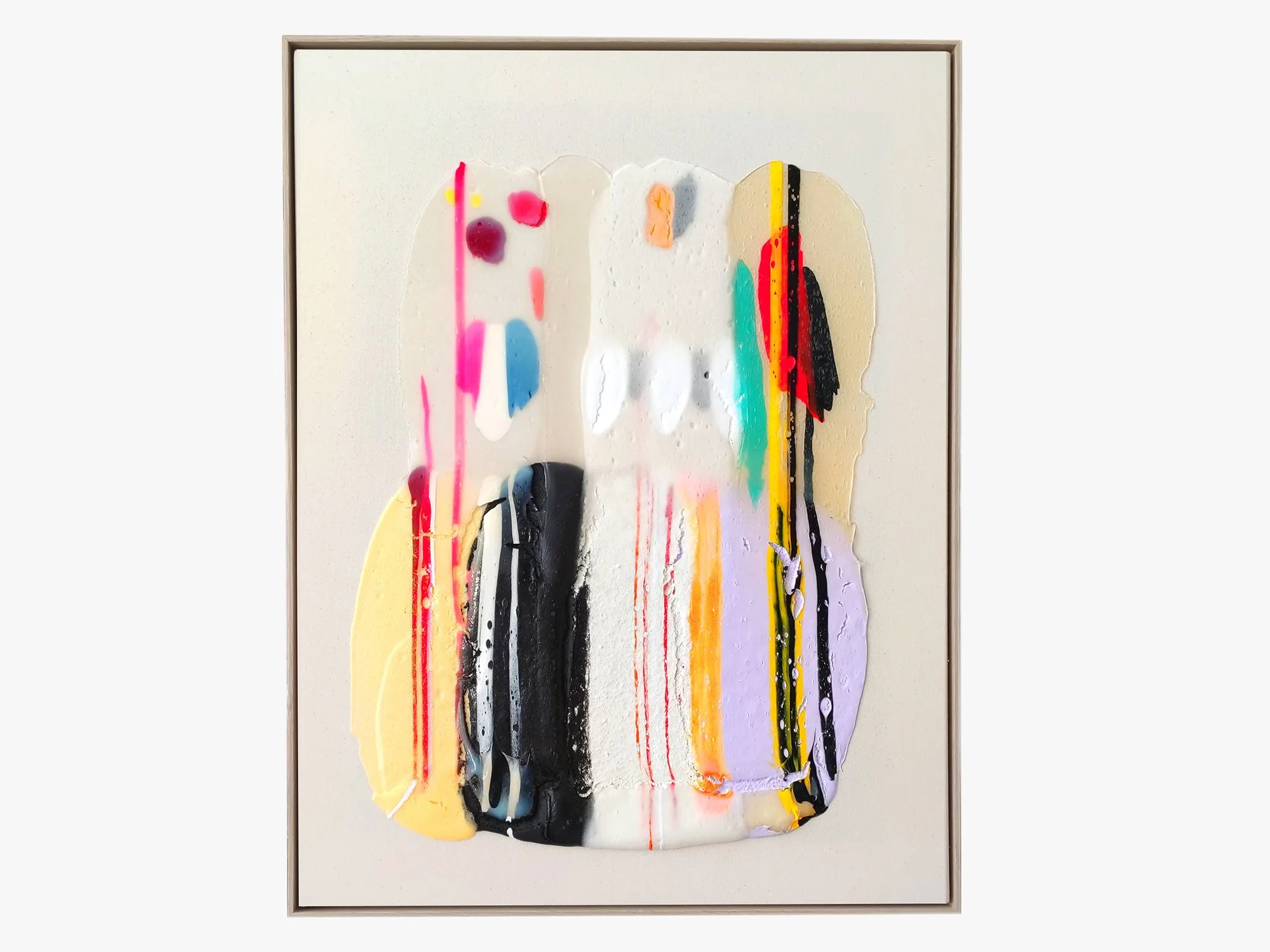
Connecting well to the spirit of North Sea Jazz is the work of Karen van de Vliet. For Karen, painting is like music, whereby colour tones can be described as frequencies. Music is inseparable from her creating process as it is the bridge to her meditative and creative state. She will be showing one or two large paintings characterised by her expressive use of colour, texture and form. Her work is focussed on embracing an imperfect beauty, taking inspiration from weathered surfaces and nature.
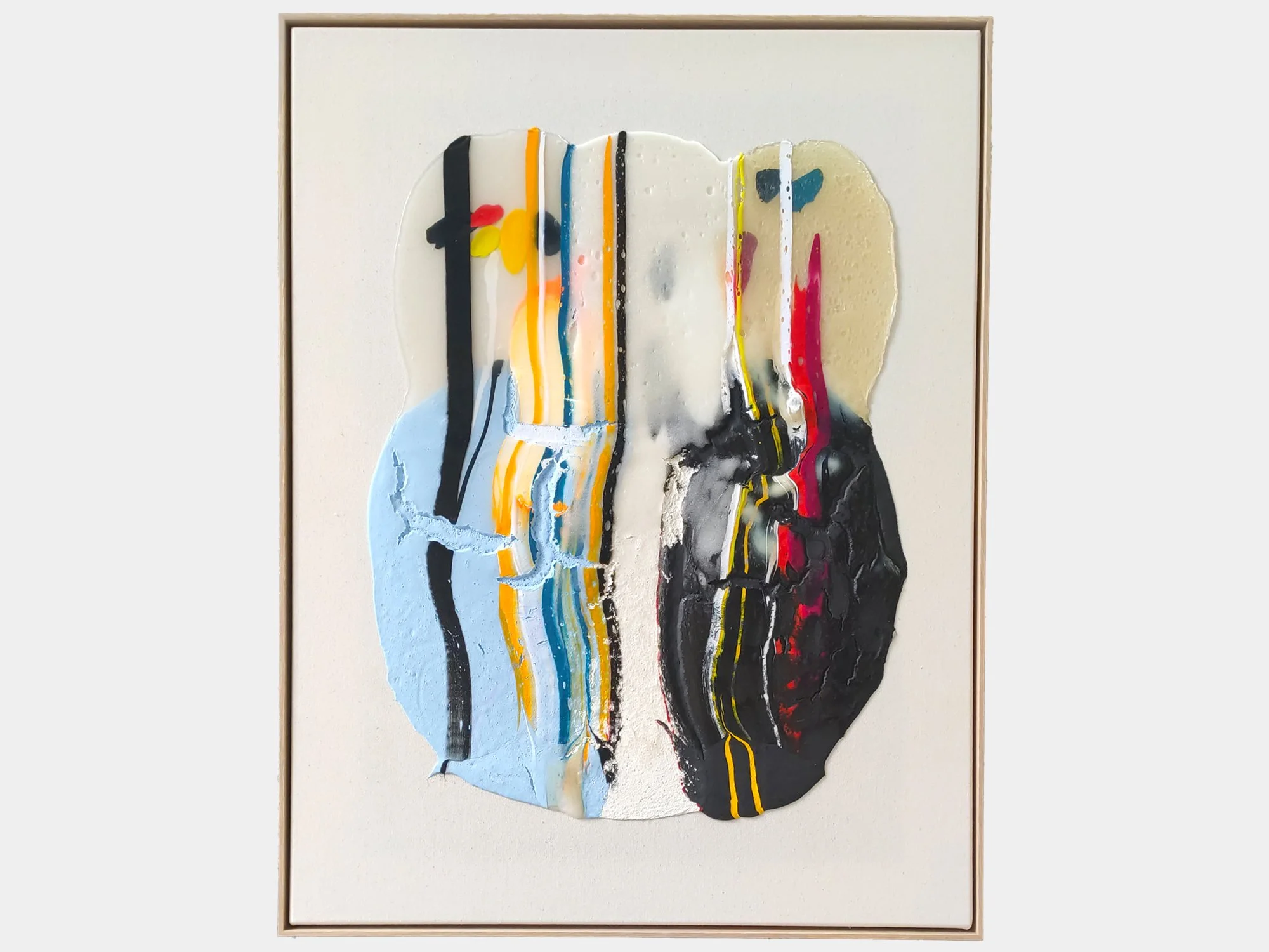
By Karen van de Vliet
120 × 90 cm, 2026
Mixed acrylic paint on cotton, framed
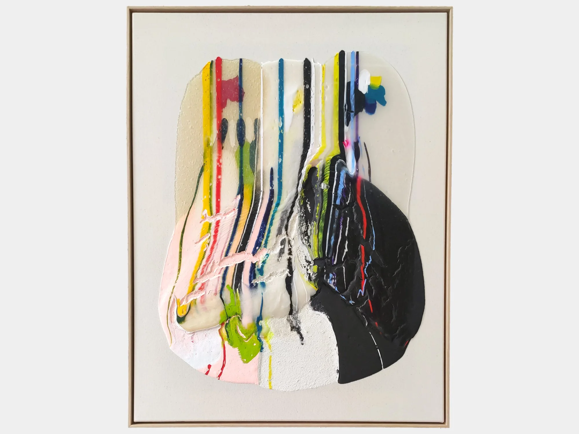
In Translucent IX, Karen van de Vliet explores the unexpected beauty of a stain: an irregular form that seems accidental yet is carefully composed. Her fascination with such shapes began in childhood, through encounters with ordinary things that appeared both beautiful and slightly off, such as autumn leaves gathered in a puddle.
Translucent materials allow colours and traces from underlying layers to remain visible. Pale blue, black and off-white are interrupted by narrow lines and vivid accents of red, yellow and fluorescent pink. Some elements appear to flow downwards, while thicker areas of paint sit prominently on the surface. The result is a tactile abstract painting that shifts between movement and stillness, precision and chance.
Delivery within the Netherlands and Belgium is arranged in consultation, either in person or securely shipped.
By Karen van de Vliet
80 × 60 cm, 2026
Mixed acrylic paint on cotton, framed
In Translucent XIII, Karen van de Vliet approaches painting as both image and physical object. Translucent materials extend across the surface like overlapping veils, while thick passages of pale blue, white and deep navy introduce weight and texture.
Vertical lines hold the composition together and form a counterpoint to the irregular contours of the painted layers. Amber tones and small accents of yellow, red and pink remain visible through and alongside the more opaque areas. The work changes subtly with the light, continually shifting the balance between transparency, colour and material presence.
Delivery within the Netherlands and Belgium is arranged in consultation, either in person or securely shipped.
By Karen van de Vliet
85 × 65 cm, 2026
Mixed Acrylic paint on cotton, framed
In Translucent VIII, Karen van de Vliet uses pale blue, white and soft pink to create a composition that feels calm yet vibrant. Transparent layers overlap with bold lines and textured passages, allowing colour to appear suspended within the work. The combination of movement and stillness gives the painting a strong architectural presence while maintaining a sense of openness.
Delivery within the Netherlands and Belgium is arranged in consultation, either in person or securely shipped.
By Karen van de Vliet
85 × 65 cm, 2026
Mixed Acrylic paint on cotton, framed
Translucent VII by Karen van de Vliet combines subtle pastel colours with darker elements and transparent layers. The composition reveals itself gradually, with areas of pink, cream, black and vivid accents emerging from beneath the surface. The work reflects the artist's ongoing interest in transparency and material, resulting in a painting with both presence and restraint.
Delivery within the Netherlands and Belgium is arranged in consultation, either in person or securely shipped.
By Karen van de Vliet
85 × 65 cm, 2026
Mixed Acrylic paint on cotton, framed
In Translucent VI, Karen van de Vliet works with luminous colours and transparent layers that reveal traces of movement and gesture. Areas of soft pink, lavender, yellow and black are brought together within a composition that feels open and spacious. The work occupies a place between painting and object, inviting the viewer to look closely at the relationship between colour, texture and light.
Delivery within the Netherlands and Belgium is arranged in consultation, either in person or securely shipped.
By Karen van de Vliet
85 × 65 cm, 2026
Mixed Acrylic paint on cotton, framed
Karen van de Vliet created Translucent IV as a balance between softness and contrast. Transparent layers surround areas of lilac, blue, pink and black, while strong vertical lines introduce rhythm to the composition. The tactile surface gives the work a sculptural quality, allowing colour to appear almost suspended within the material. The painting changes character throughout the day as light interacts with its layered surface.
Delivery within the Netherlands and Belgium is arranged in consultation, either in person or securely shipped.
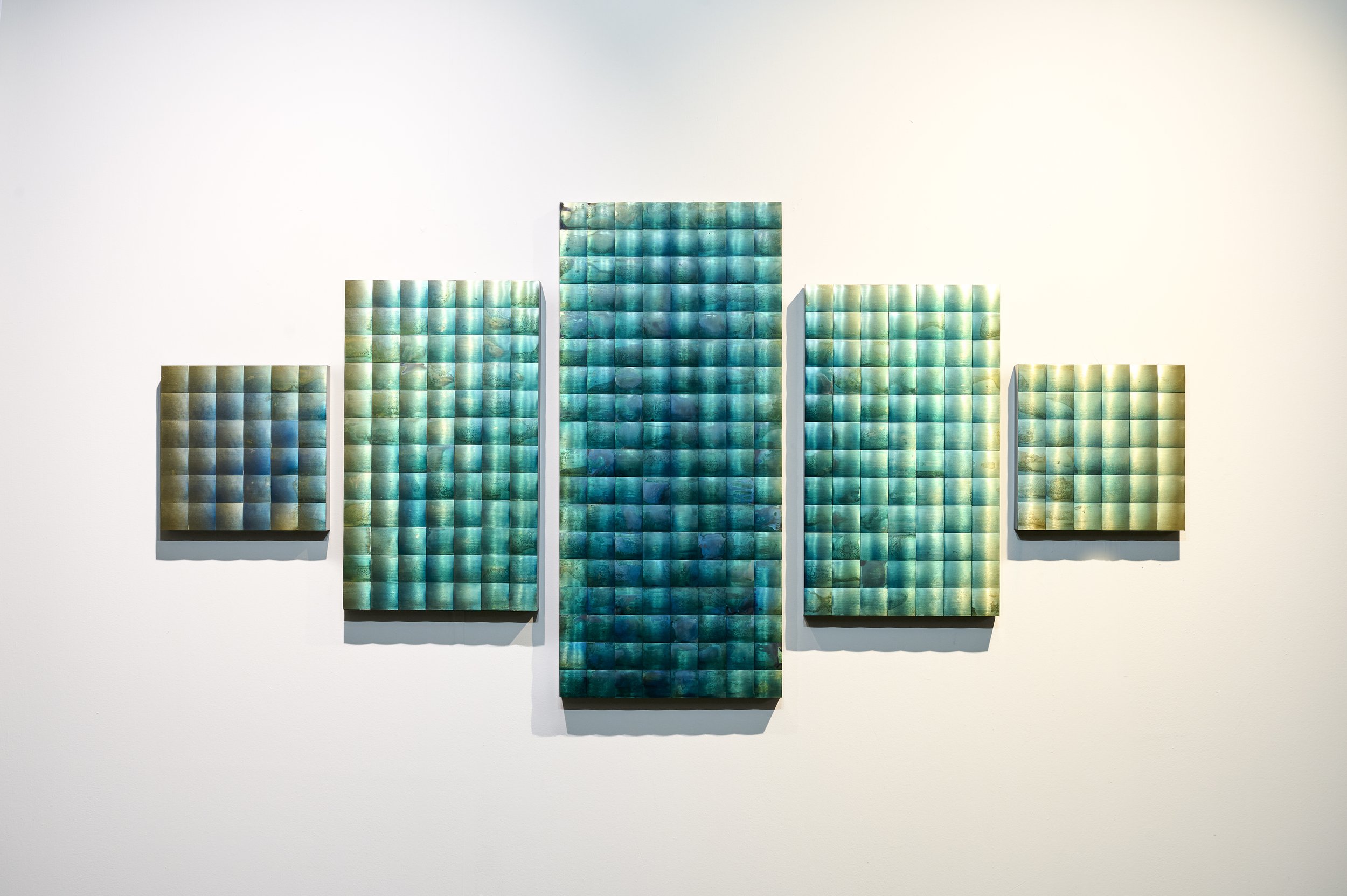
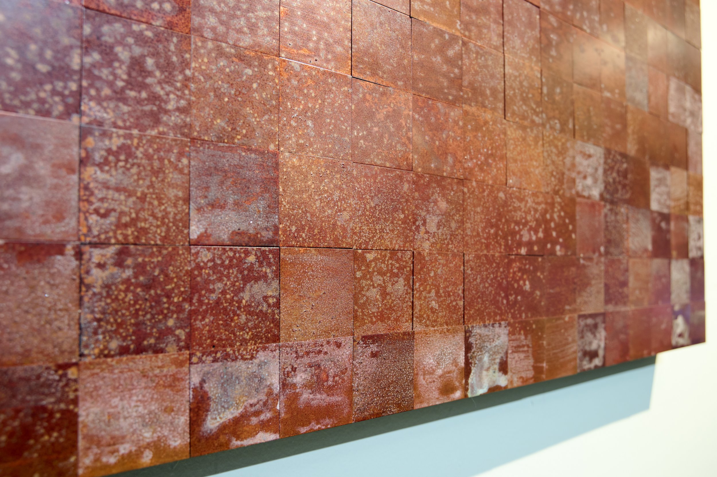
Sanne Terweij will be part of the expo at North Sea Jazz with polyptych wall objects. Sanne currently focuses on the use of metals such as brass and copper, of which the reflective surfaces shimmer and constantly change with the moving light and the position of the viewer. It's the treasures of the material, in colour as well as in texture and reflection that Sanne is after, revealing her deep-rooted love for old school craftsmanship and appreciation for the little imperfections.
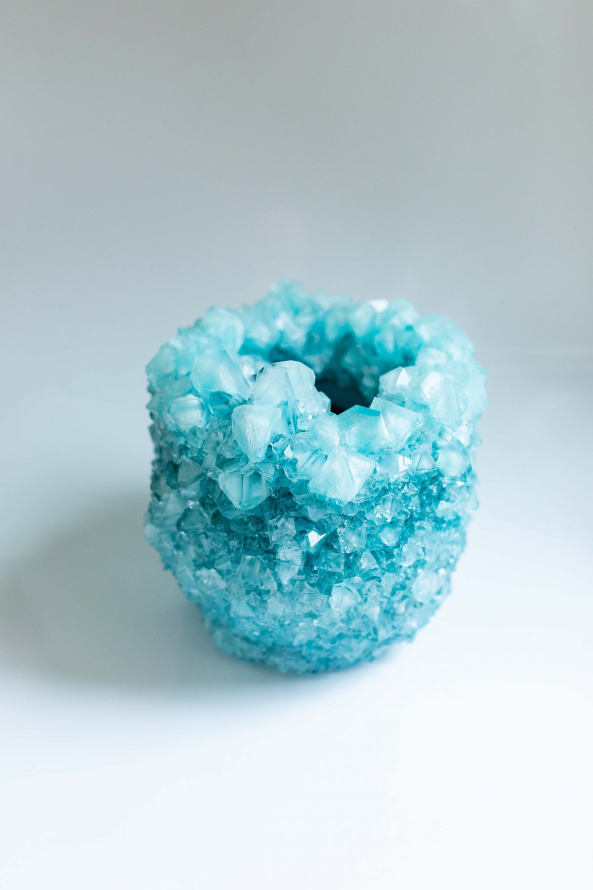
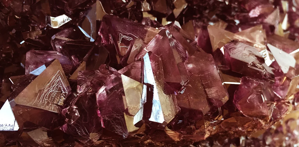
Last but not least, are the works by Isaac Monté. At the fair you can expect to see works from his ‘The Crystal 'series in which he researched stalagmites. The growing process of the objects can be seen as a metaphor for time. Each object is unique in shape, colour and texture, due to the natural crystallisation of minerals and the influence of the designer on the formation process. This process can take up to several weeks to obtain the perfect shape, interesting colour combinations and dimensions of crystals.
Location
Rotterdam Ahoy (Hudson Hall, next to Parkheuvel Restaurant)
Ahoyweg 10, 3084 BA Rotterdam
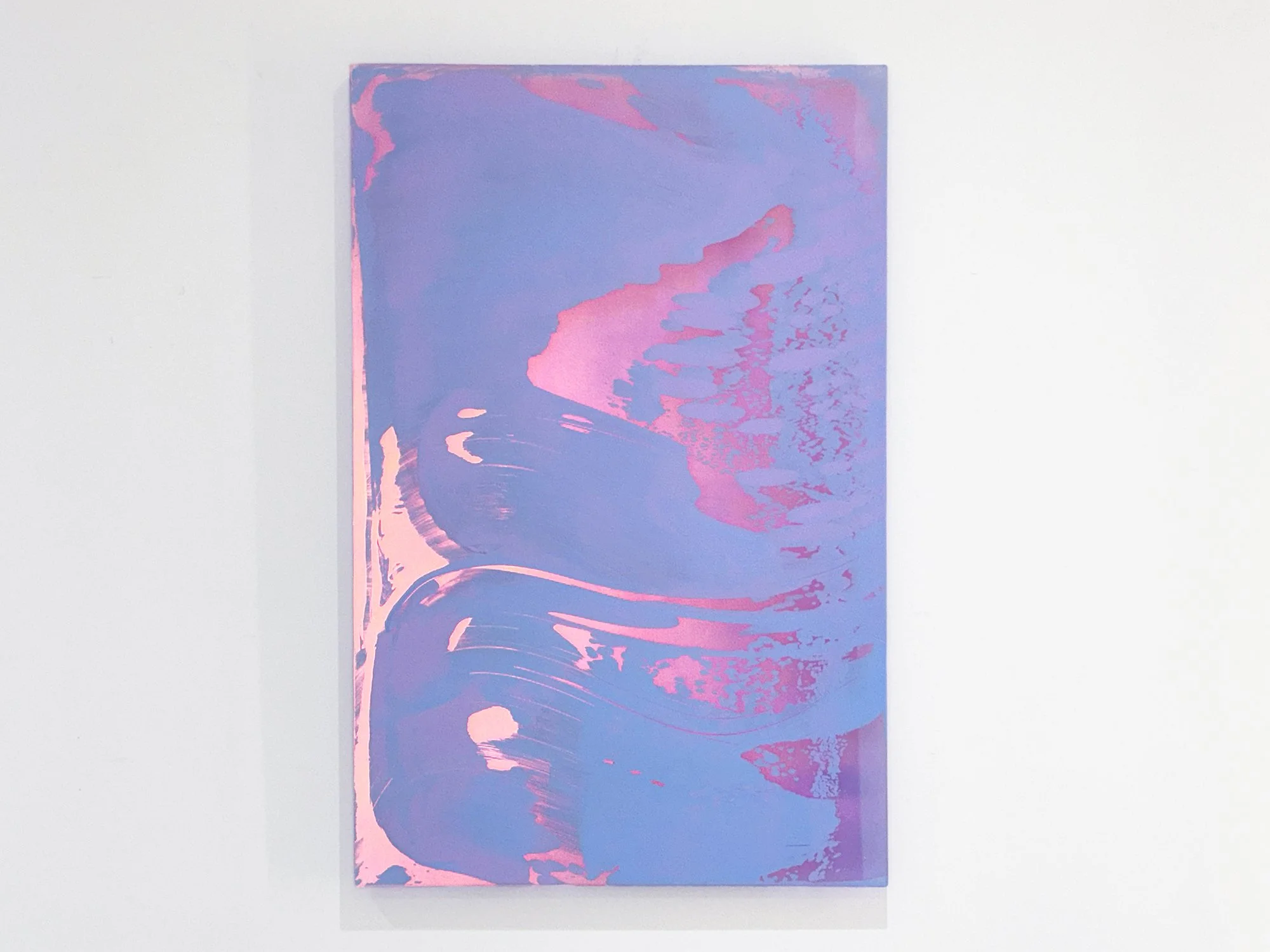
By Lisette Schumacher
60 × 50 x 6 cm, 2026
Mixed media
From the series Coachella views
Coachella Views XIV is one of the most contrasting works in Lisette Schumacher’s series. Warm coral and golden yellow meet cooler blue and lilac, recalling the striking opposition between the sunlit Coachella Valley and the snow-capped San Jacinto Mountains beyond it. Broad areas of colour create movement, while an intricate pattern on the right gives the composition a more concentrated intensity.
Schumacher does not reproduce a particular view. Instead, she brings together impressions of heat, distance, wind and rapidly changing colour. The result is a confident abstract artwork with a strong presence: vivid enough to anchor a space, yet layered enough to reveal quieter transitions on closer inspection.
This work will be shipped within the Netherlands and Belgium at no additional cost, securely and with tracking.