What colour does to a space
How colour transforms your space, and your state of mind.
Long before we understand what a painting shows, we feel its colours.
Colour sets the tone of a room. It directs light, shifts scale, and shapes the emotional climate we step into. In both art and architecture, colour is not an afterthought: it’s foundational. Colour is never passive. It moves, anchors, provokes or calms. Especially in contemporary art, colour is material, mood and meaning at once.
Below, we explore seven key colours found in the artworks created by the artists represented to Root Gallery. Each with its own story, spatial effect, and emotional resonance.

Photography Jacqueline Fuijkschot
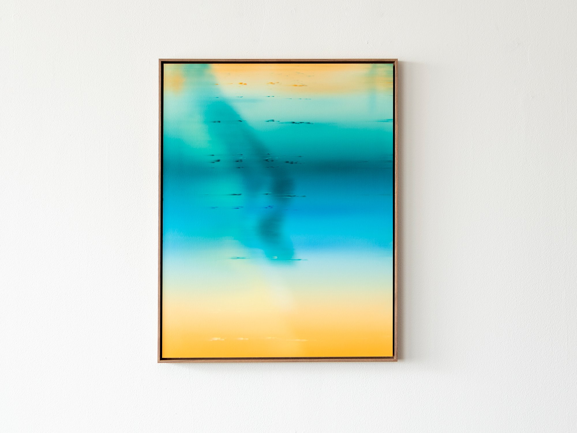
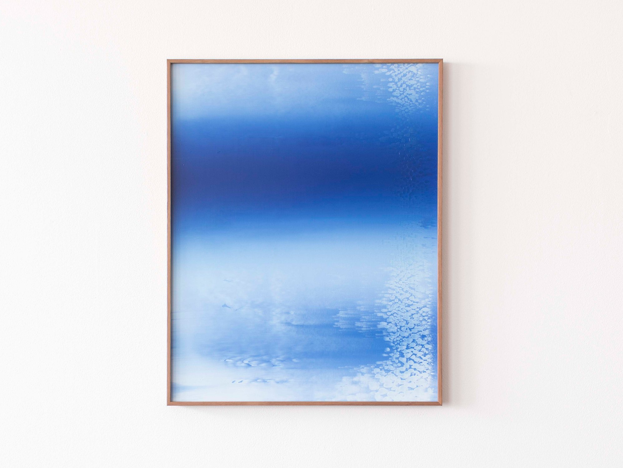
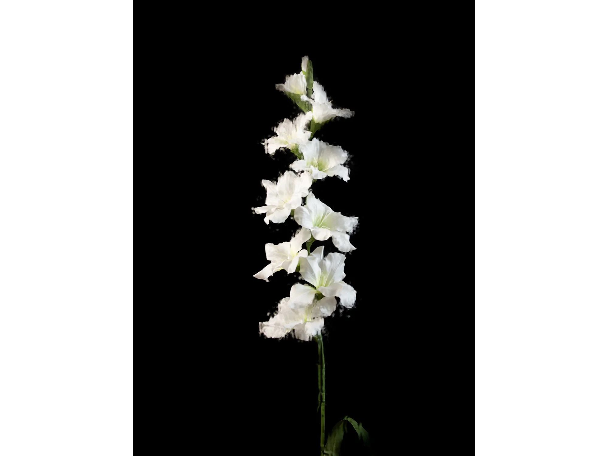
Blue: Stillness, focus and distance 💙
Blue expands. It pushes walls outward, introduces calm, and lets the eye rest. In Donald Schenkel’s earlier works, entire canvases are devoted to blue, ranging from soft mineral tones to deep ultramarine.
Historically, blue was among the most precious pigments, reserved for sacred imagery. Lapis lazuli was ground into ultramarine, often used exclusively for the Virgin Mary’s robe, a gesture of honour and reverence.
But blue also operates differently on the eye. Because of how our visual system is wired, we literally perceive blue as further away. Compared to warmer colours like red or yellow, blue light has a shorter wavelength, which causes the eye to adjust focus as if looking into the distance. It’s the same phenomenon we experience when we gaze at the sky or the sea, both appear infinite, not because they are, but because of how blue scatters through light and atmosphere.
Emotionally, this depth registers as stillness. Blue supports focus and reduces stress. In interiors, it lends itself well to entrance areas, studies, and bedrooms, spaces where quiet is welcome. A blue artwork can create visual breathing room in a busy home, offering calm without ever feeling cold.


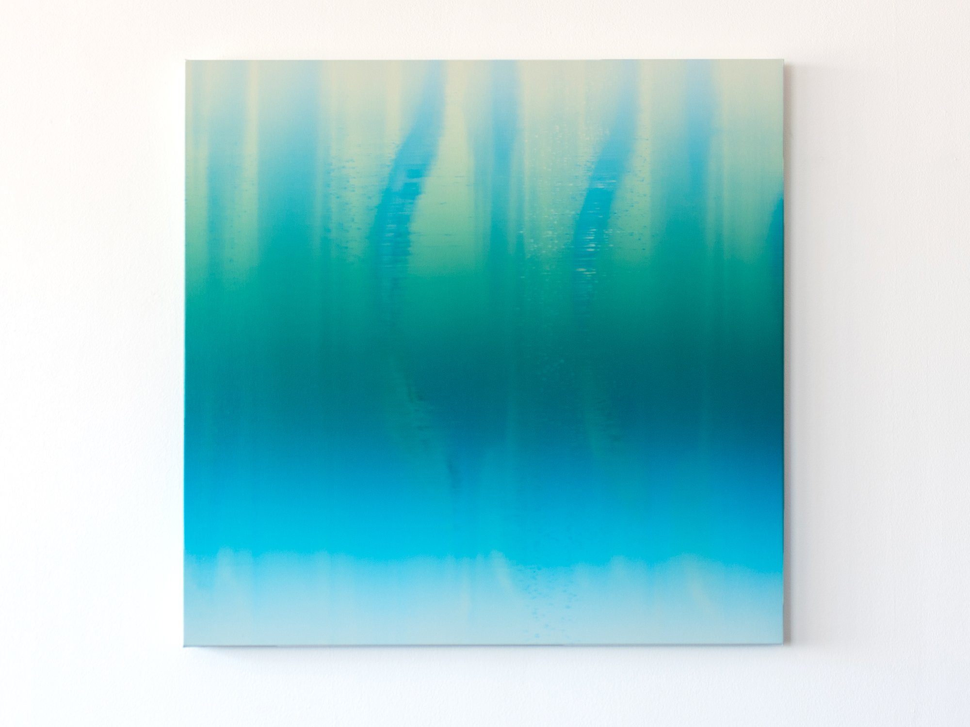


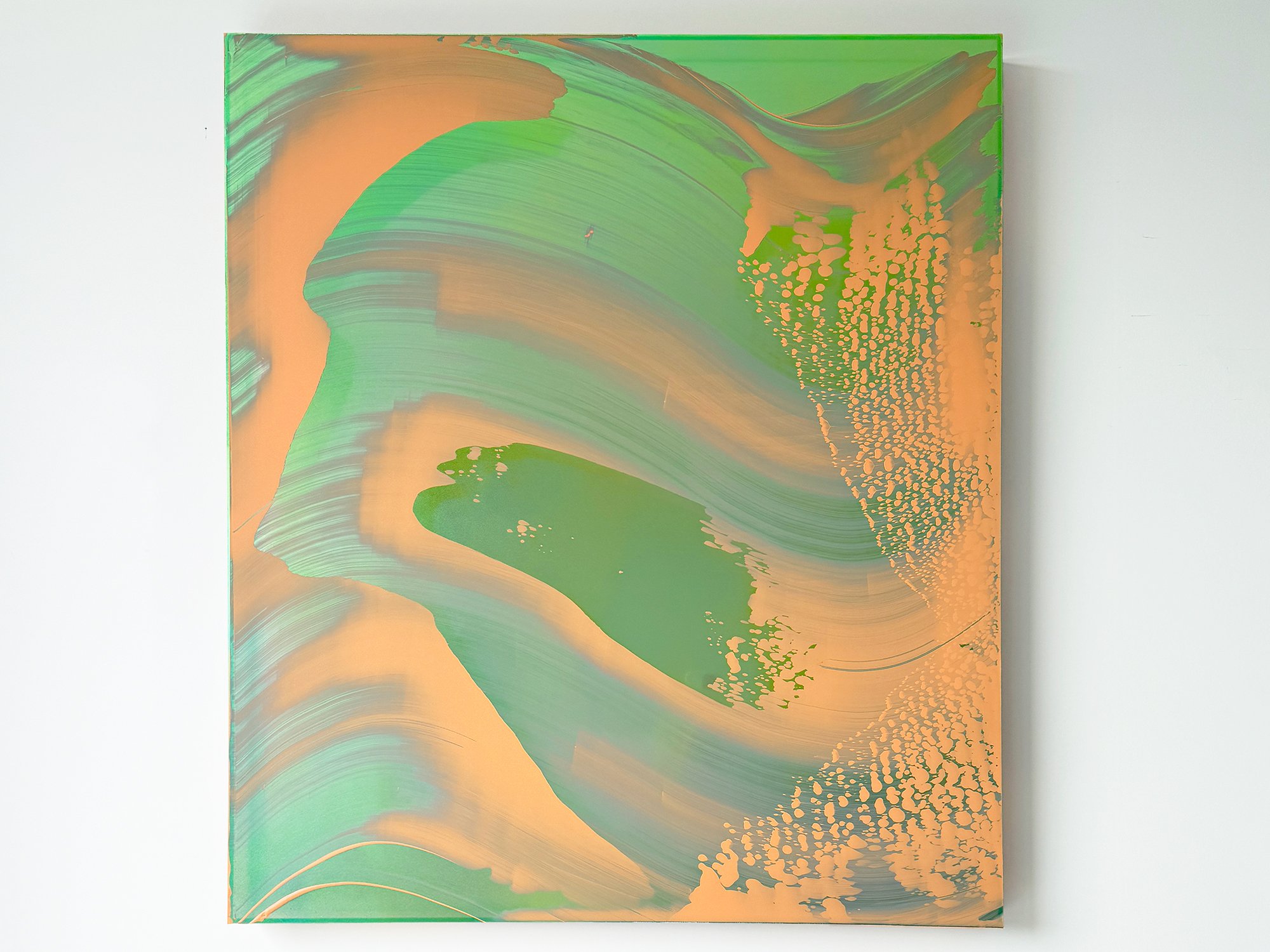
Green: Balance, nature and transition 💚
Green is the colour of in-between. It mediates - not too warm, not too cold - and offers balance in both art and interiors. In contemporary work, green often evokes landscape, systems, or decay. It reminds us of nature, but also of its fragility.
Historically, green pigments like verdigris were both luminous and treacherous. apable of corroding entire surfaces over time. Despite this, green remained the colour of rebirth, paradise, and domestic comfort in European painting and textiles.
Perceptually, green is one of the easiest colours for the human eye to process, which is why it’s often used in environments designed to reduce fatigue, like hospitals or classrooms. It’s a resting colour, neurologically speaking.
In a home, green harmonises. It connects indoor and outdoor spaces and is ideal for transitional zones like hallways, landings, and bathrooms. A green work of art doesn’t demand attention, it offers rest. Especially in combination with wood, linen or natural light, it settles the room without dulling it.


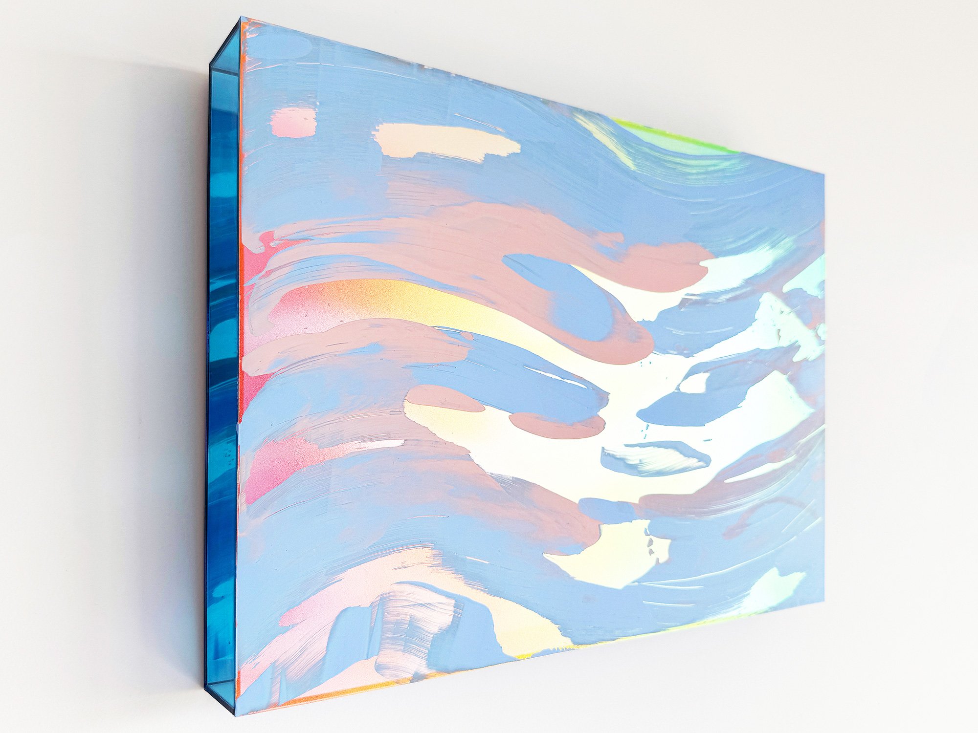
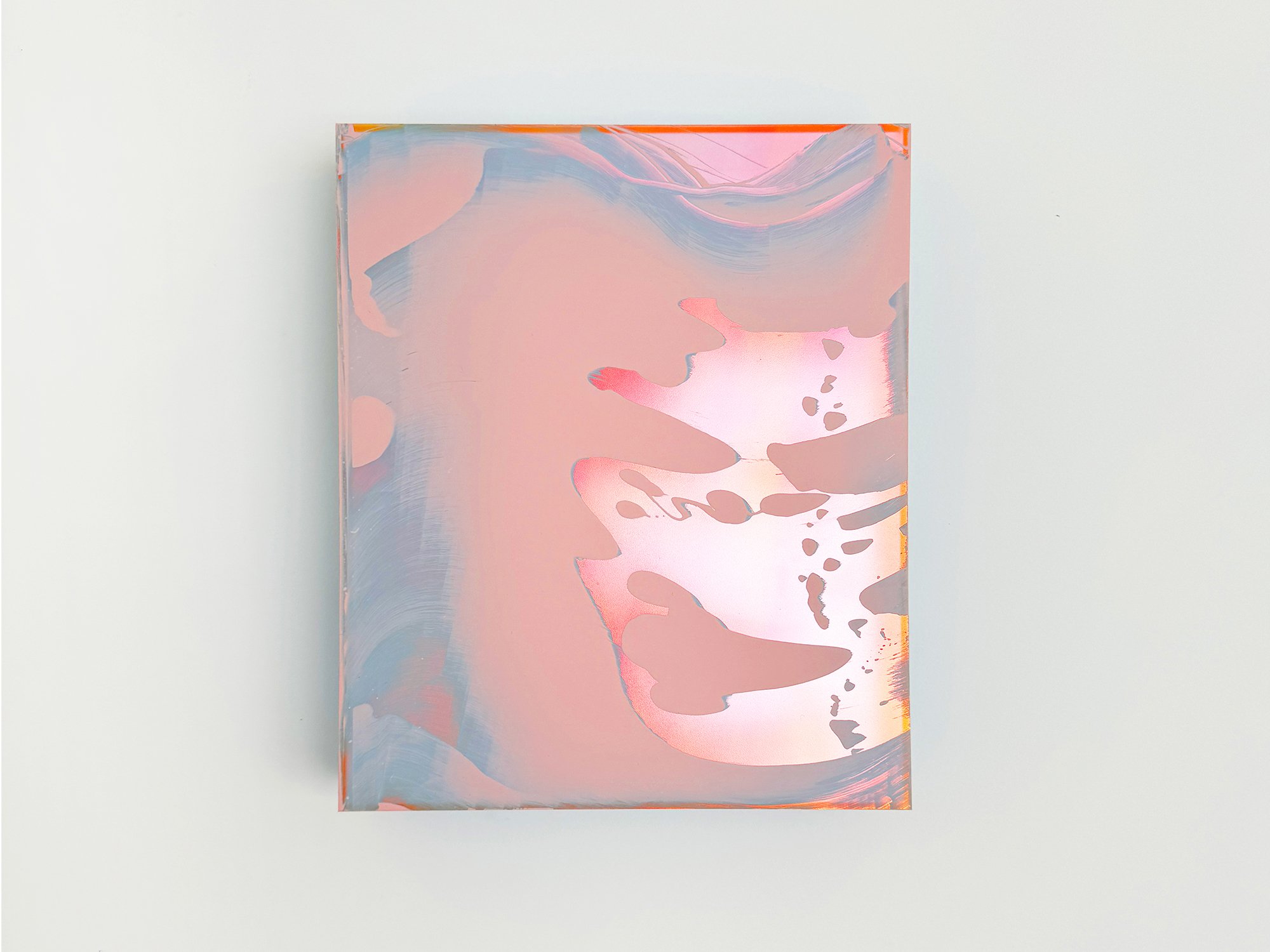
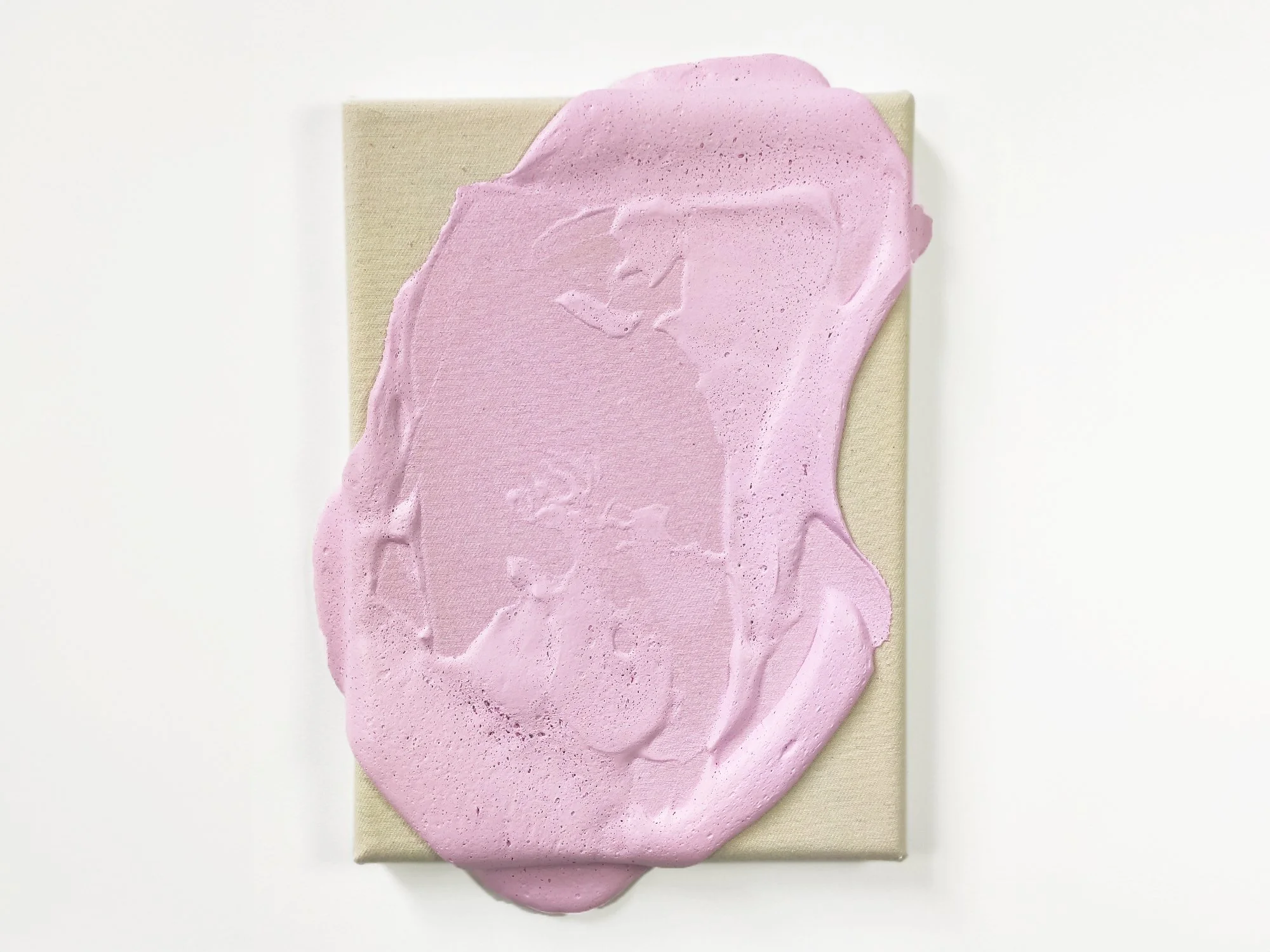
Pink: Softness, strength and subversion 💗
Pink is rarely what it seems. Often dismissed as decorative, it carries an edge that surfaces in the right hands. In Karen van de Vliet’s sculptural paintings, pink is structure, weight, and gesture, unapologetically present.
Culturally, pink has been highly mutable. In the 18th century it was worn by European aristocratic men; by the 20th century, it was aggressively gendered. Today, it’s being reclaimed in contemporary art as a colour of softness with agency, gentle, but never passive.
Visually, pink behaves differently depending on its undertone: warm pinks can energise; cooler pinks soothe. It’s a colour that invites touch, yet shifts in meaning depending on what surrounds it.
In interiors, pink can bridge opposing elements. It tempers raw materials like concrete or steel, and brings warmth to otherwise cool-toned spaces. A pink artwork can feel both radical and serene, especially when scale and surface push beyond what’s expected.


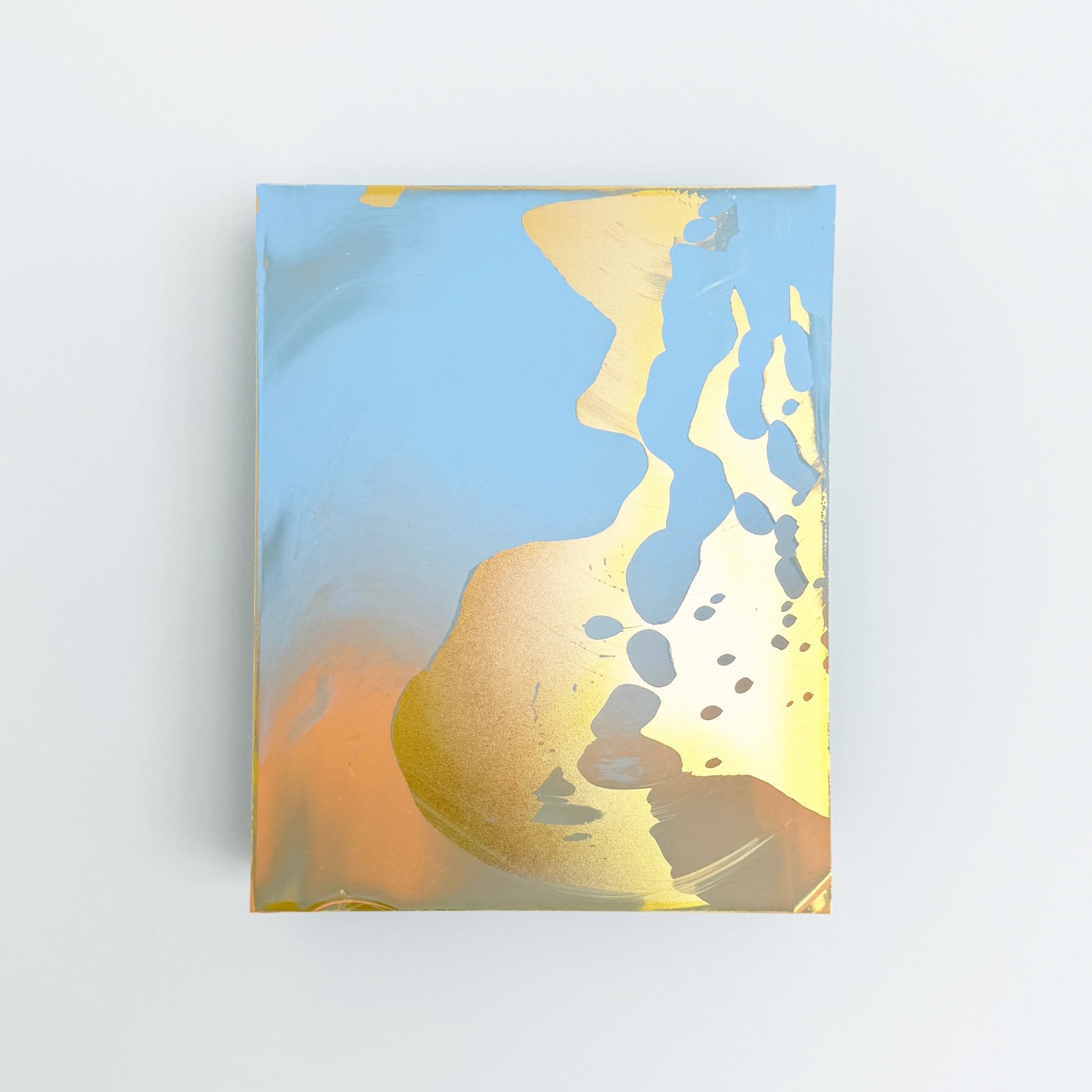
Yellow: Light, instability and motion 💛
Yellow is the most light-reflective colour. A property that gives it its brightness, but also its volatility. In Van Gogh’s hands, yellow was urgent and hallucinatory. In contemporary works, it often introduces flicker, imbalance, or upward movement.
Historically, yellow pigments were chemically unstable: many faded, browned, or reacted unpredictably to light and air. And yet, yellow has always symbolised divine light in religious art, from Byzantine gold grounds to Gothic halos.
Cognitively, yellow stimulates the brain’s left hemisphere, associated with logic and decision-making. It’s no coincidence that it’s used in warning signs: yellow literally grabs attention faster than other colours.
In the home, yellow adds motion. It brightens dark corners, enlivens cold materials, and can even act as a visual window in small spaces. But moderation is key: used in small amounts, yellow energises. Used too broadly, it overwhelms.


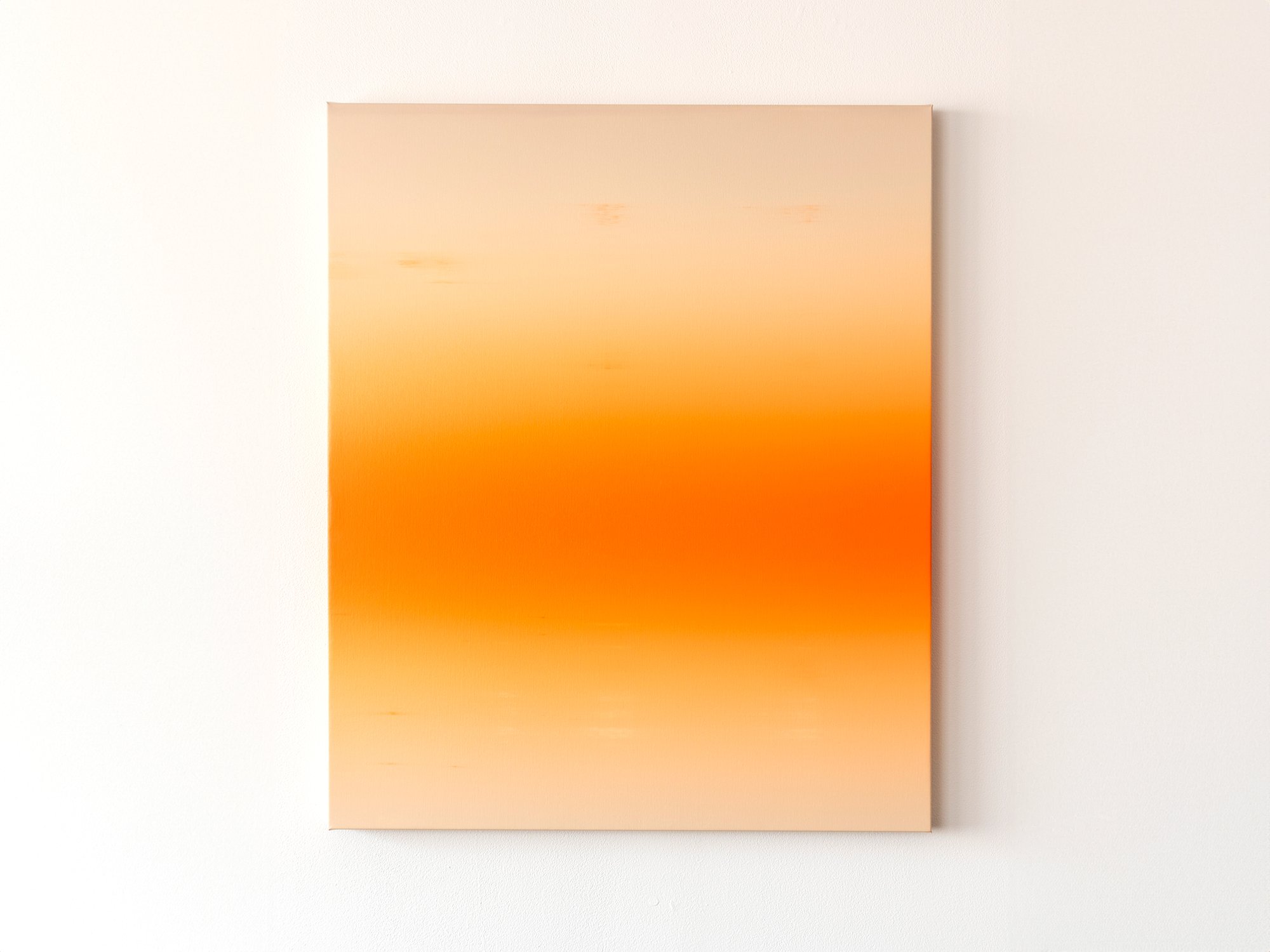
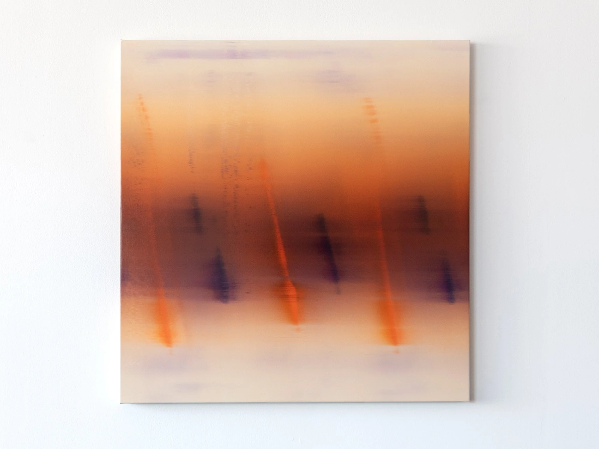
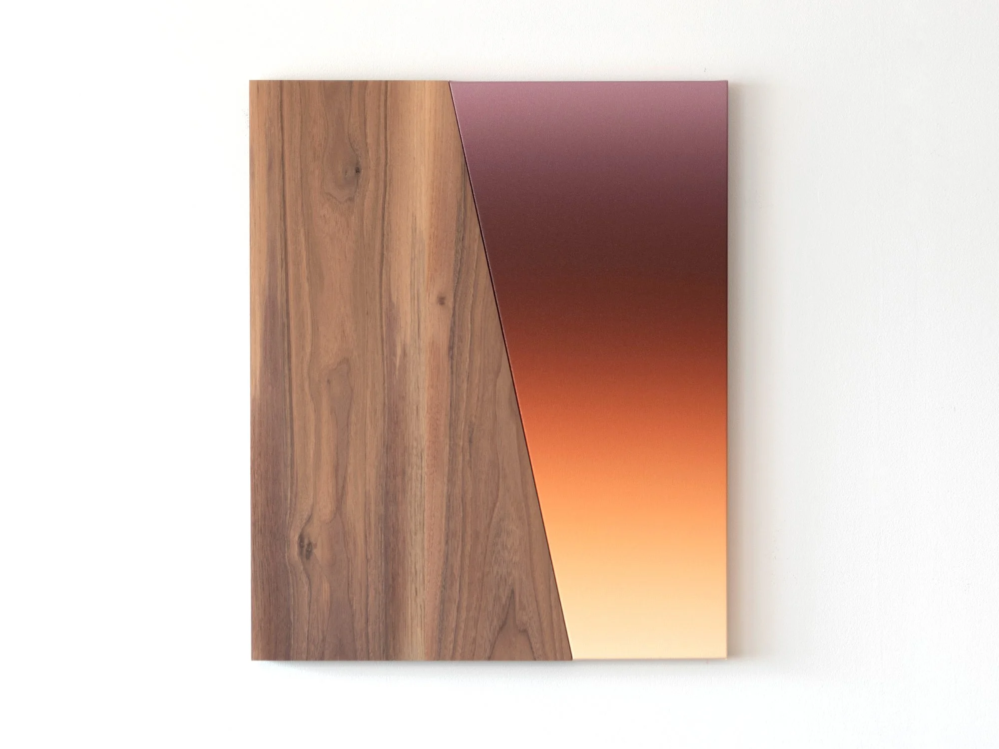
Orange: Warmth, movement and sociability 🧡
Orange lives in motion. It’s an active, social colour, born from red and yellow, yet with a character all its own. In Lisette Schumacher’s work, orange marks boundaries, defines rhythm, and adds intensity without aggression.
In historical painting, orange took time to arrive. The pigment minium was vibrant but toxic; other sources like realgar or saffron were rare and costly. Once synthetic pigments arrived, orange became a colour of the modern city: of signage, fashion, and speed.
Psychologically, orange stimulates appetite, conversation, and creative thinking. It’s frequently used in environments where interaction is encouraged, cafés, studios, or playrooms.
Optically, orange can shift dramatically depending on the light source. In the warm tones of early evening, it glows. In colder daylight, it becomes sharper, more graphic. In interiors, it’s a connector: it brings disparate elements into dialogue.


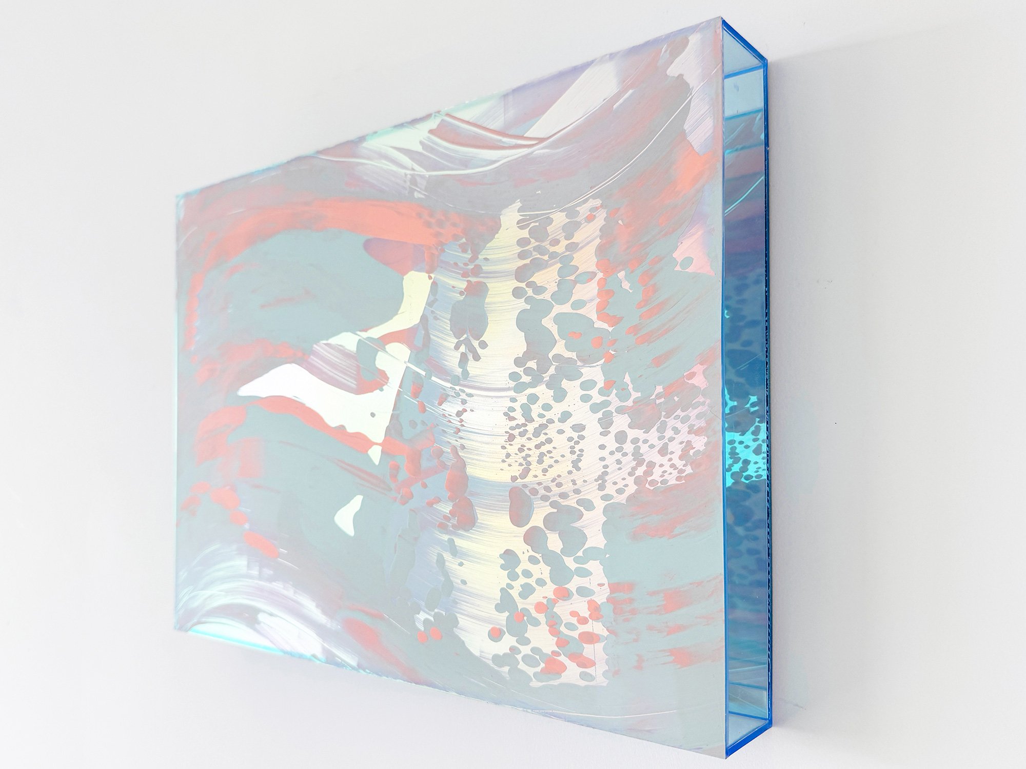
Red: Intensity, emotion and presence ❤️
Red is immersive. In the work of both Donald Schenkel and Lisette Schumacher, red is not incidental, it’s central. Donald explores red as an emotional field, saturating entire compositions to evoke physical presence and psychological depth. Lisette, by contrast, often uses red more structurally: as an accent, a rhythm, a spatial tool within her architectural language. But both artists are acutely aware of the colour’s charge.
Symbolically, red is one of humanity’s oldest pigments. Used in cave paintings, sacred rituals, royal dress, and revolutionary propaganda. Across time and cultures, it has signified life, danger, passion, and transformation.
Physiologically, red increases heart rate and attracts attention more rapidly than any other colour. It’s visceral. In a domestic space, this means red should be used with intention. A red-dominant work doesn’t simply hang, it anchors the room.
Red works beautifully in spaces where intensity is welcome: dining areas, entry halls, or reading corners where you want atmosphere. It doesn't just fill a space, it defines it.


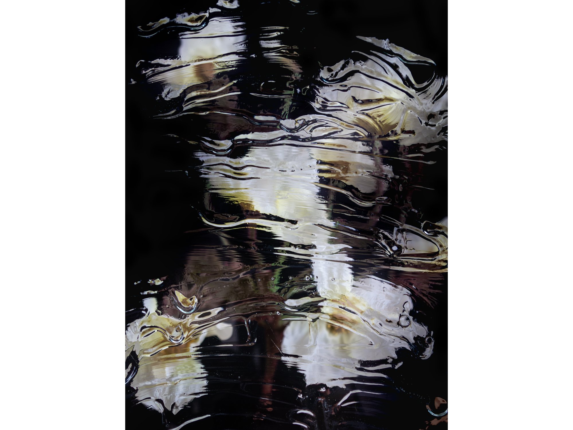
Black: Depth, precision and silence 🖤
Black absorbs and distils. In Sophie de Vos’ photographic works, black defines, not emptiness, but architecture, presence, and transition. Her compositions use black to focus attention, to withhold as much as they reveal.
Historically, black has shifted from sacred to radical. In medieval manuscripts, it was clarity; in 20th-century modernism, it became negation, starting with Malevich’s Black Square. But always, black is a boundary, it defines what is and isn’t there.
Optically, black reduces reflection and flattens form, which makes it useful in a spatial sense. In the right light, it creates depth; in shadow, it dematerialises.
In interiors, black is both frame and anchor. It makes bright colours bolder, white spaces sharper, and cluttered rooms more coherent. A black-and-white work - especially in photographic form - can stabilise a space with just one gesture.


Living with colour
To choose a work of art is to choose how a space feels, every day.
Colour shapes that feeling. It moves with the light, reflects your mood, and often shifts as you live with it longer. Whether you gravitate towards deep blues or bright oranges, muted greens or saturated reds, each colour carries intention. Not just from the artist, but from you: as the viewer, the collector.
And yet, some of the best choices defy logic.
So yes, consider how a colour might work in your home. Think about scale, contrast, light. But don’t get stuck there. You live in a home, not a museum. Art doesn’t have to match the curtains. Let yourself be surprised. Let a work seduce you, unsettle you, or simply stay with you for reasons you can’t explain.
In the end, how you place art is part of your story. And good stories are never too neat.
Curious to see how these colours take shape in the works our artists are currently creating?
Discover recent paintings, sculptures and photographs by Donald Schenkel, Lisette Schumacher, Sophie de Vos, Karen van de Vliet, Vera Klaus and others, online or in the gallery. Many of these artists are developing new pieces as we speak. We’re happy to help you find a work that fits your space and keeps unfolding over time.


In short, why colour matters when choosing art for your home:
✔ Colour shapes how a space feels, functions, and flows
✔ Each hue carries historical, emotional, and spatial meaning
✔ Blue brings focus and stillness, red creates intensity and warmth
✔ Green offers balance, yellow energises, pink softens and surprises
✔ Orange invites connection, black defines and clarifies
✔ Choosing colour consciously helps art resonate more deeply
✔ But sometimes, the best choice is the unexpected one