
Buying art for a holiday home
What to consider when buying art for a holiday home
A holiday home isn’t just a second house. It’s a place to slow down, reset, and surround yourself with what feels good. And that includes the art on your walls.
At Root Gallery, we often help clients choose works for their secondary homes. Whether it's a coastal retreat, a cabin in the woods, or a pied-à-terre in the city, the art you choose can help set the tone. But how do you go about selecting the right pieces?

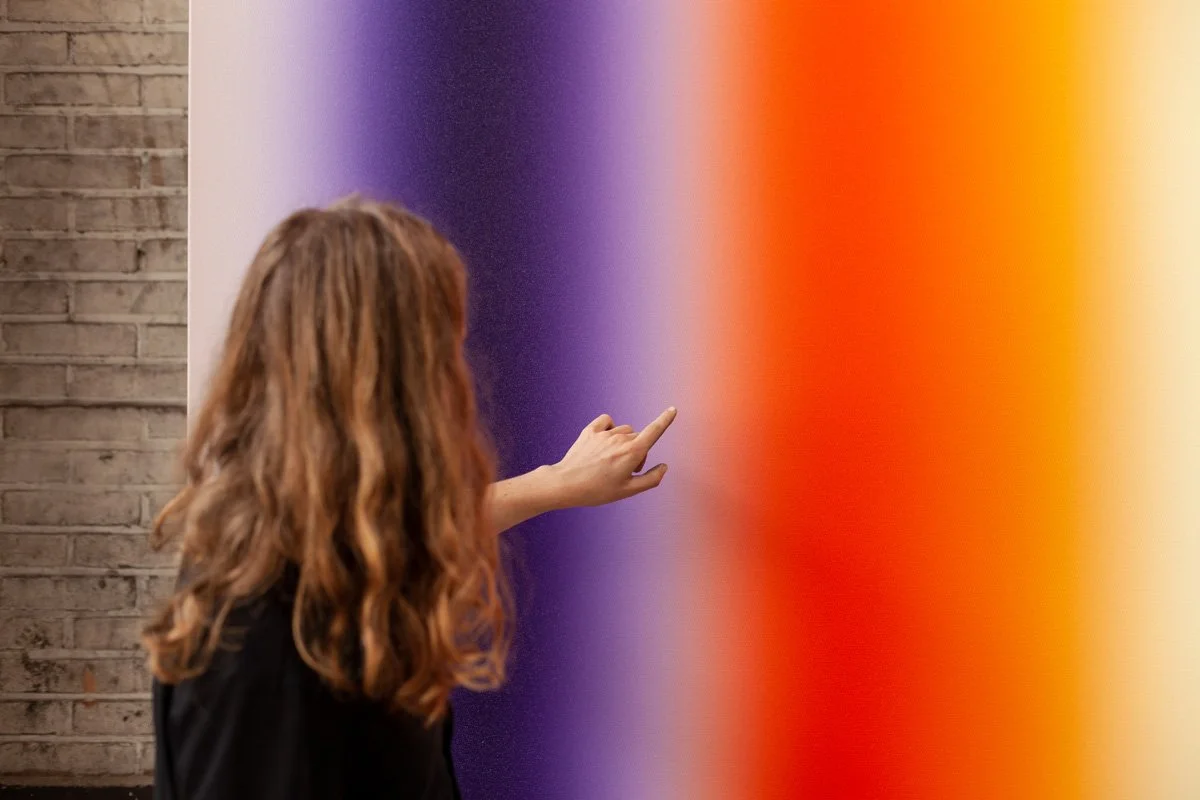
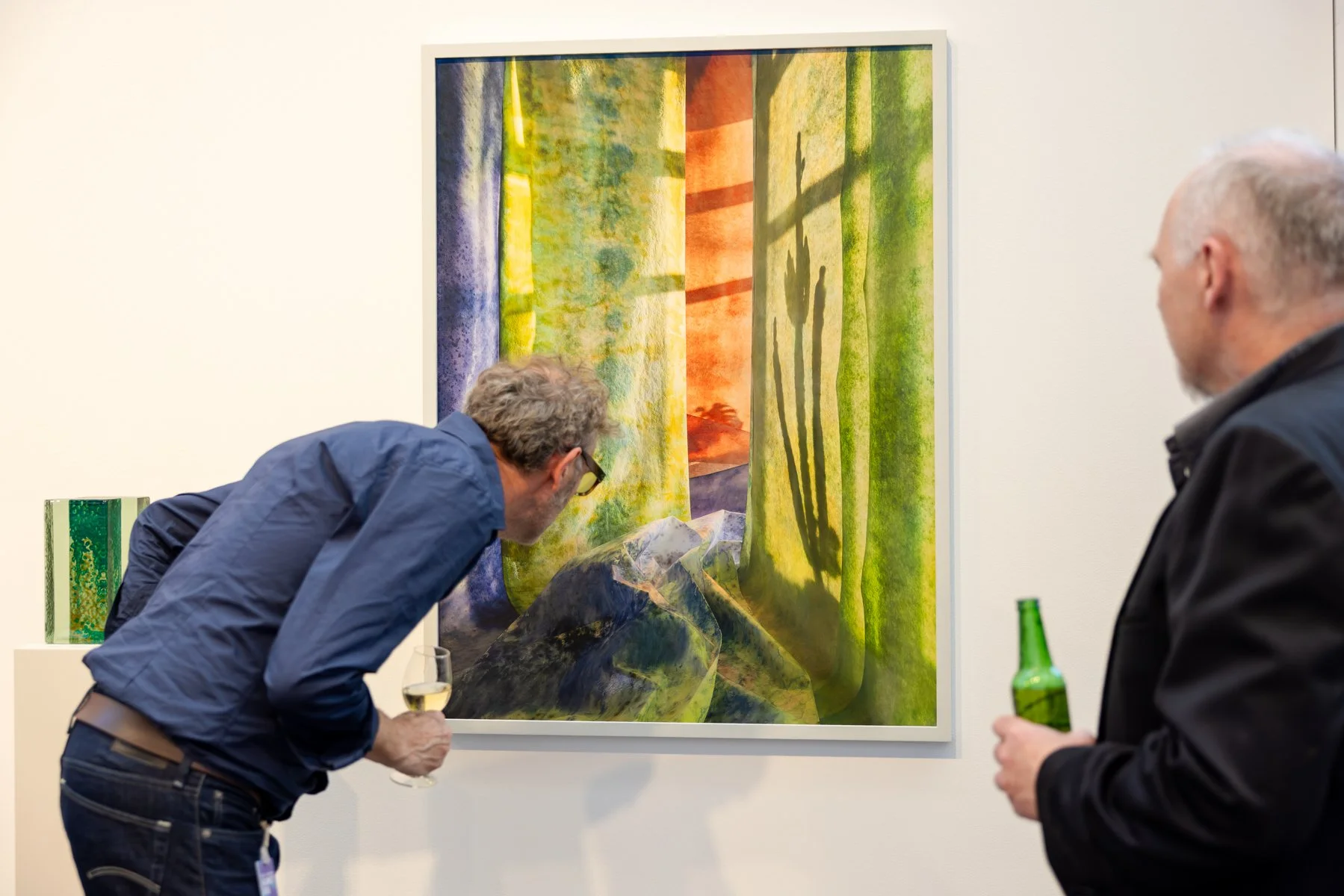
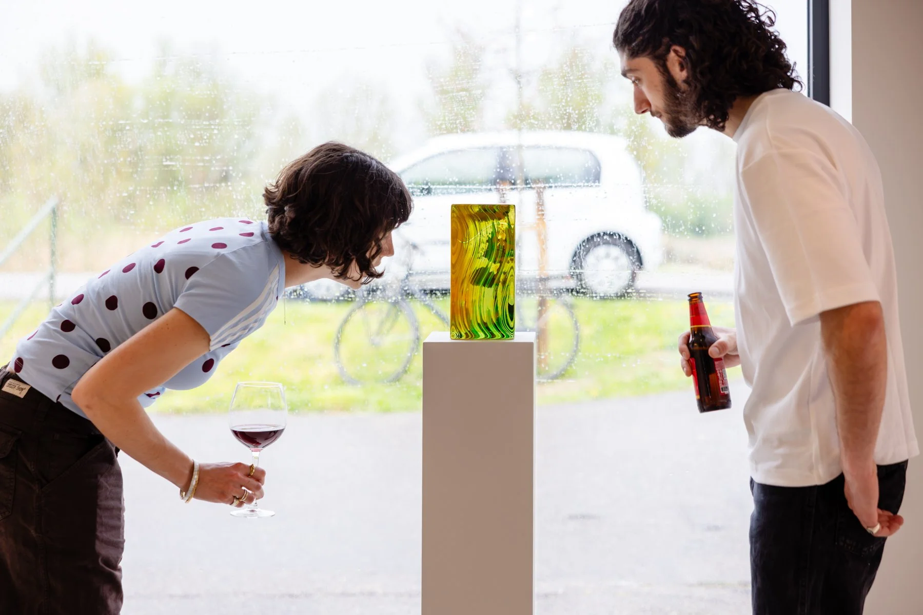
Photography by Jacqueline Fuijkschot
Think about function, not just feeling
A holiday home invites a different pace. Some people seek calm and softness here; others want energy and contrast. There’s no single approach. What matters is that the artwork contributes to the atmosphere you want to create, whether that’s restful, invigorating, or quietly surprising.
Consider the space itself
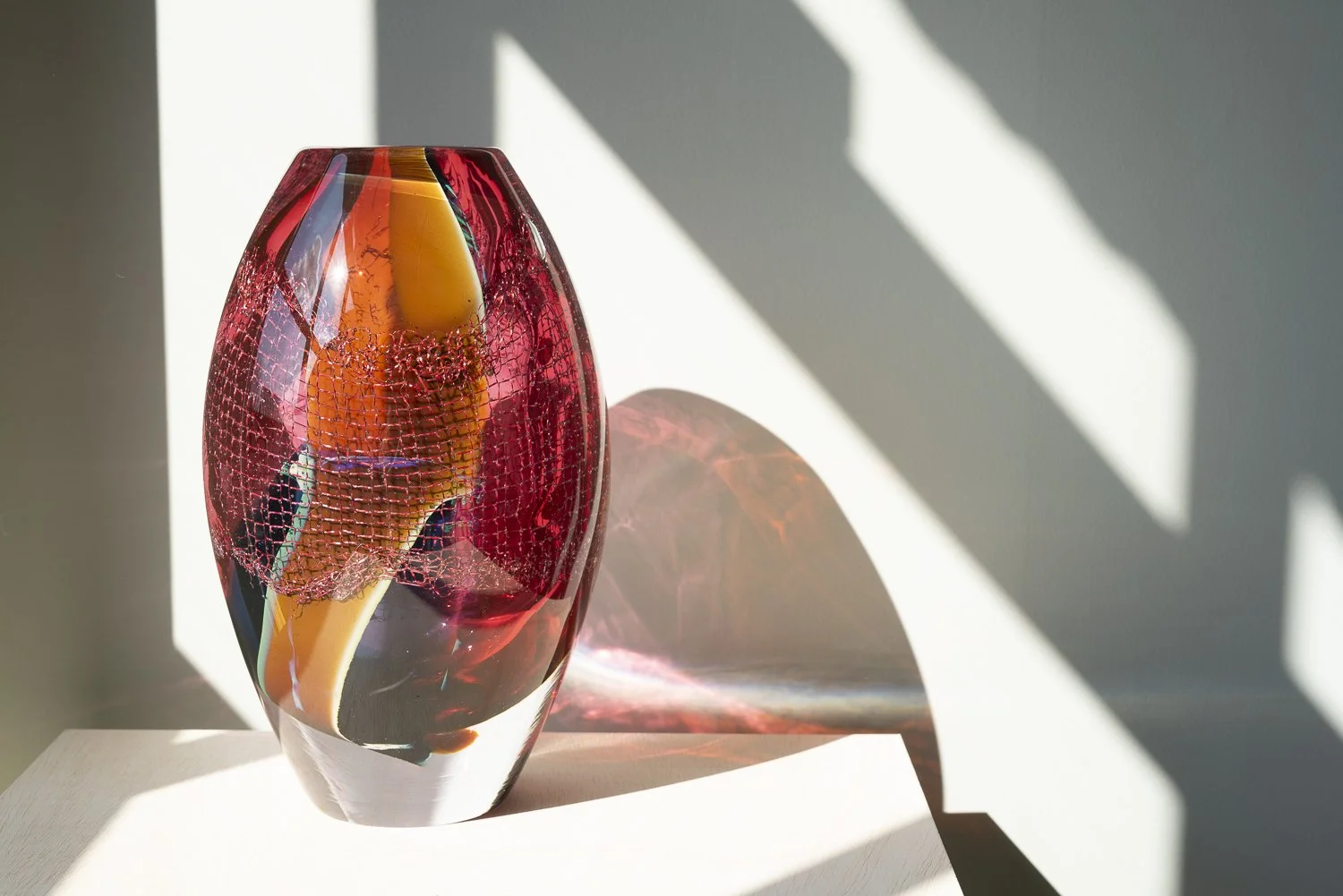
Is the home minimal or full of character? Are there lots of windows, or is it more intimate? Think about scale, colour, and light. We often advise clients to avoid very fragile materials or works that are sensitive to direct sunlight, especially in glass-heavy or sun-drenched spaces.

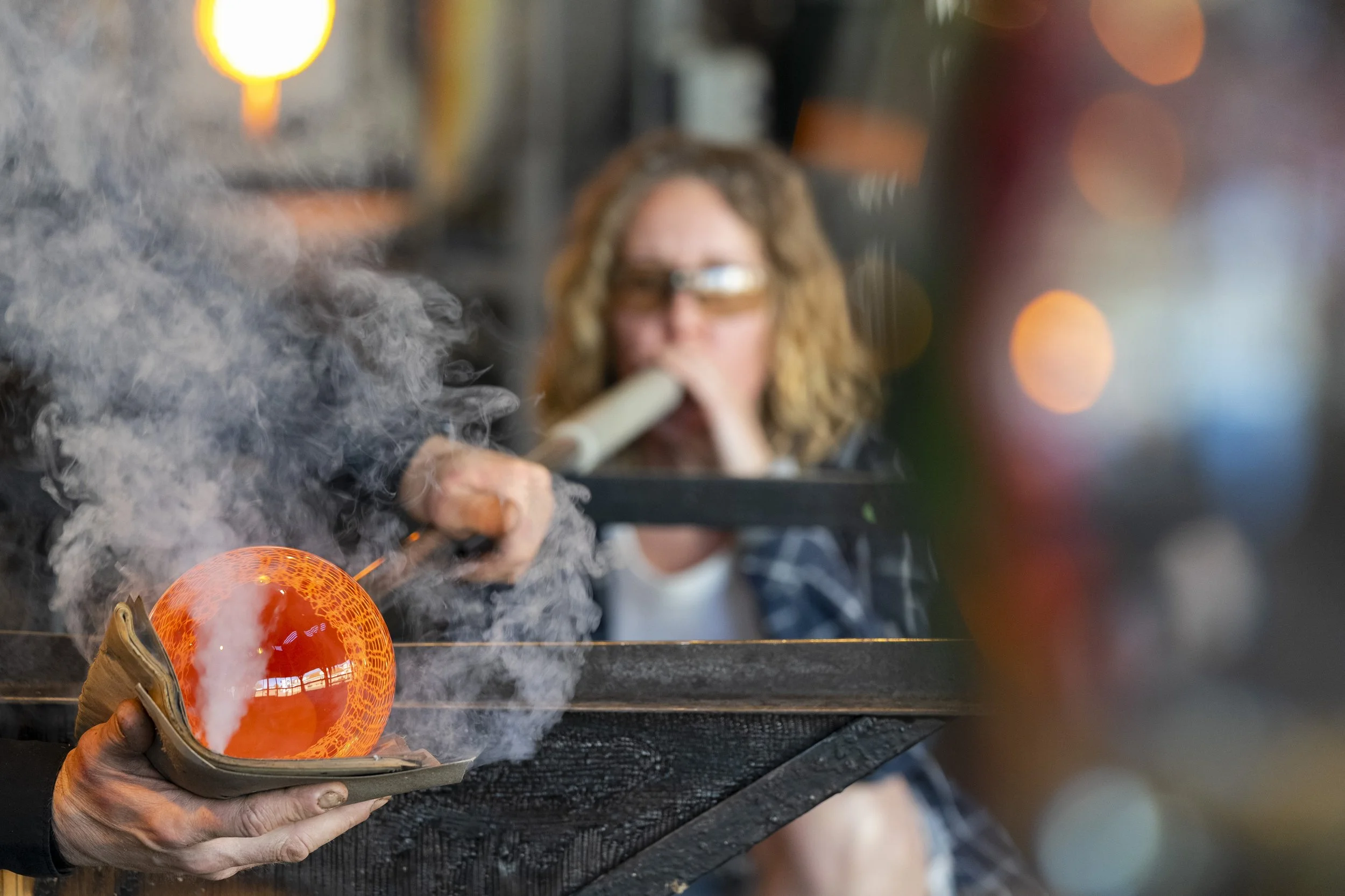
Photography by Jacqueline Fuijkschot
Let the location guide you
A house by the sea might call for something different than a forest retreat. That doesn’t mean going literal (no need for sailboats or pine trees), but you can let your surroundings inform the mood.
Practical matters
Will you be there often? If you aren't there for long periods of time, some spaces can get humid, which can affect certain materials like bronze (depending on the finish).
Are the windows UV-treated? Some colours are better resistant to UV light than others. Is the home heated year-round? These things affect what you should hang and how. We can always advise you on framing, placement, and materials.
Do you expect large temperature fluctuations? Bigger canvases may slightly warp over time. Usually not an issue, unless the stretcher bars are wooden. Aluminium stretchers are more stable and preferred in such cases. We can advise you about the different stretchers, most of the larger paintings in the gallery are already on aluminium, or they can be re-stretched.
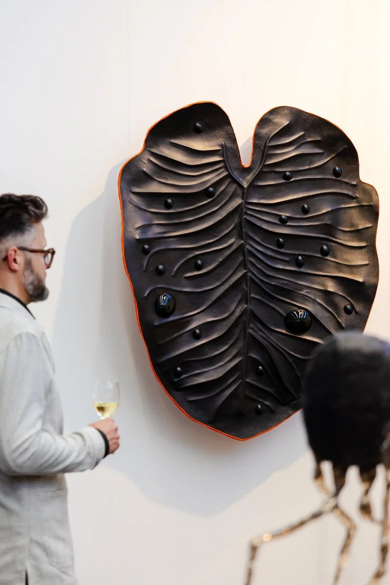
Looking for a larger work that can handle those conditions? One of Quinda Verheul’s sculptural mirrors could be a perfect fit.

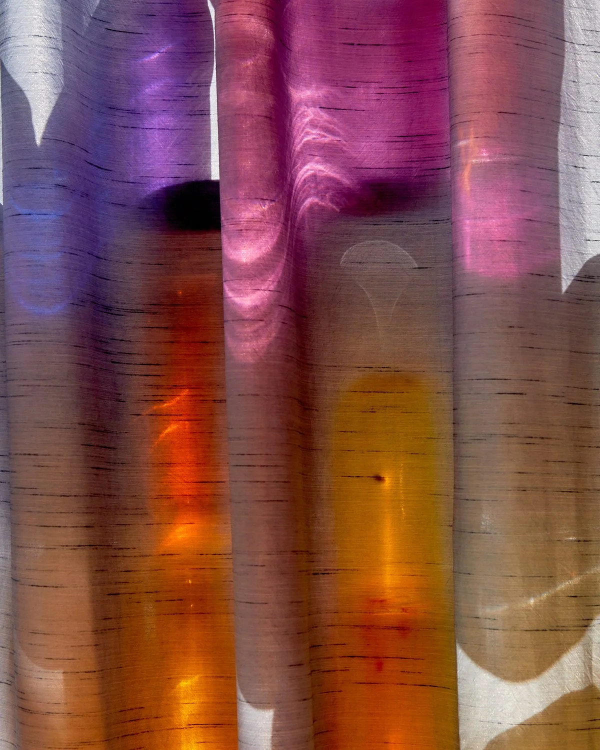
Photography by Jacqueline Fuijkschot
Don’t forget your insurance
If you're acquiring a work for a second home, check whether your current policy covers it. Some home contents insurance (inboedelverzekering) includes transport and limited coverage, but for higher-value pieces or international homes, it’s often wise to look into specialised fine art insurance. We’re happy to advise or refer you.
For more details, read our guide: → How to Insure Your Art Collection
Caring for your art
A few simple steps can extend the life of your artworks, even in changing climates. For tips on hanging, placement and protection: → How to Care for Your Artwork
Visualising it in your space
Not sure where to start? We can help you visualise the possibilities. Just send us a photo of your wall — we’ll photoshop selected works into the image so you can see how it fits. → Start with your own wall

By Donald Schenkel
145 × 135 cm, 2025
oil on linen, with wooden frame
From the series Faraway Comes Near
First Light (Orange and Cobalt) is an abstract oil painting on linen by Dutch artist Donald Schenkel. Created in 2025, the painting measures 145 × 135 cm and is presented in a wooden frame. A continuous colour gradient moves from cobalt blue through pale, luminous tones into warm orange, creating a sense of light and distance without depicting a recognisable landscape.
The painting belongs to the series that forms the foundation of Schenkel’s artistic practice: an investigation into blue as the colour of distance and the immaterial. Rebecca Solnit’s book A Field Guide to Getting Lost helped shape this exploration, connecting blue with the experience of looking towards something that remains beyond reach.
In First Light (Orange and Cobalt), the meeting of blue and orange suggests the atmosphere of daybreak while remaining entirely abstract. There is no fixed horizon or identifiable place. Instead, the gradual transitions invite the eye to move across the surface and settle into the colour.
Developing subtle gradients in oil paint has been central to Schenkel’s work for more than a decade. His carefully controlled colour transitions reveal more nuance as you move closer or spend time with the painting. Here, the visible texture of the linen sits alongside the smoothness of the gradient, grounding the impression of light in a physical, painted surface.
Personal delivery and installation within the Netherlands and Belgium are included with this work.
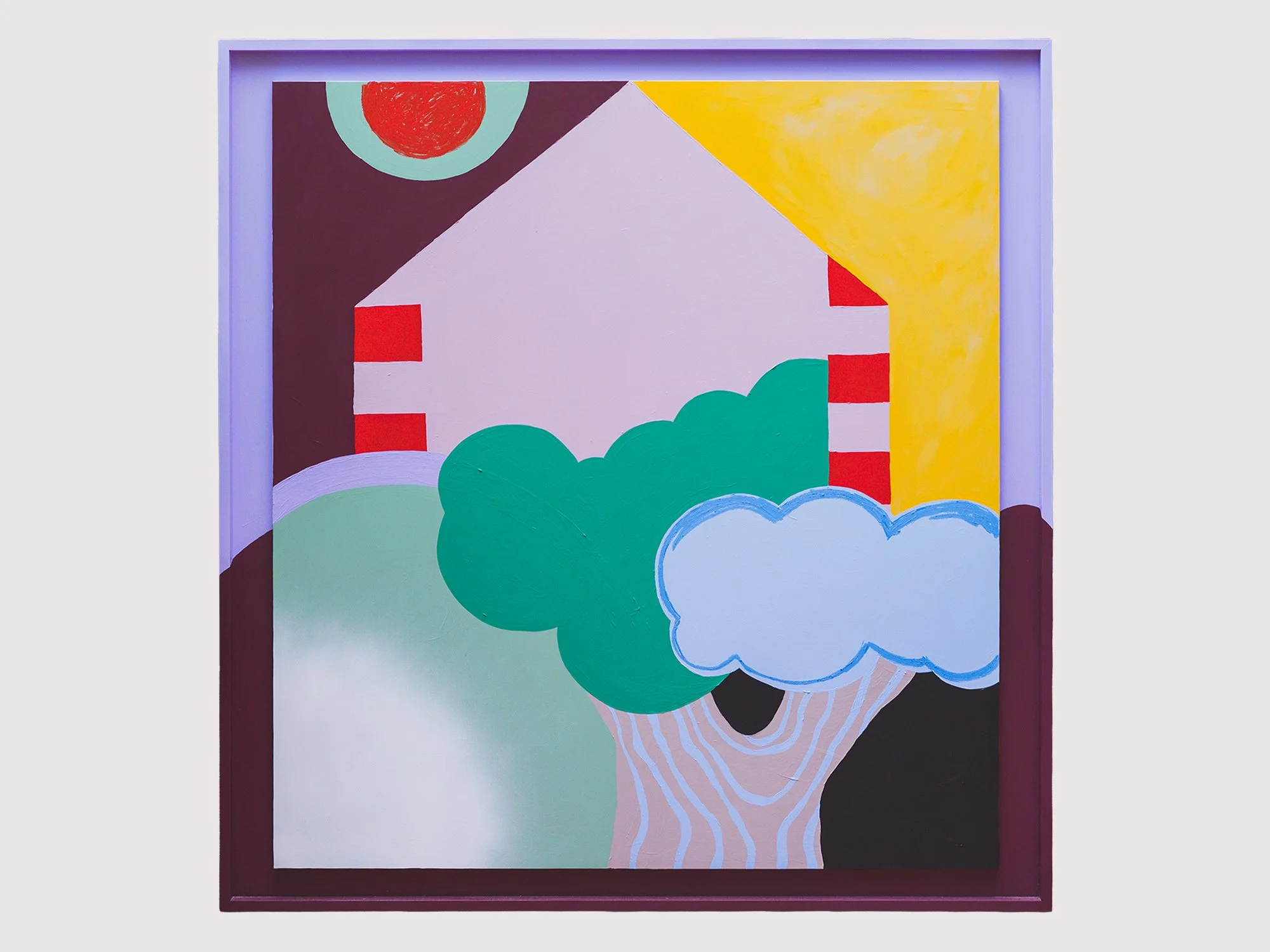
By Emma Veulemans
142 × 138 cm, 2025
Acrylic and oil stick on wood
Van Eigen Bodem is a large contemporary painting in which Emma Veulemans brings together a house, tree and sun through bold fields of colour and graphic contours. Familiar elements from the landscape are simplified and rearranged, giving the scene the directness of an illustration while retaining the texture and visible gestures of painting.
The Dutch title, which refers to something originating from one’s own soil, introduces ideas of home, familiarity and belonging. Painted in acrylic and oil stick on wood, the work balances the architectural shape of the house with the organic forms of the tree and surrounding landscape.
Delivery within the Netherlands and Belgium is arranged in consultation, either in person or securely shipped.
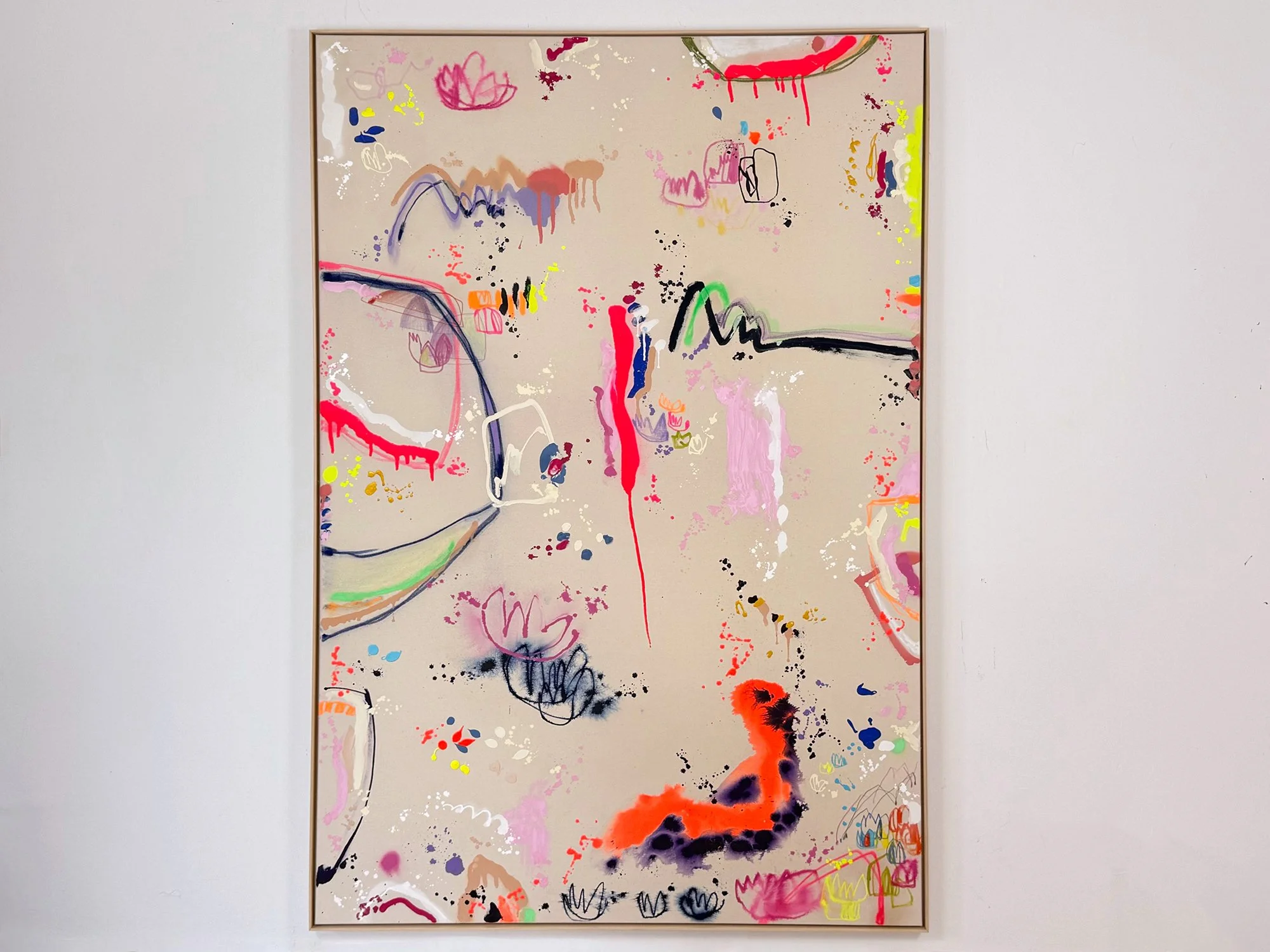
By Vera Klaus
180 × 120 cm, 2026
Mixed media on cotton, framed
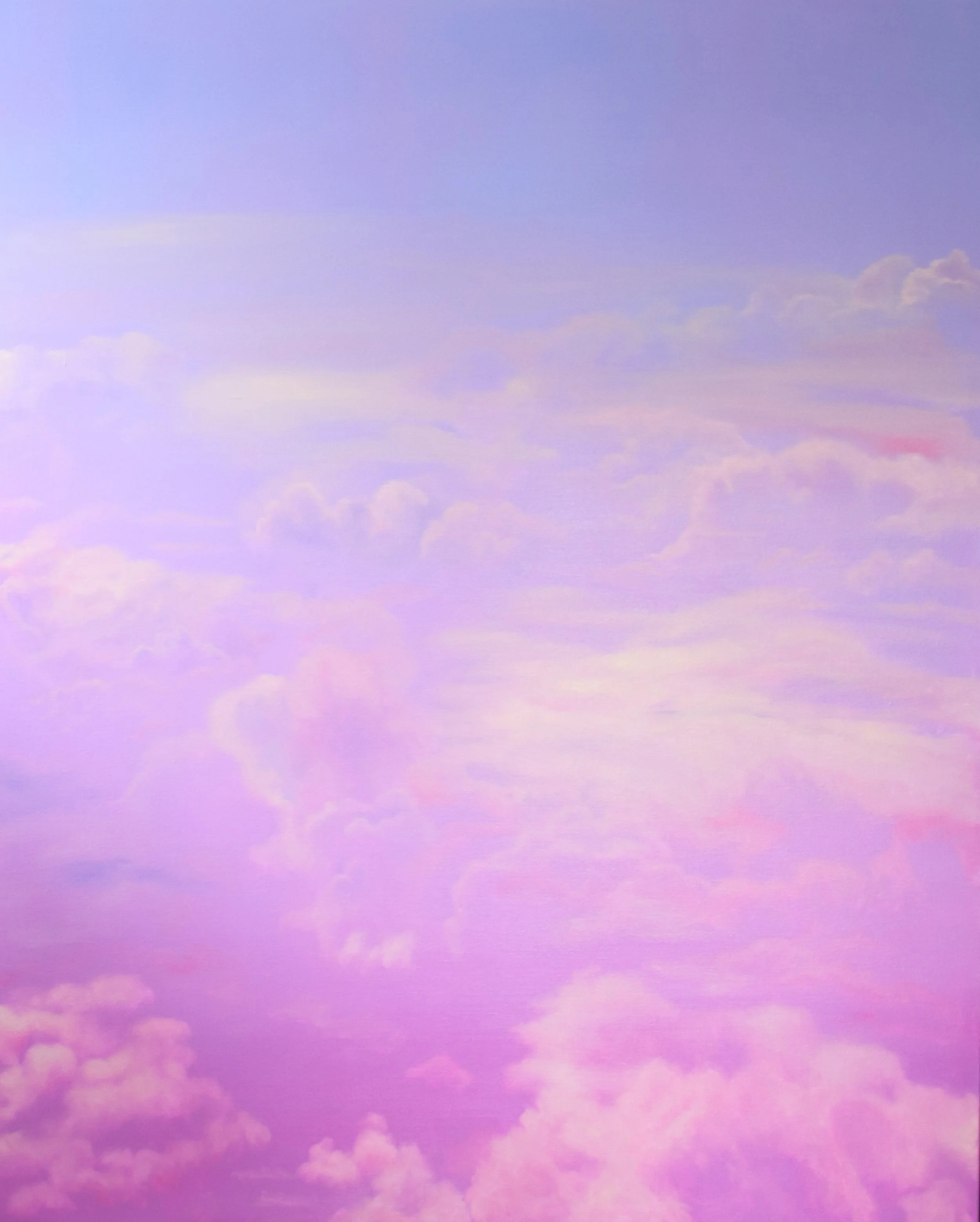
Vera Klaus creates contemporary abstract paintings through an intuitive and physical process. Working with pastel chalk and water, she builds layered, gestural compositions in which colour, movement and texture are closely connected. Music plays an important role in her practice, helping her to let go of her surroundings and become fully immersed in the present moment. Her latest colourful paintings introduce pink and blue undertones, marking a new step in her ongoing exploration of pastel and water. The resulting abstract works convey strength, vitality and joy, inviting the viewer to lose themselves in their expressive colours, subtle details and shifting nuances.
Personal delivery and installation within the Netherlands and Belgium are included with this work.
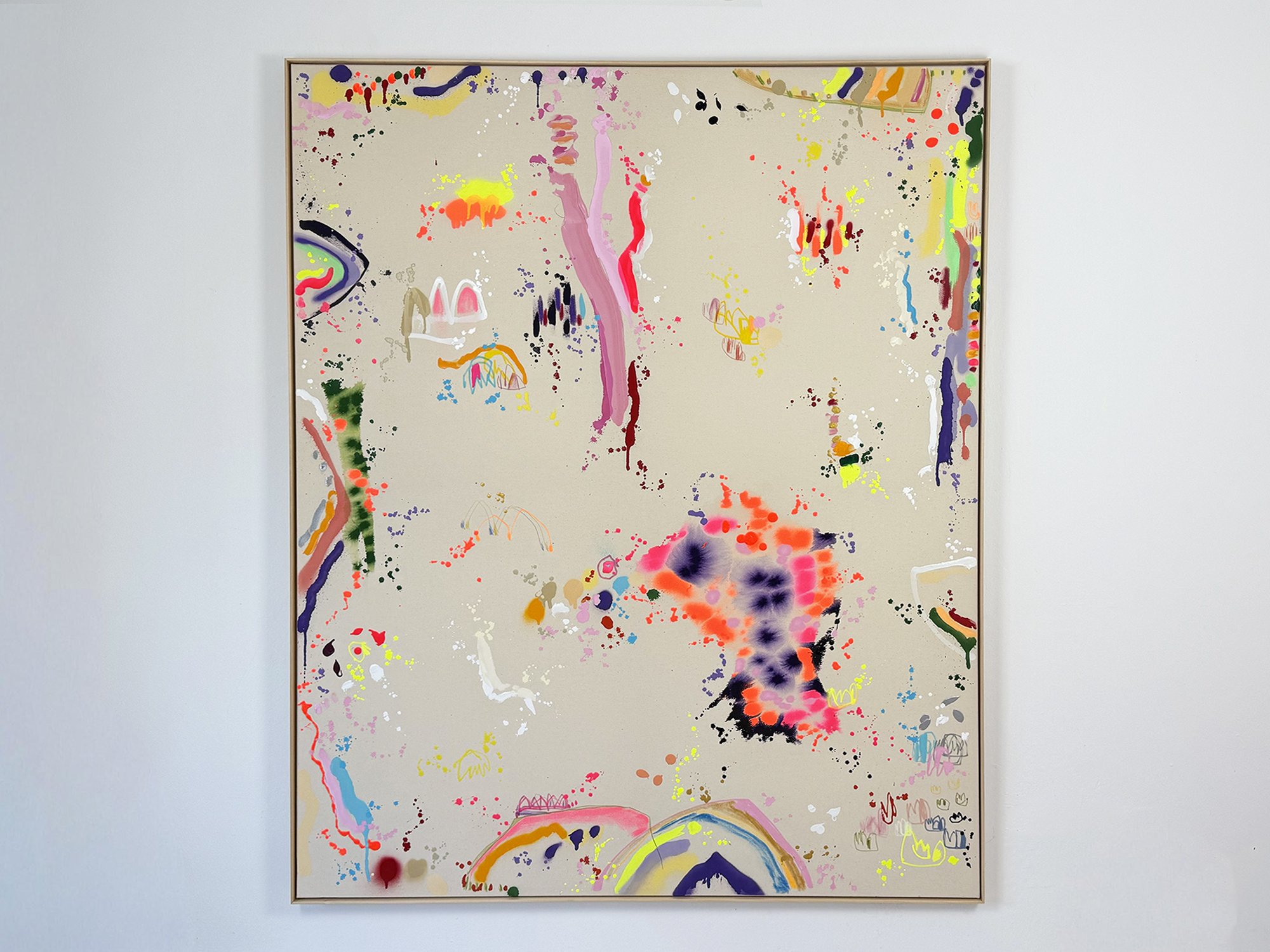
By Vera Klaus
170 × 140 cm, 2026
Mixed media on cotton, framed
Morgens Am See (Morning at the Lake) is a large abstract painting by contemporary artist Vera Klaus, created in 2026. The work is executed in mixed media on canvas and presented in a wooden floater frame.
Vera Klaus’s work often centres on the quiet intensity of small, fleeting moments. Rather than depicting a specific landscape or memory, her paintings build an atmosphere through colour, rhythm and layered gestures. In Morgens Am See, soft transitions and subtle contrasts create a sense of openness and stillness, recalling the experience of early morning light reflected on water.
The composition balances broad colour fields with more delicate passages of paint, allowing the surface to remain active without becoming overwhelming. From a distance, the painting reads as calm and expansive; up close, the layered marks and material traces reveal the artist’s process.
Through this approach, Vera Klaus creates works that invite sustained looking. The painting offers both visual clarity and depth, making it well suited for contemporary interiors where colour, light and space interact with the artwork throughout the day.
Personal delivery and installation within the Netherlands and Belgium are included with this work.

By Vera Klaus
150 × 120 cm, 2025
Mixed media on cotton, framed
Vera Klaus creates vibrant and dynamic compositions using diverse materials, including spray paint, acrylic, and chalk. Inspired by music, she channels its flow to evoke joy and positive emotions, seamlessly translating her happiness into her art. Through evocative titles, she enhances the uplifting energy of her works, inviting viewers to share in her inspiration. Everyday moments - like sunlight on your skin, blooming fields, or warm encounters - fuel her creativity, grounding her art in the beauty of the present. Each painting becomes a tangible expression of these fleeting yet profound experiences, radiating a sense of connection and vitality.
Personal delivery and installation within the Netherlands and Belgium are included with this work.
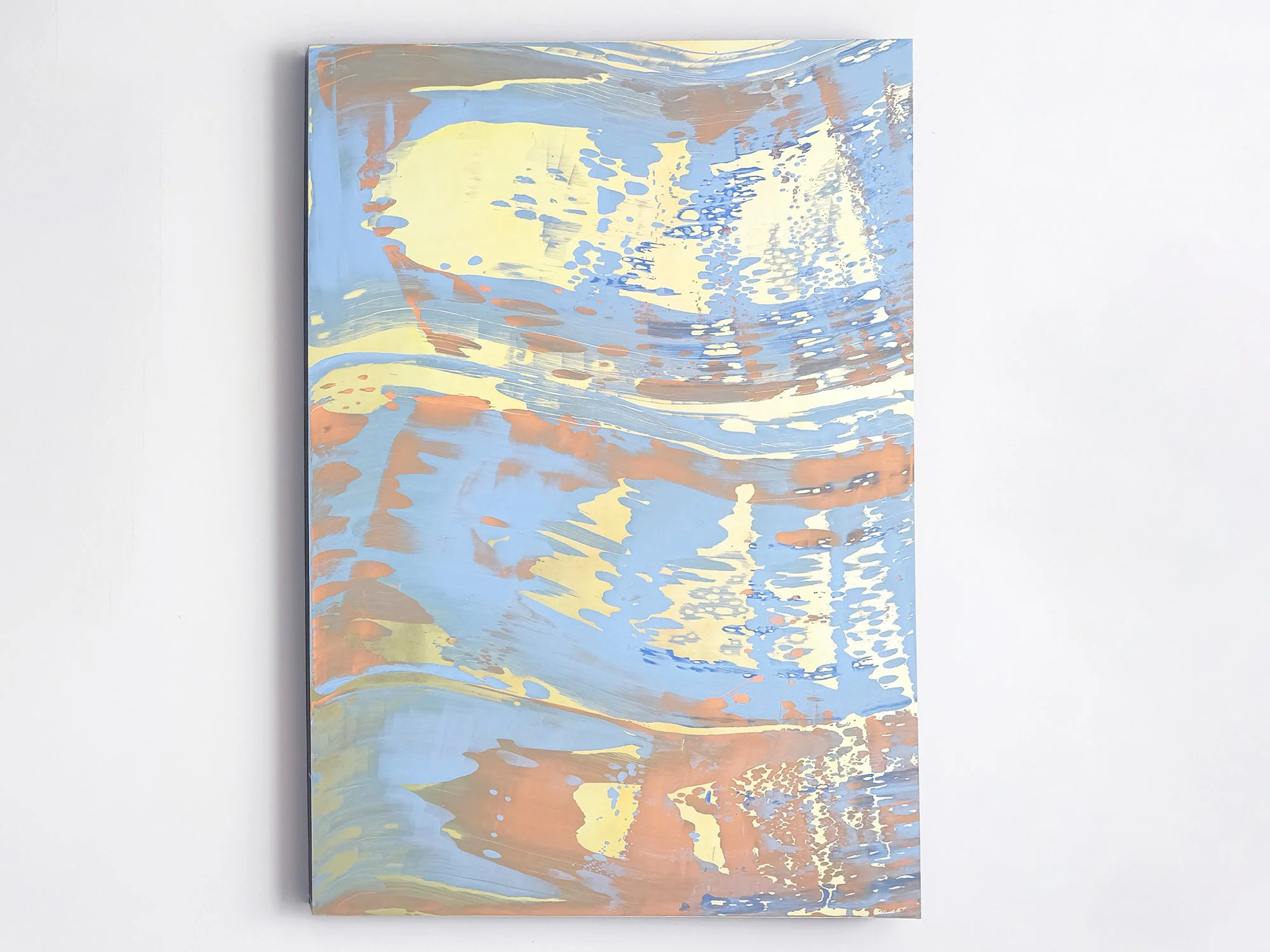
By Lisette Schumacher
160 x 110 x 6 cm, 2025
Mixed Media
From the series View On Sunset
The View on Sunset series reflects Lisette Schumacher’s ongoing exploration of mid-century modern architecture and the specific quality of light found in Los Angeles at dusk. Rather than translating architecture as a fixed image, Schumacher approaches each site as a lived experience, one that is first felt physically before it is understood intellectually.
By moving through a building repeatedly, observing shifts in light, rhythm and material, Schumacher absorbs the atmosphere of a place. This embodied experience is combined with historical research into the site and its architect, followed by an intensive investigation of colour, surface and technique. The resulting works do not depict architecture directly, but translate its presence into layered compositions and subtle colour transitions.
In this work, soft blues, pale yellows and warm earth tones flow across the surface, echoing reflections of sky and structure as daylight fades. The composition remains open and spacious, inviting slow looking and allowing the work to change with its surroundings, much like the architecture that inspired it.
Personal delivery and installation within the Netherlands and Belgium are included with this work.
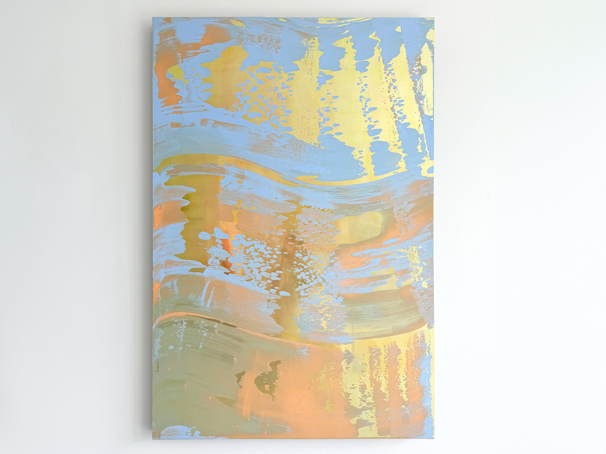
By Lisette Schumacher
160 x 110 x 6 cm, 2025
Mixed Media
From the series View On Sunset
The View on Sunset series reflects Lisette Schumacher’s deep connection with mid-century modern architecture and the captivating sunsets of Los Angeles. Lisette’s interest lies in the idea that architecture engenders a basic physical experience prior to also initiating an intellectual interpretation. By observing the location intensely and moving through each room repeatedly, she can both experience the space in a physical way and interpret it intellectually. After studying the site's history and architect, a period of in-depth research into technique, material and colour schemes follows. This results in a series of works that reflect on the site's atmosphere, history and its design.
Personal delivery and installation within the Netherlands and Belgium are included with this work.

By Lisette Schumacher
190 x 80 x 6 cm, 2023
Mixed media
From the series Novel Trailing Reflections
Endless reflections of sun on glass and water were the starting points to create Lisette Schumacher’s Trailing Reflections series. During her residency in Los Angeles (April – May 2022) she visited The Stahl House, located in the Hollywood Hills. It was designed by Buck Stahl and Pierre Koenig in 1959-60. She was stunned by the pure beauty and tranquility of the Stahl House. During her stay, Lisette noticed an intriguing play of reflections in the glass facades of the home, caused by the water of the swimming pool and the reflections of the sun. She wanted to create a body of work that would visualize her observations and bring an ode to the family home, built from glass and steel. The Stahl House has become the figurehead of modern architecture in Los Angeles. She picked the color palette based on the local rocks, succulents, interior and the swimming pool.
Personal delivery and installation within the Netherlands and Belgium are included with this work.

By Donald Schenkel
180 x 120 cm, 2021
Oil paint on linen
From the series Orange Wave
With subtle oil paint colour gradients, Donald Schenkel creates art works that express a certain clarity and peace. When taking a second, closer look, the digital, visual language of the work seems to be based on the materiality of the paint. Each work is unique. Donald doesn’t approach oil paint as a medium to paint an image, but purely as a material that exposes the behaviour of colours.
Personal delivery and installation within the Netherlands and Belgium are included with this work.
A few recent examples
A couple recently selected a painting by Donald Schenkel for their apartment in the south of Europe. The layered blues and oranges resonated with the view from their apartment near the sea.
Another couple chose a painting by Vera Klaus for a classic Italian villa, where its colour and energy provided a vibrant contrast to the historic interior and small windows.
Holiday home art checklist
Before you decide, here’s a quick checklist we often use with clients:
Does the work match the mood and pace you want in the space?
Will it hold up well in the climate (light, humidity, temperature)?
How often are you there, and is the work secure in your absence?
Will it need specific framing, fixing, or materials?
Want to visualise it? Send us a wall photo, we’ll mock it up.
Choosing art for your holiday home doesn’t have to be complicated. You don’t need a collection, just a piece that feels right in the space. At Root Gallery, we’re happy to advise you, whether you're starting from scratch or looking to add something new.
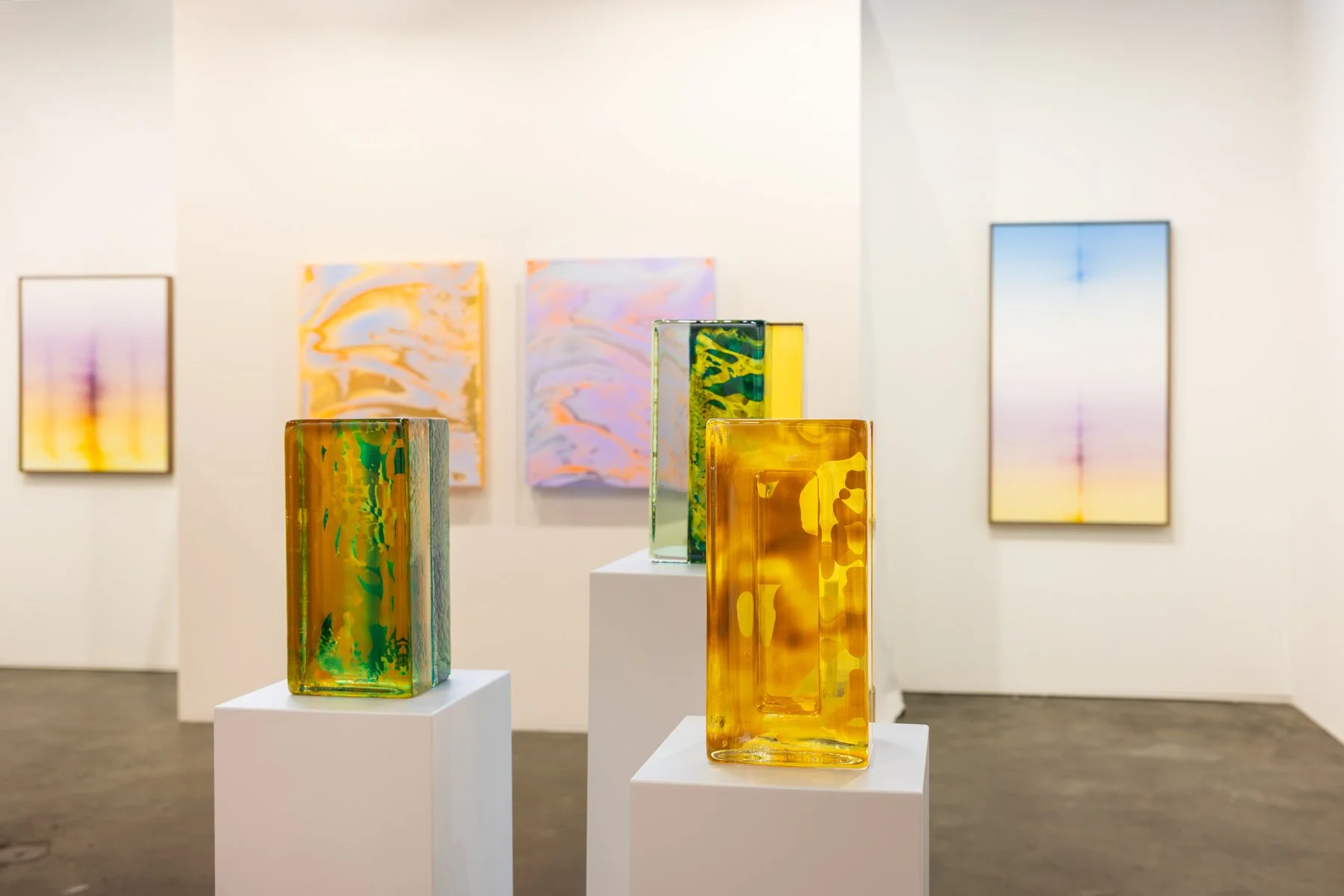
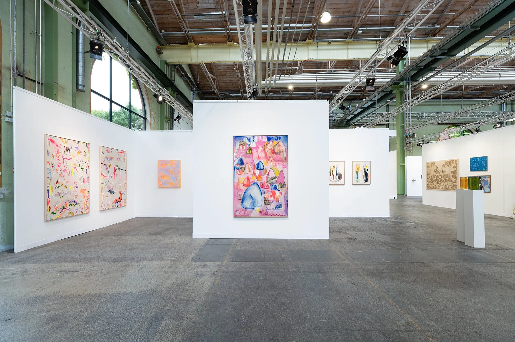
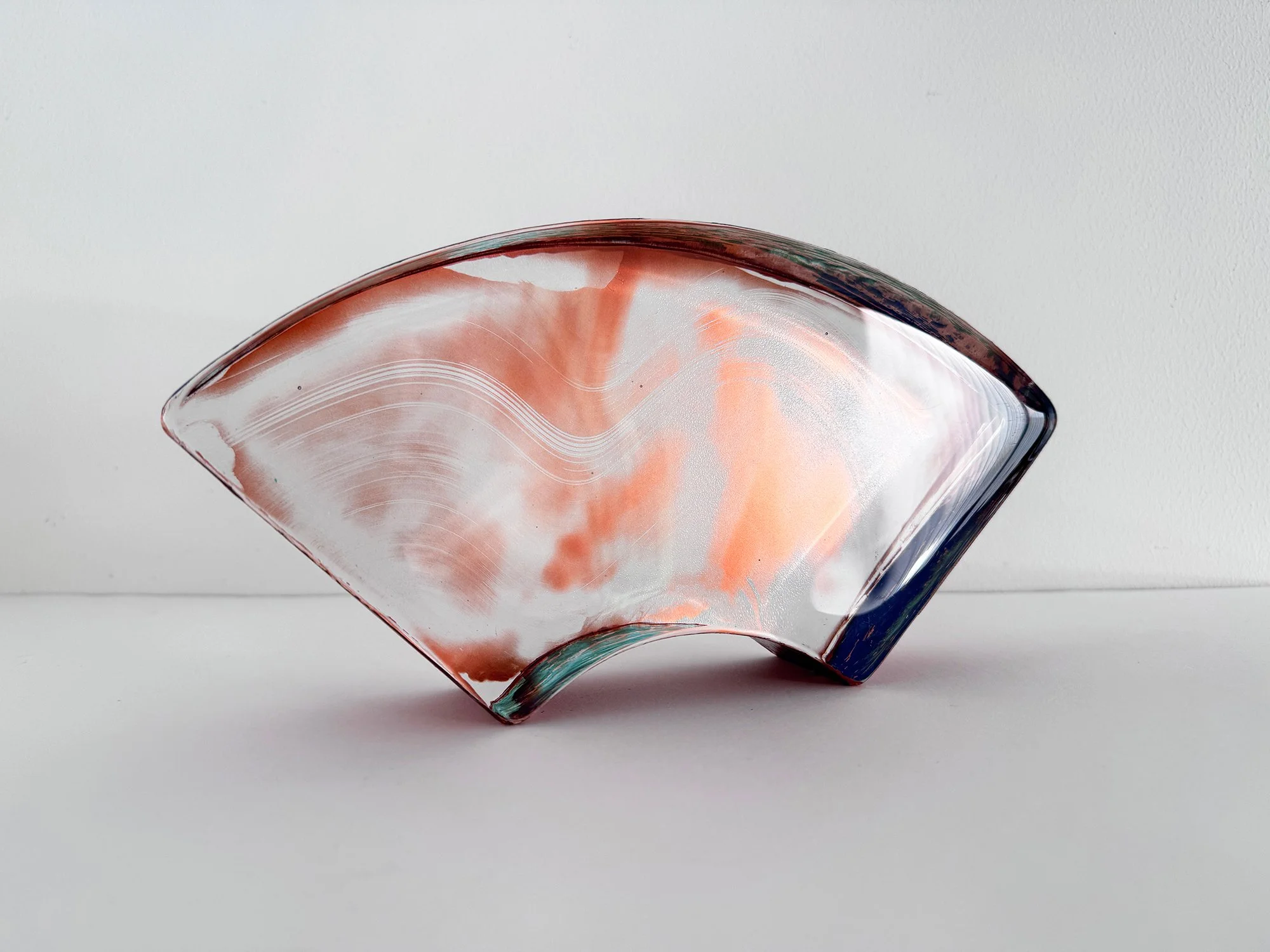


By Donald Schenkel
140 x 120 cm, 2026
oil on canvas, with wooden frame
From the series Painting as screen
The Tightrope Walker is an abstract oil painting by Dutch artist Donald Schenkel, defined by a fine red line running through a luminous field of colour. Cyan blue fades through pale blue into soft peach and orange, before deepening to dark brown at the lower edge. The line holds the composition in balance, while subtle horizontal shifts give the gradient a sense of movement. Schenkel’s layered approach to oil painting makes this colour-field work change in appearance as the viewer moves closer and the light shifts.
Personal delivery and installation within the Netherlands and Belgium are included with this work.