
What colour does to a space
How colour transforms your space, and your state of mind.
Long before we understand what a painting shows, we feel its colours.
Colour sets the tone of a room. It directs light, shifts scale, and shapes the emotional climate we step into. In both art and architecture, colour is not an afterthought: it’s foundational. Colour is never passive. It moves, anchors, provokes or calms. Especially in contemporary art, colour is material, mood and meaning at once.
Below, we explore seven key colours found in the artworks created by the artists represented to Root Gallery. Each with its own story, spatial effect, and emotional resonance.

Photography Jacqueline Fuijkschot
Blue: Stillness, focus and distance 💙
Blue expands. It pushes walls outward, introduces calm, and lets the eye rest. In Donald Schenkel’s earlier works, entire canvases are devoted to blue, ranging from soft mineral tones to deep ultramarine.
Historically, blue was among the most precious pigments, reserved for sacred imagery. Lapis lazuli was ground into ultramarine, often used exclusively for the Virgin Mary’s robe, a gesture of honour and reverence.
But blue also operates differently on the eye. Because of how our visual system is wired, we literally perceive blue as further away. Compared to warmer colours like red or yellow, blue light has a shorter wavelength, which causes the eye to adjust focus as if looking into the distance. It’s the same phenomenon we experience when we gaze at the sky or the sea, both appear infinite, not because they are, but because of how blue scatters through light and atmosphere.
Emotionally, this depth registers as stillness. Blue supports focus and reduces stress. In interiors, it lends itself well to entrance areas, studies, and bedrooms, spaces where quiet is welcome. A blue artwork can create visual breathing room in a busy home, offering calm without ever feeling cold.
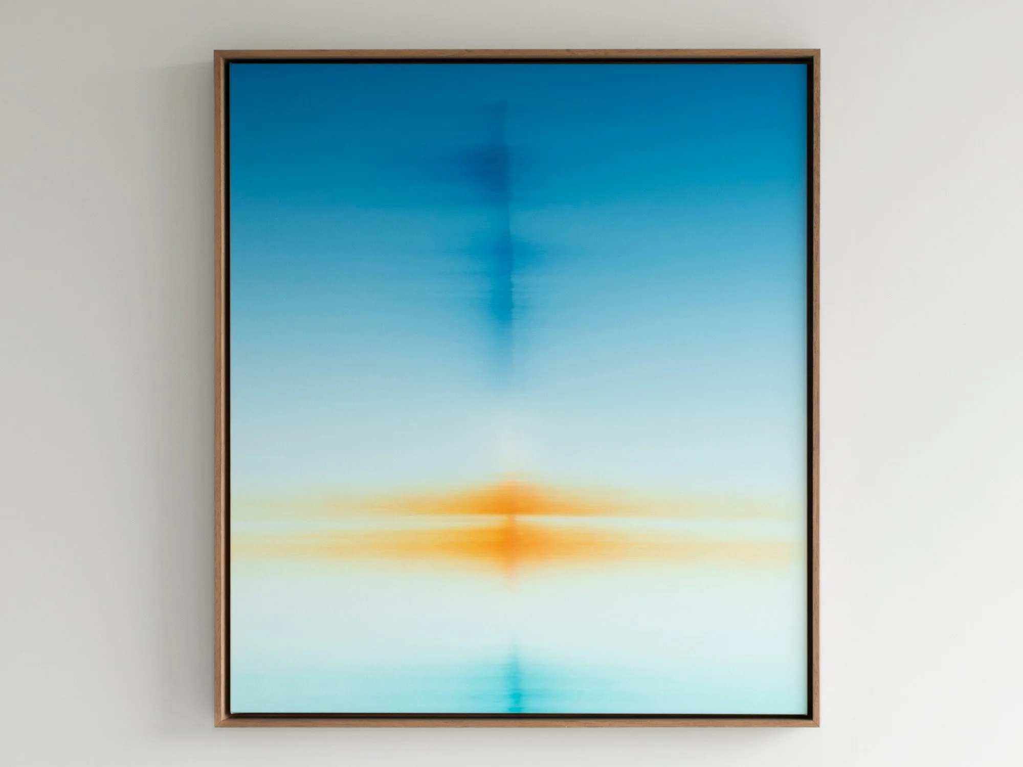
By Donald Schenkel
Oil on canvas
90 × 80 cm, 2026
Wooden frame included
The Observed draws the eye through an intense field of blue, interrupted by a concentrated orange form near the centre. The complementary colours heighten one another: the blue appears deeper, while the orange takes on the character of reflected light.
Donald Schenkel builds his paintings from numerous translucent layers of oil paint. Here, the gradual transitions are combined with blurred horizontal and vertical marks that seem to shift between distance and proximity. The composition never becomes a recognisable landscape, yet it carries the spatial quality of a horizon or reflection.
With its balanced proportions and vivid colour, The Observed is an original blue abstract painting that brings both depth and a strong focal point to a contemporary interior.
Delivery within the Netherlands and Belgium is arranged in consultation, either in person or securely shipped.

By Donald Schenkel
Oil on canvas
70 × 80 cm, 2026
Wooden frame included
No Clear Skies Ahead by Donald Schenkel is built from a concentrated blue field that shifts in density and depth. Vertical traces appear and dissolve within the surface, suggesting movement without fixed direction. The work holds a quiet tension between stillness and disruption, shaped through a controlled yet irreversible process.
Delivery within the Netherlands and Belgium is arranged in consultation, either in person or securely shipped.
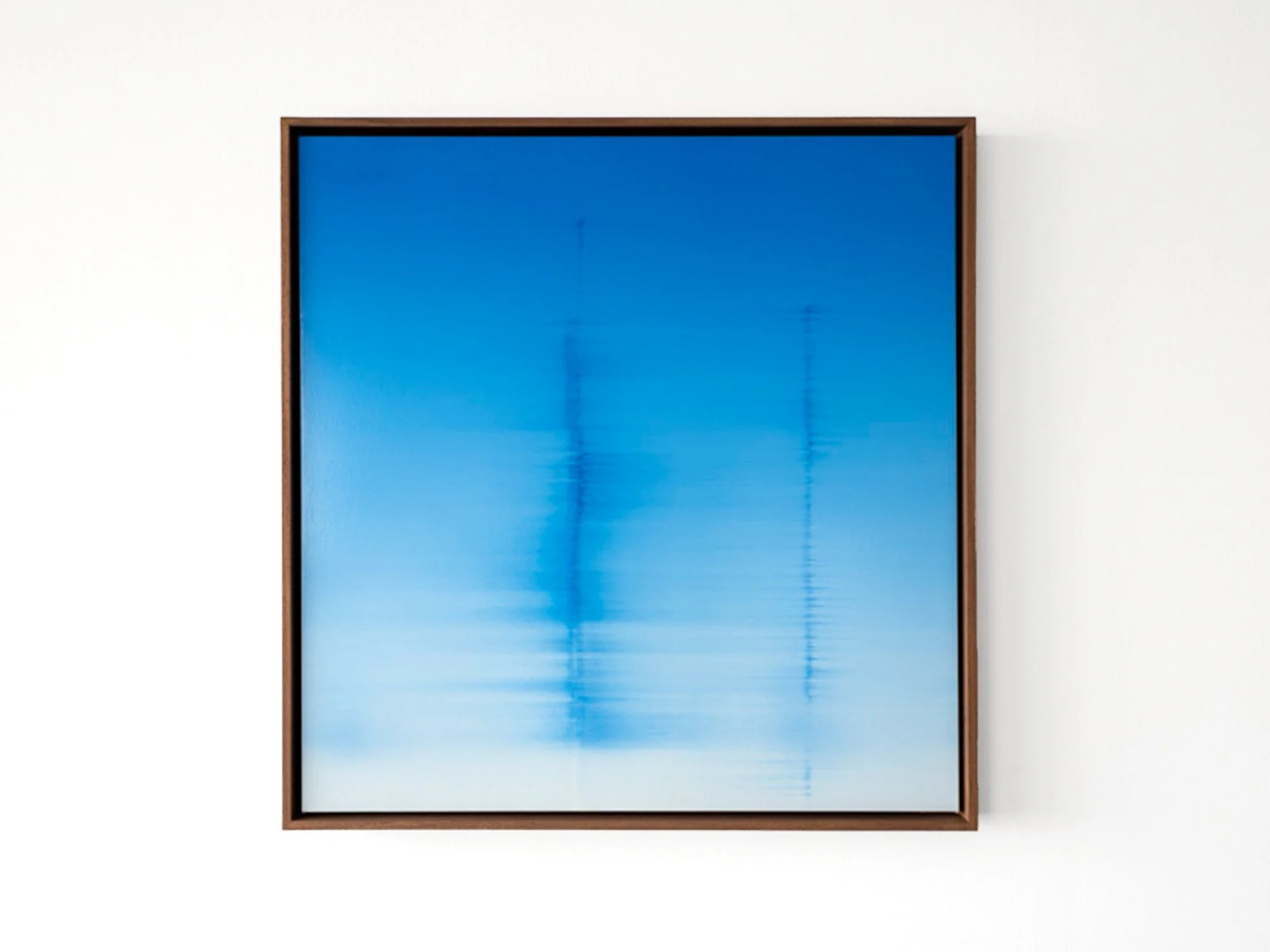
By Donald Schenkel
Oil on canvas
70 × 68 cm, 2026
Wooden frame included
No Clear Skies Ahead by Donald Schenkel is built from a concentrated blue field that shifts in density and depth. Vertical traces appear and dissolve within the surface, suggesting movement without fixed direction. The work holds a quiet tension between stillness and disruption, shaped through a controlled yet irreversible process.
Delivery within the Netherlands and Belgium is arranged in consultation, either in person or securely shipped.
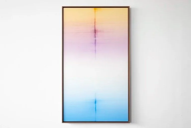
By Donald Schenkel
Oil on canvas
140 × 80 cm, 2026
Wooden frame included
Lucid Line by Donald Schenkel unfolds through a gradual shift from warm to cool tones, where colour moves from yellow and pink into blue. A single vertical line interrupts the surface, creating a sense of alignment and tension. The painting balances clarity and instability, with each transition revealing the immediacy of a single-layer process.
Delivery within the Netherlands and Belgium is arranged in consultation, either in person or securely shipped.
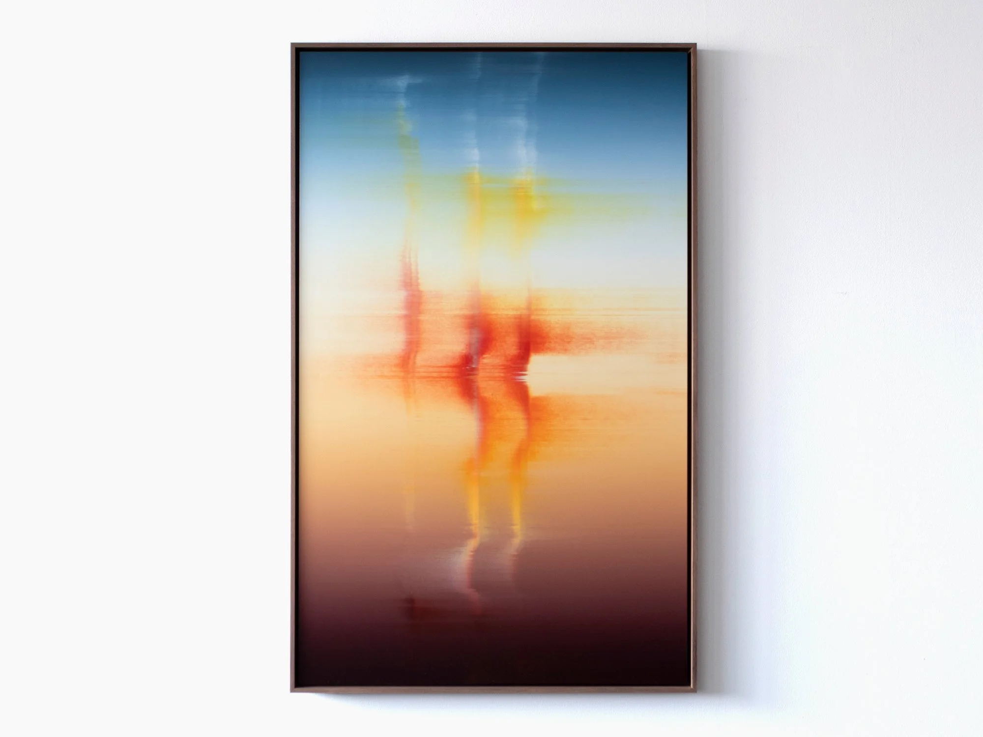
By Donald Schenkel
Oil on canvas
130 × 80 cm, 2025
Wooden frame included
In Unexpected Visitor, Donald Schenkel explores the presence of something unfamiliar entering a space without announcement.
The painting unfolds through layered gradients of oil paint, applied wet-in-wet in a single, continuous process. From a distance, the surface appears smooth and atmospheric; up close, the texture of the canvas and the movement of the paint become visible.
Vertical traces rise through the composition, subtly interrupting the horizontal flow of colour. Rather than disrupting the image entirely, they introduce a sense of passage, as if something has moved through the space and left a temporary imprint.
The title suggests a quiet encounter rather than a disruption. In Schenkel’s practice, unpredictability is part of the process: colours interact, shift, and assert themselves beyond full control.
Unexpected Visitor reflects on transience, attention, and the way brief presences - in life as well as in material - can alter perception without fully revealing themselves.
Delivery within the Netherlands and Belgium is arranged in consultation, either in person or securely shipped.
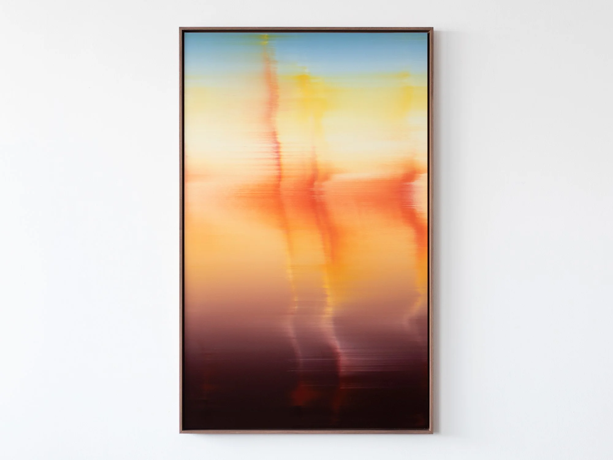
By Donald Schenkel
Oil on canvas
130 × 80 cm, 2025
Wooden frame included
In Unexpected Guest, Donald Schenkel explores the moment when an unforeseen presence enters an otherwise balanced system.
The painting unfolds through soft gradients of colour, created wet-in-wet in a single movement. From a distance, the surface appears smooth and almost immaterial; up close, the texture of the canvas and the physicality of oil paint become visible.
Subtle vertical shifts interrupt the horizontal flow of colour, introducing a quiet disturbance that alters the rhythm of the composition. What initially reads as calm and expansive gradually reveals a sense of ambiguity.
The title refers both to lived experience and to Schenkel’s painting process, in which chance plays an active role. Certain colours emerge unexpectedly, reshaping the work as it develops.
Unexpected Guest reflects on hospitality, vulnerability, and the way unforeseen encounters - in life and in material - can leave a lasting trace.
Delivery within the Netherlands and Belgium is arranged in consultation, either in person or securely shipped.

By Donald Schenkel
Oil on paper
57 × 43 cm, 2025
Wooden frame included
“Last Shimmer” belongs to Donald Schenkel’s new Real World Renders series, created for Root Gallery’s 2025 programme.
Through this body of work, Schenkel continues his exploration of how light, colour, and material interact to shape perception. Painted in a single wet-in-wet layer, each work demands complete control and acceptance of unpredictability, gradients merge, pigments shift, and no correction is possible.
On paper, the delicacy of oil paint becomes even more pronounced. Subtle transitions unfold across the surface, suggesting a digital glow that remains grounded in pure material presence.
Framed in walnut, Last Shimmer evokes both warmth and contemplation, the final glimmer of daylight, suspended between certainty and change.
Delivery within the Netherlands and Belgium is arranged in consultation, either in person or securely shipped.
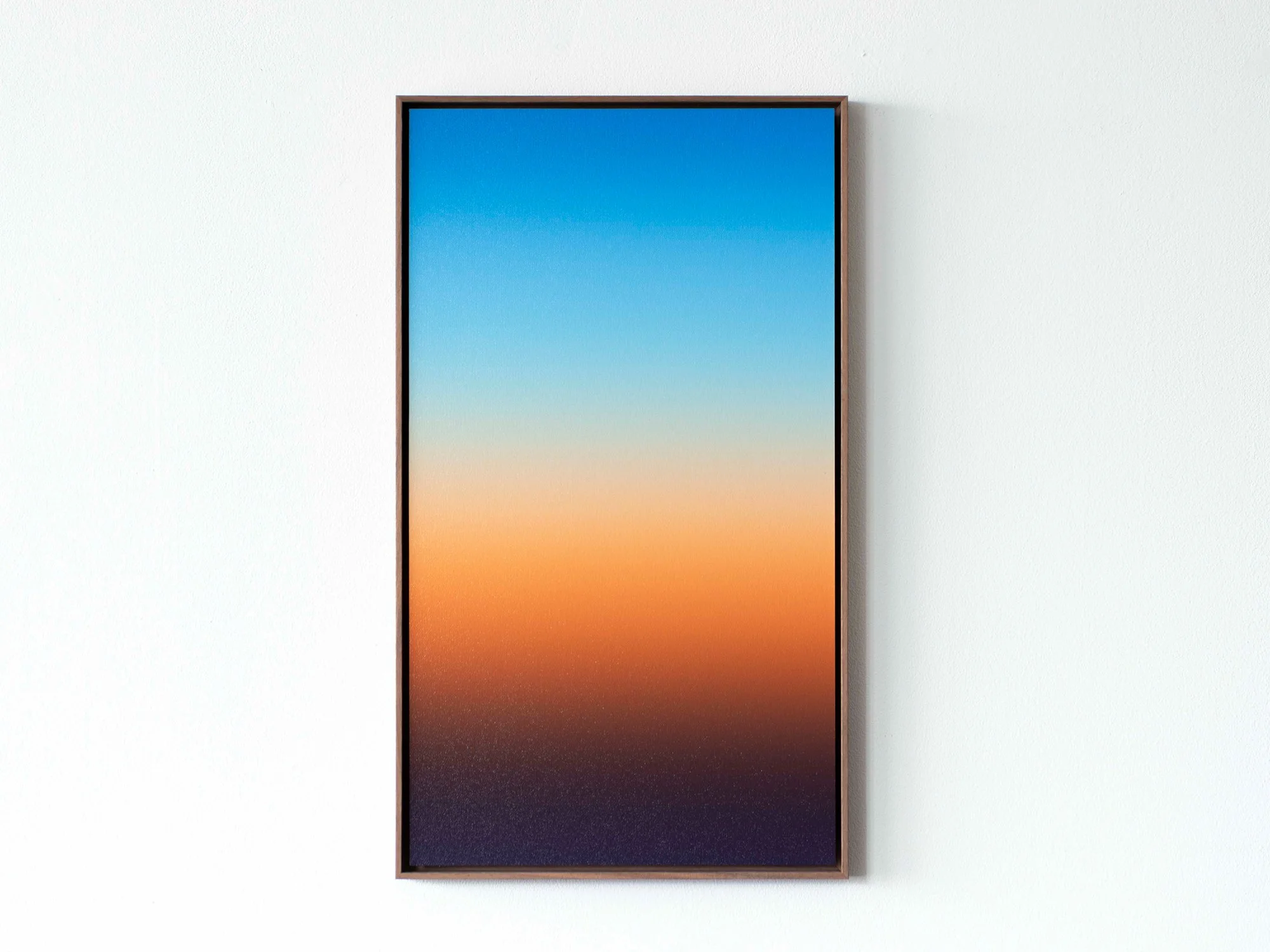
By Donald Schenkel
57 x 32 cm, 2025
Oil paint on paper with walnut frame
In The Last Sunset (2025), Donald Schenkel captures the moment where day dissolves into night through the slow layering of oil paint. Working with a traditional glazing technique, he builds depth and luminosity without visible brushstrokes. The colour shift, from deep violet to warm orange and pale blue, evokes the lingering light of dusk, suspended between presence and disappearance.
Delivery within the Netherlands and Belgium is arranged in consultation, either in person or securely shipped.
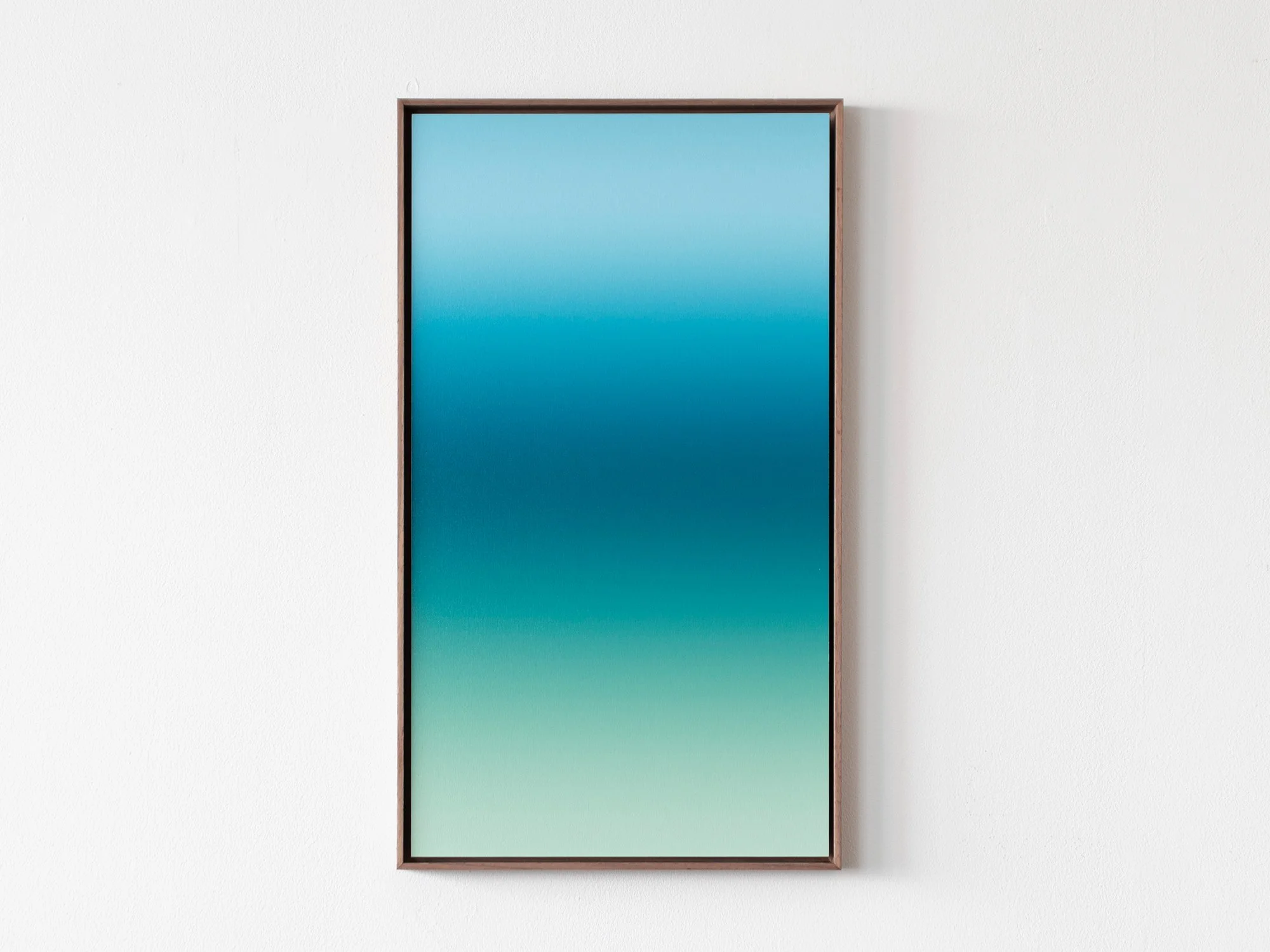
By Donald Schenkel
57 x 32 cm, 2024
Oil paint on paper with walnut frame
In Soft Green Twilight No. 2, Donald Schenkel works in a remarkably traditional way, layer by layer, with slow-drying oil paint that allows for subtle transitions and lasting depth. The surface may appear effortless, but it is the result of countless thin glazes and hours of drying time between each layer.
By working patiently and without digital tools, Schenkel continues a centuries-old painting tradition, using time itself as a material. The result is a sense of calm and precision that feels both timeless and contemporary.
Delivery within the Netherlands and Belgium is arranged in consultation, either in person or securely shipped.

By Donald Schenkel
70 × 70 cm, 2024
Oil paint on synthetic canvas
Donald Schenkel's latest series explores the idea of paintings as screens, inspired by the seemingly digital character of the gradients. By suspending the works from the wall, they evoke the feel of computer screens. He draws on the historical shift in art from symbolic and spiritual meanings to alternate realities, which evolved further with the introduction of cinema, and digital screens.
As we grow up with digital screens, images are increasingly seen as generated, rather than physical objects. Schenkel questions if the same becomes true for paintings.Will future generations understand a painting as more than a screen-like image? His use of materials like thin sheets of paper highlights this tension, as what appears digital is, in fact, created using techniques that stem back from the early Renaissance.The perception of reality and the interpretation of the painting is changed by the material aspects of the object itself and how we view them in today’s day and age.
Delivery within the Netherlands and Belgium is arranged in consultation, either in person or securely shipped.

By Donald Schenkel
84 × 50 cm, 2025
Oil on linen
In Donald Schenkel’s work, painting becomes a means to examine the tension between control and intuition, surface and depth. Through abstract compositions, he investigates how colour, form and material can suggest space without representing it, how a shift in texture or transparency can alter perception.
Delivery within the Netherlands and Belgium is arranged in consultation, either in person or securely shipped.

By Donald Schenkel
Oil on canvas
130 × 120 cm, 2025
Wooden frame included
Twilight’s Reflections is a bold, energetic composition where deep blue dominates the surface, broken by sharp contrasts of pale blue and sudden bursts of orange. Created with Donald Schenkel’s self-developed tools, the painting reveals a highly physical and layered process, where gesture, texture and light collide.
There’s tension in the surface: between control and unpredictability, stillness and movement. Each layer builds on the next, creating depth not just in material, but in sensation. A powerful statement within Donald’s evolving visual language.
Delivery within the Netherlands and Belgium is arranged in consultation, either in person or securely shipped.
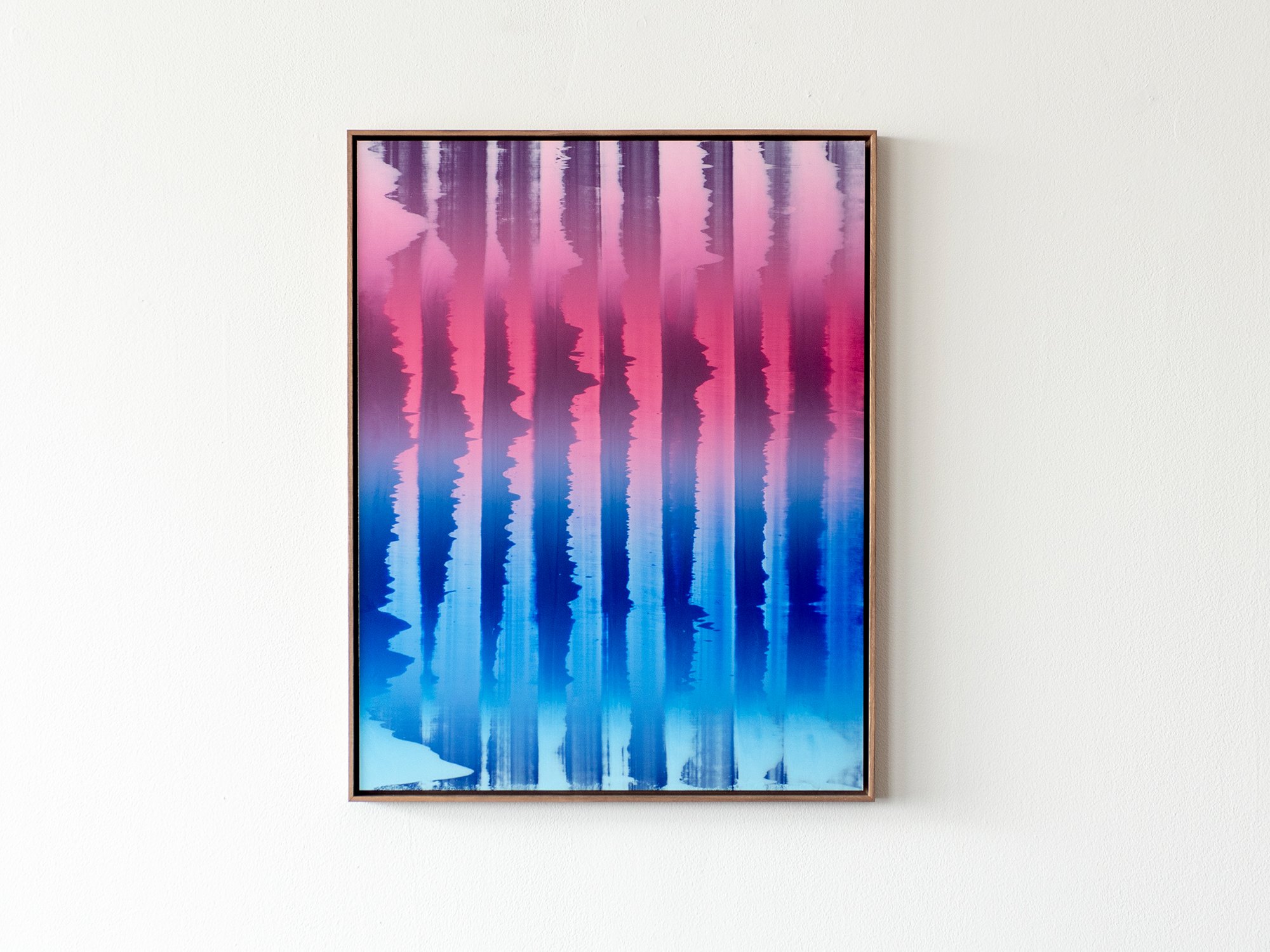
By Donald Schenkel
59 x 46 cm, 2024
Oil paint on paper, on dibond with walnut wood frame
Donald Schenkel has recently developed a unique, brushless approach that infuses the canvas with dynamic energy and expressive movement. The innovative technique highlights his ability to explore the intrinsic and materialistic qualities of pigments and colors, creating vivid impressions of translucency and reflection. This panel’s vibrant, loose strokes invite viewers into a world of endless space and light, evoking a sense of vitality and spontaneity.
Delivery within the Netherlands and Belgium is arranged in consultation, either in person or securely shipped.

By Donald Schenkel
57 x 32 cm, 2023
Oil paint on paper with walnut frame
Opposite to the expanse of lightness, there is the depth expressed by shadows. The series Archaic Shadows is grounded in this depth, found in gradients where lighter colours dissolve into darkening twilights. For Donald Schenkel, the book ‘In Praise of Shadows’ points out the beauty of what we would consider darkness, and that befits the sensibility of these artworks. Shadows linger on the edge of the unknown, mystical and dark.The works part of this series sparked his attention to the object, the artefact and the archaic. This sensation of the ancient and otherworldly fits Donald’s idea of a silent wonder well. Yet, it contains a potency to be further explored.
Delivery within the Netherlands and Belgium is arranged in consultation, either in person or securely shipped.

By Donald Schenkel
57 x 32 cm, 2023
Oil paint on paper with walnut frame
Opposite to the expanse of lightness, there is the depth expressed by shadows. The series Archaic Shadows is grounded in this depth, found in gradients where lighter colours dissolve into darkening twilights. For Donald Schenkel, the book ‘In Praise of Shadows’ points out the beauty of what we would consider darkness, and that befits the sensibility of these artworks. Shadows linger on the edge of the unknown, mystical and dark.The works part of this series sparked his attention to the object, the artefact and the archaic. This sensation of the ancient and otherworldly fits Donald’s idea of a silent wonder well. Yet, it contains a potency to be further explored.
Delivery within the Netherlands and Belgium is arranged in consultation, either in person or securely shipped.

By Donald Schenkel
74 x 60 cm, 2023
Oil paint on linen, with walnut wood
These paintings by Donald Schenkel are a result of his continuing research into the approach of paintings as objects, and the combination of oil paint with other materials. There is something compelling in turning the organic look of wood into a polished, almost industrial surface. By combining his signature gradients with wood, Schenkel deepens his exploration of abstract shapes, a recurring element in his practice.
Working with these materials interrupts the illusion of the gradient as endless depth. The grain of the wood flows along the surface and seems to suggest a certain direction, much like the gradients imply movement in the transitioning colours.
Delivery within the Netherlands and Belgium is arranged in consultation, either in person or securely shipped.

By Donald Schenkel
74 x 60 cm, 2023
Oil paint on linen, with walnut wood
These paintings by Donald Schenkel are a result of his continuing research into the approach of paintings as objects, and the combination of oil paint with other materials. There is something compelling in turning the organic look of wood into a polished, almost industrial surface. By combining his signature gradients with wood, Donald deepens his exploration of abstract shapes, a recurring element in his practice.
Working with these materials interrupts the illusion of the gradient as endless depth. The grain of the wood flows along the surface and seems to suggest a certain direction, much like the gradients imply movement in the transitioning colours.
Delivery within the Netherlands and Belgium is arranged in consultation, either in person or securely shipped.
Green: Balance, nature and transition 💚
Green is the colour of in-between. It mediates - not too warm, not too cold - and offers balance in both art and interiors. In contemporary work, green often evokes landscape, systems, or decay. It reminds us of nature, but also of its fragility.
Historically, green pigments like verdigris were both luminous and treacherous. apable of corroding entire surfaces over time. Despite this, green remained the colour of rebirth, paradise, and domestic comfort in European painting and textiles.
Perceptually, green is one of the easiest colours for the human eye to process, which is why it’s often used in environments designed to reduce fatigue, like hospitals or classrooms. It’s a resting colour, neurologically speaking.
In a home, green harmonises. It connects indoor and outdoor spaces and is ideal for transitional zones like hallways, landings, and bathrooms. A green work of art doesn’t demand attention, it offers rest. Especially in combination with wood, linen or natural light, it settles the room without dulling it.
By Donald Schenkel
57 x 32 cm, 2025
Oil paint on paper with walnut frame
In The Last Sunset (2025), Donald Schenkel captures the moment where day dissolves into night through the slow layering of oil paint. Working with a traditional glazing technique, he builds depth and luminosity without visible brushstrokes. The colour shift, from deep violet to warm orange and pale blue, evokes the lingering light of dusk, suspended between presence and disappearance.
Delivery within the Netherlands and Belgium is arranged in consultation, either in person or securely shipped.
By Donald Schenkel
57 x 32 cm, 2024
Oil paint on paper with walnut frame
In Soft Green Twilight No. 2, Donald Schenkel works in a remarkably traditional way, layer by layer, with slow-drying oil paint that allows for subtle transitions and lasting depth. The surface may appear effortless, but it is the result of countless thin glazes and hours of drying time between each layer.
By working patiently and without digital tools, Schenkel continues a centuries-old painting tradition, using time itself as a material. The result is a sense of calm and precision that feels both timeless and contemporary.
Delivery within the Netherlands and Belgium is arranged in consultation, either in person or securely shipped.
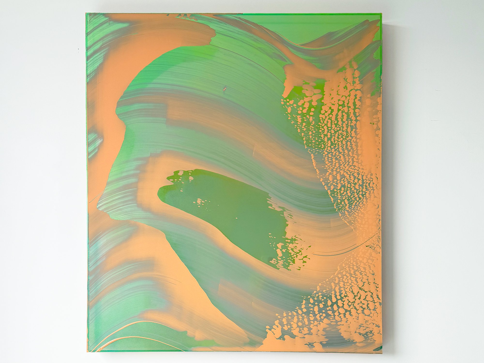
By Lisette Schumacher
100 x 90 x 6 cm, 2025
Mixed Media
"Mirroring Reflections" by Lisette Schumacher explores the interplay of light and reflections inspired by Los Angeles's iconic Stahl House. Combining mirrors with abstract compositions, her works capture the serene beauty of sunlit glass and water, evoking an almost sculptural depth. This series is a tribute to mid-century architecture, blending California's natural hues with the modernist legacy of glass and steel.
Delivery within the Netherlands and Belgium is arranged in consultation, either in person or securely shipped.
Pink: Softness, strength and subversion 💗
Pink is rarely what it seems. Often dismissed as decorative, it carries an edge that surfaces in the right hands. In Karen van de Vliet’s sculptural paintings, pink is structure, weight, and gesture, unapologetically present.
Culturally, pink has been highly mutable. In the 18th century it was worn by European aristocratic men; by the 20th century, it was aggressively gendered. Today, it’s being reclaimed in contemporary art as a colour of softness with agency, gentle, but never passive.
Visually, pink behaves differently depending on its undertone: warm pinks can energise; cooler pinks soothe. It’s a colour that invites touch, yet shifts in meaning depending on what surrounds it.
In interiors, pink can bridge opposing elements. It tempers raw materials like concrete or steel, and brings warmth to otherwise cool-toned spaces. A pink artwork can feel both radical and serene, especially when scale and surface push beyond what’s expected.
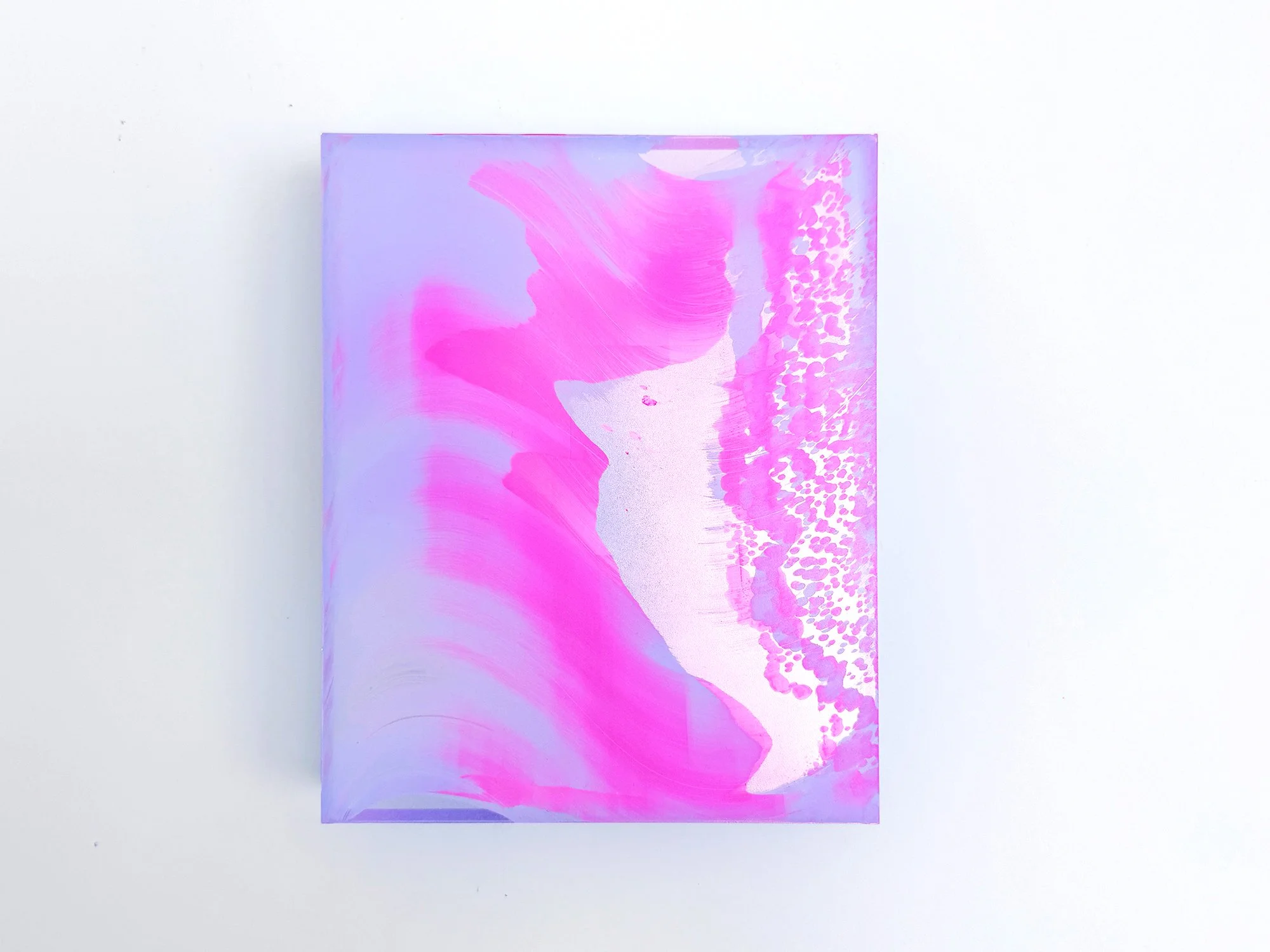
By Lisette Schumacher
30 × 25 x 6 cm, 2026
Mixed media
From the series Coachella views
Lisette Schumacher explores the expressive range of a concentrated palette in Coachella Views XVI. Saturated magenta moves through translucent lilac, surrounding a pale central form that seems to open up within the composition. Along the right edge, a finely broken pattern adds texture and counters the larger, flowing movements.
Although nearly monochromatic at first glance, the work contains subtle differences in tone, density and reflection. These variations become more apparent over time, giving the composition a changing presence without losing its clarity. Coachella Views XVI is an assured choice for collectors drawn to colour-led abstraction and works that combine immediate impact with visual depth.
This work will be shipped within the Netherlands and Belgium at no additional cost, securely and with tracking.
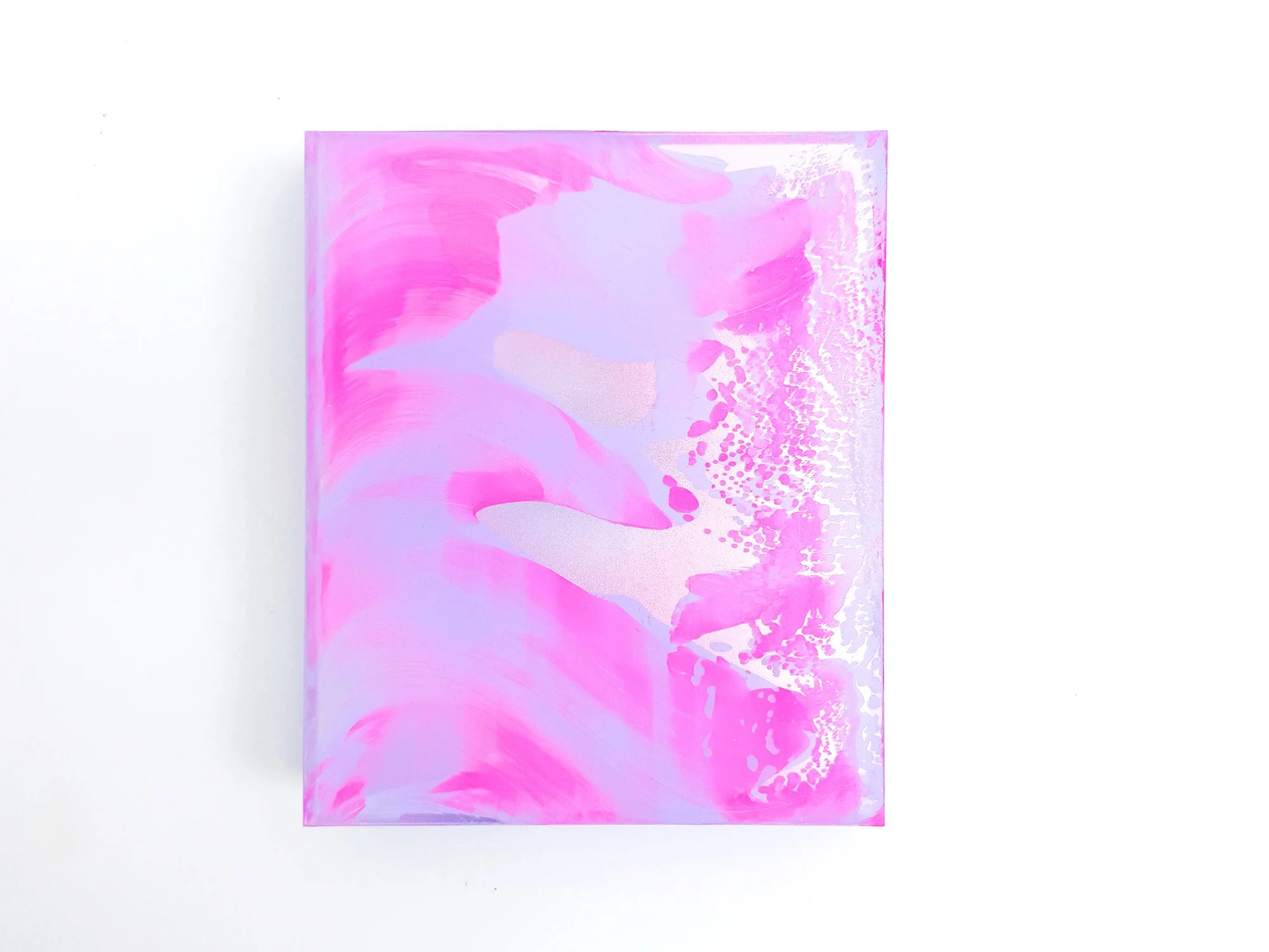
By Lisette Schumacher
30 × 25 x 6 cm, 2026
Mixed media
From the series Coachella views
In Coachella Views XV, Lisette Schumacher condenses the atmosphere of the desert into an intimate composition. Vivid pink forms move across a pale lilac ground, interspersed with softly reflective areas and a dense pattern that gathers along the right edge. The contrast between broad gestures and precise details gives the small work an unexpectedly strong presence.
Inspired by the changing colours Schumacher observed while travelling through the Coachella Valley, the artwork captures a brief visual impression rather than a fixed landscape. Its compact format makes it particularly suited to a carefully chosen position or to an existing group of artworks, while the saturated colour allows it to hold its own within a larger space.
This work will be shipped within the Netherlands and Belgium at no additional cost, securely and with tracking.
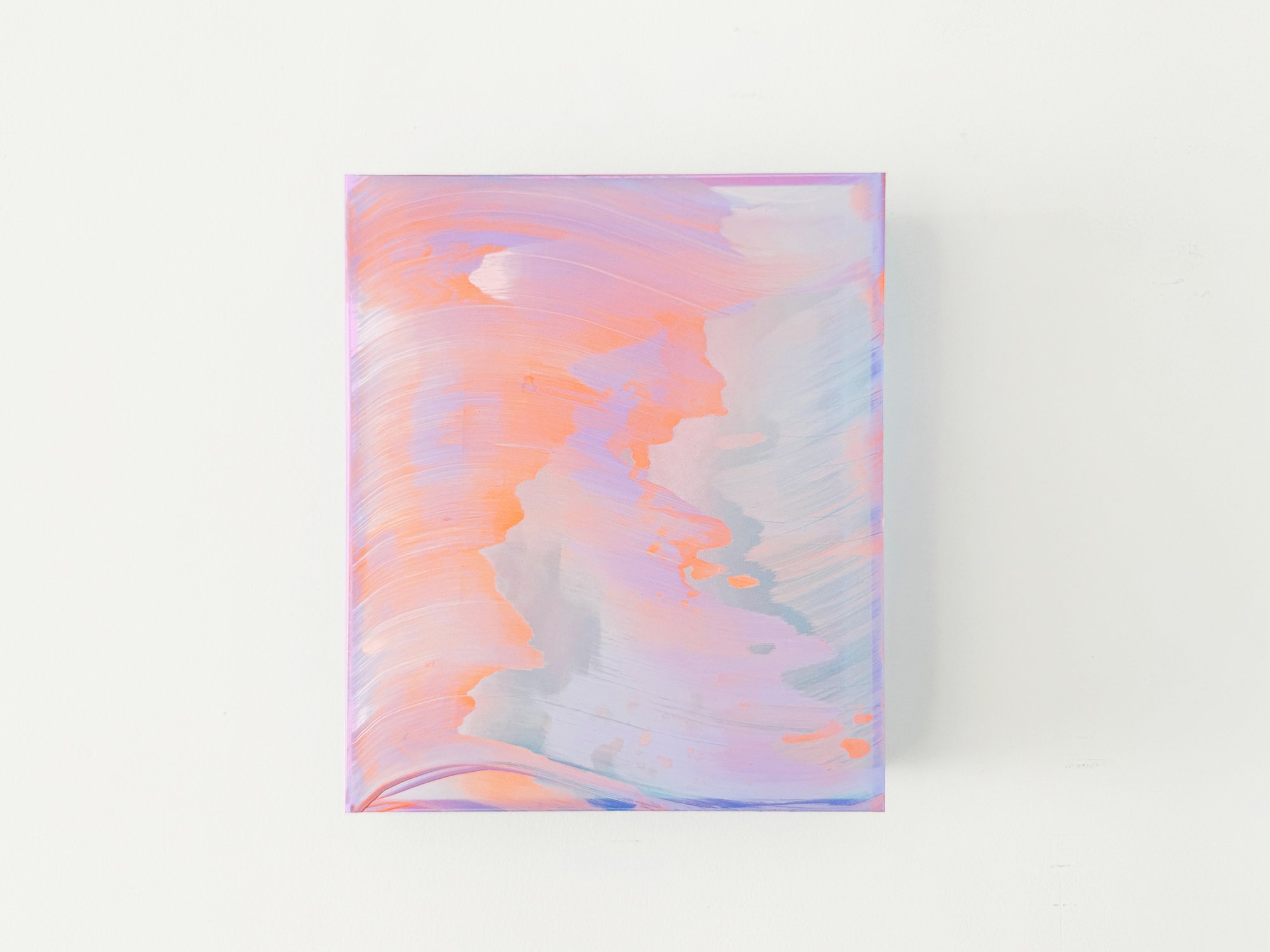
By Lisette Schumacher
30 × 25 x 6 cm, 2026
Mixed media
From the series Coachella views
Coachella Views IV is part of a series of paintings by Lisette Schumacher inspired by her travels through Palm Springs and the Coachella Valley in California. During visits to historic mid-century modern houses in the desert landscape, Schumacher became increasingly aware of the shifting colours and atmosphere created by the intense desert light.
The composition reflects these observations through layered colour fields in soft pink, peach, lavender and pale blue. Fluid gestures move across the surface like changing light conditions in the desert, where colours slowly transform throughout the day.
Rather than depicting a specific landscape, the painting translates the experience of desert light and atmosphere into a quiet abstract composition. Subtle transitions in colour create a sense of movement and openness, echoing the expansive character of the desert environment.
This work will be shipped within the Netherlands and Belgium at no additional cost, securely and with tracking.
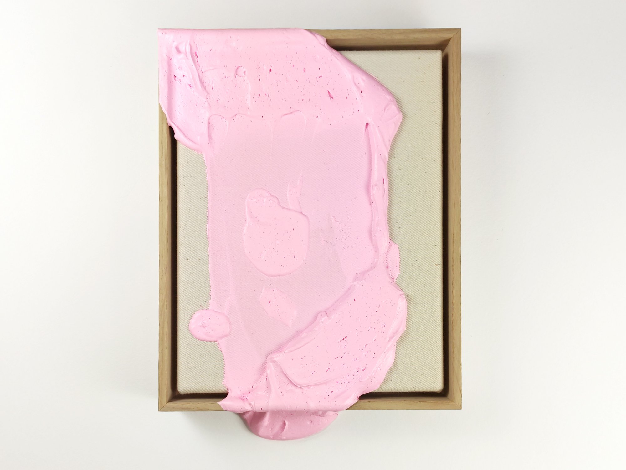
By Karen van der Vliet
23 × 18 cm, 2026
Mixed acrylic paint on cotton, framed
In the Bubblegum series, Karen van de Vliet explores the physical boundaries of painting. Her work moves beyond the flat surface, developing into a relief-like terrain where thick paint accumulates and expands into an almost sculptural form.
Working with a dense and viscous medium, she builds layered structures that suggest organic formations or microscopic landscapes. The compositions remain abstract, yet distinctly physical: the gesture is embedded in the surface, and movement and pressure remain visible.
Colour plays a defining role in this series. In Bubblegum, Van de Vliet uses bold and luminous tones that contrast with the weight and density of the material. This tension between playful colour and physical intensity gives the work its character.
These paintings approach abstraction as a material process, where paint itself becomes the central subject rather than merely a carrier of colour.
This work will be shipped within the Netherlands and Belgium at no additional cost, securely and with tracking.
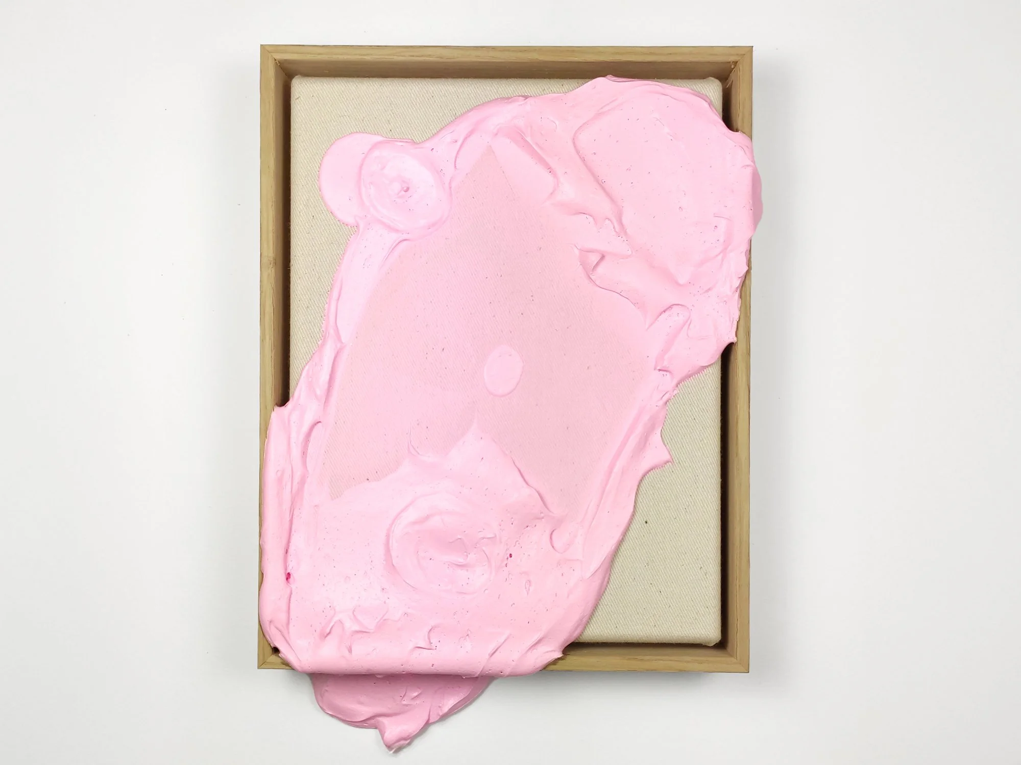
By Karen van der Vliet
23 × 18 cm, 2026
Mixed acrylic paint on cotton, framed
In the Bubblegum series, Karen van de Vliet explores the physical boundaries of painting. Her work moves beyond the flat surface, developing into a relief-like terrain where thick pink paint accumulates and expands into an almost sculptural form.
Working with a dense and viscous medium, she builds layered structures that suggest organic formations or microscopic landscapes. The compositions remain abstract, yet distinctly physical: the gesture is embedded in the surface, and movement and pressure remain visible.
Colour plays a defining role in this series. In Bubblegum, Van de Vliet uses bold and luminous tones that contrast with the weight and density of the material. This tension between playful colour and physical intensity gives the work its character.
These paintings approach abstraction as a material process, where paint itself becomes the central subject rather than merely a carrier of colour.
This work will be shipped within the Netherlands and Belgium at no additional cost, securely and with tracking.

By Lisette Schumacher
30 × 20 × 2 cm, 2025
Mixed media
From the series Dawn
In Dawn, Lisette Schumacher continues her exploration of light and perception. Each work captures the fleeting transitions between night and day, where colour and reflection seem to shift with every glance. The soft gradients and translucent layers evoke a sense of calm and movement at once, an abstract translation of the changing light that defines the early hours.
This work will be shipped within the Netherlands and Belgium at no additional cost, securely and with tracking.

By Lisette Schumacher
30 × 20 × 2 cm, 2025
Mixed media
From the series Dawn
In Dawn, Lisette Schumacher continues her exploration of light and perception. Each work captures the fleeting transitions between night and day, where colour and reflection seem to shift with every glance. The soft gradients and translucent layers evoke a sense of calm and movement at once, an abstract translation of the changing light that defines the early hours.
This work will be shipped within the Netherlands and Belgium at no additional cost, securely and with tracking.

By Lisette Schumacher
30 × 20 × 2 cm, 2025
Mixed media
From the series Dawn
In Dawn, Lisette Schumacher continues her exploration of light and perception. Each work captures the fleeting transitions between night and day, where colour and reflection seem to shift with every glance. The soft gradients and translucent layers evoke a sense of calm and movement at once, an abstract translation of the changing light that defines the early hours.
This work will be shipped within the Netherlands and Belgium at no additional cost, securely and with tracking.

By Lisette Schumacher
30 × 20 × 2 cm, 2025
Mixed media
From the series Dawn
In Dawn, Lisette Schumacher continues her exploration of light and perception. Each work captures the fleeting transitions between night and day, where colour and reflection seem to shift with every glance. The soft gradients and translucent layers evoke a sense of calm and movement at once, an abstract translation of the changing light that defines the early hours.
This work will be shipped within the Netherlands and Belgium at no additional cost, securely and with tracking.

By Lisette Schumacher
30 × 20 × 2 cm, 2025
Mixed media
From the series Dawn
In Dawn, Lisette Schumacher continues her exploration of light and perception. Each work captures the fleeting transitions between night and day, where colour and reflection seem to shift with every glance. The soft gradients and translucent layers evoke a sense of calm and movement at once, an abstract translation of the changing light that defines the early hours.
This work will be shipped within the Netherlands and Belgium at no additional cost, securely and with tracking.
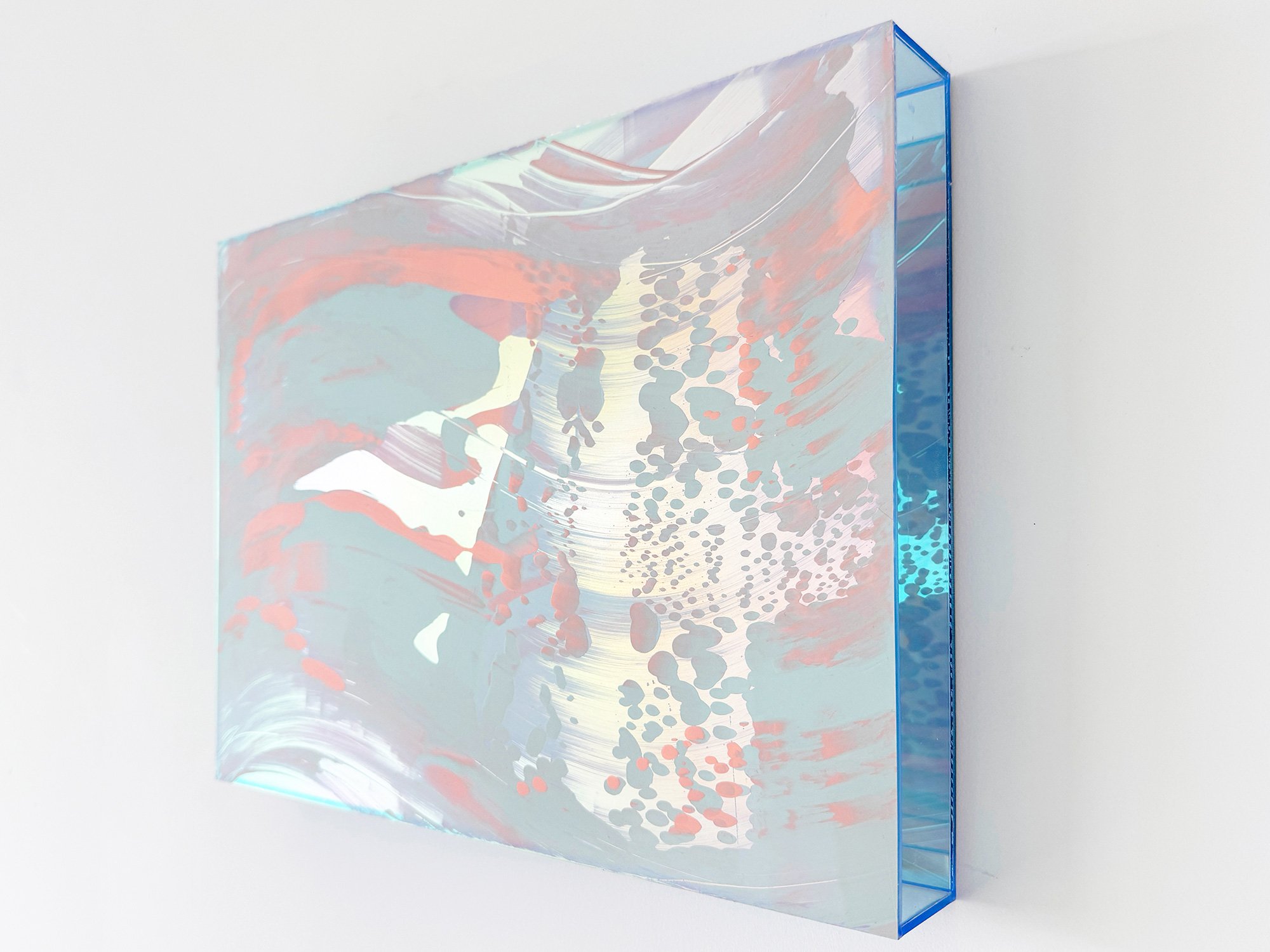
By Lisette Schumacher
30 × 40 × 5 cm, 2025
Mixed media
From the series Sunrise at Griffith
In Sunrise at Griffith, Lisette Schumacher captures the quiet beauty of early mornings in Los Angeles. Inspired by the light surrounding Griffith Observatory, this series features soft compositions in pale pinks, yellows, and muted blues. The works invite viewers to pause and experience a fleeting moment of calm – a gentle beginning to a city that rarely rests.
This work will be shipped within the Netherlands and Belgium at no additional cost, securely and with tracking.

By Lisette Schumacher
30 × 40 × 5 cm, 2025
Mixed media
From the series Sunrise at Griffith
In Sunrise at Griffith, Lisette Schumacher captures the quiet beauty of early mornings in Los Angeles. Inspired by the light surrounding Griffith Observatory, this series features soft compositions in pale pinks, yellows, and muted blues. The works invite viewers to pause and experience a fleeting moment of calm – a gentle beginning to a city that rarely rests.
This work will be shipped within the Netherlands and Belgium at no additional cost, securely and with tracking.

By Lisette Schumacher
30 × 40 × 5 cm, 2025
Mixed media
From the series Sunrise at Griffith
Lisette Schumacher is known for her translations of modernist architecture into layered, spatial works. Using transparent boxes as her canvas, she builds up layers of acrylic paint to create a distinctive play of light, colour, and depth.
Following her earlier series View on Sunset, inspired by the colours and lines of mid-century modern architecture in Los Angeles, she now presents her latest body of work: Sunrise at Griffith. This new series focuses on the early morning light surrounding the iconic Griffith Observatory. Painted in exceptionally soft tones – delicate gradients of pale yellow, lavender, and dusty pink – the works evoke the quiet atmosphere of a city just beginning to wake.
As always, the plexiglass enhances the transparency and layering in her work, turning each piece into a moment suspended in time and space. With Sunrise at Griffith, Lisette invites viewers to pause and take in the ephemeral beauty of a new day unfolding.
This work will be shipped within the Netherlands and Belgium at no additional cost, securely and with tracking.
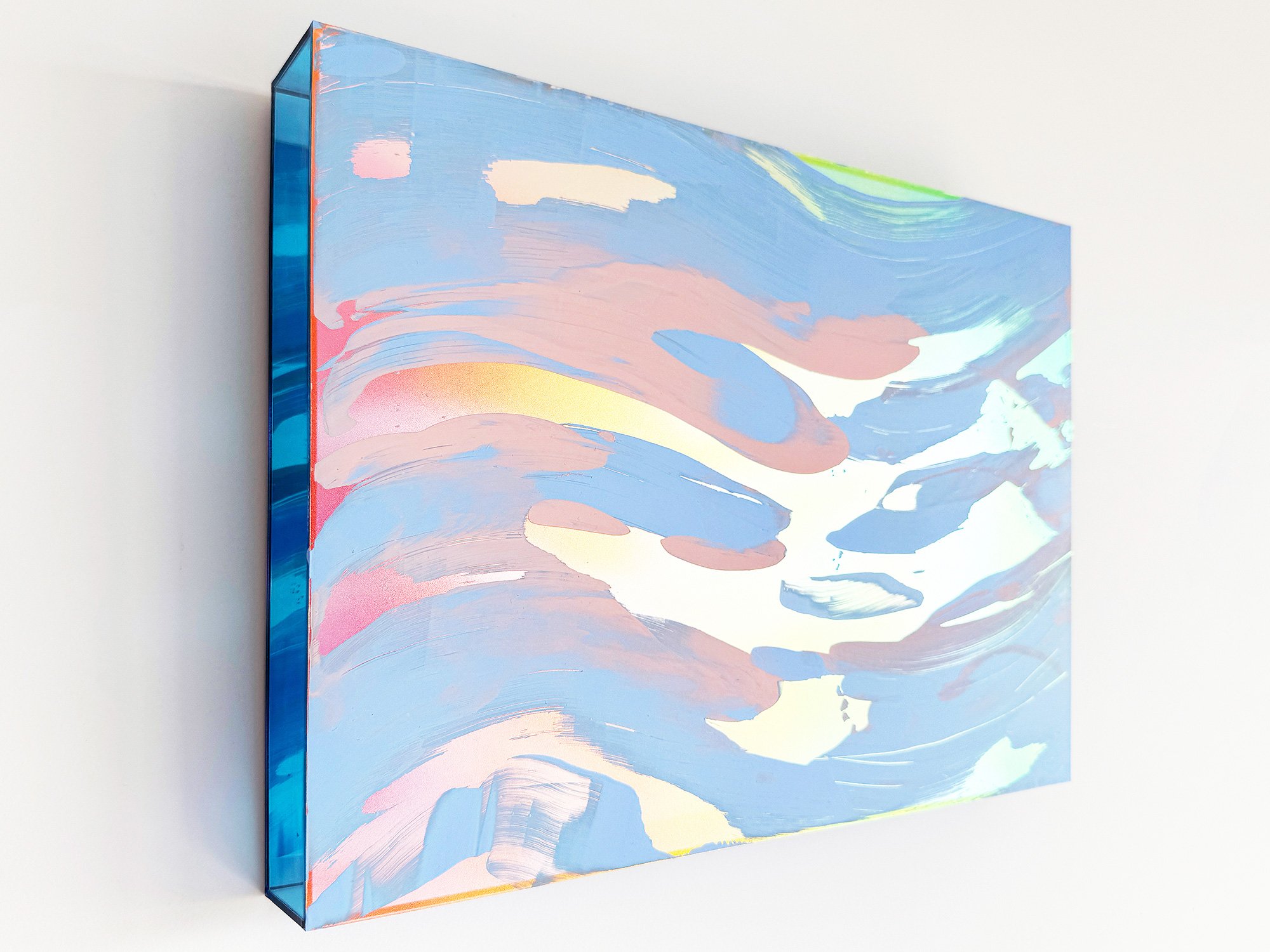
By Lisette Schumacher
30 × 40 × 5 cm, 2025
Mixed media
From the series Sunrise at Griffith
In Sunrise at Griffith, Lisette Schumacher captures the quiet beauty of early mornings in Los Angeles. Inspired by the light surrounding Griffith Observatory, this series features soft compositions in pale pinks, yellows, and muted blues. The works invite viewers to pause and experience a fleeting moment of calm – a gentle beginning to a city that rarely rests.
This work will be shipped within the Netherlands and Belgium at no additional cost, securely and with tracking.
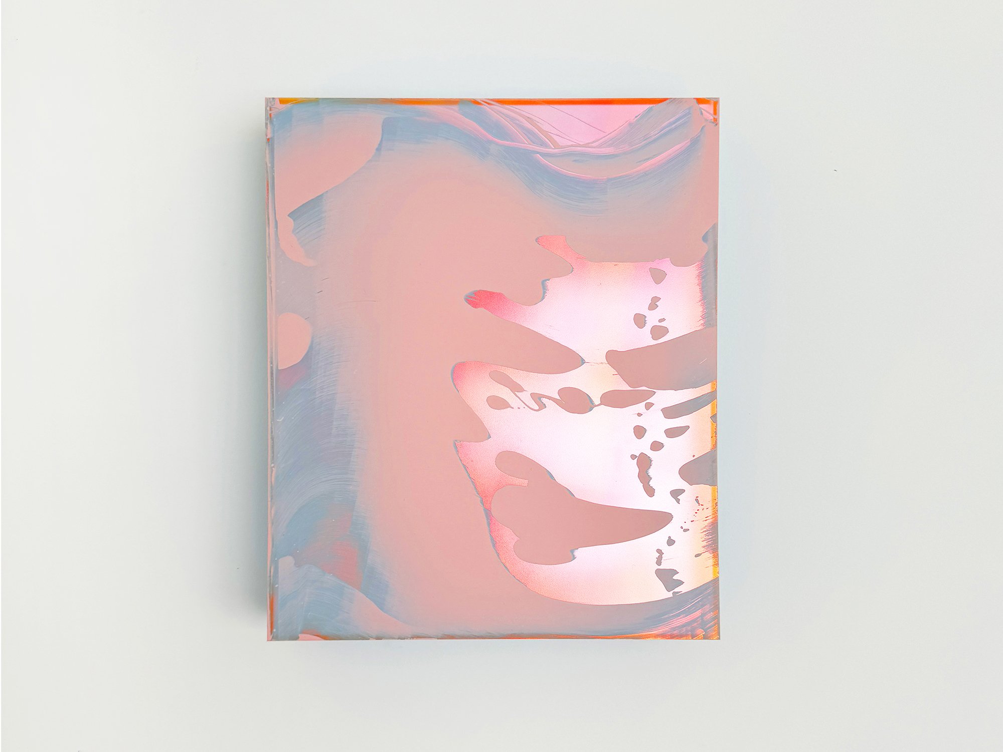
By Lisette Schumacher
30 × 25 x 6 cm, 2024
Mixed media
From the series Mirroring Reflections
Mirroring Reflections is a translation to Lisette Schumacher's previous series in which she added a mirror to the backdrop of the artwork. This mirror reflects the painting on the frontside, creating an extra layer of depth which gives the work an almost sculptural character. Endless reflections of sun on glass and water were the starting points to create Lisette’s Mirroring Reflections series. During her residency in Los Angeles (April – May 2022), she visited The Stahl House, located in the Hollywood Hills. It was designed by Buck Stahl and Pierre Koenig in 1959-60. She was stunned by the pure beauty and tranquility of the Stahl House. During her stay, Lisette noticed an intriguing play of reflections in the glass facades of the home, caused by the water of the swimming pool and the reflections of the sun. She wanted to create a body of work that would visualize her observations and bring an ode to the family home, built from glass and steel. The Stahl House has become the figurehead of modern architecture in Los Angeles. She picked the color palette based on the local rocks, succulents, interior and the swimming pool.
This work will be shipped within the Netherlands and Belgium at no additional cost, securely and with tracking.

By Lisette Schumacher
40 x 30 x 6 cm cm, 2023
Mixed media
From the series Novel Trailing Reflections
Endless reflections of sun on glass and water were the starting points to create Lisette Schumacher’s Trailing Reflections series. During her residency in Los Angeles (April – May 2022) she visited The Stahl House, located in the Hollywood Hills. It was designed by Buck Stahl and Pierre Koenig in 1959-60. She was stunned by the pure beauty and tranquility of the Stahl House. During her stay, Lisette noticed an intriguing play of reflections in the glass facades of the home, caused by the water of the swimming pool and the reflections of the sun. She wanted to create a body of work that would visualize her observations and bring an ode to the family home, built from glass and steel. The Stahl House has become the figurehead of modern architecture in Los Angeles. She picked the color palette based on the local rocks, succulents, interior and the swimming pool.
This work will be shipped within the Netherlands and Belgium at no additional cost, securely and with tracking.
Yellow: Light, instability and motion 💛
Yellow is the most light-reflective colour. A property that gives it its brightness, but also its volatility. In Van Gogh’s hands, yellow was urgent and hallucinatory. In contemporary works, it often introduces flicker, imbalance, or upward movement.
Historically, yellow pigments were chemically unstable: many faded, browned, or reacted unpredictably to light and air. And yet, yellow has always symbolised divine light in religious art, from Byzantine gold grounds to Gothic halos.
Cognitively, yellow stimulates the brain’s left hemisphere, associated with logic and decision-making. It’s no coincidence that it’s used in warning signs: yellow literally grabs attention faster than other colours.
In the home, yellow adds motion. It brightens dark corners, enlivens cold materials, and can even act as a visual window in small spaces. But moderation is key: used in small amounts, yellow energises. Used too broadly, it overwhelms.
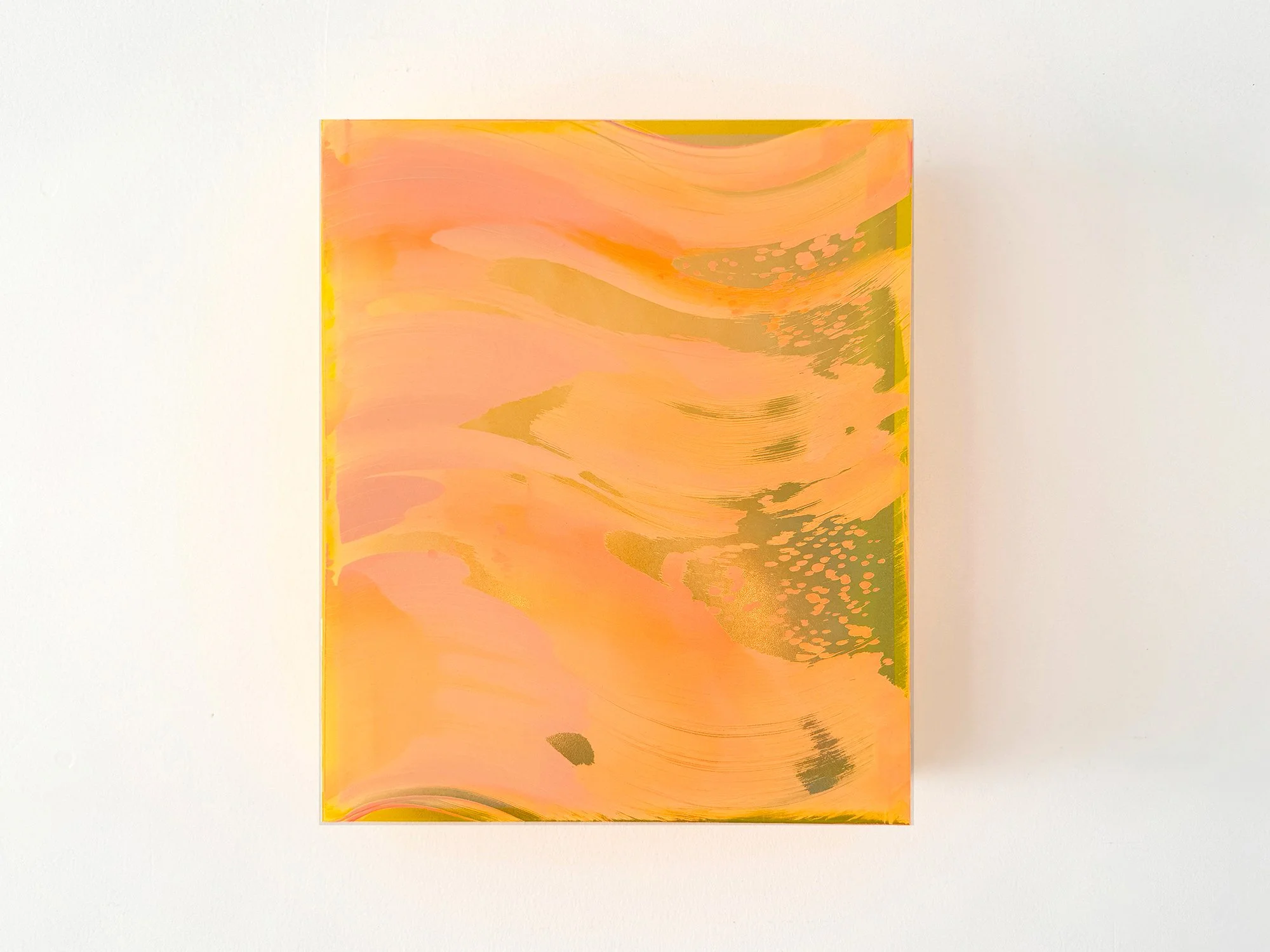
By Lisette Schumacher
30 × 25 x 6 cm, 2026
Mixed media
From the series Coachella views
The desert landscapes surrounding Palm Springs are known for their clarity of light and wide horizons. During her visits to the Coachella Valley, Lisette Schumacher experienced how dramatically the atmosphere can shift throughout the day.
Bright sunlight, wind and the vast openness of the desert create a landscape in constant transformation. Colours appear to intensify, fade and re-emerge as the sun moves across the valley.
Schumacher approaches these observations through an intuitive process in which colour and gesture develop gradually across the surface. Soft layers of pink, orange and yellow pigments move across the painting like shifting light fields, occasionally interrupted by reflective passages that recall flashes of sun across the desert terrain.
The composition reflects Lisette Schumacher’s ongoing interest in how landscape, architecture and atmosphere influence the perception of colour. Rather than presenting a fixed view of the desert, the work captures the sensation of light moving through space.
This work will be shipped within the Netherlands and Belgium at no additional cost, securely and with tracking.
By Lisette Schumacher
30 × 40 × 5 cm, 2025
Mixed media
From the series Sunrise at Griffith
Lisette Schumacher is known for her translations of modernist architecture into layered, spatial works. Using transparent boxes as her canvas, she builds up layers of acrylic paint to create a distinctive play of light, colour, and depth.
Following her earlier series View on Sunset, inspired by the colours and lines of mid-century modern architecture in Los Angeles, she now presents her latest body of work: Sunrise at Griffith. This new series focuses on the early morning light surrounding the iconic Griffith Observatory. Painted in exceptionally soft tones – delicate gradients of pale yellow, lavender, and dusty pink – the works evoke the quiet atmosphere of a city just beginning to wake.
As always, the plexiglass enhances the transparency and layering in her work, turning each piece into a moment suspended in time and space. With Sunrise at Griffith, Lisette invites viewers to pause and take in the ephemeral beauty of a new day unfolding.
This work will be shipped within the Netherlands and Belgium at no additional cost, securely and with tracking.

By Lisette Schumacher
30 x 30 x 6 cm cm, 2023
Mixed media
From the series Novel Trailing Reflections
Endless reflections of sun on glass and water were the starting points to create Lisette Schumacher’s Trailing Reflections series. During her residency in Los Angeles (April – May 2022) she visited The Stahl House, located in the Hollywood Hills. It was designed by Buck Stahl and Pierre Koenig in 1959-60. She was stunned by the pure beauty and tranquility of the Stahl House. During her stay, Lisette noticed an intriguing play of reflections in the glass facades of the home, caused by the water of the swimming pool and the reflections of the sun. She wanted to create a body of work that would visualize her observations and bring an ode to the family home, built from glass and steel. The Stahl House has become the figurehead of modern architecture in Los Angeles. She picked the color palette based on the local rocks, succulents, interior and the swimming pool.
This work will be shipped within the Netherlands and Belgium at no additional cost, securely and with tracking.
Orange: Warmth, movement and sociability 🧡
Orange lives in motion. It’s an active, social colour, born from red and yellow, yet with a character all its own. In Lisette Schumacher’s work, orange marks boundaries, defines rhythm, and adds intensity without aggression.
In historical painting, orange took time to arrive. The pigment minium was vibrant but toxic; other sources like realgar or saffron were rare and costly. Once synthetic pigments arrived, orange became a colour of the modern city: of signage, fashion, and speed.
Psychologically, orange stimulates appetite, conversation, and creative thinking. It’s frequently used in environments where interaction is encouraged, cafés, studios, or playrooms.
Optically, orange can shift dramatically depending on the light source. In the warm tones of early evening, it glows. In colder daylight, it becomes sharper, more graphic. In interiors, it’s a connector: it brings disparate elements into dialogue.
By Donald Schenkel
Oil on canvas
70 × 80 cm, 2026
Wooden frame included
No Clear Skies Ahead by Donald Schenkel is built from a concentrated blue field that shifts in density and depth. Vertical traces appear and dissolve within the surface, suggesting movement without fixed direction. The work holds a quiet tension between stillness and disruption, shaped through a controlled yet irreversible process.
Delivery within the Netherlands and Belgium is arranged in consultation, either in person or securely shipped.
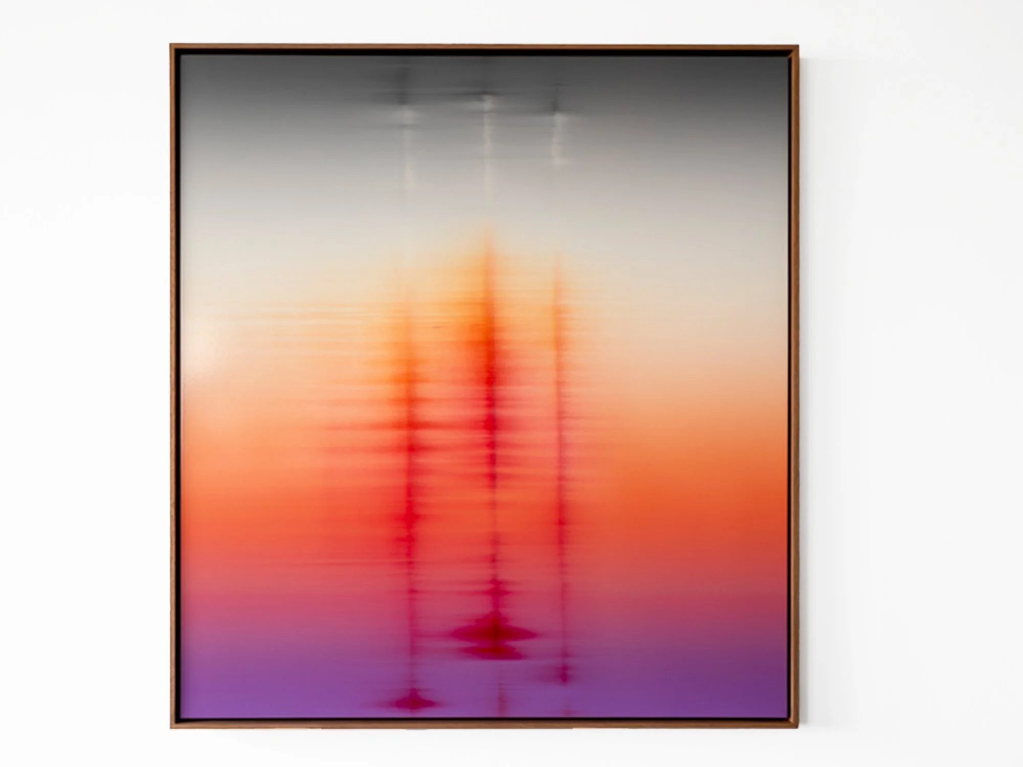
By Donald Schenkel
Oil on canvas
120 × 110 cm, 2026
Wooden frame included
Troika’s Dusk by Donald Schenkel is structured through a sequence of vertical forms emerging from a warm spectrum of red, orange and violet. The surface appears to shift between density and transparency, with colour moving across the canvas in a single, continuous layer. The composition suggests rhythm and repetition, without settling into a fixed structure.
Delivery within the Netherlands and Belgium is arranged in consultation, either in person or securely shipped.
By Donald Schenkel
Oil on canvas
70 × 68 cm, 2026
Wooden frame included
No Clear Skies Ahead by Donald Schenkel is built from a concentrated blue field that shifts in density and depth. Vertical traces appear and dissolve within the surface, suggesting movement without fixed direction. The work holds a quiet tension between stillness and disruption, shaped through a controlled yet irreversible process.
Delivery within the Netherlands and Belgium is arranged in consultation, either in person or securely shipped.
By Donald Schenkel
Oil on canvas
140 × 80 cm, 2026
Wooden frame included
Lucid Line by Donald Schenkel unfolds through a gradual shift from warm to cool tones, where colour moves from yellow and pink into blue. A single vertical line interrupts the surface, creating a sense of alignment and tension. The painting balances clarity and instability, with each transition revealing the immediacy of a single-layer process.
Delivery within the Netherlands and Belgium is arranged in consultation, either in person or securely shipped.
By Donald Schenkel
Oil on canvas
130 × 80 cm, 2025
Wooden frame included
In Unexpected Visitor, Donald Schenkel explores the presence of something unfamiliar entering a space without announcement.
The painting unfolds through layered gradients of oil paint, applied wet-in-wet in a single, continuous process. From a distance, the surface appears smooth and atmospheric; up close, the texture of the canvas and the movement of the paint become visible.
Vertical traces rise through the composition, subtly interrupting the horizontal flow of colour. Rather than disrupting the image entirely, they introduce a sense of passage, as if something has moved through the space and left a temporary imprint.
The title suggests a quiet encounter rather than a disruption. In Schenkel’s practice, unpredictability is part of the process: colours interact, shift, and assert themselves beyond full control.
Unexpected Visitor reflects on transience, attention, and the way brief presences - in life as well as in material - can alter perception without fully revealing themselves.
Delivery within the Netherlands and Belgium is arranged in consultation, either in person or securely shipped.
By Donald Schenkel
Oil on canvas
130 × 80 cm, 2025
Wooden frame included
In Unexpected Guest, Donald Schenkel explores the moment when an unforeseen presence enters an otherwise balanced system.
The painting unfolds through soft gradients of colour, created wet-in-wet in a single movement. From a distance, the surface appears smooth and almost immaterial; up close, the texture of the canvas and the physicality of oil paint become visible.
Subtle vertical shifts interrupt the horizontal flow of colour, introducing a quiet disturbance that alters the rhythm of the composition. What initially reads as calm and expansive gradually reveals a sense of ambiguity.
The title refers both to lived experience and to Schenkel’s painting process, in which chance plays an active role. Certain colours emerge unexpectedly, reshaping the work as it develops.
Unexpected Guest reflects on hospitality, vulnerability, and the way unforeseen encounters - in life and in material - can leave a lasting trace.
Delivery within the Netherlands and Belgium is arranged in consultation, either in person or securely shipped.
By Donald Schenkel
Oil on paper
57 × 43 cm, 2025
Wooden frame included
“Last Shimmer” belongs to Donald Schenkel’s new Real World Renders series, created for Root Gallery’s 2025 programme.
Through this body of work, Schenkel continues his exploration of how light, colour, and material interact to shape perception. Painted in a single wet-in-wet layer, each work demands complete control and acceptance of unpredictability, gradients merge, pigments shift, and no correction is possible.
On paper, the delicacy of oil paint becomes even more pronounced. Subtle transitions unfold across the surface, suggesting a digital glow that remains grounded in pure material presence.
Framed in walnut, Last Shimmer evokes both warmth and contemplation, the final glimmer of daylight, suspended between certainty and change.
Delivery within the Netherlands and Belgium is arranged in consultation, either in person or securely shipped.

By Donald Schenkel
84 x 70 cm, 2024
Oil paint on synthetic canvas on aluminium frame
Donald Schenkel has recently developed a unique, brushless approach that infuses the canvas with dynamic energy and expressive movement. The innovative technique highlights his ability to explore the intrinsic and materialistic qualities of pigments and colors, creating vivid impressions of translucency and reflection. This panel’s vibrant, loose strokes invite viewers into a world of endless space and light, evoking a sense of vitality and spontaneity.
Delivery within the Netherlands and Belgium is arranged in consultation, either in person or securely shipped.
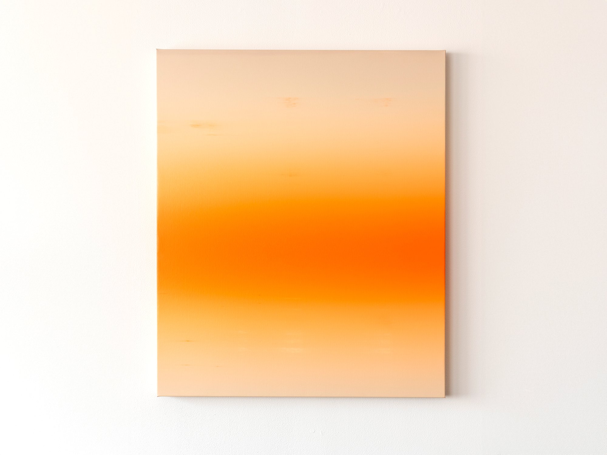
By Donald Schenkel
84 x 70 cm, 2024
Oil paint on synthetic canvas on aluminium frame
Donald Schenkel has recently developed a unique, brushless approach that infuses the canvas with dynamic energy and expressive movement. The innovative technique highlights his ability to explore the intrinsic and materialistic qualities of pigments and colors, creating vivid impressions of translucency and reflection. This panel’s vibrant, loose strokes invite viewers into a world of endless space and light, evoking a sense of vitality and spontaneity.
Delivery within the Netherlands and Belgium is arranged in consultation, either in person or securely shipped.

By Donald Schenkel
80 x 75 cm each, 2024
Oil paint on synthetic canvas
Explore Donald Schenkel’s latest diptych at Root Gallery, where he merges innovation with tradition in a stunning display of oil painting mastery. The left panel introduces Schenkel’s new, dynamic painting technique, marked by expressive shapes that infuse the canvas with energy and movement. In contrast, the right panel showcases his expertise in traditional color gradients, blending warm purples and oranges to create a serene ambiance of depth and rhythm.
Schenkel’s meticulous use of oil paint reveals a profound dialogue with materials, highlighting the inherent qualities of pigments and colors. Shadows and reflections across the canvas evoke a sense of translucency and endless space, inviting viewers into moments of contemplation and wonder. Don’t miss the opportunity to experience this masterpiece firsthand at Root Gallery. Contact us today for more information and to schedule your visit.
Delivery within the Netherlands and Belgium is arranged in consultation, either in person or securely shipped.
By Donald Schenkel
57 x 32 cm, 2023
Oil paint on paper with walnut frame
Opposite to the expanse of lightness, there is the depth expressed by shadows. The series Archaic Shadows is grounded in this depth, found in gradients where lighter colours dissolve into darkening twilights. For Donald Schenkel, the book ‘In Praise of Shadows’ points out the beauty of what we would consider darkness, and that befits the sensibility of these artworks. Shadows linger on the edge of the unknown, mystical and dark.The works part of this series sparked his attention to the object, the artefact and the archaic. This sensation of the ancient and otherworldly fits Donald’s idea of a silent wonder well. Yet, it contains a potency to be further explored.
Delivery within the Netherlands and Belgium is arranged in consultation, either in person or securely shipped.

By Donald Schenkel
74 x 60 cm, 2023
Oil paint on linen, with walnut wood
These paintings by Donald Schenkel are a result of his continuing research into the approach of paintings as objects, and the combination of oil paint with other materials. There is something compelling in turning the organic look of wood into a polished, almost industrial surface. By combining his signature gradients with wood, Donald deepens his exploration of abstract shapes, a recurring element in his practice.
Working with these materials interrupts the illusion of the gradient as endless depth. The grain of the wood flows along the surface and seems to suggest a certain direction, much like the gradients imply movement in the transitioning colours.
Delivery within the Netherlands and Belgium is arranged in consultation, either in person or securely shipped.
Red: Intensity, emotion and presence ❤️
Red is immersive. In the work of both Donald Schenkel and Lisette Schumacher, red is not incidental, it’s central. Donald explores red as an emotional field, saturating entire compositions to evoke physical presence and psychological depth. Lisette, by contrast, often uses red more structurally: as an accent, a rhythm, a spatial tool within her architectural language. But both artists are acutely aware of the colour’s charge.
Symbolically, red is one of humanity’s oldest pigments. Used in cave paintings, sacred rituals, royal dress, and revolutionary propaganda. Across time and cultures, it has signified life, danger, passion, and transformation.
Physiologically, red increases heart rate and attracts attention more rapidly than any other colour. It’s visceral. In a domestic space, this means red should be used with intention. A red-dominant work doesn’t simply hang, it anchors the room.
Red works beautifully in spaces where intensity is welcome: dining areas, entry halls, or reading corners where you want atmosphere. It doesn't just fill a space, it defines it.

By Donald Schenkel
70 x 50 cm, 2024
Oil paint on synthetic canvas
Donald Schenkel's latest series explores the idea of paintings as screens, inspired by the seemingly digital character of the gradients. By suspending the works from the wall, they evoke the feel of computer screens. He draws on the historical shift in art from symbolic and spiritual meanings to alternate realities, which evolved further with the introduction of cinema, and digital screens.
As we grow up with digital screens, images are increasingly seen as generated, rather than physical objects. Schenkel questions if the same becomes true for paintings.Will future generations understand a painting as more than a screen-like image? His use of materials like thin sheets of paper highlights this tension, as what appears digital is, in fact, created using techniques that stem back from the early Renaissance.The perception of reality and the interpretation of the painting is changed by the material aspects of the object itself and how we view them in today’s day and age.
Delivery within the Netherlands and Belgium is arranged in consultation, either in person or securely shipped.

By Lisette Schumacher
100 x 90 x 6 cm, 2024
Mixed media
From the series Sunset at Woods Drive
During Fall 2023 (September - October), Lisette Schumacher returned to Los Angeles for a second residency. She revisited the Stahl House twice during sunset and witnessed an exciting transition in the appearance of the house. The Stahl House is located in the Hollywood Hills and was designed by Buck Stahl and Pierre Koenig in 1959-60. The residence has become the figurehead of modern architecture in Los Angeles.
During previous daytime visits, her experience of the Stahl House was dominated by reflections due to the affluent presence of glass and water. During the sunset, however, what stood out were the mesmerizing colour transformations. Lisette sat down on a sofa in the living room overlooking the pool, and watched the sunset at the house. By consciously observing the gradual disappearanceof daylight, Lisette witnessed the colour transition taking place in and around the house.
The colours in the sky displayed vibrant gradients of yellow, orange, pink and purple, especially during the short period of twilight. With the sun setting, the house turned dark and the sky shifted in different hues of blue, finally displaying a deep night blue. After sunset, the house was subtly lit with large round glass lamps suspended by invisible wires which provided a surrealistic sight of multiple full moons. The pool lit up brightly providing a stark contrast with the subdued colours of the exterior of the house.
The Sunset series consists of paintings that showcase the different stages of the sun setting., Various colour combinations, both bright and subdued, depict the transition from twilight to sunset.
Delivery within the Netherlands and Belgium is arranged in consultation, either in person or securely shipped

By Donald Schenkel
74 x 60 cm, 2023
Oil paint on linen, with walnut wood
These paintings by Donald Schenkel are a result of his continuing research into the approach of paintings as objects, and the combination of oil paint with other materials. There is something compelling in turning the organic look of wood into a polished, almost industrial surface. By combining his signature gradients with wood, Donald deepens his exploration of abstract shapes, a recurring element in his practice.
Working with these materials interrupts the illusion of the gradient as endless depth. The grain of the wood flows along the surface and seems to suggest a certain direction, much like the gradients imply movement in the transitioning colours.
Delivery within the Netherlands and Belgium is arranged in consultation, either in person or securely shipped.
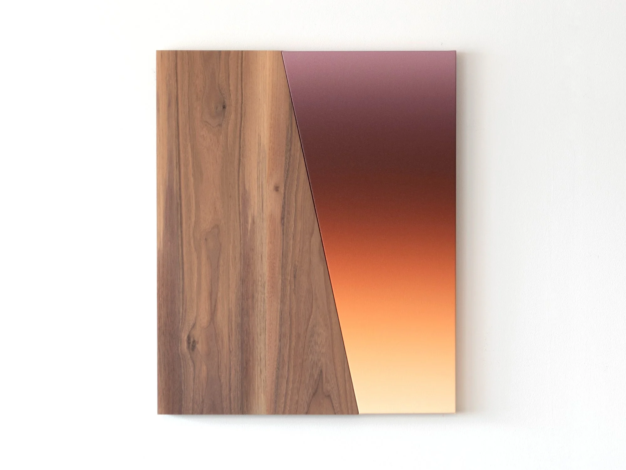
By Donald Schenkel
74 x 60 cm, 2023
Oil paint on linen, with walnut wood
These paintings by Donald Schenkel are a result of his continuing research into the approach of paintings as objects, and the combination of oil paint with other materials. There is something compelling in turning the organic look of wood into a polished, almost industrial surface. By combining his signature gradients with wood, Donald deepens his exploration of abstract shapes, a recurring element in his practice.
Working with these materials interrupts the illusion of the gradient as endless depth. The grain of the wood flows along the surface and seems to suggest a certain direction, much like the gradients imply movement in the transitioning colours.
Delivery within the Netherlands and Belgium is arranged in consultation, either in person or securely shipped.

By Lisette Schumacher
80 x 80 x 6 cm, 2023
Mixed media
From the series Mirroring Reflections
Mirroring Reflections is a translation to Lisette Schumacher's previous series in which she added a mirror to the backdrop of the artwork. This mirror reflects the painting on the frontside, creating an extra layer of depth which gives the work an almost sculptural character.
Endless reflections of sun on glass and water were the starting points to create Lisette’s Mirroring Reflections series. During her residency in Los Angeles (April – May 2022), she visited The Stahl House, located in the Hollywood Hills. It was designed by Buck Stahl and Pierre Koenig in 1959-60. She was stunned by the pure beauty and tranquility of the Stahl House. During her stay, Lisette noticed an intriguing play of reflections in the glass facades of the home, caused by the water of the swimming pool and the reflections of the sun. She wanted to create a body of work that would visualize her observations and bring an ode to the family home, built from glass and steel. The Stahl House has become the figurehead of modern architecture in Los Angeles. She picked the color palette based on the local rocks, succulents, interior and the swimming pool.
Delivery within the Netherlands and Belgium is arranged in consultation, either in person or securely shipped.
Black: Depth, precision and silence 🖤
Black absorbs and distils. In Sophie de Vos’ photographic works, black defines, not emptiness, but architecture, presence, and transition. Her compositions use black to focus attention, to withhold as much as they reveal.
Historically, black has shifted from sacred to radical. In medieval manuscripts, it was clarity; in 20th-century modernism, it became negation, starting with Malevich’s Black Square. But always, black is a boundary, it defines what is and isn’t there.
Optically, black reduces reflection and flattens form, which makes it useful in a spatial sense. In the right light, it creates depth; in shadow, it dematerialises.
In interiors, black is both frame and anchor. It makes bright colours bolder, white spaces sharper, and cluttered rooms more coherent. A black-and-white work - especially in photographic form - can stabilise a space with just one gesture.
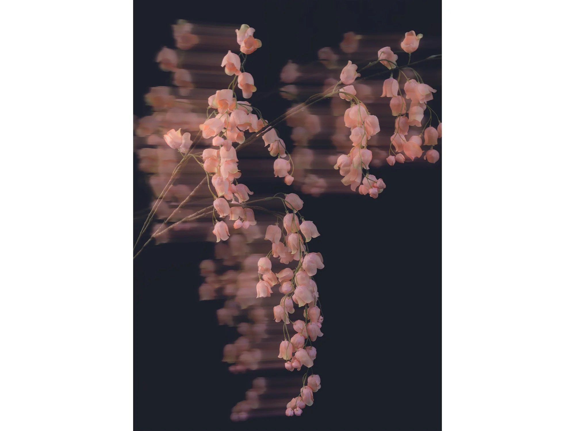
By Sophie de Vos
70 × 50 cm, ed. 1/3, 2026
Hahnemuhle, framed in black, museumglass
From the series Fragments of Clarity
The word ‘reflecting’ carries dual meanings; it can refer to an actual reflection - seeing an image mirrored in a glossy surface like glass - or it can describe the process of deep, thoughtful contemplation.
The photographic series ‘Fragments of Clarity’ by Sophie de Vos explores this duality, moving between the literal and metaphorical aspects of reflection. In most works, Sophie uses glass as a physical and conceptual layer over her subjects, creating subtle distortions that question how we perceive the world. When we look at something, are we truly seeing it as it is, or through the lens of our own experiences, memories, and emotions?
In the work ‘What Lingers After’, this approach shifts. Instead of glass, Sophie uses a photographic intervention, where movement and time become the material of distortion. Here, perception is not refracted by a physical surface, but shaped by duration and what remains after the moment has passed.
Shipping within the Netherlands and Belgium is on us.
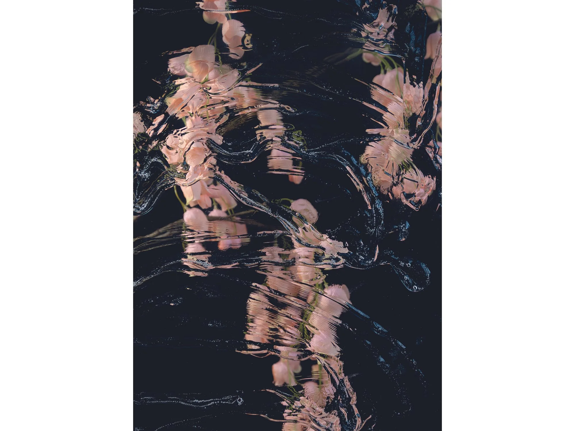
By Sophie de Vos
70 × 50 cm, ed. 1/3, 2026
Hahnemuhle, framed in black, museumglass
From the series Fragments of Clarity
The word ‘reflecting’ carries dual meanings; it can refer to an actual reflection - seeing an image mirrored in a glossy surface like glass - or it can describe the process of deep, thoughtful contemplation.
This photographic series by Sophie de Vos intertwines both interpretations, exploring the intersection between the literal and metaphorical aspects of reflection. In this series, Sophie incorporates glass as a physical and conceptual layer over her subjects, manipulating its positioning to create dynamic visual distortions. By alternating and playing with these layers, she raises profound questions about perception: When we look at something, are we truly seeing it as it is, or are we viewing it through the complex prism of our own experiences, biases, and emotions? Sophie challenges the viewer to consider the nature of clarity itself, suggesting that true understanding may be filtered and refracted by the lenses through which we observe the world.
Through this blending of visual and philosophical reflection, the series becomes not just a study of surfaces and subjects, but a deeper inquiry into the limits of perception and understanding.
Shipping within the Netherlands and Belgium is on us.
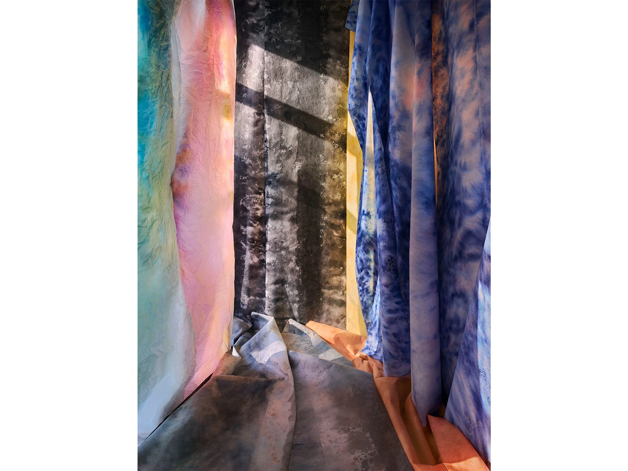
By Jan Theun van Rees
122 × 91,5 cm, ed. 3, 2026
Pigment ink on bright white Photorag mounted on museum board, framed with spacer and UV70 museum glass
This work is part of the series Painted Room
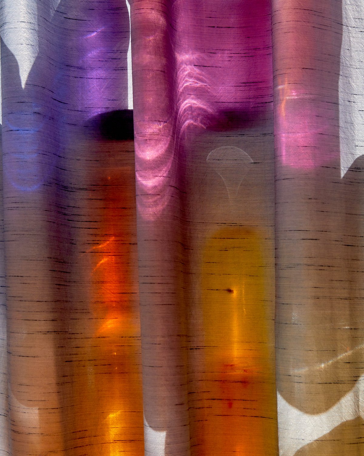
In Painted Room, Jan Theun van Rees constructs a temporary, immersive space using layered materials and painted surfaces, brought together through carefully controlled light. Soft textiles in shifting tones of blue, pink and grey create a spatial composition that feels both architectural and atmospheric. The interplay between shadow and colour blurs the line between physical structure and illusion, inviting the viewer to question depth, perspective and material reality.
This work is part of Van Rees’ ongoing exploration of spatial perception in contemporary photography, where constructed environments become the subject. Through subtle variations in light and surface, Painted Room offers a quiet, contemplative image that evolves with prolonged viewing.
Shipping within the Netherlands and Belgium is on us.
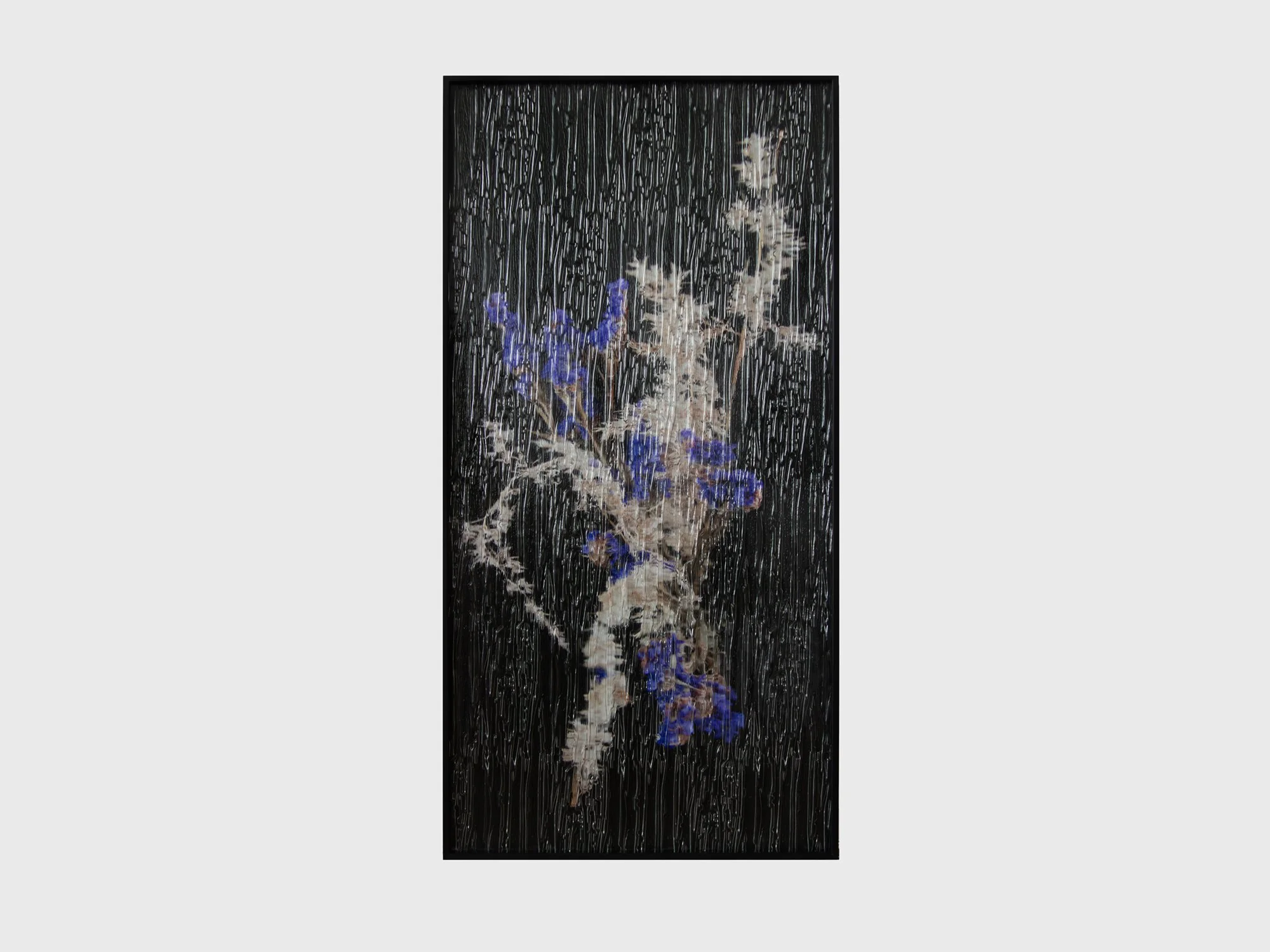
By Sophie de Vos
90 × 45 cm, unique, 2025
Hahnemuhle photo rag pearl, framed in black, niagara glass
From the series A Fragile Shift of Sight
This work by Sophie de Vos unfolds as both an image and a window. Against a deep black background, fragile flowers emerge in the foreground, suspended between clarity and obscurity. They are seen not directly, but through textured glass once part of an actual window frame. Its flowing surface recalls falling rain, transforming the act of looking into something layered and elusive.
For Sophie de Vos, art functions as a window onto another world; a threshold to the imaginary. By placing the photograph behind this glass, she invites the viewer to experience the image as something glimpsed rather than fully grasped - a fleeting vision that is both present and just beyond reach. At the same time, the glass evokes a sense of protection, as if the flowers are shielded in their own fragile space, reminding us of the delicate boundary between distance and intimacy, reality and imagination.
Shipping within the Netherlands and Belgium is on us.

By Sophie de Vos
90 × 45 cm, unique, 2025
Hahnemuhle photo rag pearl, framed in black, niagara glass
From the series A Fragile Shift of Sight
This work by Sophie de Vos unfolds as both an image and a window. Against a deep black background, fragile flowers emerge in the foreground, suspended between clarity and obscurity. They are seen not directly, but through textured glass once part of an actual window frame. Its flowing surface recalls falling rain, transforming the act of looking into something layered and elusive.
For Sophie de Vos, art functions as a window onto another world; a threshold to the imaginary. By placing the photograph behind this glass, she invites the viewer to experience the image as something glimpsed rather than fully grasped - a fleeting vision that is both present and just beyond reach. At the same time, the glass evokes a sense of protection, as if the flowers are shielded in their own fragile space, reminding us of the delicate boundary between distance and intimacy, reality and imagination.
Shipping within the Netherlands and Belgium is on us.

By Sophie de Vos
120 × 90 cm, ed. 1/2, 2024
Hahnemuhle, framed in black, museumglass
From the series Fragments of Clarity
The word ‘reflecting’ carries dual meanings; it can refer to an actual reflection - seeing an image mirrored in a glossy surface like glass - or it can describe the process of deep, thoughtful contemplation.
This photographic series by Sophie de Vos intertwines both interpretations, exploring the intersection between the literal and metaphorical aspects of reflection. In this series, Sophie incorporates glass as a physical and conceptual layer over her subjects, manipulating its positioning to create dynamic visual distortions. By alternating and playing with these layers, she raises profound questions about perception: When we look at something, are we truly seeing it as it is, or are we viewing it through the complex prism of our own experiences, biases, and emotions? Sophie challenges the viewer to consider the nature of clarity itself, suggesting that true understanding may be filtered and refracted by the lenses through which we observe the world.
Through this blending of visual and philosophical reflection, the series becomes not just a study of surfaces and subjects, but a deeper inquiry into the limits of perception and understanding.
Shipping within the Netherlands and Belgium is on us.

By Sophie de Vos
40 x 30 cm, ed. 3/5, 2025
Hahnemuhle, framed in black, museumglass
From the series Fragments of Clarity
The word ‘reflecting’ carries dual meanings; it can refer to an actual reflection — seeing an image mirrored in a glossy surface like glass — or it can describe the process of deep, thoughtful contemplation.
This photographic series by Sophie de Vos intertwines both interpretations, exploring the intersection between the literal and metaphorical aspects of reflection. In this series, Sophie incorporates glass as a physical and conceptual layer over her subjects, manipulating its positioning to create dynamic visual distortions. By alternating and playing with these layers, she raises profound questions about perception: When we look at something, are we truly seeing it as it is, or are we viewing it through the complex prism of our own experiences, biases, and emotions? Sophie challenges the viewer to consider the nature of clarity itself, suggesting that true understanding may be filtered and refracted by the lenses through which we observe the world.
Through this blending of visual and philosophical reflection, the series becomes not just a study of surfaces and subjects, but a deeper inquiry into the limits of perception and understanding.
Shipping within the Netherlands and Belgium is on us.

By Sophie de Vos
40 x 30 cm, ed. 1/5, 2024
Hahnemuhle, framed in black, museumglass
For this work, Sophie de Vos was inspired by the found of her late grandmother's nightgown. Although she never saw her grandmother in this nightgown, she was confronted with a nostalgic sense of familiarity beyond comprehension.
While capturing this intimate image, she noticed an intriguing play of light on the surface of the fabric which shifted her mind to other eras. The abundance of swirling fabrics with beautiful light and shadow areas in paintings from the Renaissance and the fabric draped elegantly over the floor in Roman sculptures. Sophie was fascinated by the ways in which well-known references from our collective visual memory could coincide with the little nostalgic memory her grandmother's nightgown evoked.
Shipping within the Netherlands and Belgium is on us.
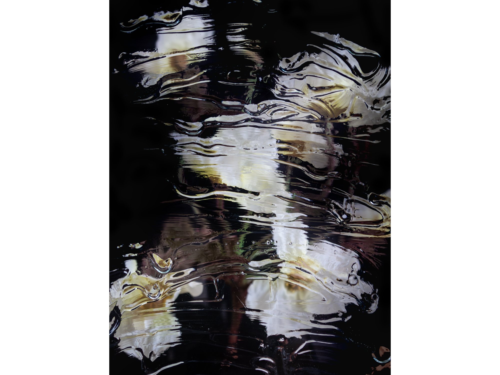
By Sophie de Vos
120 × 90 cm, ed. 1/2, 2024
Hahnemuhle, framed in black, museumglass
Also available in 40 × 30 cm, edition 3/5
From the series Fragments of Clarity
The word ‘reflecting’ carries dual meanings; it can refer to an actual reflection — seeing an image mirrored in a glossy surface like glass — or it can describe the process of deep, thoughtful contemplation.
This photographic series by Sophie de Vos intertwines both interpretations, exploring the intersection between the literal and metaphorical aspects of reflection. In this series, Sophie incorporates glass as a physical and conceptual layer over her subjects, manipulating its positioning to create dynamic visual distortions. By alternating and playing with these layers, she raises profound questions about perception: When we look at something, are we truly seeing it as it is, or are we viewing it through the complex prism of our own experiences, biases, and emotions? Sophie challenges the viewer to consider the nature of clarity itself, suggesting that true understanding may be filtered and refracted by the lenses through which we observe the world.
Through this blending of visual and philosophical reflection, the series becomes not just a study of surfaces and subjects, but a deeper inquiry into the limits of perception and understanding.
Shipping within the Netherlands and Belgium is on us.
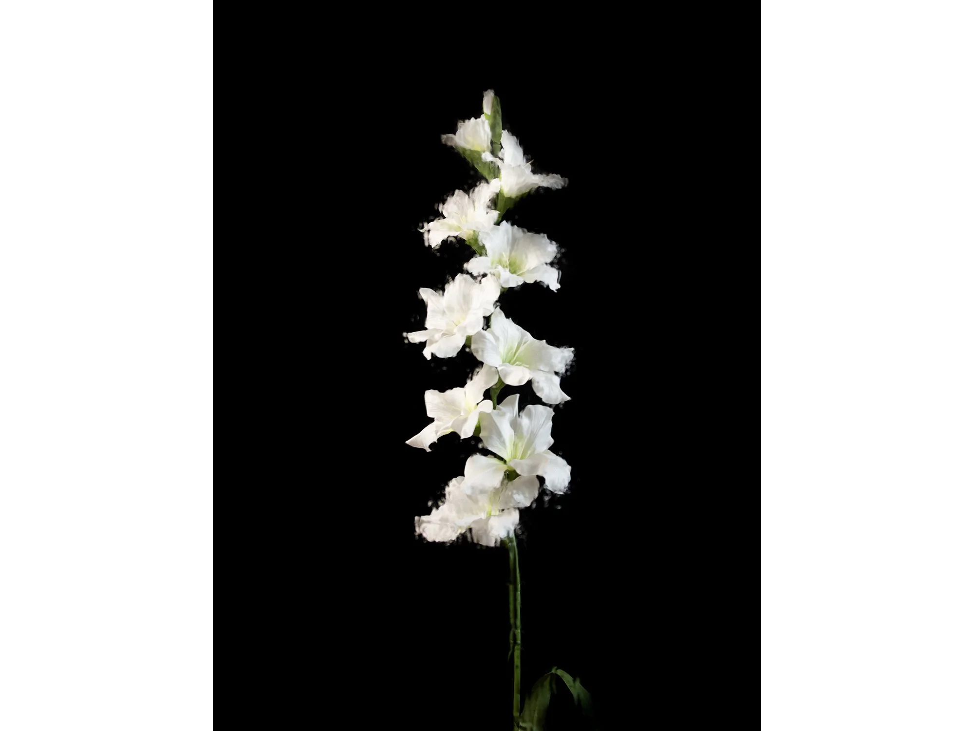
By Sophie de Vos
120 × 90 cm, ed. 2/2, 2024
Hahnemuhle, framed in black, museumglass
From the series Fragments of Clarity
The word ‘reflecting’ carries dual meanings; it can refer to an actual reflection — seeing an image mirrored in a glossy surface like glass — or it can describe the process of deep, thoughtful contemplation.
This photographic series by Sophie de Vos intertwines both interpretations, exploring the intersection between the literal and metaphorical aspects of reflection. In this series, Sophie incorporates glass as a physical and conceptual layer over her subjects, manipulating its positioning to create dynamic visual distortions. By alternating and playing with these layers, she raises profound questions about perception: When we look at something, are we truly seeing it as it is, or are we viewing it through the complex prism of our own experiences, biases, and emotions? Sophie challenges the viewer to consider the nature of clarity itself, suggesting that true understanding may be filtered and refracted by the lenses through which we observe the world.
Through this blending of visual and philosophical reflection, the series becomes not just a study of surfaces and subjects, but a deeper inquiry into the limits of perception and understanding.
Shipping within the Netherlands and Belgium is on us.

By Sophie de Vos
40 x 30 cm, ed. 3/5, 2024
Hahnemuhle, framed in black, museumglass
From the series Fragments of Clarity
The word ‘reflecting’ carries dual meanings; it can refer to an actual reflection — seeing an image mirrored in a glossy surface like glass — or it can describe the process of deep, thoughtful contemplation.
This photographic series by Sophie de Vos intertwines both interpretations, exploring the intersection between the literal and metaphorical aspects of reflection. In this series, Sophie incorporates glass as a physical and conceptual layer over her subjects, manipulating its positioning to create dynamic visual distortions. By alternating and playing with these layers, she raises profound questions about perception: When we look at something, are we truly seeing it as it is, or are we viewing it through the complex prism of our own experiences, biases, and emotions? Sophie challenges the viewer to consider the nature of clarity itself, suggesting that true understanding may be filtered and refracted by the lenses through which we observe the world.
Through this blending of visual and philosophical reflection, the series becomes not just a study of surfaces and subjects, but a deeper inquiry into the limits of perception and understanding.
Shipping within the Netherlands and Belgium is on us.

By Sophie de Vos
40 x 30 cm, ed. 1/5, 2024
Hahnemuhle, framed in black, museumglass
From the series Fragments of Clarity
The word ‘reflecting’ carries dual meanings; it can refer to an actual reflection — seeing an image mirrored in a glossy surface like glass — or it can describe the process of deep, thoughtful contemplation.
This photographic series by Sophie de Vos intertwines both interpretations, exploring the intersection between the literal and metaphorical aspects of reflection. In this series, Sophie incorporates glass as a physical and conceptual layer over her subjects, manipulating its positioning to create dynamic visual distortions. By alternating and playing with these layers, she raises profound questions about perception: When we look at something, are we truly seeing it as it is, or are we viewing it through the complex prism of our own experiences, biases, and emotions? Sophie challenges the viewer to consider the nature of clarity itself, suggesting that true understanding may be filtered and refracted by the lenses through which we observe the world.
Through this blending of visual and philosophical reflection, the series becomes not just a study of surfaces and subjects, but a deeper inquiry into the limits of perception and understanding.
Shipping within the Netherlands and Belgium is on us.
Living with colour
To choose a work of art is to choose how a space feels, every day.
Colour shapes that feeling. It moves with the light, reflects your mood, and often shifts as you live with it longer. Whether you gravitate towards deep blues or bright oranges, muted greens or saturated reds, each colour carries intention. Not just from the artist, but from you: as the viewer, the collector.
And yet, some of the best choices defy logic.
So yes, consider how a colour might work in your home. Think about scale, contrast, light. But don’t get stuck there. You live in a home, not a museum. Art doesn’t have to match the curtains. Let yourself be surprised. Let a work seduce you, unsettle you, or simply stay with you for reasons you can’t explain.
In the end, how you place art is part of your story. And good stories are never too neat.
Curious to see how these colours take shape in the works our artists are currently creating?
Discover recent paintings, sculptures and photographs by Donald Schenkel, Lisette Schumacher, Sophie de Vos, Karen van de Vliet, Vera Klaus and others, online or in the gallery. Many of these artists are developing new pieces as we speak. We’re happy to help you find a work that fits your space and keeps unfolding over time.


In short, why colour matters when choosing art for your home:
✔ Colour shapes how a space feels, functions, and flows
✔ Each hue carries historical, emotional, and spatial meaning
✔ Blue brings focus and stillness, red creates intensity and warmth
✔ Green offers balance, yellow energises, pink softens and surprises
✔ Orange invites connection, black defines and clarifies
✔ Choosing colour consciously helps art resonate more deeply
✔ But sometimes, the best choice is the unexpected one
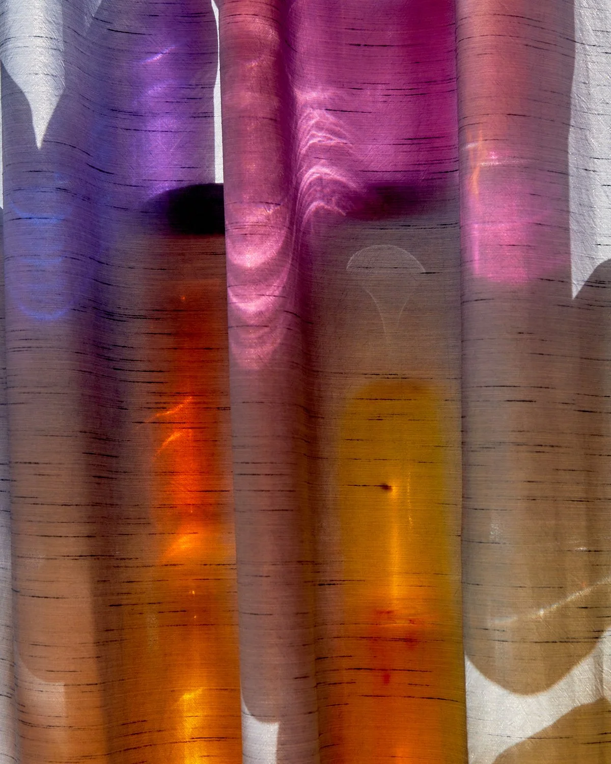




By Donald Schenkel
Oil on canvas
140 × 80 cm, 2026
Wooden frame included
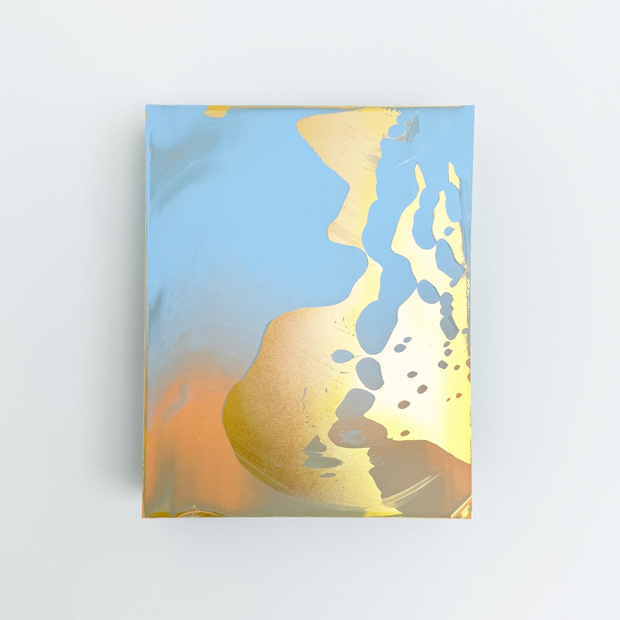
In The Observer, Donald Schenkel combines clear turquoise and blue tones with a softly illuminated centre. Fine vertical and horizontal marks appear throughout the composition, introducing a subtle rhythm within the expansive fields of colour.
The painting is built up in numerous thin layers of oil paint, creating smooth transitions and a remarkable sense of depth. Its tall, narrow format strengthens the meditative quality of the work. Both calming and quietly captivating, The Observerbrings colour into an interior without overwhelming the space.
Delivery within the Netherlands and Belgium is arranged in consultation, either in person or securely shipped.