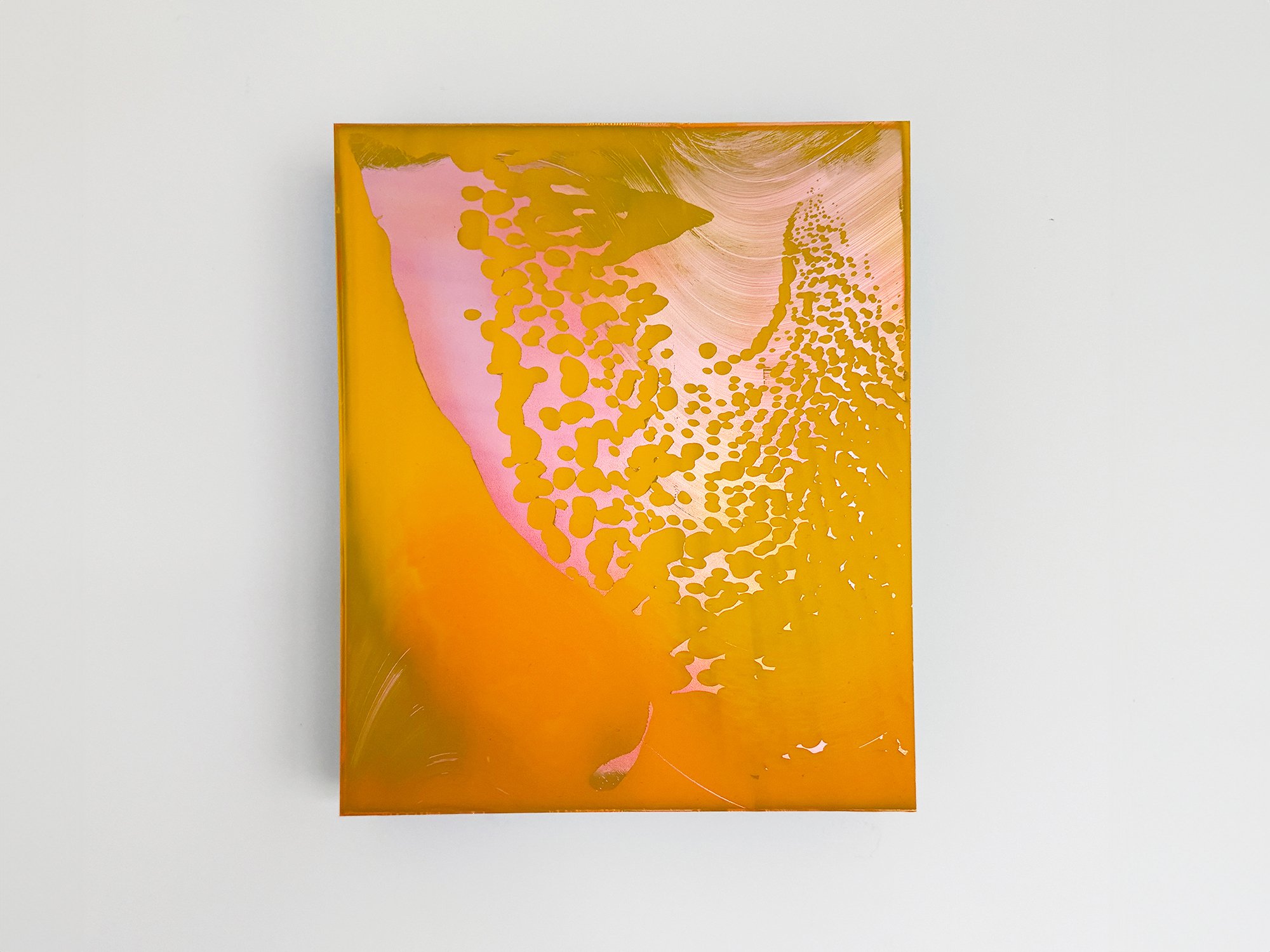
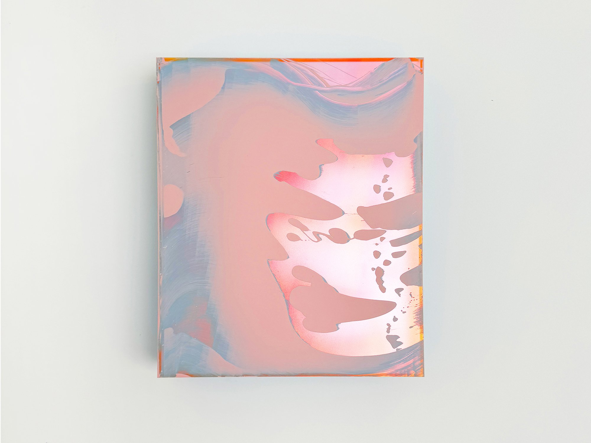
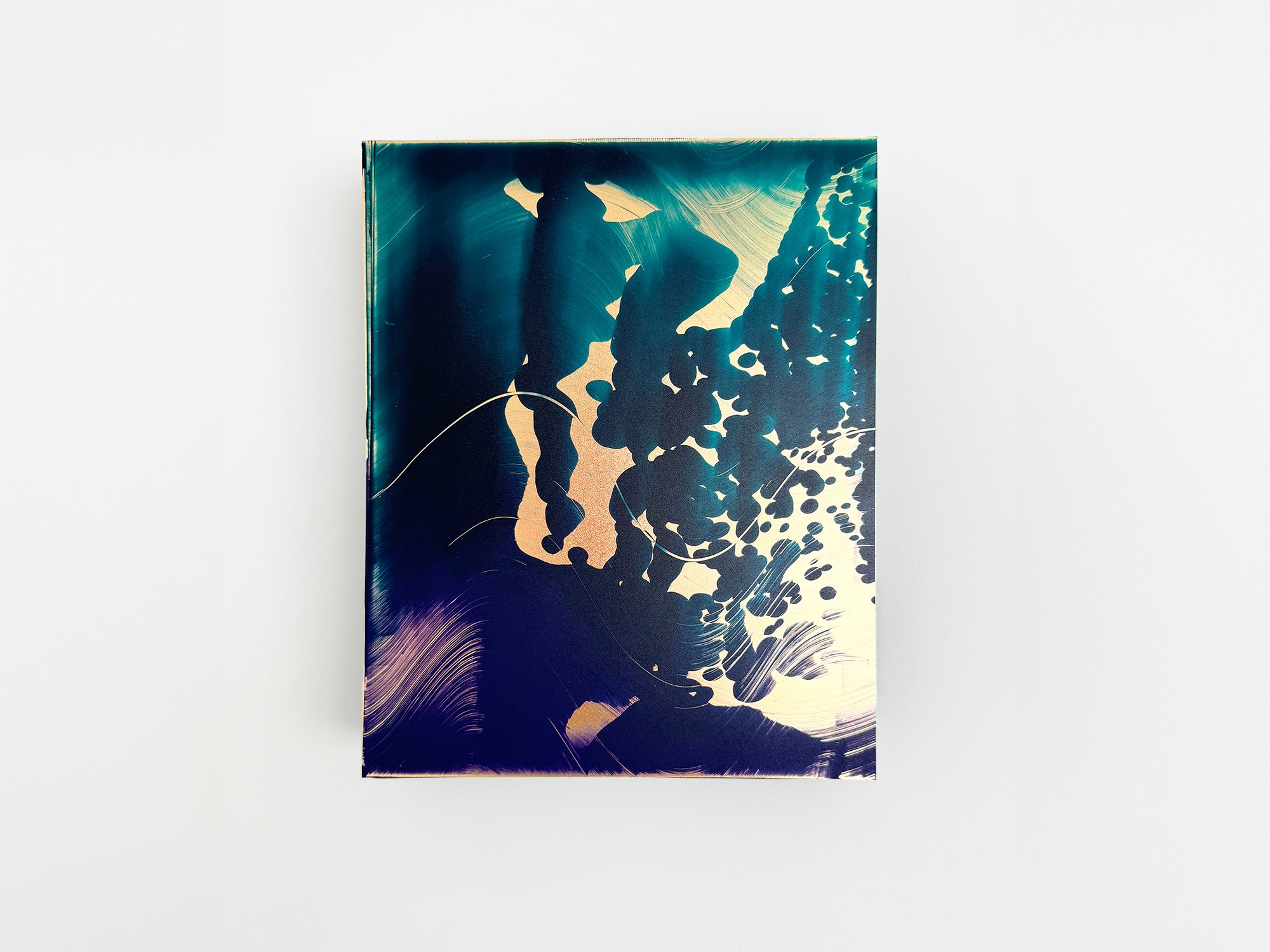
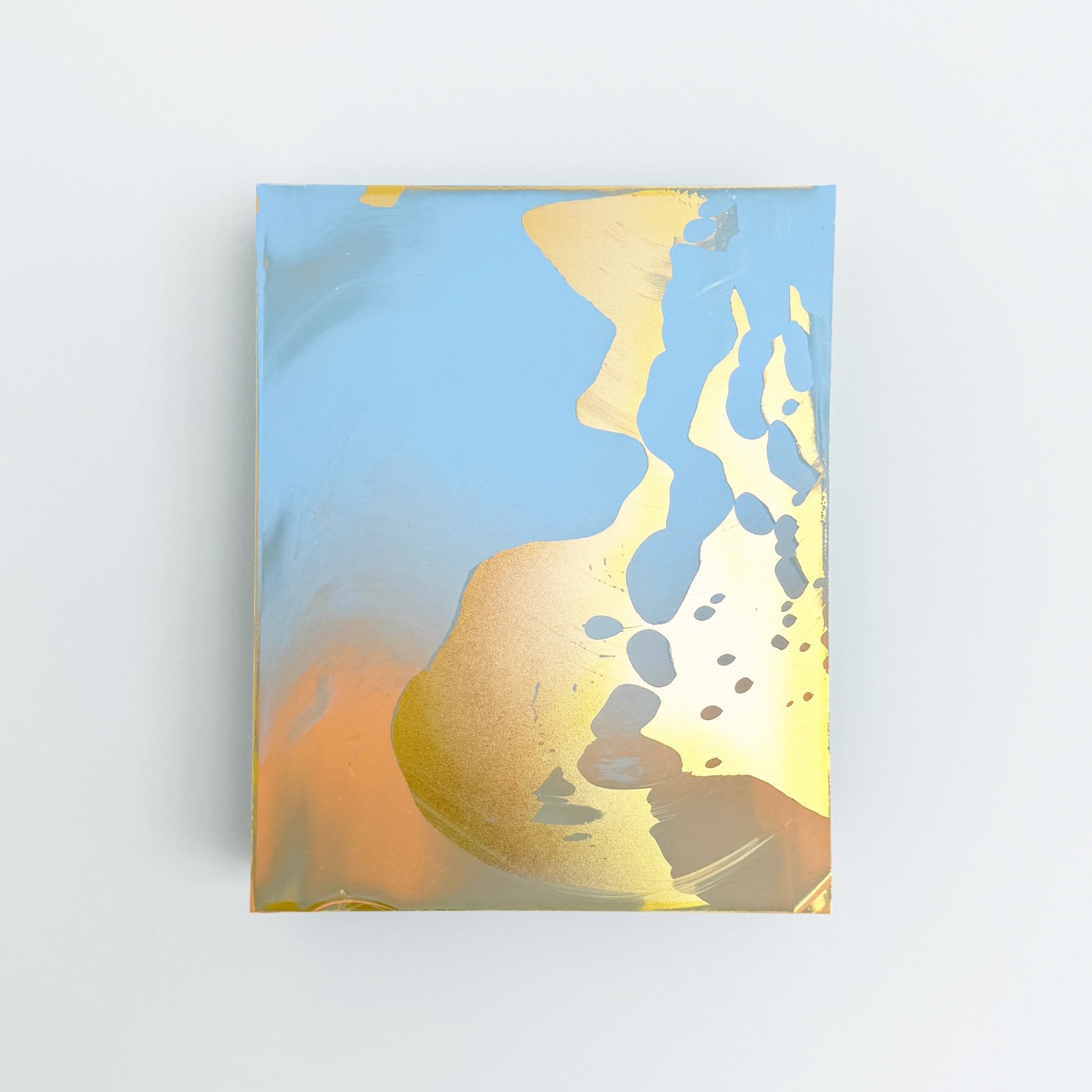
Stories behind art bought at Root Gallery
And the unexpected ways it connects to the lives of our collectors
Most people who buy from us share the story behind their choice. Sometimes casually, during a studio visit or fair, other times more deliberately, over a coffee in the gallery.
And while we almost never ask, we always listen. These moments, of doubt, recognition, celebration, or simple instinct, tell us something about the role art plays beyond our walls. And we love to hear your stories.
Over the years, we’ve learned that people rarely buy art just because it matches a wall. They buy it because it does something. It marks a memory. It softens a space. It connects. In this blog, we share a few stories from recent years that show how varied and human the reasons behind an acquisition can be. No strategy, no checklist. Just people, their spaces, and the works that stayed with them.
We hope it offers inspiration, or recognition. And if you’d like to share your story, or find a piece that speaks to yours, we’d love to hear from you.
A light counterbalance at work
One client bought a piece by Vera Klaus for her office. Her daily work is intense and emotionally demanding, and she wanted something uplifting to balance that energy. Vera’s playful compositions and use of colour brought exactly the kind of brightness she was looking for.
Vera's works often hover between abstraction and intuition, using bold yet soft shapes to invite both joy and curiosity.
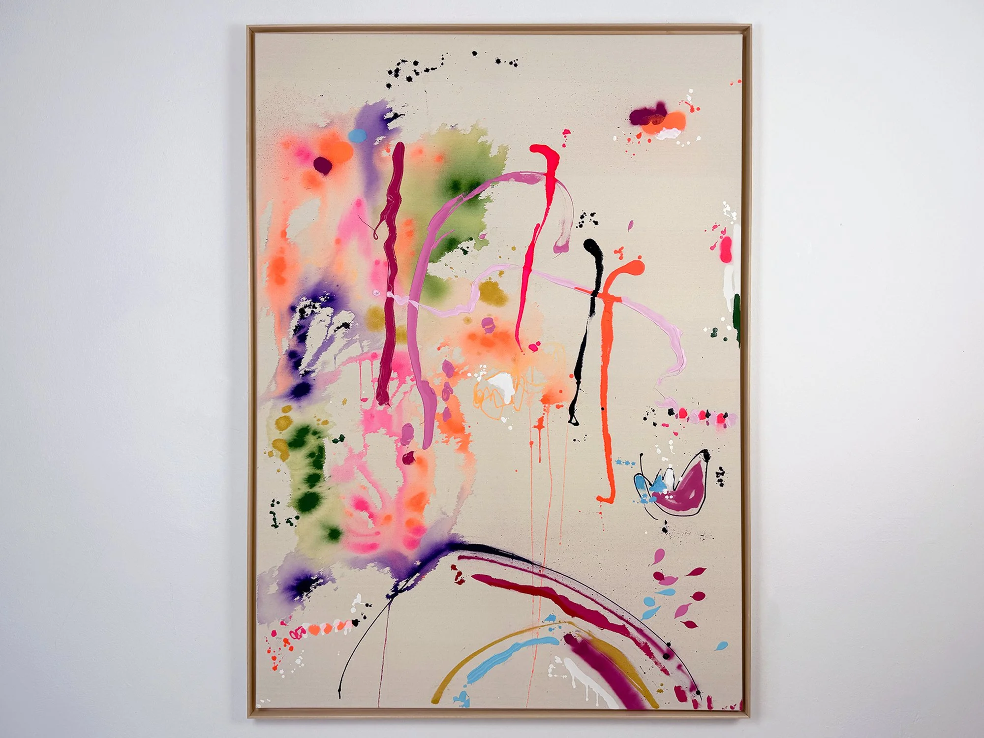
By Vera Klaus
100 × 100 cm, 2026
Mixed Media on canvas, framed
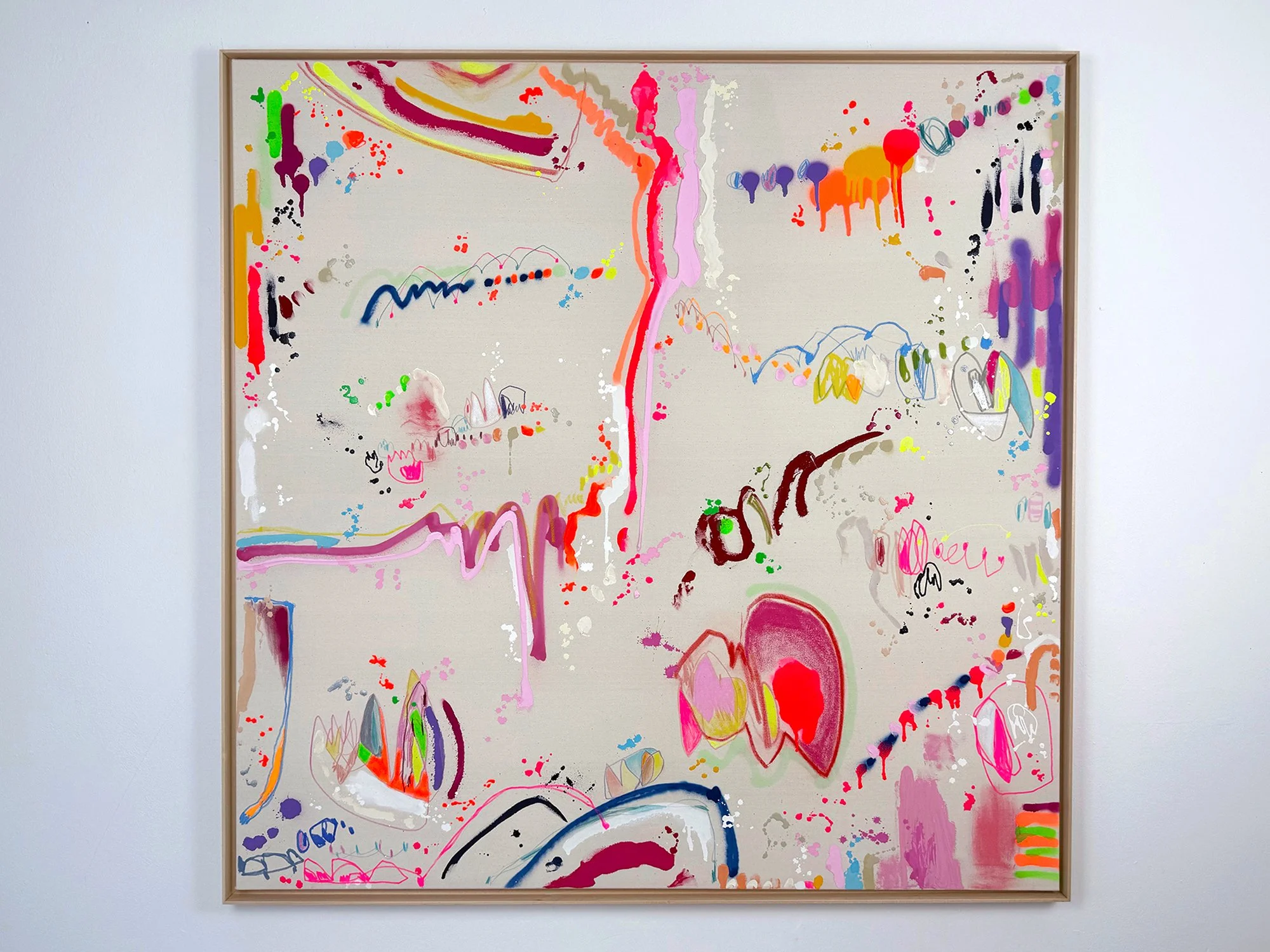
Auszeit (Time Out) is a mixed media painting by Vera Klaus in which vivid colour spreads across raw canvas through spontaneous gestures, drips and fluid paint stains. Bright tones of pink, yellow, orange and deep violet interact with delicate lines and splashes of pigment, creating a composition that feels both energetic and open.
The painting develops through movement rather than structure. Larger colour gestures dissolve into the surface while smaller marks and drawn elements appear between them, forming a lively rhythm across the canvas. Areas of exposed canvas remain visible, allowing the material qualities of the surface to play an important role.
The work carries a sense of pause within movement. Colour gathers and disperses across the canvas, creating a moment of lightness and reflection within the expressive flow of the composition.
Delivery within the Netherlands and Belgium is arranged in consultation, either in person or securely shipped.
By Vera Klaus
80 × 60 cm, 2026
Mixed Media on canvas, framed
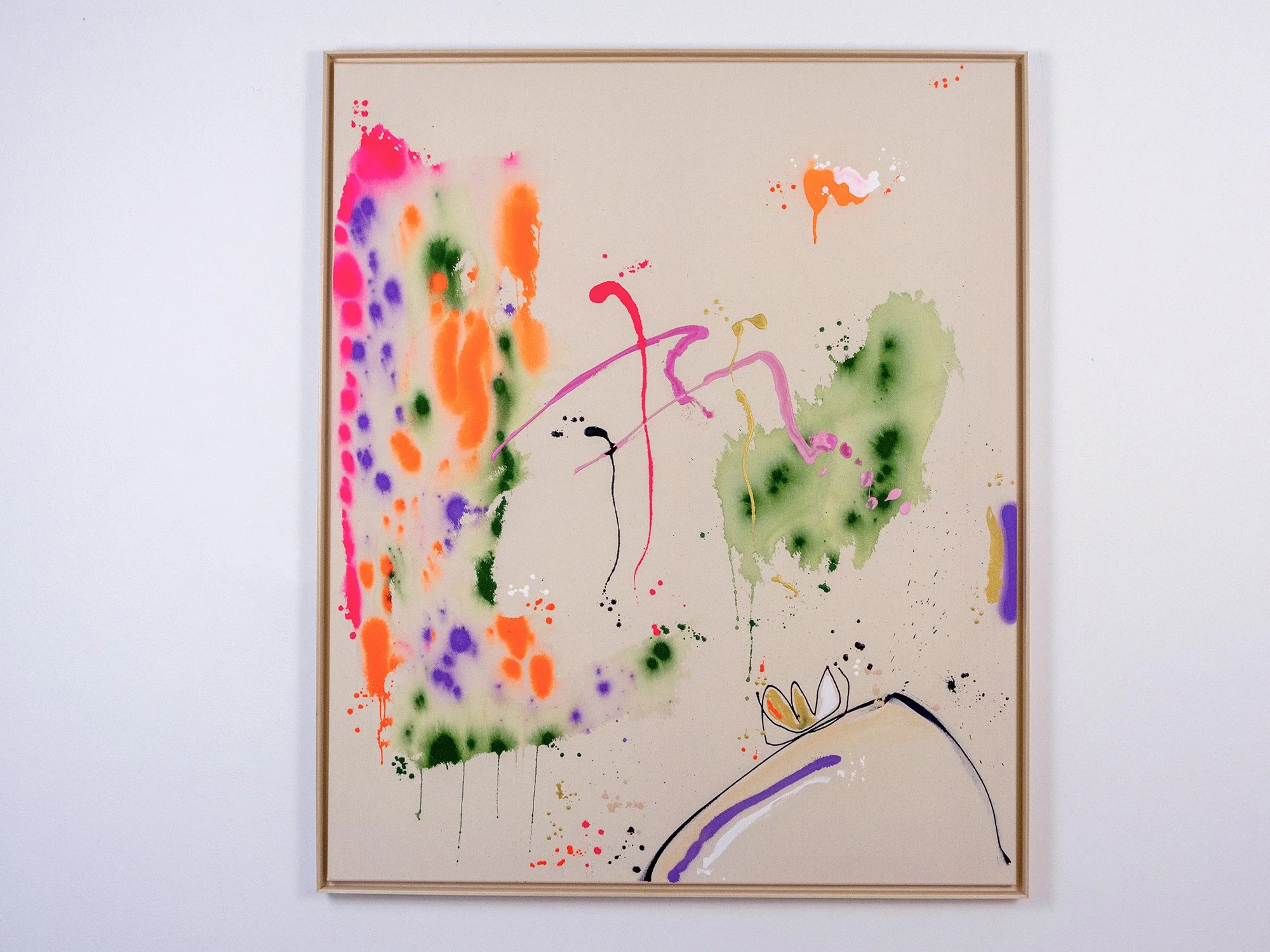
Gutes Gefühl (Good Feeling) is a mixed media painting by Vera Klaus in which colour spreads freely across raw canvas through drips, stains and quick gestural marks. Bright tones of neon pink, orange, yellow and deep green appear to surface organically, interacting with delicate lines and spontaneous splashes of pigment.
The composition unfolds through rhythm rather than structure. Larger colour fields dissolve into soft edges while smaller marks and drawn elements create a lively constellation across the surface. Areas of exposed canvas remain visible, allowing the natural texture of the material to play an active role in the painting.
The result is a work that feels energetic yet balanced, where colour moves lightly across the canvas and moments of intensity are offset by calm, open space. The painting captures the immediacy of the artist’s gesture and the intuitive process through which the composition emerged.
Delivery within the Netherlands and Belgium is arranged in consultation, either in person or securely shipped.
A mirror, but make it art
Someone searching for a mirror in the hallway came across a wall piece by Quinda Verheul. Her sculptural works in layered plexiglass reflect light and movement, and just enough of your own silhouette before leaving the house. Art and function met in one surprising gesture.
Quinda’s work explores transparency, layering, and reflection, often drawing inspiration from landscape and topography.
By Quinda Verheul
50 × 40, 2024
Rose and ochre concrete on rose mirror
Quinda Verheul immerses herself in the constantly changing landscapes and the influence that humans have on them. She is fascinated by natural forces like wind, water and sunlight, and often addresses grand topics like the exploitation of natural resources which alter the landscape. Yet, there are different aspects to the same topic which Quinda explores in different series. This is reflected in her use of raw, earthy materials such as sand and natural stone. Mirrors form a returning metaphorical element in her sculptures and installations which invite spectators to reflect on themselves while simultaneously exploring different perspectives. The results are unique aesthetic translations which are able to present new confrontational information within a certain comfort.
Delivery in the Netherlands and Belgium is complimentary and arranged with care, either in person or via secure shipment.
By Quinda Verheul
50 × 40, 2024
Sandblasting in rose mirror
“Noctilucent” by Quinda Verheul is a contemporary, minimalistic wall sculpture crafted through sandblasting techniques that modify the surface of a mirror. The sandblasting process disperses minuscule particles, transforming the reflective quality of the mirror into a misty, almost ephemeral surface. This altered state creates an atmosphere of quiet subtlety, inviting viewers to experience a sensory shift in perception.
The piece is inspired by natural phenomena that blend simplicity and splendor, a sunset in a mountainous desert where a lone cloud catches the light, glowing against a vast sky. “Noctilucent” distills this moment, drawing on the idea that through selective framing, even the most transient details of nature can evoke an artful composition. The artwork emphasizes how minimal visual cues can resonate deeply, echoing the interplay between the tangible and the abstract.
Delivery in the Netherlands and Belgium is complimentary and arranged with care, either in person or via secure shipment.
By Quinda Verheul
50 × 40, 2024
Sandblasting on blue mirror
“Noctilucent” by Quinda Verheul is a contemporary, minimalistic wall sculpture crafted through sandblasting techniques that modify the surface of a mirror. The sandblasting process disperses minuscule particles, transforming the reflective quality of the mirror into a misty, almost ephemeral surface. This altered state creates an atmosphere of quiet subtlety, inviting viewers to experience a sensory shift in perception.
This artwork from the Noctilucent series captures the quiet elegance of moonlight as it gently illuminates clouds against the dark sky. The minimalist approach emphasizes the subtle interaction between light and shadow, evoking a sense of tranquility and timelessness. The deep, rich tones and smooth surface invite viewers to reflect on the beauty of night skies and the elusive, fleeting nature of nocturnal light. This piece aims to create a serene and contemplative space, encouraging a moment of stillness and introspection.
Delivery in the Netherlands and Belgium is complimentary and arranged with care, either in person or via secure shipment.
By Quinda Verheul
60 × 30, 2024
Rose mirror and mixed concrete
This piece from Islands In The Sky by Quinda Verheul captures the essence of open landscapes, drawing color inspiration from the ochres and pinks of the Moroccan desert and mountains. The warm, earthy hues echo the vivid tones found in these rugged terrains, where the sun-bleached sands and weathered stones radiate life. Being in these vast, untamed spaces gives my mind room to wander, where thoughts drift like clouds across the horizon. The organic shapes and soft colors reflect moments spent outdoors, where I feel most connected to the earth and my own instincts, exposed yet entirely at peace. These works are a celebration of nature’s grounding warmth and the profound clarity it offers.
Delivery in the Netherlands and Belgium is complimentary and arranged with care, either in person or via secure shipment.
By Quinda Verheul
60 × 40, 2024
Rose mirror and mixed concrete
The Between the Desert and the Ocean series at Root Gallery delves into the balance between two vast, contrasting landscapes, capturing the essence of Morocco's Atlas Mountains. Using concrete mixed with magenta and ochre pigments, each piece is carefully layered on a rose-tinted oval mirror, achieving a tactile, almost geological quality that mirrors the rugged textures of desert and mountain. The mirror introduces an ethereal quality, reminiscent of the ocean’s expanse and its reflective depth. This fusion of raw concrete and delicate mirror creates a harmonious duality - where earthy tones meet fluid, reflective surfaces - inviting viewers to reflect on the connections between land and sea, solidity and fluidity. The Between the Desert and the Ocean series presents a unique, contemplative experience, blending landscape-inspired materials and textures with an elegant, modern twist.
Delivery in the Netherlands and Belgium is complimentary and arranged with care, either in person or via secure shipment.
By Quinda Verheul
100 x 75, 2024
Blue coloured mirror and concrete
From the series Celestial Mountains
Inspired by her journey to Kyrgyzstan, and her experience of the enigmatic landscapes, Quinda Verheul unveils a poetic odyssey through Kok-Ayryk; named after the 3883 metres mountain pass in the Tian Shan mountains. Memories of day and night are combined in pink and blue mirrors, with the concrete lines becoming silhouettes of the mountainous terrain, forming a ballet of reflections that can only be experienced when viewing the work in real life. Concrete edges embody the struggle against the mountain's stoic surface, a testament to the complexities of nature, and the challenging journey in the thin air.
Kok-Ayryk embodies her journey through the mountains; a crisp road tracing a wild river, where clouds converge and drizzle adorns reflections. Landslides and the endless stream of rocks that cover the path form fascinating landscapes, with red and pink stones taking centre stage. As the series unfolds, clouds part, revealing a cerulean sky. The mirrors turn into a mountainous backdrop, capturing the red mountains and glaciers. As the sun sets, the sky darkens, captured in the deep blue of night.
Delivery in the Netherlands and Belgium is complimentary and arranged with care, either in person or via secure shipment.
By Quinda Verheul
100 x 75, 2024
Blue coloured mirror and concrete
From the series Celestial Mountains
Inspired by her journey to Kyrgyzstan, and her experience of the enigmatic landscapes, Quinda Verheul unveils a poetic odyssey through Kok-Ayryk; named after the 3883 metres mountain pass in the Tian Shan mountains. Memories of day and night are combined in pink and blue mirrors, with the concrete lines becoming silhouettes of the mountainous terrain, forming a ballet of reflections that can only be experienced when viewing the work in real life. Concrete edges embody the struggle against the mountain's stoic surface, a testament to the complexities of nature, and the challenging journey in the thin air.
Kok-Ayryk embodies her journey through the mountains; a crisp road tracing a wild river, where clouds converge and drizzle adorns reflections. Landslides and the endless stream of rocks that cover the path form fascinating landscapes, with red and pink stones taking centre stage. As the series unfolds, clouds part, revealing a cerulean sky. The mirrors turn into a mountainous backdrop, capturing the red mountains and glaciers. As the sun sets, the sky darkens, captured in the deep blue of night.
Delivery in the Netherlands and Belgium is complimentary and arranged with care, either in person or via secure shipment.
By Quinda Verheul
100 x 75, 2024
Rose mirror and mixed concrete
This work by Quinda Verheul results from her experiences in Kyrgyzstan where she rode the Tian Shan mountains for 1900 kilometers. Tian Shan is a large system of mountains in Central Asia that can be translated to Celestial Mountains. Being in the midst of the landscape, experiencing the mountains, the different weather conditions, the site at night and seeing celestial bodies shine, enhances her fascination for the landscape. Immersing herself in the natural environment is essential to her being and inextricably reflected in her practice.
Delivery in the Netherlands and Belgium is complimentary and arranged with care, either in person or via secure shipment.
By Quinda Verheul
100 x 75, 2024
Blue coloured mirror and concrete
From the series Celestial Mountains
Inspired by her journey to Kyrgyzstan, and her experience of the enigmatic landscapes, Quinda Verheul unveils a poetic odyssey through Kok-Ayryk; named after the 3883 metres mountain pass in the Tian Shan mountains. Memories of day and night are combined in pink and blue mirrors, with the concrete lines becoming silhouettes of the mountainous terrain, forming a ballet of reflections that can only be experienced when viewing the work in real life. Concrete edges embody the struggle against the mountain's stoic surface, a testament to the complexities of nature, and the challenging journey in the thin air.
Kok-Ayryk embodies her journey through the mountains; a crisp road tracing a wild river, where clouds converge and drizzle adorns reflections. Landslides and the endless stream of rocks that cover the path form fascinating landscapes, with red and pink stones taking centre stage. As the series unfolds, clouds part, revealing a cerulean sky. The mirrors turn into a mountainous backdrop, capturing the red mountains and glaciers. As the sun sets, the sky darkens, captured in the deep blue of night.
Delivery in the Netherlands and Belgium is complimentary and arranged with care, either in person or via secure shipment.
Art to celebrate a union
This year alone, multiple couples chose a painting by Donald Schenkel as a wedding gift, or received one. Donald’s atmospheric compositions, often tied to shared memories of travel or landscape, make his work a poetic way to mark new chapters.
Donald creates meditative, abstract paintings rooted in colour theory, memory, and spatial rhythm.
By Donald Schenkel
Oil on canvas
70 × 80 cm, 2026
Wooden frame included
No Clear Skies Ahead by Donald Schenkel is built from a concentrated blue field that shifts in density and depth. Vertical traces appear and dissolve within the surface, suggesting movement without fixed direction. The work holds a quiet tension between stillness and disruption, shaped through a controlled yet irreversible process.
Delivery within the Netherlands and Belgium is arranged in consultation, either in person or securely shipped.
By Donald Schenkel
Oil on canvas
120 × 110 cm, 2026
Wooden frame included
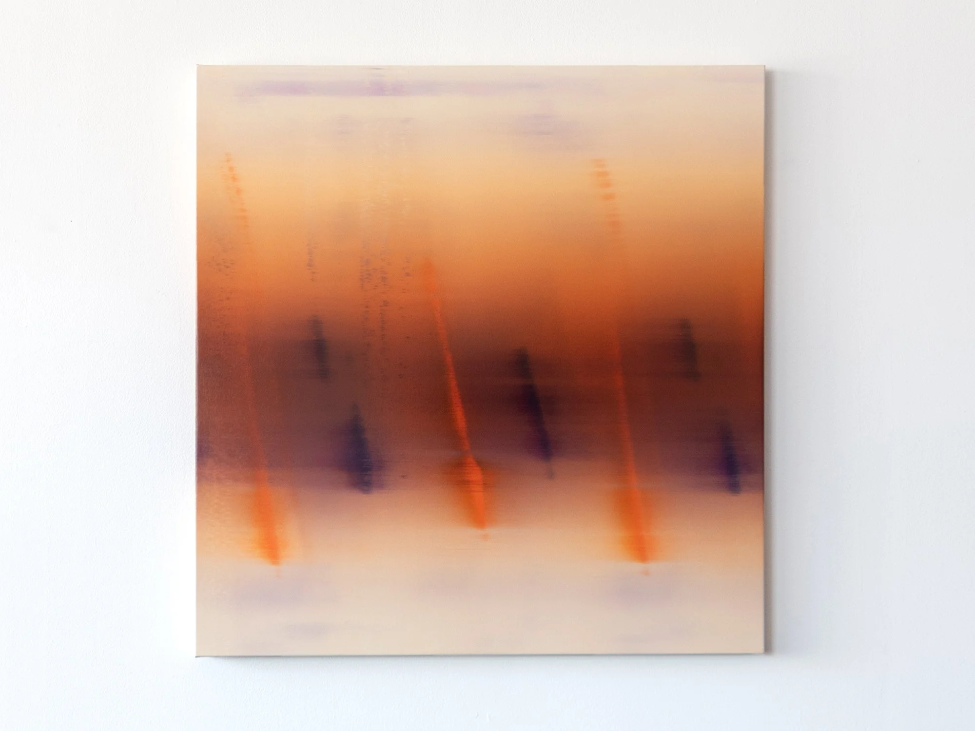
Troika’s Dusk by Donald Schenkel is structured through a sequence of vertical forms emerging from a warm spectrum of red, orange and violet. The surface appears to shift between density and transparency, with colour moving across the canvas in a single, continuous layer. The composition suggests rhythm and repetition, without settling into a fixed structure.
Delivery within the Netherlands and Belgium is arranged in consultation, either in person or securely shipped.
By Donald Schenkel
Oil on canvas
70 × 68 cm, 2026
Wooden frame included
No Clear Skies Ahead by Donald Schenkel is built from a concentrated blue field that shifts in density and depth. Vertical traces appear and dissolve within the surface, suggesting movement without fixed direction. The work holds a quiet tension between stillness and disruption, shaped through a controlled yet irreversible process.
Delivery within the Netherlands and Belgium is arranged in consultation, either in person or securely shipped.
By Donald Schenkel
Oil on canvas
140 × 80 cm, 2026
Wooden frame included
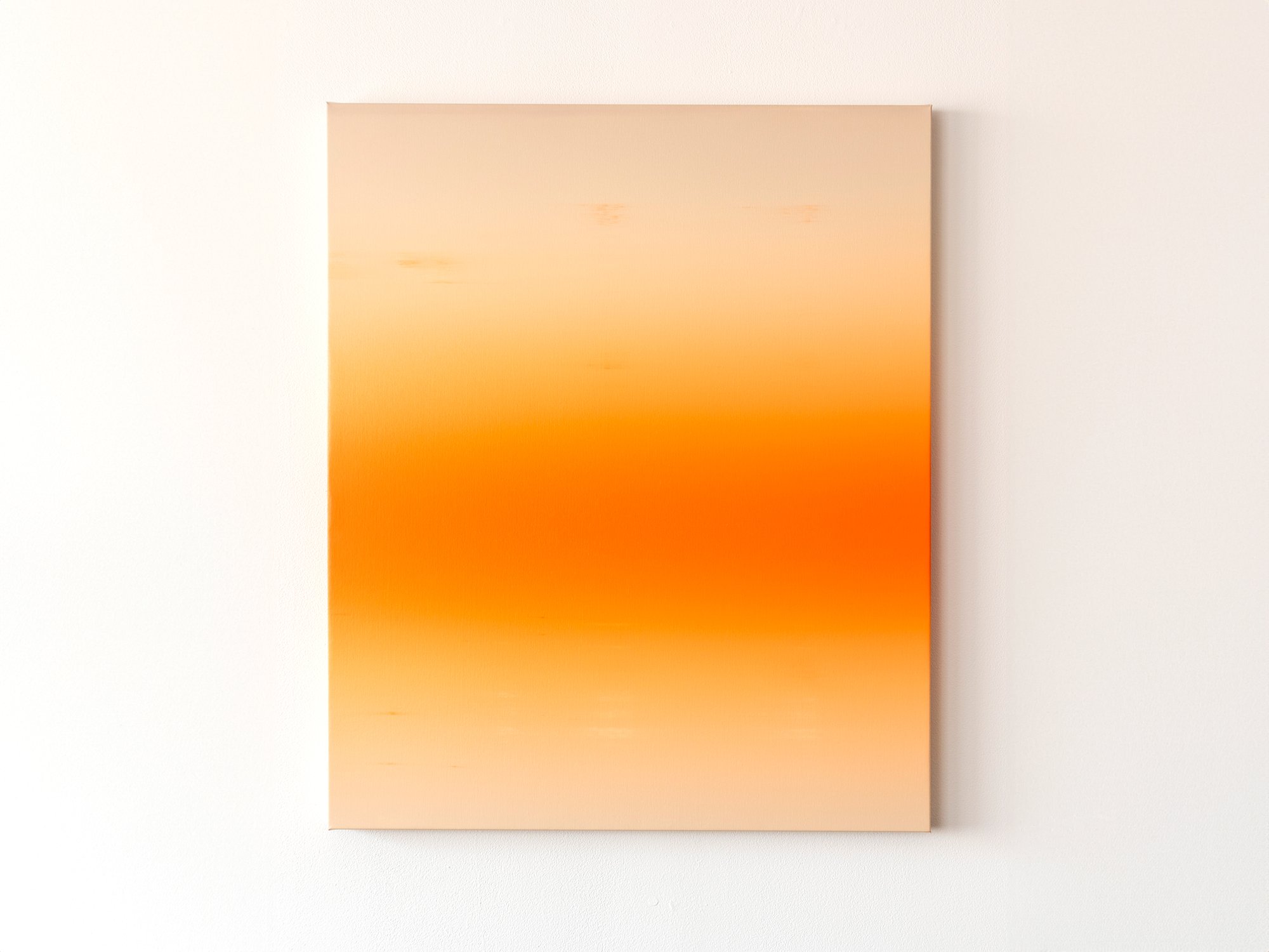
Lucid Line by Donald Schenkel unfolds through a gradual shift from warm to cool tones, where colour moves from yellow and pink into blue. A single vertical line interrupts the surface, creating a sense of alignment and tension. The painting balances clarity and instability, with each transition revealing the immediacy of a single-layer process.
Delivery within the Netherlands and Belgium is arranged in consultation, either in person or securely shipped.
By Donald Schenkel
Oil on canvas
130 × 80 cm, 2025
Wooden frame included
In Unexpected Visitor, Donald Schenkel explores the presence of something unfamiliar entering a space without announcement.
The painting unfolds through layered gradients of oil paint, applied wet-in-wet in a single, continuous process. From a distance, the surface appears smooth and atmospheric; up close, the texture of the canvas and the movement of the paint become visible.
Vertical traces rise through the composition, subtly interrupting the horizontal flow of colour. Rather than disrupting the image entirely, they introduce a sense of passage, as if something has moved through the space and left a temporary imprint.
The title suggests a quiet encounter rather than a disruption. In Schenkel’s practice, unpredictability is part of the process: colours interact, shift, and assert themselves beyond full control.
Unexpected Visitor reflects on transience, attention, and the way brief presences - in life as well as in material - can alter perception without fully revealing themselves.
Delivery within the Netherlands and Belgium is arranged in consultation, either in person or securely shipped.
By Donald Schenkel
Oil on canvas
130 × 80 cm, 2025
Wooden frame included
In Unexpected Guest, Donald Schenkel explores the moment when an unforeseen presence enters an otherwise balanced system.
The painting unfolds through soft gradients of colour, created wet-in-wet in a single movement. From a distance, the surface appears smooth and almost immaterial; up close, the texture of the canvas and the physicality of oil paint become visible.
Subtle vertical shifts interrupt the horizontal flow of colour, introducing a quiet disturbance that alters the rhythm of the composition. What initially reads as calm and expansive gradually reveals a sense of ambiguity.
The title refers both to lived experience and to Schenkel’s painting process, in which chance plays an active role. Certain colours emerge unexpectedly, reshaping the work as it develops.
Unexpected Guest reflects on hospitality, vulnerability, and the way unforeseen encounters - in life and in material - can leave a lasting trace.
Delivery within the Netherlands and Belgium is arranged in consultation, either in person or securely shipped.
By Donald Schenkel
Oil on paper
57 × 43 cm, 2025
Wooden frame included
“Last Shimmer” belongs to Donald Schenkel’s new Real World Renders series, created for Root Gallery’s 2025 programme.
Through this body of work, Schenkel continues his exploration of how light, colour, and material interact to shape perception. Painted in a single wet-in-wet layer, each work demands complete control and acceptance of unpredictability, gradients merge, pigments shift, and no correction is possible.
On paper, the delicacy of oil paint becomes even more pronounced. Subtle transitions unfold across the surface, suggesting a digital glow that remains grounded in pure material presence.
Framed in walnut, Last Shimmer evokes both warmth and contemplation, the final glimmer of daylight, suspended between certainty and change.
Delivery within the Netherlands and Belgium is arranged in consultation, either in person or securely shipped.
By Donald Schenkel
70 x 50 cm, 2024
Oil paint on synthetic canvas
Donald Schenkel's latest series explores the idea of paintings as screens, inspired by the seemingly digital character of the gradients. By suspending the works from the wall, they evoke the feel of computer screens. He draws on the historical shift in art from symbolic and spiritual meanings to alternate realities, which evolved further with the introduction of cinema, and digital screens.
As we grow up with digital screens, images are increasingly seen as generated, rather than physical objects. Schenkel questions if the same becomes true for paintings.Will future generations understand a painting as more than a screen-like image? His use of materials like thin sheets of paper highlights this tension, as what appears digital is, in fact, created using techniques that stem back from the early Renaissance.The perception of reality and the interpretation of the painting is changed by the material aspects of the object itself and how we view them in today’s day and age.
Delivery within the Netherlands and Belgium is arranged in consultation, either in person or securely shipped.
By Donald Schenkel
84 x 70 cm, 2024
Oil paint on synthetic canvas on aluminium frame
Donald Schenkel has recently developed a unique, brushless approach that infuses the canvas with dynamic energy and expressive movement. The innovative technique highlights his ability to explore the intrinsic and materialistic qualities of pigments and colors, creating vivid impressions of translucency and reflection. This panel’s vibrant, loose strokes invite viewers into a world of endless space and light, evoking a sense of vitality and spontaneity.
Delivery within the Netherlands and Belgium is arranged in consultation, either in person or securely shipped.
By Donald Schenkel
84 x 70 cm, 2024
Oil paint on synthetic canvas on aluminium frame
Donald Schenkel has recently developed a unique, brushless approach that infuses the canvas with dynamic energy and expressive movement. The innovative technique highlights his ability to explore the intrinsic and materialistic qualities of pigments and colors, creating vivid impressions of translucency and reflection. This panel’s vibrant, loose strokes invite viewers into a world of endless space and light, evoking a sense of vitality and spontaneity.
Delivery within the Netherlands and Belgium is arranged in consultation, either in person or securely shipped.
By Donald Schenkel
80 x 75 cm each, 2024
Oil paint on synthetic canvas
Explore Donald Schenkel’s latest diptych at Root Gallery, where he merges innovation with tradition in a stunning display of oil painting mastery. The left panel introduces Schenkel’s new, dynamic painting technique, marked by expressive shapes that infuse the canvas with energy and movement. In contrast, the right panel showcases his expertise in traditional color gradients, blending warm purples and oranges to create a serene ambiance of depth and rhythm.
Schenkel’s meticulous use of oil paint reveals a profound dialogue with materials, highlighting the inherent qualities of pigments and colors. Shadows and reflections across the canvas evoke a sense of translucency and endless space, inviting viewers into moments of contemplation and wonder. Don’t miss the opportunity to experience this masterpiece firsthand at Root Gallery. Contact us today for more information and to schedule your visit.
Delivery within the Netherlands and Belgium is arranged in consultation, either in person or securely shipped.
By Donald Schenkel
57 x 32 cm, 2023
Oil paint on paper with walnut frame
Opposite to the expanse of lightness, there is the depth expressed by shadows. The series Archaic Shadows is grounded in this depth, found in gradients where lighter colours dissolve into darkening twilights. For Donald Schenkel, the book ‘In Praise of Shadows’ points out the beauty of what we would consider darkness, and that befits the sensibility of these artworks. Shadows linger on the edge of the unknown, mystical and dark.The works part of this series sparked his attention to the object, the artefact and the archaic. This sensation of the ancient and otherworldly fits Donald’s idea of a silent wonder well. Yet, it contains a potency to be further explored.
Delivery within the Netherlands and Belgium is arranged in consultation, either in person or securely shipped.
By Donald Schenkel
74 x 60 cm, 2023
Oil paint on linen, with walnut wood
These paintings by Donald Schenkel are a result of his continuing research into the approach of paintings as objects, and the combination of oil paint with other materials. There is something compelling in turning the organic look of wood into a polished, almost industrial surface. By combining his signature gradients with wood, Donald deepens his exploration of abstract shapes, a recurring element in his practice.
Working with these materials interrupts the illusion of the gradient as endless depth. The grain of the wood flows along the surface and seems to suggest a certain direction, much like the gradients imply movement in the transitioning colours.
Delivery within the Netherlands and Belgium is arranged in consultation, either in person or securely shipped.
By Donald Schenkel
74 x 60 cm, 2023
Oil paint on linen, with walnut wood
These paintings by Donald Schenkel are a result of his continuing research into the approach of paintings as objects, and the combination of oil paint with other materials. There is something compelling in turning the organic look of wood into a polished, almost industrial surface. By combining his signature gradients with wood, Donald deepens his exploration of abstract shapes, a recurring element in his practice.
Working with these materials interrupts the illusion of the gradient as endless depth. The grain of the wood flows along the surface and seems to suggest a certain direction, much like the gradients imply movement in the transitioning colours.
Delivery within the Netherlands and Belgium is arranged in consultation, either in person or securely shipped.
A farewell gift
When a beloved colleague left a company, a group of coworkers gifted her a painting by Karen van de Vliet. A small, vivid work that offered both warmth and presence. It felt personal, lasting, and struck a balance between energy and quietude in her next chapter.
Karen van de Vliet’s artistic practice is centred around the beauty of imperfection. Her sculptural paintings - often inspired by weathered surfaces, water, and chance gestures - explore texture, rhythm, and colour.
By Karen van der Vliet
23 × 18 cm, 2026
Mixed acrylic paint on cotton, framed
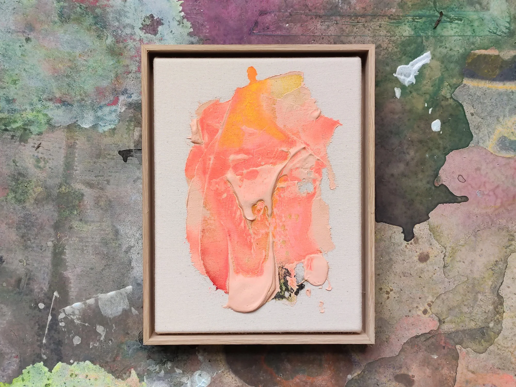
In the Bubblegum series, Karen van de Vliet explores the physical boundaries of painting. Her work moves beyond the flat surface, developing into a relief-like terrain where thick paint accumulates and expands into an almost sculptural form.
Working with a dense and viscous medium, she builds layered structures that suggest organic formations or microscopic landscapes. The compositions remain abstract, yet distinctly physical: the gesture is embedded in the surface, and movement and pressure remain visible.
Colour plays a defining role in this series. In Bubblegum, Van de Vliet uses bold and luminous tones that contrast with the weight and density of the material. This tension between playful colour and physical intensity gives the work its character.
These paintings approach abstraction as a material process, where paint itself becomes the central subject rather than merely a carrier of colour.
This work will be shipped within the Netherlands and Belgium at no additional cost, securely and with tracking.
By Karen van der Vliet
23 × 18 cm, 2026
Mixed acrylic paint on cotton, framed
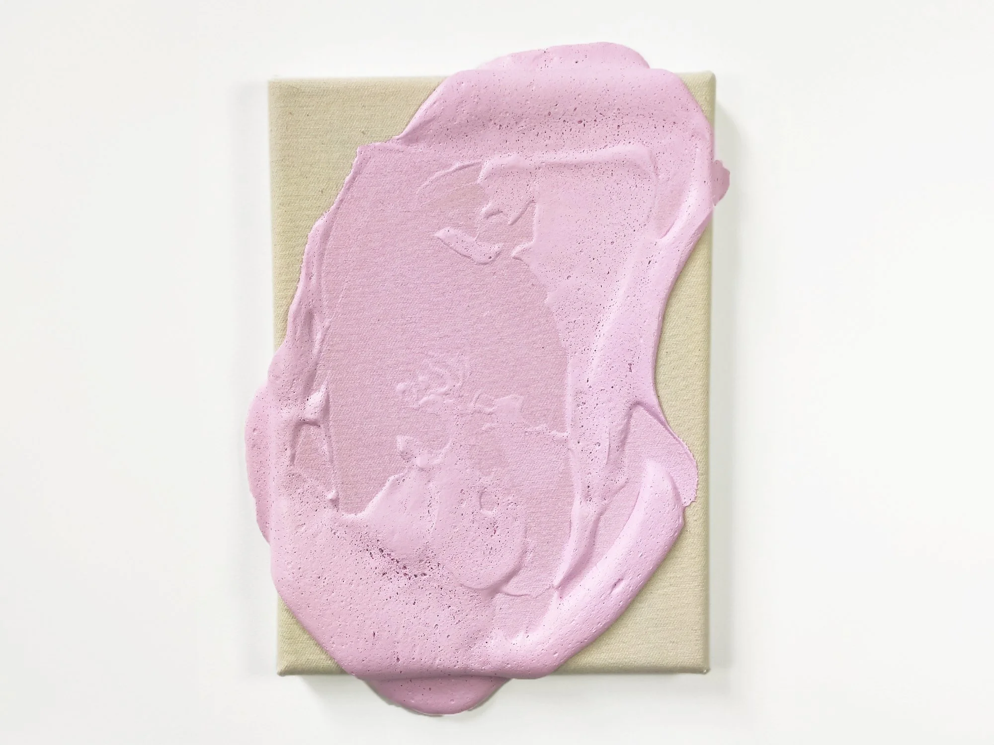
In the Bubblegum series, Karen van de Vliet explores the physical boundaries of painting. Her work moves beyond the flat surface, developing into a relief-like terrain where thick pink paint accumulates and expands into an almost sculptural form.
Working with a dense and viscous medium, she builds layered structures that suggest organic formations or microscopic landscapes. The compositions remain abstract, yet distinctly physical: the gesture is embedded in the surface, and movement and pressure remain visible.
Colour plays a defining role in this series. In Bubblegum, Van de Vliet uses bold and luminous tones that contrast with the weight and density of the material. This tension between playful colour and physical intensity gives the work its character.
These paintings approach abstraction as a material process, where paint itself becomes the central subject rather than merely a carrier of colour.
This work will be shipped within the Netherlands and Belgium at no additional cost, securely and with tracking.
Starting small (but intentionally)
One collector came to Root Gallery looking for something modest, a starting point for a wall of small works. She chose a piece by Saïd Kinos, whose layered compositions in text and colour opened the door for further collecting, one careful step at a time.
Saïd's work merges language and abstraction, exploring rhythm, urban aesthetics, and visual culture.
By Saïd Kinos
40 × 30 cm excl frame, 2025
Pencil on paper, framed with museum glass
In Note to Self, Saïd Kinos takes a more introspective approach. This series is built around personal notes he has written over the past months, fragments of thought, reminders, and observations that serve as a guide in his own life. By translating these notes into works on paper, he bridges the gap between internal reflection and external expression.
Each piece in the series shares the same format, reinforcing a sense of continuity while allowing for variation in texture, colour, and form. Drawings, paintings, watercolours, and collages come together in a modular arrangement that speaks to the fluidity of language and meaning. Note to Self marks the beginning of a new body of work, Between Being and Becoming, where Saïd shifts from broader conceptual themes to a more personal and direct narrative.
Delivery in the Netherlands and Belgium is included.
By Saïd Kinos
40 × 30 cm excl frame, 2025
Collage on paper, framed with museum glass
In Note to Self, Saïd Kinos takes a more introspective approach. This series is built around personal notes he has written over the past months, fragments of thought, reminders, and observations that serve as a guide in his own life. By translating these notes into works on paper, he bridges the gap between internal reflection and external expression.
Each piece in the series shares the same format, reinforcing a sense of continuity while allowing for variation in texture, colour, and form. Drawings, paintings, watercolours, and collages come together in a modular arrangement that speaks to the fluidity of language and meaning. Note to Self marks the beginning of a new body of work, Between Being and Becoming, where Saïd shifts from broader conceptual themes to a more personal and direct narrative.
Delivery in the Netherlands and Belgium is included.
By Saïd Kinos
40 × 30 cm excl frame, 2025
Collage on paper, framed with museum glass
In Note to Self, Saïd Kinos takes a more introspective approach. This series is built around personal notes he has written over the past months, fragments of thought, reminders, and observations that serve as a guide in his own life. By translating these notes into works on paper, he bridges the gap between internal reflection and external expression.
Each piece in the series shares the same format, reinforcing a sense of continuity while allowing for variation in texture, colour, and form. Drawings, paintings, watercolours, and collages come together in a modular arrangement that speaks to the fluidity of language and meaning. Note to Self marks the beginning of a new body of work, Between Being and Becoming, where Saïd shifts from broader conceptual themes to a more personal and direct narrative.
Delivery in the Netherlands and Belgium is included.
Art in the boardroom
A beautiful hotel recently installed two works by Vera Klaus in their meeting room. Her balance of abstraction and warmth created a space that felt less formal, more welcoming, while still maintaining a sense of energy and focus.
Vera Klaus’s work resonates with viewers through its use of uplifting colours, layered textures, and intuitive mark-making. She captures feelings of spontaneity and joy, turning simple impressions into radiant visual experiences.
By Vera Klaus
150 × 120 cm, 2025
Mixed media on cotton, framed
Vera Klaus creates vibrant and dynamic compositions using diverse materials, including spray paint, acrylic, and chalk. Inspired by music, she channels its flow to evoke joy and positive emotions, seamlessly translating her happiness into her art. Through evocative titles, she enhances the uplifting energy of her works, inviting viewers to share in her inspiration. Everyday moments - like sunlight on your skin, blooming fields, or warm encounters - fuel her creativity, grounding her art in the beauty of the present. Each painting becomes a tangible expression of these fleeting yet profound experiences, radiating a sense of connection and vitality.
Personal delivery and installation within the Netherlands and Belgium are included with this work.
Why not both?
A couple stood in front of two works by Lisette Schumacher, hesitating between them. The mood, the colour, the scale, both felt just right. In the end, they bought both. Some decisions don’t need to be made.
Lisette's paintings often draw from modern architecture, translating spatial harmony and sunlight into colour and form.
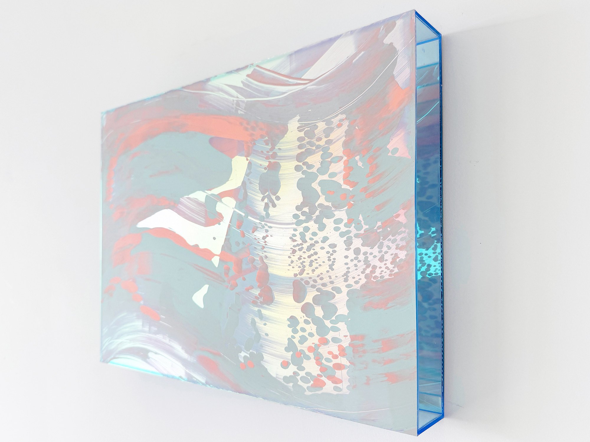
By Lisette Schumacher
30 × 25 x 6 cm, 2026
Mixed media
From the series Coachella views
Coachella Views XVIII brings together peach, coral and lavender in a light, open composition. The colours follow a flowing diagonal movement, leading towards a pale golden area on the right. Smaller lilac and coral forms gather around this opening, creating a point of focus within the otherwise expansive arrangement.
Lisette Schumacher based the series on the fleeting colour shifts she observed while travelling through Palm Springs and the surrounding desert cities. In this work, that experience is expressed with particular softness. Warm and cool tones move easily alongside one another, giving the artwork an elegant balance. Its intimate scale allows the nuances of the composition to be experienced from close range.
This work will be shipped within the Netherlands and Belgium at no additional cost, securely and with tracking.
By Lisette Schumacher
30 × 25 x 6 cm, 2026
Mixed media
From the series Coachella views
Lisette Schumacher explores the expressive range of a concentrated palette in Coachella Views XVI. Saturated magenta moves through translucent lilac, surrounding a pale central form that seems to open up within the composition. Along the right edge, a finely broken pattern adds texture and counters the larger, flowing movements.
Although nearly monochromatic at first glance, the work contains subtle differences in tone, density and reflection. These variations become more apparent over time, giving the composition a changing presence without losing its clarity. Coachella Views XVI is an assured choice for collectors drawn to colour-led abstraction and works that combine immediate impact with visual depth.
This work will be shipped within the Netherlands and Belgium at no additional cost, securely and with tracking.
By Lisette Schumacher
30 × 25 x 6 cm, 2026
Mixed media
From the series Coachella views
In Coachella Views XV, Lisette Schumacher condenses the atmosphere of the desert into an intimate composition. Vivid pink forms move across a pale lilac ground, interspersed with softly reflective areas and a dense pattern that gathers along the right edge. The contrast between broad gestures and precise details gives the small work an unexpectedly strong presence.
Inspired by the changing colours Schumacher observed while travelling through the Coachella Valley, the artwork captures a brief visual impression rather than a fixed landscape. Its compact format makes it particularly suited to a carefully chosen position or to an existing group of artworks, while the saturated colour allows it to hold its own within a larger space.
This work will be shipped within the Netherlands and Belgium at no additional cost, securely and with tracking.
By Lisette Schumacher
30 × 25 x 6 cm, 2026
Mixed media
From the series Coachella views
The desert landscapes surrounding Palm Springs are known for their clarity of light and wide horizons. During her visits to the Coachella Valley, Lisette Schumacher experienced how dramatically the atmosphere can shift throughout the day.
Bright sunlight, wind and the vast openness of the desert create a landscape in constant transformation. Colours appear to intensify, fade and re-emerge as the sun moves across the valley.
Schumacher approaches these observations through an intuitive process in which colour and gesture develop gradually across the surface. Soft layers of pink, orange and yellow pigments move across the painting like shifting light fields, occasionally interrupted by reflective passages that recall flashes of sun across the desert terrain.
The composition reflects Lisette Schumacher’s ongoing interest in how landscape, architecture and atmosphere influence the perception of colour. Rather than presenting a fixed view of the desert, the work captures the sensation of light moving through space.
This work will be shipped within the Netherlands and Belgium at no additional cost, securely and with tracking.
By Lisette Schumacher
30 × 25 x 6 cm, 2026
Mixed media
From the series Coachella views
Coachella Views IV is part of a series of paintings by Lisette Schumacher inspired by her travels through Palm Springs and the Coachella Valley in California. During visits to historic mid-century modern houses in the desert landscape, Schumacher became increasingly aware of the shifting colours and atmosphere created by the intense desert light.
The composition reflects these observations through layered colour fields in soft pink, peach, lavender and pale blue. Fluid gestures move across the surface like changing light conditions in the desert, where colours slowly transform throughout the day.
Rather than depicting a specific landscape, the painting translates the experience of desert light and atmosphere into a quiet abstract composition. Subtle transitions in colour create a sense of movement and openness, echoing the expansive character of the desert environment.
This work will be shipped within the Netherlands and Belgium at no additional cost, securely and with tracking.
By Lisette Schumacher
30 × 20 × 2 cm, 2025
Mixed media
From the series Dawn
In Dawn, Lisette Schumacher continues her exploration of light and perception. Each work captures the fleeting transitions between night and day, where colour and reflection seem to shift with every glance. The soft gradients and translucent layers evoke a sense of calm and movement at once, an abstract translation of the changing light that defines the early hours.
This work will be shipped within the Netherlands and Belgium at no additional cost, securely and with tracking.
By Lisette Schumacher
30 × 20 × 2 cm, 2025
Mixed media
From the series Dawn
In Dawn, Lisette Schumacher continues her exploration of light and perception. Each work captures the fleeting transitions between night and day, where colour and reflection seem to shift with every glance. The soft gradients and translucent layers evoke a sense of calm and movement at once, an abstract translation of the changing light that defines the early hours.
This work will be shipped within the Netherlands and Belgium at no additional cost, securely and with tracking.
By Lisette Schumacher
30 × 20 × 2 cm, 2025
Mixed media
From the series Dawn
In Dawn, Lisette Schumacher continues her exploration of light and perception. Each work captures the fleeting transitions between night and day, where colour and reflection seem to shift with every glance. The soft gradients and translucent layers evoke a sense of calm and movement at once, an abstract translation of the changing light that defines the early hours.
This work will be shipped within the Netherlands and Belgium at no additional cost, securely and with tracking.
By Lisette Schumacher
30 × 20 × 2 cm, 2025
Mixed media
From the series Dawn
In Dawn, Lisette Schumacher continues her exploration of light and perception. Each work captures the fleeting transitions between night and day, where colour and reflection seem to shift with every glance. The soft gradients and translucent layers evoke a sense of calm and movement at once, an abstract translation of the changing light that defines the early hours.
This work will be shipped within the Netherlands and Belgium at no additional cost, securely and with tracking.
By Lisette Schumacher
30 × 20 × 2 cm, 2025
Mixed media
From the series Dawn
In Dawn, Lisette Schumacher continues her exploration of light and perception. Each work captures the fleeting transitions between night and day, where colour and reflection seem to shift with every glance. The soft gradients and translucent layers evoke a sense of calm and movement at once, an abstract translation of the changing light that defines the early hours.
This work will be shipped within the Netherlands and Belgium at no additional cost, securely and with tracking.
By Lisette Schumacher
30 × 20 × 2 cm, 2025
Mixed media
From the series Dawn
In Dawn, Lisette Schumacher continues her exploration of light and perception. Each work captures the fleeting transitions between night and day, where colour and reflection seem to shift with every glance. The soft gradients and translucent layers evoke a sense of calm and movement at once, an abstract translation of the changing light that defines the early hours.
This work will be shipped within the Netherlands and Belgium at no additional cost, securely and with tracking.
By Lisette Schumacher
30 × 40 × 5 cm, 2025
Mixed media
From the series Sunrise at Griffith
In Sunrise at Griffith, Lisette Schumacher captures the quiet beauty of early mornings in Los Angeles. Inspired by the light surrounding Griffith Observatory, this series features soft compositions in pale pinks, yellows, and muted blues. The works invite viewers to pause and experience a fleeting moment of calm – a gentle beginning to a city that rarely rests.
This work will be shipped within the Netherlands and Belgium at no additional cost, securely and with tracking.
Curious to explore more?
Browse available works online or visit the gallery. We’re here to help you find a piece that fits your story, and stays with you.
Whether you're looking for a thoughtful gift, a bold statement, or something that simply makes you feel more at home, Root Gallery offers contemporary artworks with lasting meaning.
From colourful abstractions to sculptural wall pieces, our artists bring something personal to every space.
We believe art should be felt before it’s analysed, and we’re here to help you find what resonates.
By Vera Klaus
120 × 120 cm, 2026
Mixed Media on canvas, framed
Großes Abenteuer (Great Adventure) is a large-scale mixed media painting by Vera Klaus in which vibrant colour spreads across raw canvas through energetic splashes, stains and gestural marks. Bright pink, yellow, green and violet pigments appear to move freely across the surface, interacting with spontaneous lines and scattered paint droplets.
The composition develops through an intuitive process in which movement and rhythm guide the placement of colour. Areas of exposed canvas create breathing space between the expressive gestures, allowing the material qualities of the surface to remain visible.
The result is a dynamic painting in which colour appears to travel across the canvas, creating a sense of exploration and discovery within the expressive flow of the work.
Delivery within the Netherlands and Belgium is arranged in consultation, either in person or securely shipped.