
Private viewings
An artwork caught your eye? Come and see it in person.
Root Gallery is a contemporary art gallery in Krimpen aan de Lek, near Rotterdam. Visit us on Fridays and Saturdays between 13:00 and 17:00, or make an appointment at a time that suits you.
You are welcome to walk in during opening hours. If you are coming to see a particular artwork, let us know beforehand so we can check that it is here for you to view. Our exhibitions change throughout the year, and some available works are with the artist or being shown elsewhere.
We show contemporary paintings, sculptures, photography and mixed-media works by artists including Donald Schenkel, Lisette Schumacher, Karen van de Vliet, Vera Klaus, Jeske Haak, Madelon Uljee, Sophie de Vos, Jan Theun van Rees and Saïd Kinos.
Seeing an artwork in person gives you a better sense of its colour, texture and presence. Take your time, look closely and ask us about the work and the artist. You do not need to have decided whether to buy it before you visit.


Book a private viewing
Cannot make our regular opening hours, or would you like some time to explore particular works? Book a private viewing at Root Gallery.
If you are considering buying art, we can also bring together a small selection based on the artists or works you like and your budget. Whether it is your first purchase or an addition to your collection, we are happy to help you find a work you want to live with.
Tell us which artwork or artist you would like to see and when you would like to visit. We will check availability and confirm your appointment.
Buying art remotely
If you are considering an artwork at Root Gallery but cannot visit, we can provide additional photographs, close-ups and videos, and answer your questions about its materials, colours and appearance.
We can also create a digital preview of the artwork in your home. Send us a front-facing photograph of the wall and its measurements to help you judge its scale and placement.
Delivery within the Netherlands and Belgium is complimentary. We also offer insured worldwide shipping, with every artwork carefully packed for transport.
Tell us which artwork has caught your attention and what you would like to know. We will get back to you personally.
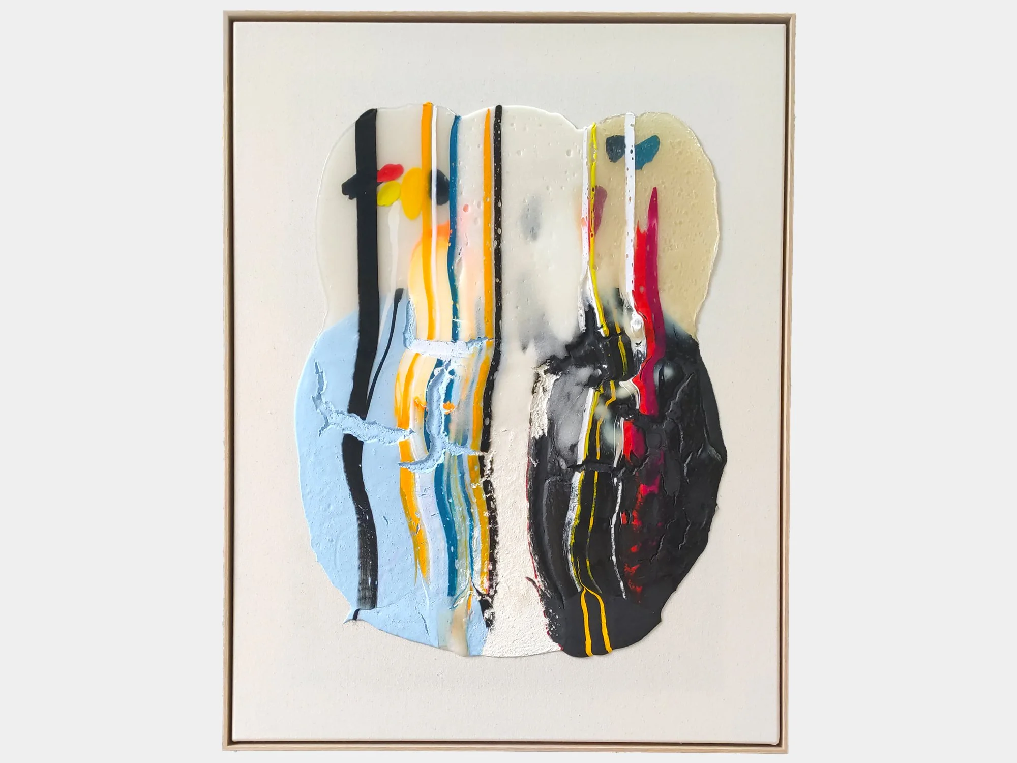
By Karen van de Vliet
85 × 65 cm, 2026
Mixed acrylic paint on cotton, framed
In Translucent XIX, Karen van de Vliet takes the stain as her starting point: an unpredictable form that cannot be entirely controlled and therefore leaves room for unexpected beauty. Her fascination with such forms began in childhood, when ordinary sights - such as a puddle scattered with autumn leaves - could appear both beautiful and slightly strange.
Translucent layers, clearly defined lines and thicker areas of paint come together in a composition that seems suspended mid-flow. Pale blue, black and off-white are intersected by red, yellow and fluorescent pink. Underlying colours, gestures and traces remain visible, allowing the work to reveal new details when viewed up close.
In Translucent XIX, spontaneity is carefully balanced with structure. The work moves between accident and control, visual attraction and a subtle sense of dissonance.
Delivery within the Netherlands and Belgium is arranged in consultation, either in person or securely shipped.
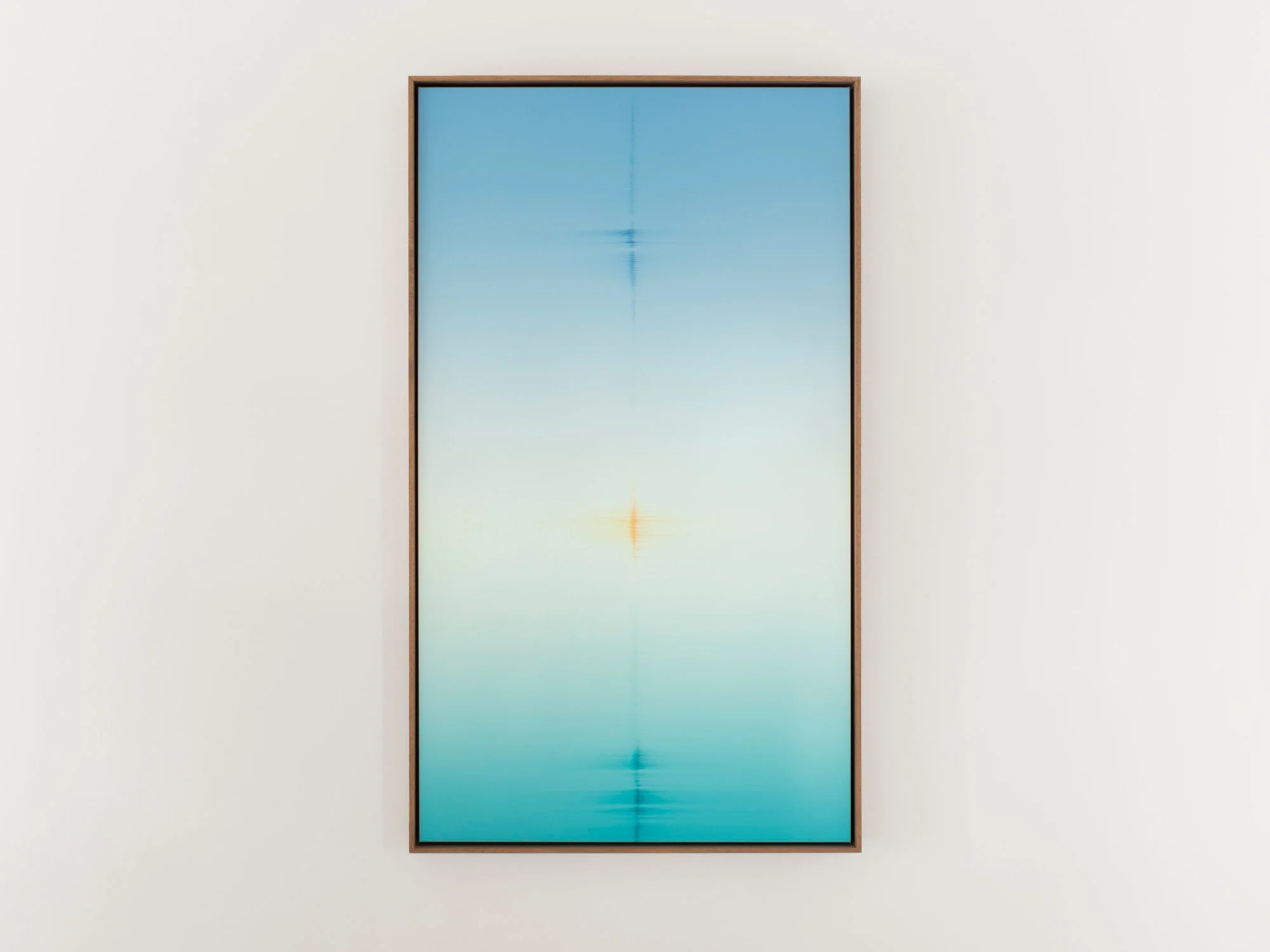
By Donald Schenkel
Oil on canvas
140 × 80 cm, 2026
Wooden frame included
In The Observer, Donald Schenkel combines clear turquoise and blue tones with a softly illuminated centre. Fine vertical and horizontal marks appear throughout the composition, introducing a subtle rhythm within the expansive fields of colour.
The painting is built up in numerous thin layers of oil paint, creating smooth transitions and a remarkable sense of depth. Its tall, narrow format strengthens the meditative quality of the work. Both calming and quietly captivating, The Observerbrings colour into an interior without overwhelming the space.
Delivery within the Netherlands and Belgium is arranged in consultation, either in person or securely shipped.
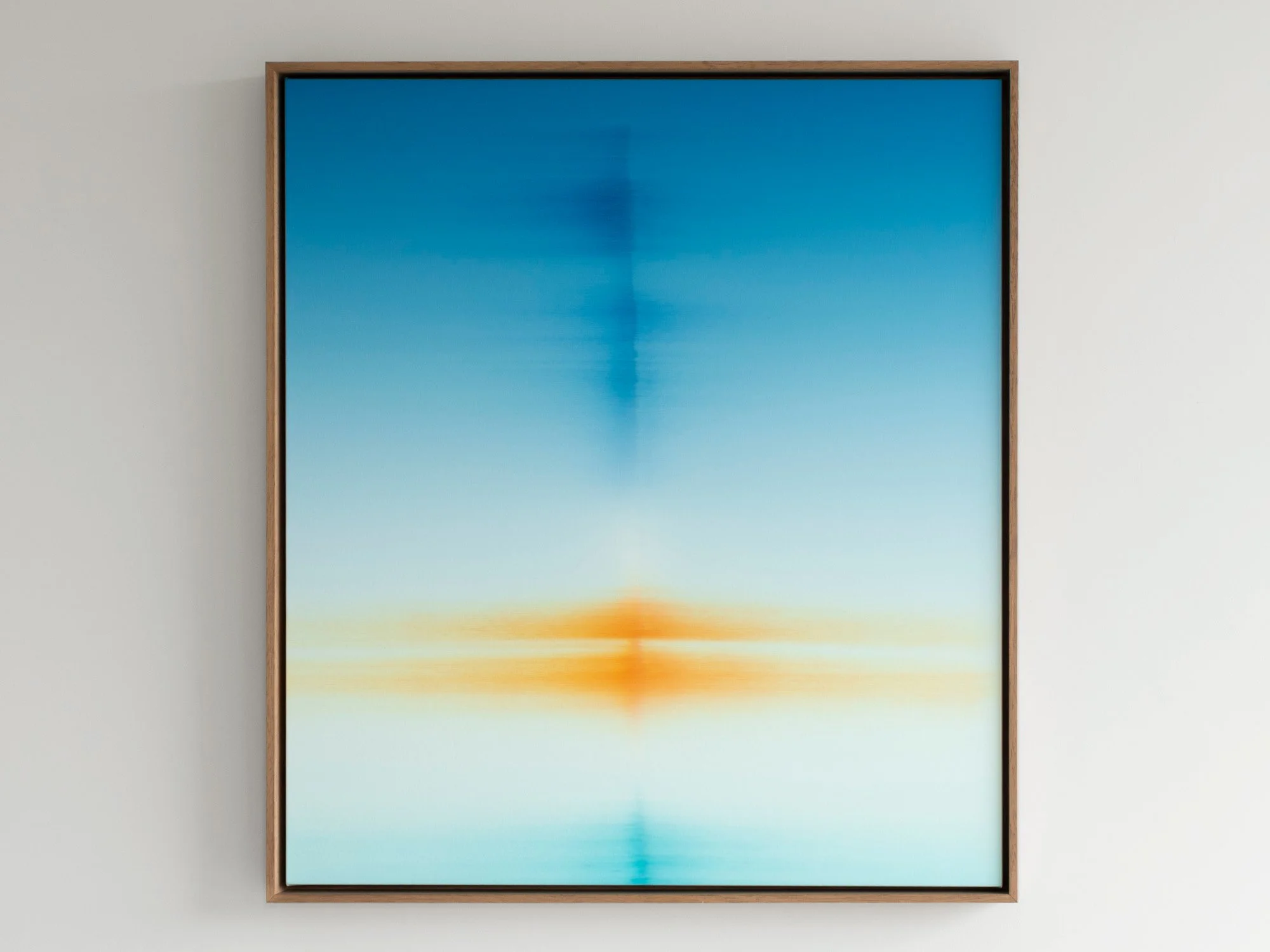
By Donald Schenkel
Oil on canvas
90 × 80 cm, 2026
Wooden frame included
The Observed draws the eye through an intense field of blue, interrupted by a concentrated orange form near the centre. The complementary colours heighten one another: the blue appears deeper, while the orange takes on the character of reflected light.
Donald Schenkel builds his paintings from numerous translucent layers of oil paint. Here, the gradual transitions are combined with blurred horizontal and vertical marks that seem to shift between distance and proximity. The composition never becomes a recognisable landscape, yet it carries the spatial quality of a horizon or reflection.
With its balanced proportions and vivid colour, The Observed is an original blue abstract painting that brings both depth and a strong focal point to a contemporary interior.
Delivery within the Netherlands and Belgium is arranged in consultation, either in person or securely shipped.
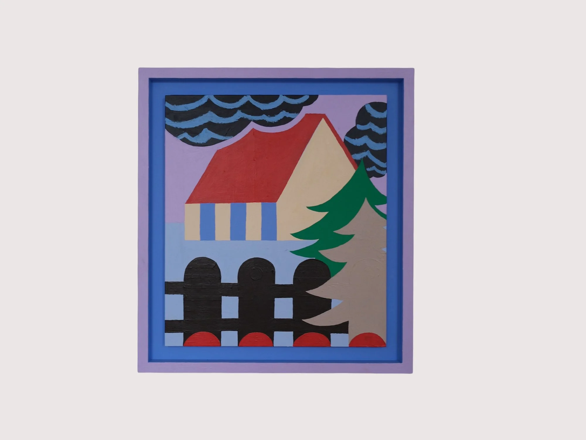
By Emma Veulemans
60 × 55 cm, 2026
Acrylic and oil stick on wood
In Tuinhek (Garden Gate), Emma Veulemans transforms a familiar domestic scene into a carefully constructed arrangement of colour and form. A red-roofed house appears behind a dark garden gate, surrounded by fir trees and rhythmic clouds.
The gate forms a strong graphic structure in the foreground, partly concealing the house while drawing attention to what lies beyond it. Painted in acrylic and oil stick on MDF, the work combines flat areas of colour with visible marks and subtle variations in texture.
Delivery within the Netherlands and Belgium is arranged in consultation, either in person or securely shipped.
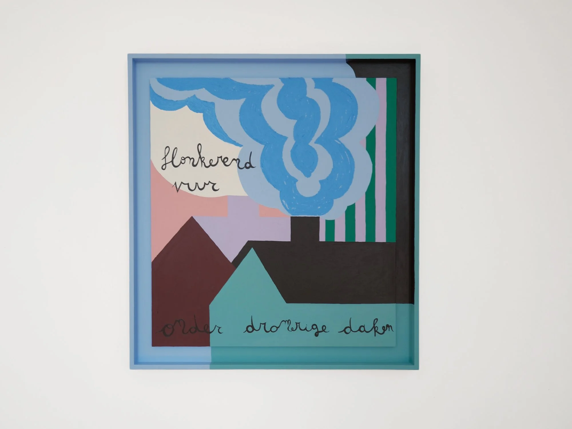
By Emma Veulemans
76 × 71 cm, 2026
Acrylic and oil stick on wood
In Eigen Haard Is Goud Waard, Emma Veulemans brings together fragments of rooftops, clouds and handwritten language. Geometric colour fields overlap like shifting planes, while the painted frame becomes part of the composition. The work reflects her illustration-led approach, in which familiar observations are transformed through unnatural colour, graphic contours and visible layers.
Delivery within the Netherlands and Belgium is arranged in consultation, either in person or securely shipped.
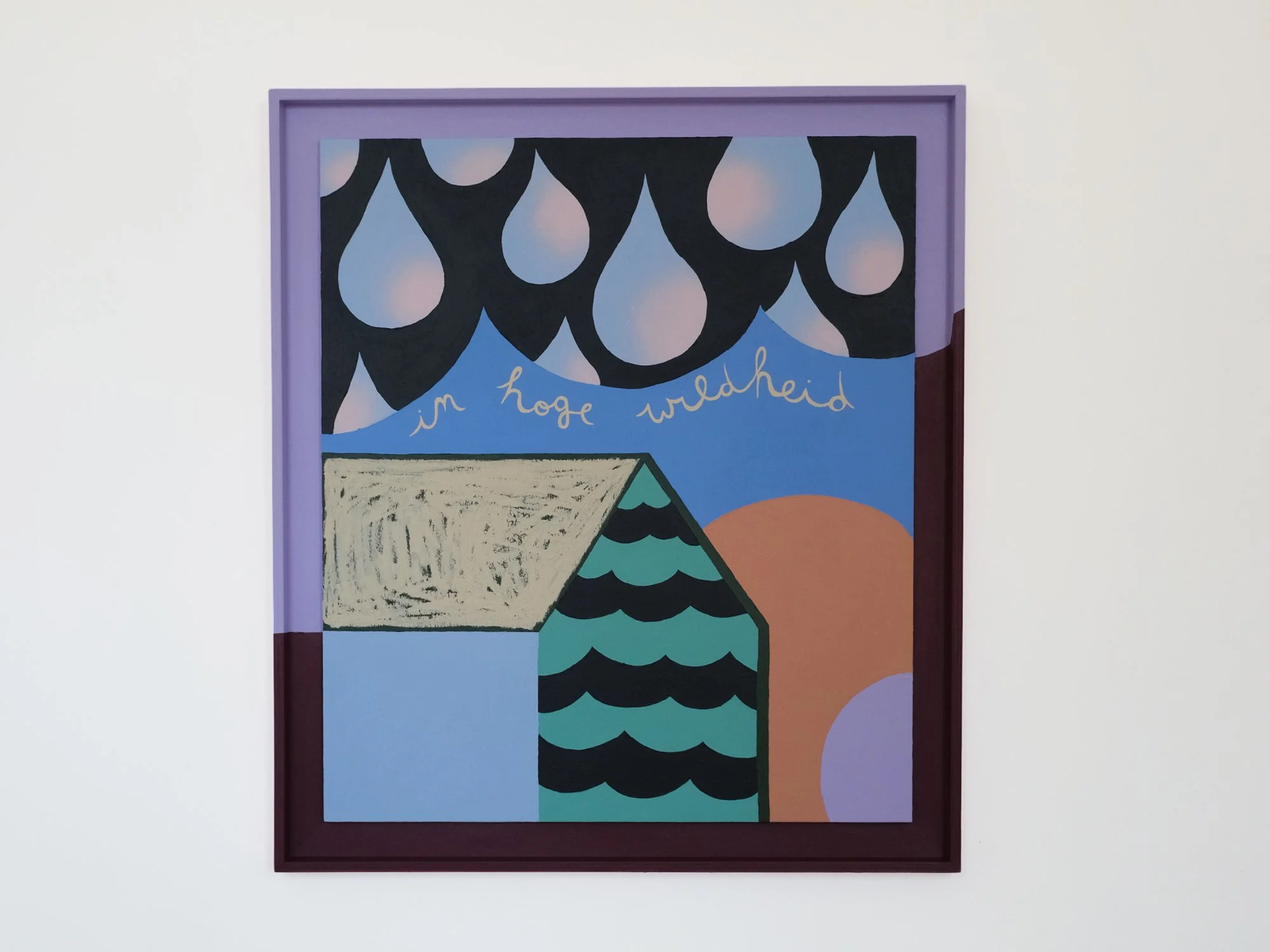
By Emma Veulemans
87 × 76 cm, 2026
Acrylic and oil stick on wood
In Wildenhoge, a small house stands beneath a sky filled with oversized falling drops. Repeated curves contrast with the angular architecture and handwritten words running through the composition. Areas of acrylic paint and oil stick retain different textures, revealing how Emma Veulemans builds her images through line, rhythm and overlapping forms.
Delivery within the Netherlands and Belgium is arranged in consultation, either in person or securely shipped.
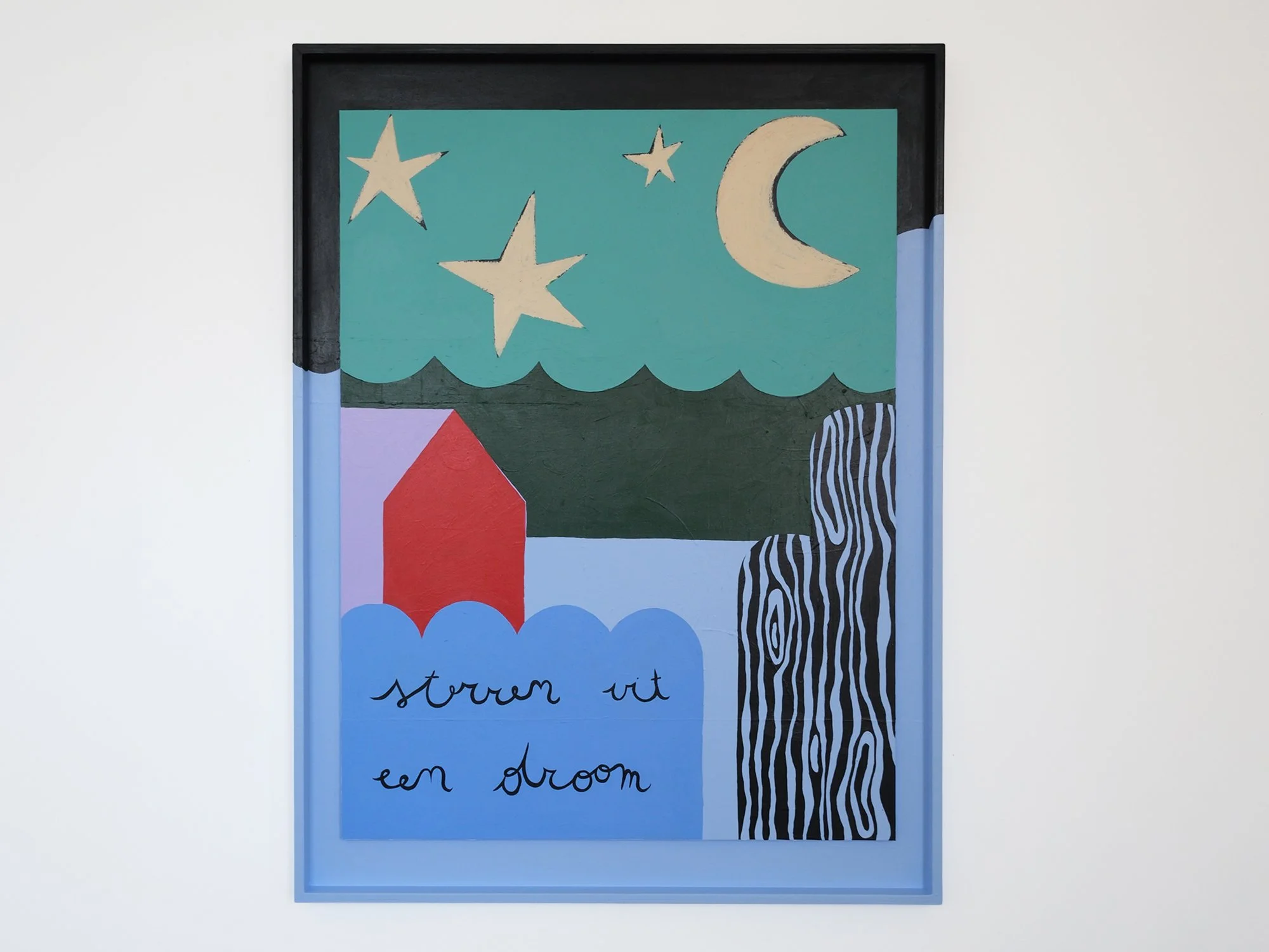
By Emma Veulemans
100 × 75 cm, 2026
Acrylic and oil stick on wood
A house, moon and stars form the recognisable starting points of Thuis Best. Emma Veulemans places these familiar motifs within an unexpected landscape of turquoise, red and pale blue. Handwritten words and woodgrain-like lines introduce contrasting rhythms, balancing the apparent simplicity of illustration with a carefully structured, layered composition.
Delivery within the Netherlands and Belgium is arranged in consultation, either in person or securely shipped.
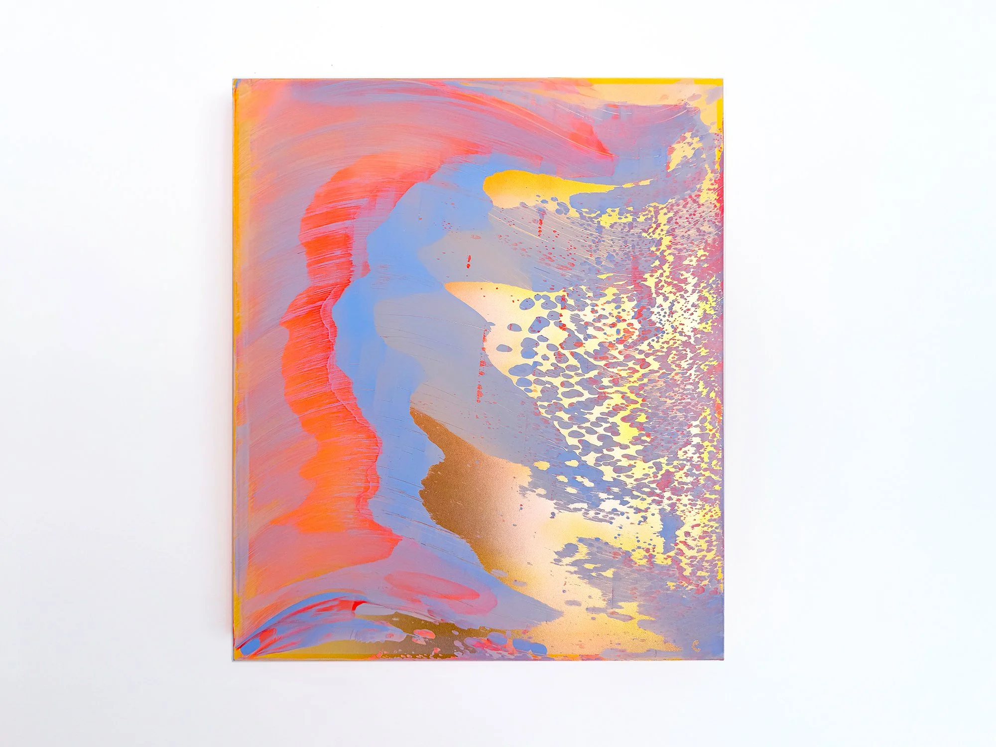
By Lisette Schumacher
60 × 50 x 6 cm, 2026
Mixed media
From the series Coachella views
Coachella Views XIV is one of the most contrasting works in Lisette Schumacher’s series. Warm coral and golden yellow meet cooler blue and lilac, recalling the striking opposition between the sunlit Coachella Valley and the snow-capped San Jacinto Mountains beyond it. Broad areas of colour create movement, while an intricate pattern on the right gives the composition a more concentrated intensity.
Schumacher does not reproduce a particular view. Instead, she brings together impressions of heat, distance, wind and rapidly changing colour. The result is a confident abstract artwork with a strong presence: vivid enough to anchor a space, yet layered enough to reveal quieter transitions on closer inspection.
This work will be shipped within the Netherlands and Belgium at no additional cost, securely and with tracking.
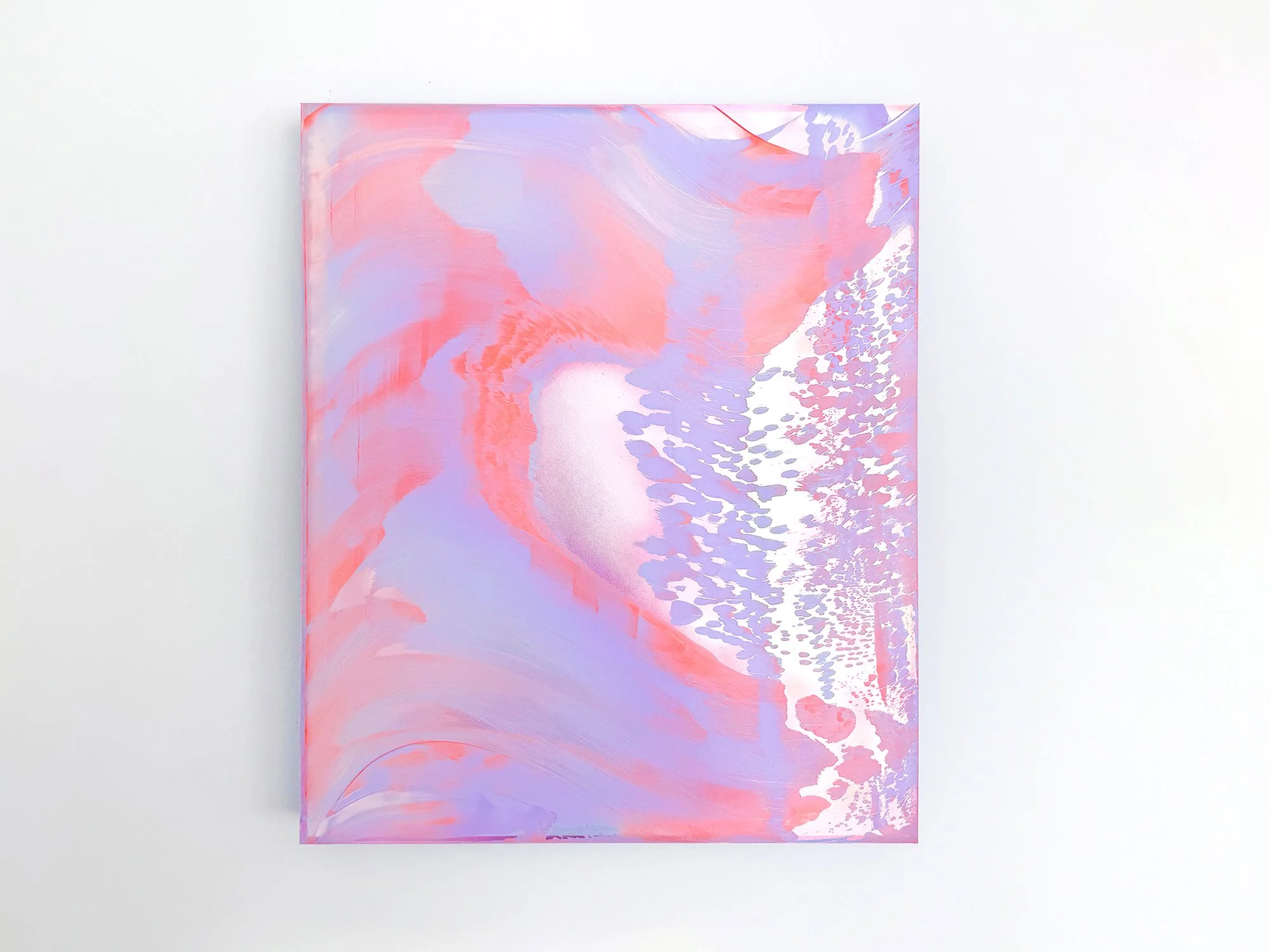
By Lisette Schumacher
60 × 50 x 6 cm, 2026
Mixed media
From the series Coachella views
Lisette Schumacher brings coral pink and soft lilac together in Coachella Views XIII. Large, fluid forms are interrupted by a finely patterned area that appears to disperse across the right side of the composition. A pale central opening creates depth, as though a distant light or landscape is briefly visible between the surrounding colours.
The work originates in Schumacher’s observations of the Coachella Valley, where intense sunlight, wind and distance continually alter how the landscape is perceived. Here, that experience becomes an atmospheric composition that feels both open and enveloping. The restrained palette makes the work easy to live with, while its subtle visual shifts continue to reward close attention.
This work will be shipped within the Netherlands and Belgium at no additional cost, securely and with tracking.
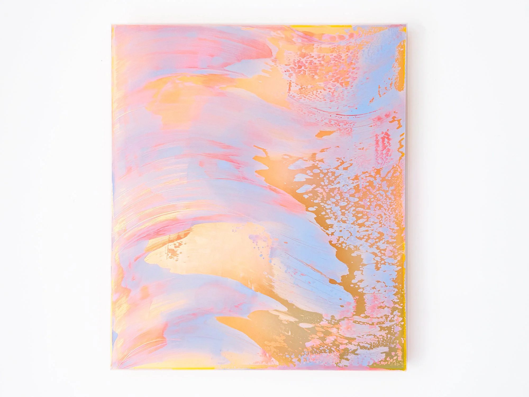
By Lisette Schumacher
95 × 80 x 6 cm, 2026
Mixed media
From the series Coachella views
In Coachella Views XII, Lisette Schumacher translates the shifting colours of the California desert into an expansive abstract composition. Pale blue, peach and pink move across the surface in broad, sweeping forms, while warmer golden areas appear between the layers. Finer patterns along the right-hand side introduce contrast and draw the eye further into the work.
The painting was inspired by Schumacher’s journey through Palm Springs, Cathedral City and Desert Hot Springs. Rather than depicting the landscape directly, she captures the experience of colour changing across the Coachella Valley: open, bright and never entirely still. Its generous scale gives the work a strong presence while the nuanced palette keeps the composition balanced.
This work will be shipped within the Netherlands and Belgium at no additional cost, securely and with tracking.
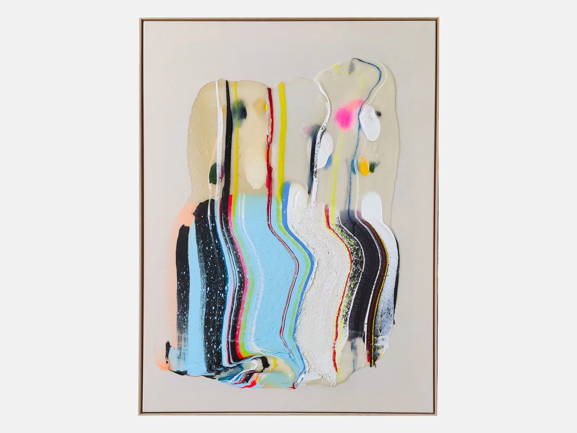
By Karen van de Vliet
120 × 90 cm, 2026
Mixed acrylic paint on cotton, framed
In Translucent IX, Karen van de Vliet explores the unexpected beauty of a stain: an irregular form that seems accidental yet is carefully composed. Her fascination with such shapes began in childhood, through encounters with ordinary things that appeared both beautiful and slightly off, such as autumn leaves gathered in a puddle.
Translucent materials allow colours and traces from underlying layers to remain visible. Pale blue, black and off-white are interrupted by narrow lines and vivid accents of red, yellow and fluorescent pink. Some elements appear to flow downwards, while thicker areas of paint sit prominently on the surface. The result is a tactile abstract painting that shifts between movement and stillness, precision and chance.
Delivery within the Netherlands and Belgium is arranged in consultation, either in person or securely shipped.
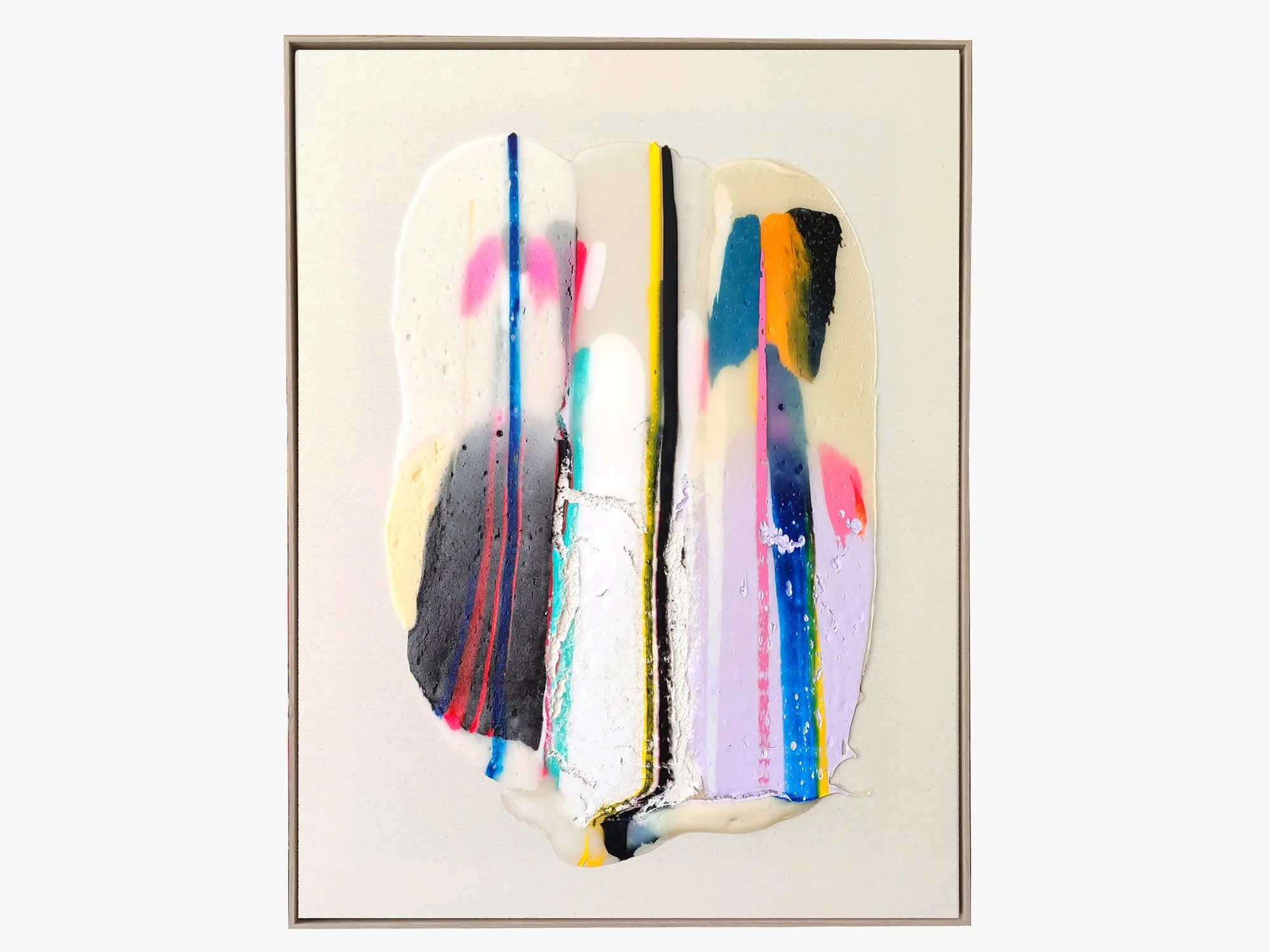
By Karen van de Vliet
85 × 65 cm, 2026
Mixed Acrylic paint on cotton, framed
Translucent VII by Karen van de Vliet combines subtle pastel colours with darker elements and transparent layers. The composition reveals itself gradually, with areas of pink, cream, black and vivid accents emerging from beneath the surface. The work reflects the artist's ongoing interest in transparency and material, resulting in a painting with both presence and restraint.
Delivery within the Netherlands and Belgium is arranged in consultation, either in person or securely shipped.
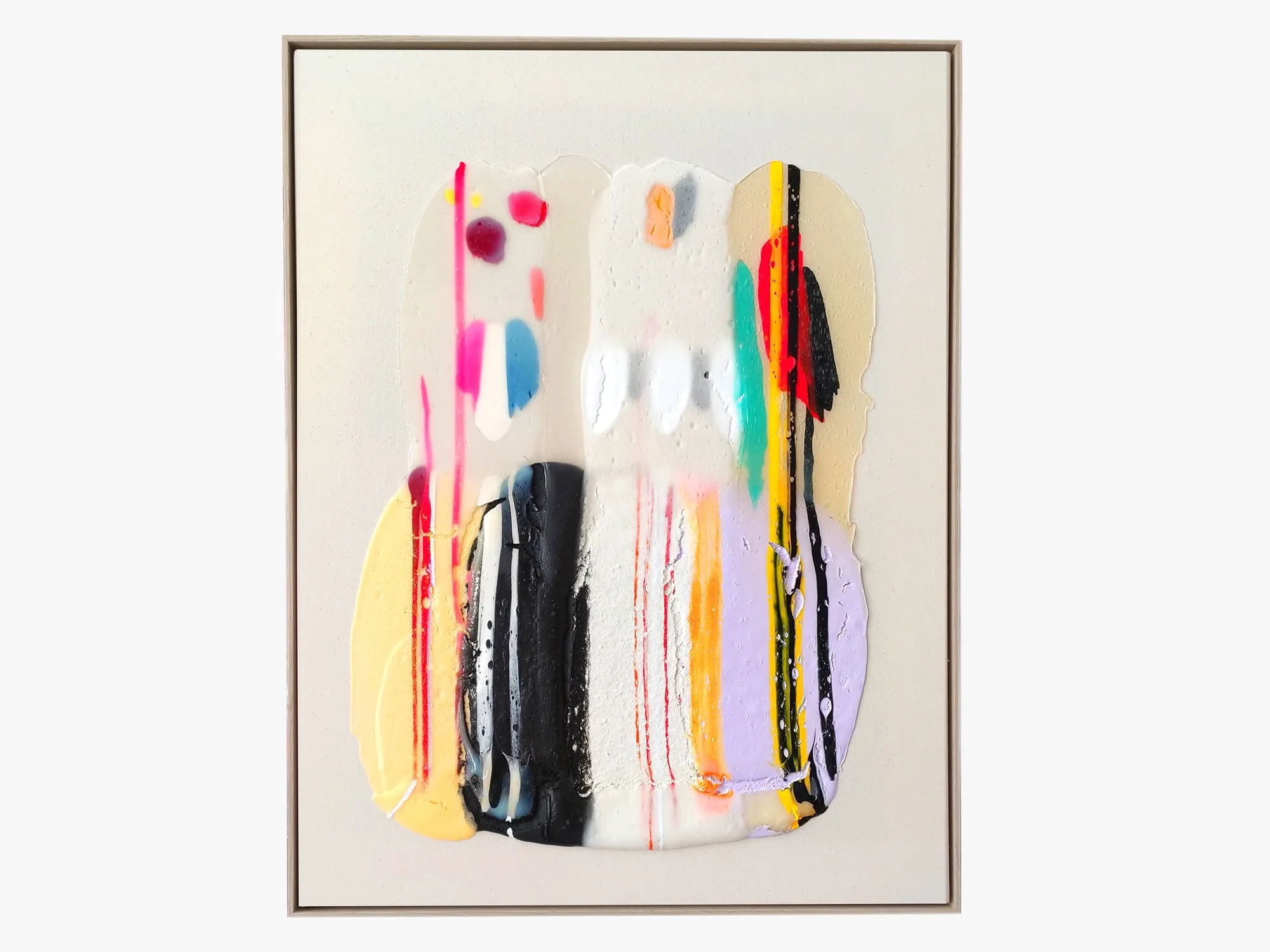
By Karen van de Vliet
85 × 65 cm, 2026
Mixed Acrylic paint on cotton, framed
In Translucent VI, Karen van de Vliet works with luminous colours and transparent layers that reveal traces of movement and gesture. Areas of soft pink, lavender, yellow and black are brought together within a composition that feels open and spacious. The work occupies a place between painting and object, inviting the viewer to look closely at the relationship between colour, texture and light.
Delivery within the Netherlands and Belgium is arranged in consultation, either in person or securely shipped.
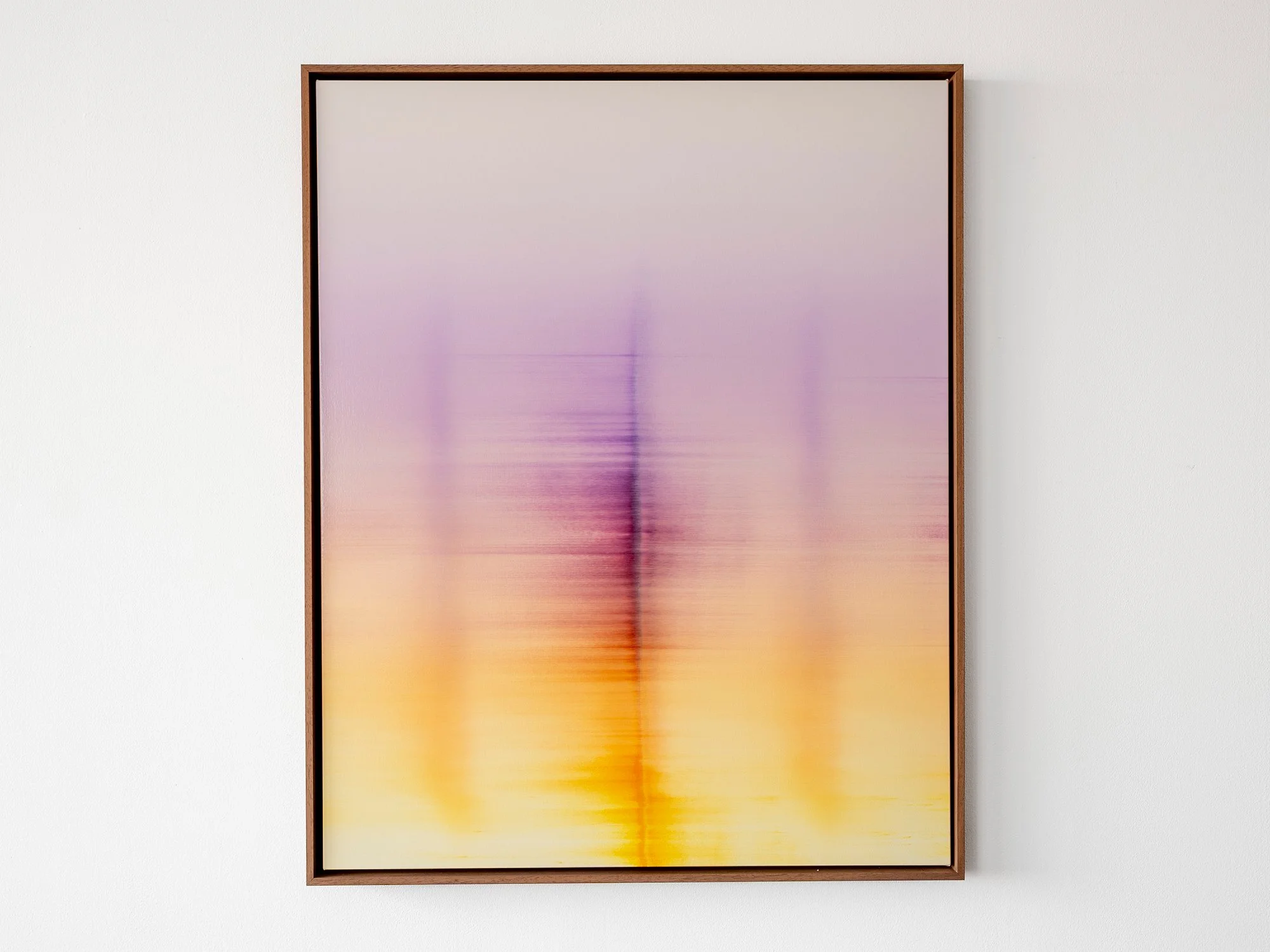
By Donald Schenkel
Oil on canvas
100 × 80 cm, 2026
Wooden frame included
Wandering Phantoms is part of Donald Schenkel's ongoing exploration of colour and atmosphere. Layers of soft violet, pink and warm yellow dissolve into one another, while subtle vertical forms emerge and disappear within the composition.
Rather than depicting a specific landscape or place, the painting balances between presence and absence. The image remains open, allowing associations with reflections, light or distant horizons without settling into a fixed interpretation.
Built up through numerous translucent layers of oil paint, the surface reveals different nuances throughout the day. The restrained palette and luminous centre give the work a calm yet radiant character.
Presented in a custom wooden frame, Wandering Phantoms brings together colour, light and subtle movement in a composition that rewards prolonged viewing.
Delivery within the Netherlands and Belgium is arranged in consultation, either in person or securely shipped.

By Donald Schenkel
Oil on canvas
70 × 80 cm, 2026
Wooden frame included
No Clear Skies Ahead by Donald Schenkel is built from a concentrated blue field that shifts in density and depth. Vertical traces appear and dissolve within the surface, suggesting movement without fixed direction. The work holds a quiet tension between stillness and disruption, shaped through a controlled yet irreversible process.
Delivery within the Netherlands and Belgium is arranged in consultation, either in person or securely shipped.
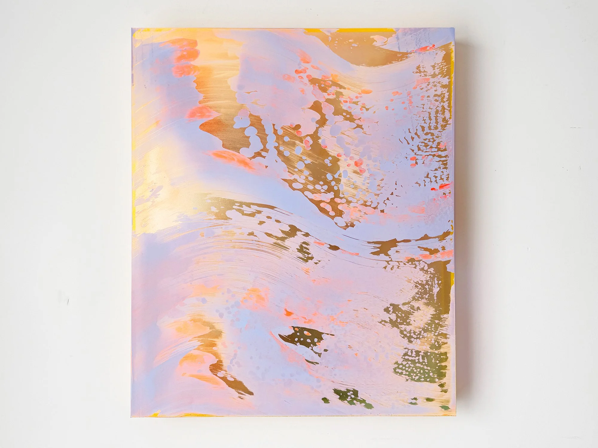
By Lisette Schumacher
60 × 50 x 6 cm, 2026
Mixed media
From the series Coachella views
The desert landscapes surrounding Palm Springs are known for their clarity of light and wide horizons. During her visits to the Coachella Valley, Lisette Schumacher experienced how dramatically the atmosphere can shift throughout the day.
Bright sunlight, wind and the vast openness of the desert create a landscape in constant transformation. Colours appear to intensify, fade and re-emerge as the sun moves across the valley.
Schumacher approaches these observations through an intuitive process in which colour and gesture develop gradually across the surface. Soft layers of pink, orange and yellow pigments move across the painting like shifting light fields, occasionally interrupted by reflective passages that recall flashes of sun across the desert terrain.
The composition reflects Lisette Schumacher’s ongoing interest in how landscape, architecture and atmosphere influence the perception of colour. Rather than presenting a fixed view of the desert, the work captures the sensation of light moving through space.
This work will be shipped within the Netherlands and Belgium at no additional cost, securely and with tracking.
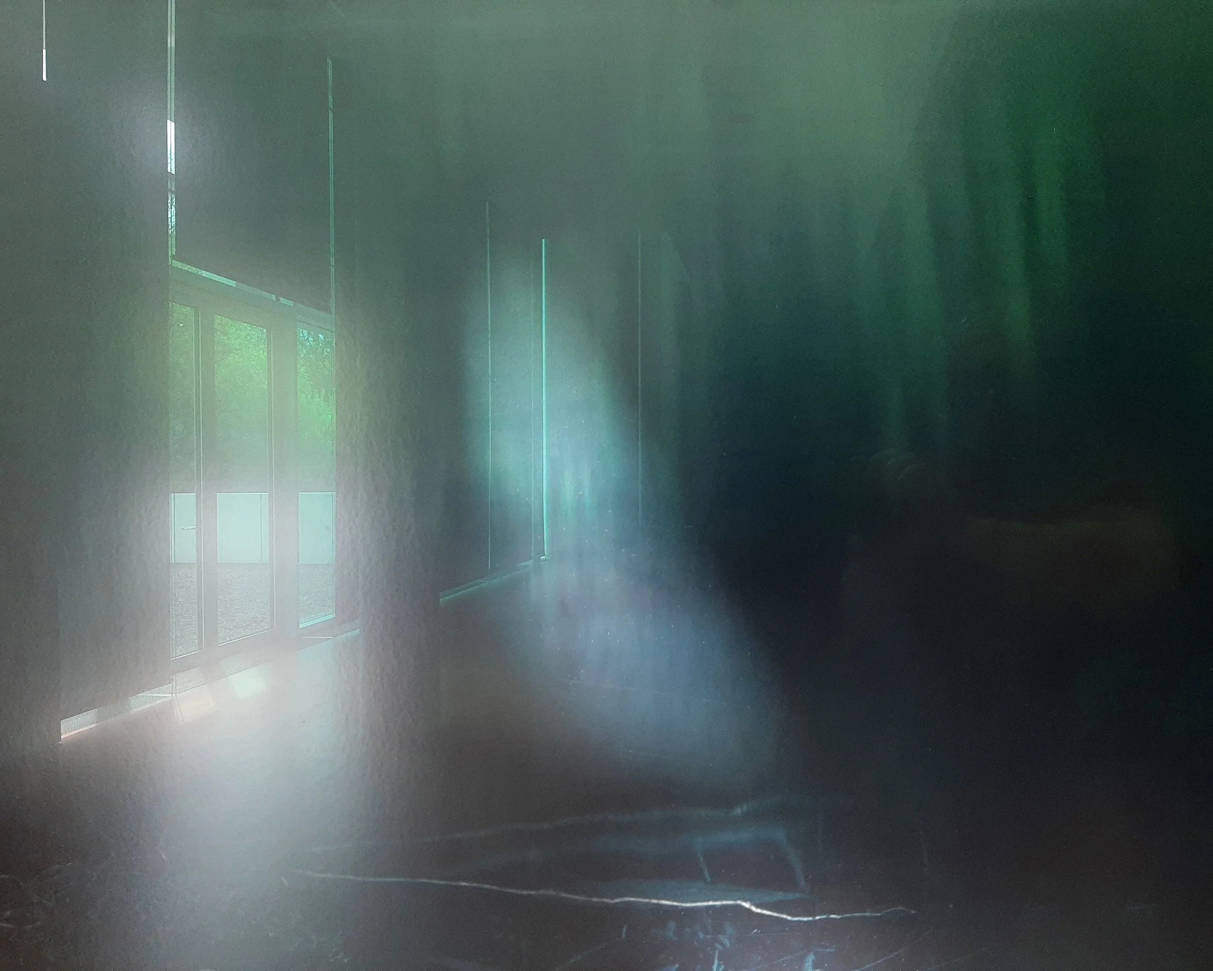
By Jan Theun van Rees
20 × 25 cm, ed. 3/10, 2026
Archival pigment ink on Innova ”Soft Textured BrightWhite Photorag” with nutwood frame and museumglass
This work is part of the series Painted Room
In this series, Jan Theun van Rees explores the relationship between art and the spaces in which it is displayed. He photographs museum interiors through reflections in artworks or the glass of their frames. Blurred fragments of the original work remain visible, merging with the surrounding architecture and creating a new photographic composition.
This small-scale photograph was created at the Arp Museum Bahnhof Rolandseck in Germany during Silent Spaces, a retrospective exhibition of photographer Axel Hütte. The reflection shows how an artwork can shape the atmosphere and perception of the room around it.
Shipping within the Netherlands and Belgium is on us.
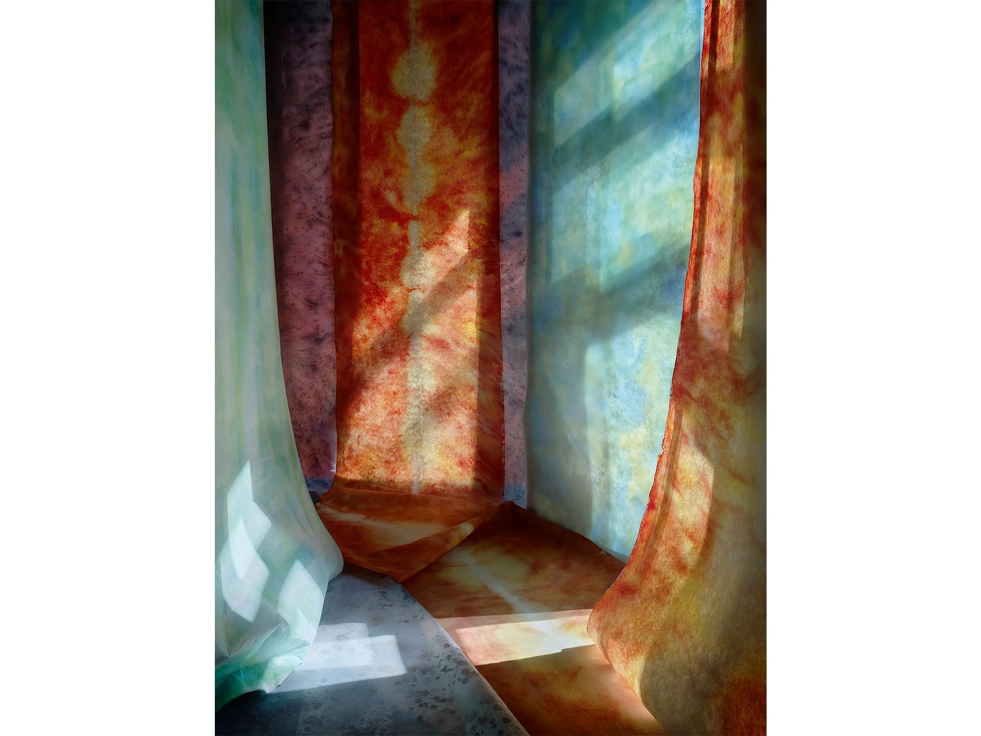
By Jan Theun van Rees
122 × 91,5 cm, ed. 3, 2026
Pigment ink on acid free Innova Soft Textured Bright White - frame, raw nutwood with spacers and Museumglass (UV70)
Also available in 60 × 45 cm, ed 2/5, 2026
This work is part of the series Painted Room
Licht Omloop is part of Jan Theun van Rees' ongoing series Painted Room. Through a process of constructing, observing and continuously repositioning elements in relation to changing daylight, the artist creates photographs in which colour and space remain in constant flux.
In Licht Omloop, warm orange tones are balanced by areas of aqua blue and subtle touche of purple. The image hovers between abstraction and architecture, suggesting depth and movement without revealing the temporary set from which it emerged. Rather than depicting an existing space, the work presents a carefully constructed situation in which light, perspective and colour come together in a single moment.
Shipping within the Netherlands and Belgium is on us.
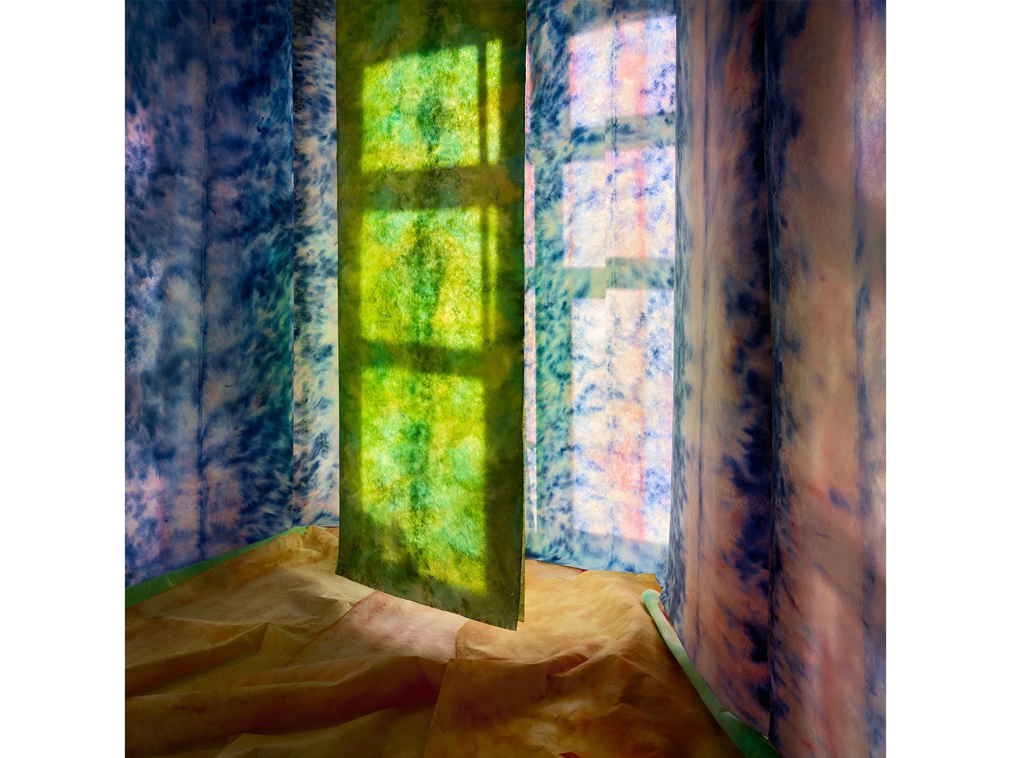
By Jan Theun van Rees
90 × 90 cm, ed. 3, 2026
Pigment ink on bright white Photorag mounted on museum board, framed with spacer and UV70 museum glass
Also available in 45 × 45 cm, ed 5, 2026
This work is part of the series Painted Room
Zeldzaam Groen is part of Jan Theun van Rees' ongoing series Painted Room. Working with temporary constructions, shifting daylight and carefully positioned elements, the artist creates photographs in which colour, space and perspective remain in constant flux.
In this work, a soft green surface and subtle spatial cues create an image that moves between abstraction and architecture. The final composition is not predetermined but emerges through observation, adjustment and photography. What appears to be a simple image reveals itself as a carefully balanced construction, resulting in a photograph that invites a slower way of looking.
Shipping within the Netherlands and Belgium is on us.
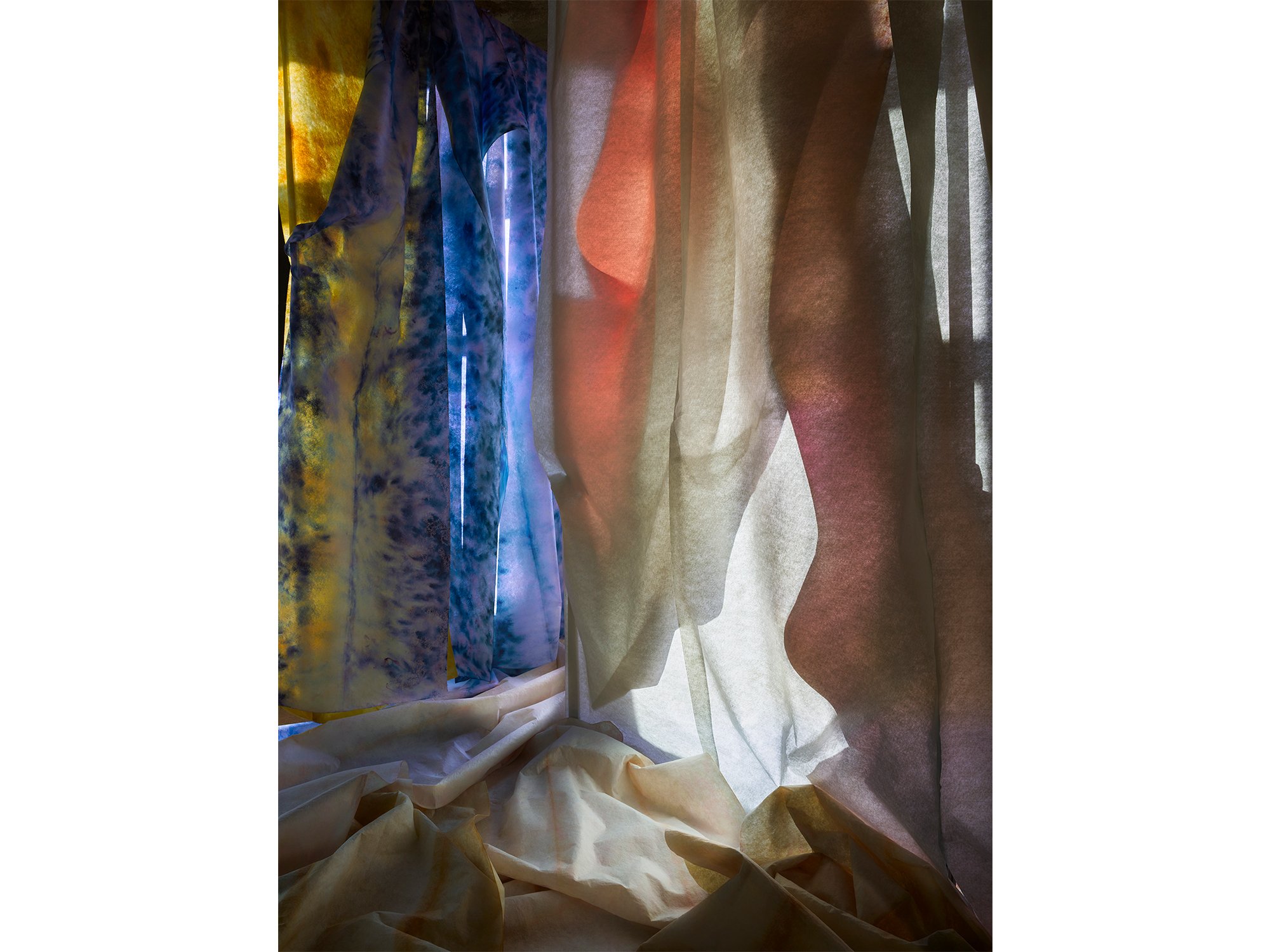
By Jan Theun van Rees
122 × 91,5 cm, ed. 3, 2026
Pigment ink on bright white Photorag mounted on museum board, framed with spacer and UV70 museum glass
This work is part of the series Painted Room
This photograph is part of the ongoing Painted Room series by Jan Theun van Rees, in which temporary architectural spaces are constructed using painted strips of textile. Through the careful interplay of light, colour, material, and perspective, the artist creates compositions that exist only for a brief moment before being transformed into photographic works.
Natural daylight plays a central role in the process. As the light changes throughout the day, shadows shift across the installation, creating visual relationships that are unique to a specific place and moment in time. The installation is continuously adjusted in response to these changing conditions, while the camera position evolves alongside the work.
Rather than documenting a fixed scene, the photograph captures a temporary spatial construction in constant transition. Light, space, material, and viewpoint influence one another throughout the process, resulting in an image whose final outcome remains uncertain until the photographs are reviewed afterwards.
Van Rees' work explores the relationship between photography, architecture, abstraction, and perception. By transforming simple materials into immersive spatial compositions, he challenges the viewer's understanding of depth, scale, and reality.
Shipping within the Netherlands and Belgium is on us.
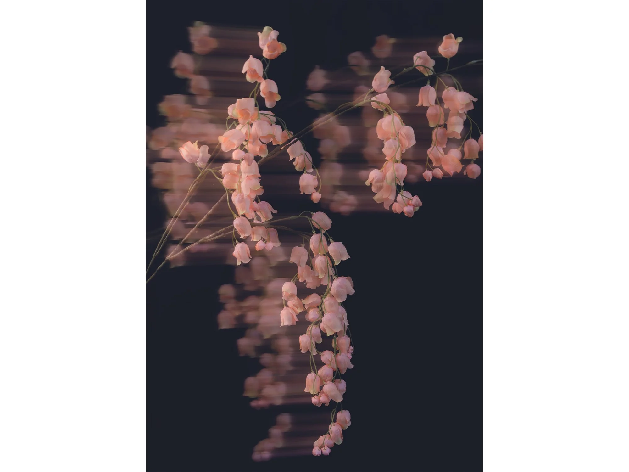
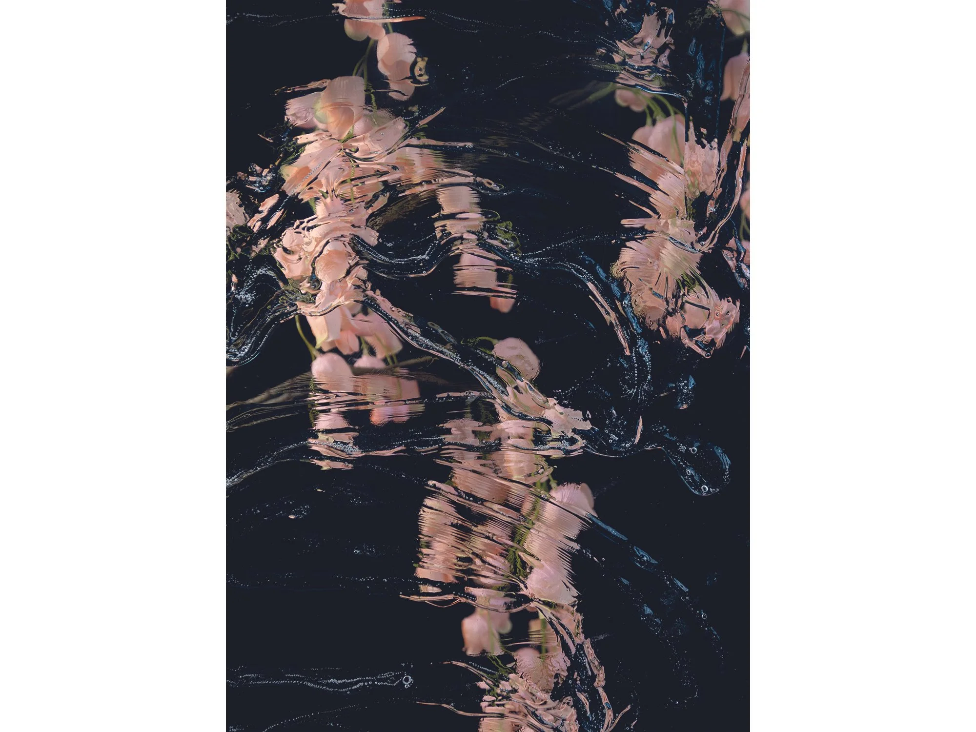
By Sophie de Vos
70 × 50 cm, ed. 1/3, 2026
Hahnemuhle, framed in black, museumglass
From the series Fragments of Clarity
The word ‘reflecting’ carries dual meanings; it can refer to an actual reflection - seeing an image mirrored in a glossy surface like glass - or it can describe the process of deep, thoughtful contemplation.
The photographic series ‘Fragments of Clarity’ by Sophie de Vos explores this duality, moving between the literal and metaphorical aspects of reflection. In most works, Sophie uses glass as a physical and conceptual layer over her subjects, creating subtle distortions that question how we perceive the world. When we look at something, are we truly seeing it as it is, or through the lens of our own experiences, memories, and emotions?
In the work ‘What Lingers After’, this approach shifts. Instead of glass, Sophie uses a photographic intervention, where movement and time become the material of distortion. Here, perception is not refracted by a physical surface, but shaped by duration and what remains after the moment has passed.
Shipping within the Netherlands and Belgium is on us.
By Sophie de Vos
70 × 50 cm, ed. 1/3, 2026
Hahnemuhle, framed in black, museumglass
From the series Fragments of Clarity
The word ‘reflecting’ carries dual meanings; it can refer to an actual reflection - seeing an image mirrored in a glossy surface like glass - or it can describe the process of deep, thoughtful contemplation.
This photographic series by Sophie de Vos intertwines both interpretations, exploring the intersection between the literal and metaphorical aspects of reflection. In this series, Sophie incorporates glass as a physical and conceptual layer over her subjects, manipulating its positioning to create dynamic visual distortions. By alternating and playing with these layers, she raises profound questions about perception: When we look at something, are we truly seeing it as it is, or are we viewing it through the complex prism of our own experiences, biases, and emotions? Sophie challenges the viewer to consider the nature of clarity itself, suggesting that true understanding may be filtered and refracted by the lenses through which we observe the world.
Through this blending of visual and philosophical reflection, the series becomes not just a study of surfaces and subjects, but a deeper inquiry into the limits of perception and understanding.
Shipping within the Netherlands and Belgium is on us.
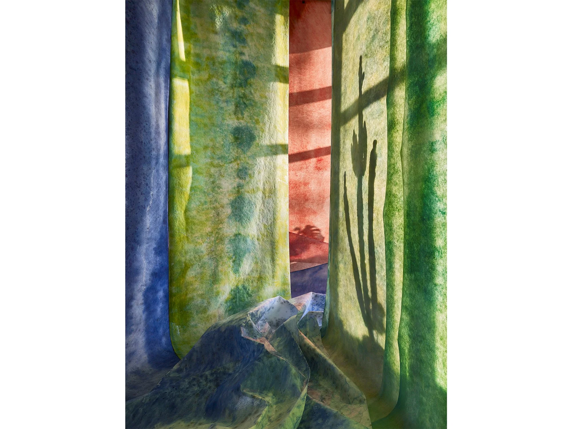
By Jan Theun van Rees
122 × 91,5 cm, ed. 3, 2026
Pigment ink on bright white Photorag mounted on museum board, framed with spacer and UV70 museum glass
This work is part of the series Painted Room
In Painted Room, Jan Theun van Rees constructs a temporary, immersive space using layered materials and painted surfaces, brought together through carefully controlled light. Soft textiles in shifting tones of blue, pink and grey create a spatial composition that feels both architectural and atmospheric. The interplay between shadow and colour blurs the line between physical structure and illusion, inviting the viewer to question depth, perspective and material reality.
This work is part of Van Rees’ ongoing exploration of spatial perception in contemporary photography, where constructed environments become the subject. Through subtle variations in light and surface, Painted Room offers a quiet, contemplative image that evolves with prolonged viewing.
Shipping within the Netherlands and Belgium is on us.
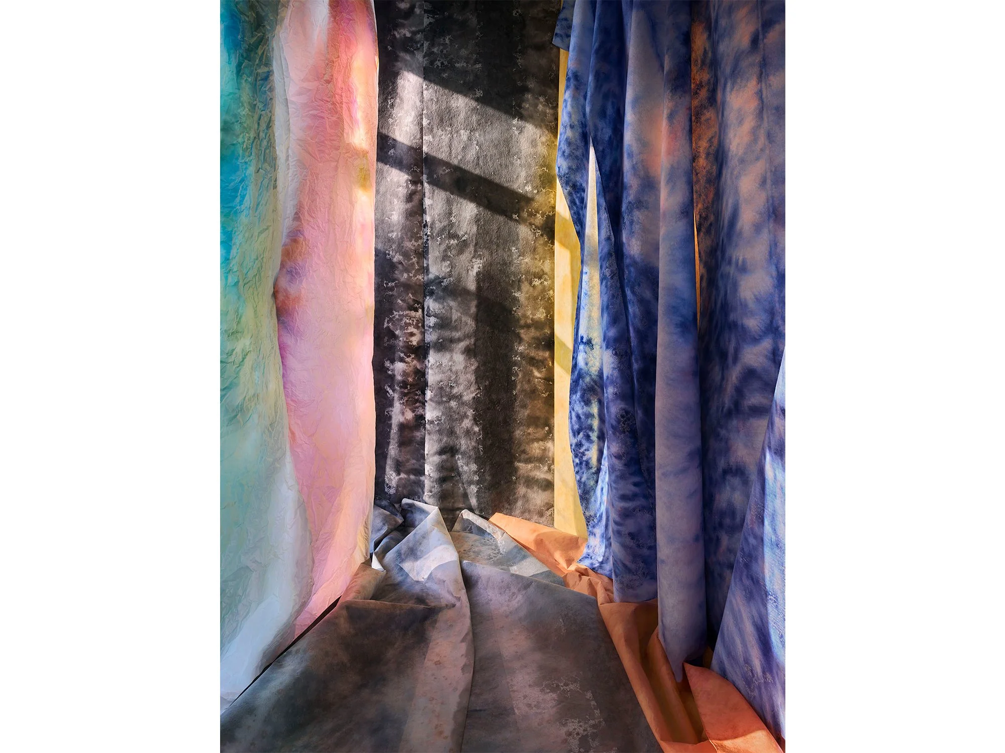
By Jan Theun van Rees
122 × 91,5 cm, ed. 3, 2026
Pigment ink on bright white Photorag mounted on museum board, framed with spacer and UV70 museum glass
This work is part of the series Painted Room
In Painted Room, Jan Theun van Rees constructs a temporary, immersive space using layered materials and painted surfaces, brought together through carefully controlled light. Soft textiles in shifting tones of blue, pink and grey create a spatial composition that feels both architectural and atmospheric. The interplay between shadow and colour blurs the line between physical structure and illusion, inviting the viewer to question depth, perspective and material reality.
This work is part of Van Rees’ ongoing exploration of spatial perception in contemporary photography, where constructed environments become the subject. Through subtle variations in light and surface, Painted Room offers a quiet, contemplative image that evolves with prolonged viewing.
Shipping within the Netherlands and Belgium is on us.

By Jan Theun van Rees
110 × 55 cm, ed. 3, 2025
Pigment ink on bright white Photorag mounted on museum board, framed with spacer and UV70 museum glass
This work is part of the series Painted Room
In Moonlit Corner, Jan Theun van Rees captures the quiet interplay between colour, light and constructed space. Created within his ongoing Painted Room series, the work depicts a temporary environment built and painted specifically for the photograph, a space that ceases to exist once the image is made.
Here, bands of deep blue and warm orange fabric interact with the cool grey tones of the floor, illuminated by a soft, angled light. The composition evokes both architecture and abstraction, balancing material presence with a sense of illusion.
Van Rees explores how light transforms painted surfaces into something ephemeral. Through this process, he turns photography into a form of painting, where each image becomes a moment of stillness, shaped entirely by colour and perception.
Shipping within the Netherlands and Belgium is on us.

By Jan Theun van Rees
50 × 40 cm, ed. 3/5, 2025
Pigment ink on bright white Photorag mounted on museum board, framed with spacer and UV70 museum glass. Also available 115 × 91,5 cm, ed 3.
This work is part of the series Painted Room
With his art, Jan Theun van Rees focuses on the appearance of space as an image, the perception of that (visualised) space in relation to the space that surrounds us. Through his photographs he tries to visualise the specific qualities of those spaces. “Camera Lucida” is the catch-all term for all his artistic projects that try to visualise a connection between (interior) spaces and the outside world through incoming light. He intervenes in the space, manipulates the incoming light, to emphasise the spatial qualities he experiences. These interventions have become essential to his current practice. He constructs his own spaces, his own versions of a new, not yet existing reality. A certain spatial quality is visualised by constructing a space with the sole purpose to photograph the result.
In his new series Painted Room you can step into a new reality and become mesmerised by the rays of light, colourful surroundings and mystic shadows.
Shipping within the Netherlands and Belgium is on us.
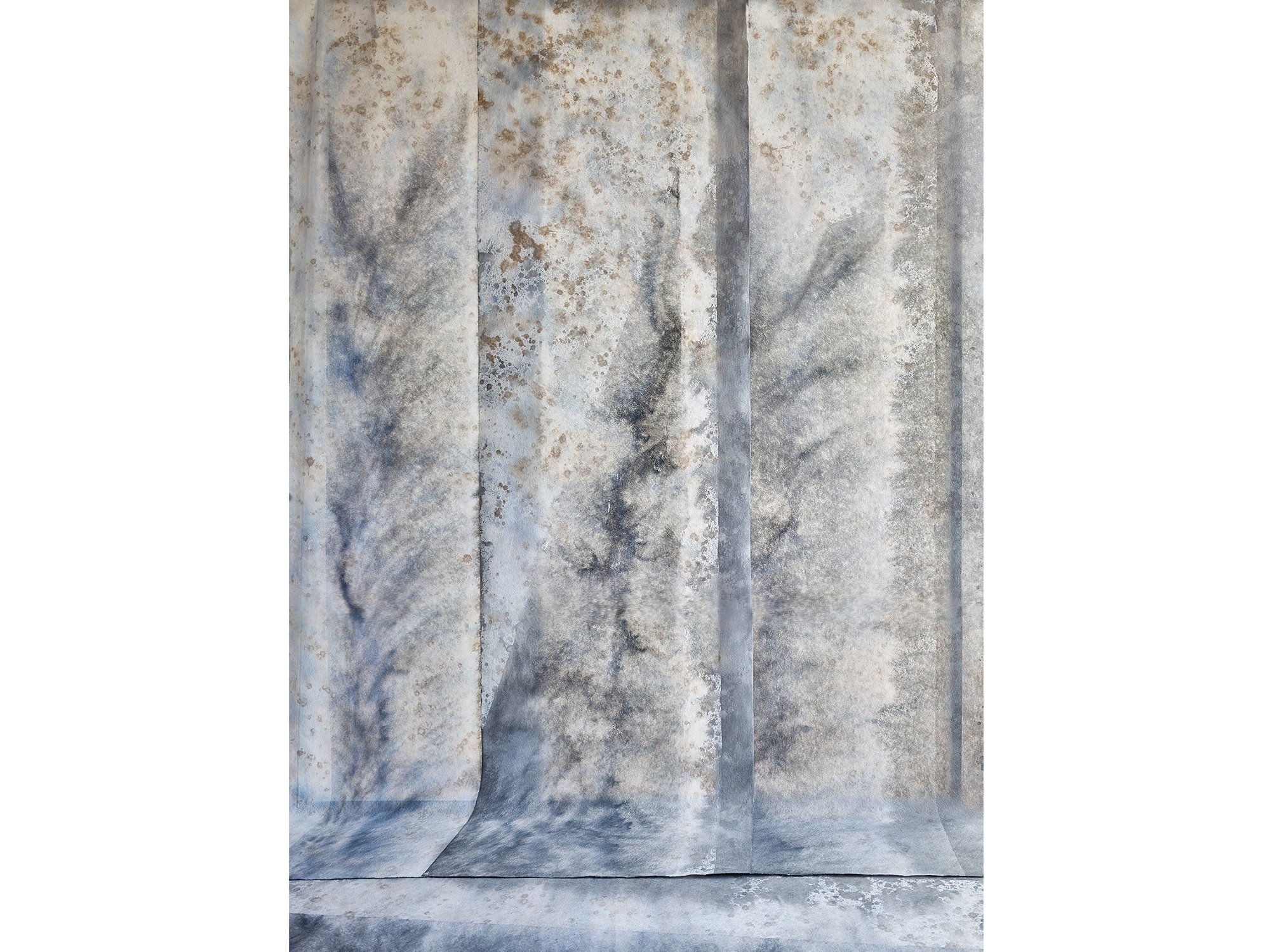
By Jan Theun van Rees
55 × 40 cm, ed. 5, 2025
Pigment ink on bright white Photorag mounted on museum board, framed with spacer and UV70 museum glass
This work is part of the series Painted Room
Wintergarden by Dutch artist Jan Theun van Rees continues his exploration of constructed spaces within the Painted Room series. Each work begins as a temporary environment, built, painted, and lit solely to be photographed, then dismantled afterwards.
In this piece, cool tones of blue, grey, and earthy brown merge across painted paper walls, evoking the quiet atmosphere of a winter interior. The folds and shadows suggest architectural depth while remaining entirely painterly.
Through this process, Van Rees turns photography into an act of creation rather than documentation. The result is a meditative image where light, surface, and perception converge, a space that exists only in the moment of being seen.
Shipping within the Netherlands and Belgium is on us.

By Jan Theun van Rees
125 × 76 cm, ed. 3, 2025
Pigment ink on bright white Photorag mounted on museum board, framed with spacer and UV70 museum glass
This work is part of the series Painted Room
In Dented Space, Dutch artist Jan Theun van Rees continues his Painted Room series, in which photography, painting, and architecture merge. The space we see does not truly exist, it is a temporary construction, built and painted solely to be photographed, and dismantled immediately afterwards.
This work captures the momentary play of light across hand-painted fabric walls. The folds and textures suggest both depth and fragility, transforming a constructed scene into something that feels organic and timeless.
Van Rees’s practice explores the perception of space and how light defines form. By painting his environments and then photographing them, he turns the act of observation itself into an artistic process, where what remains is not documentation, but transformation.
Shipping within the Netherlands and Belgium is on us.
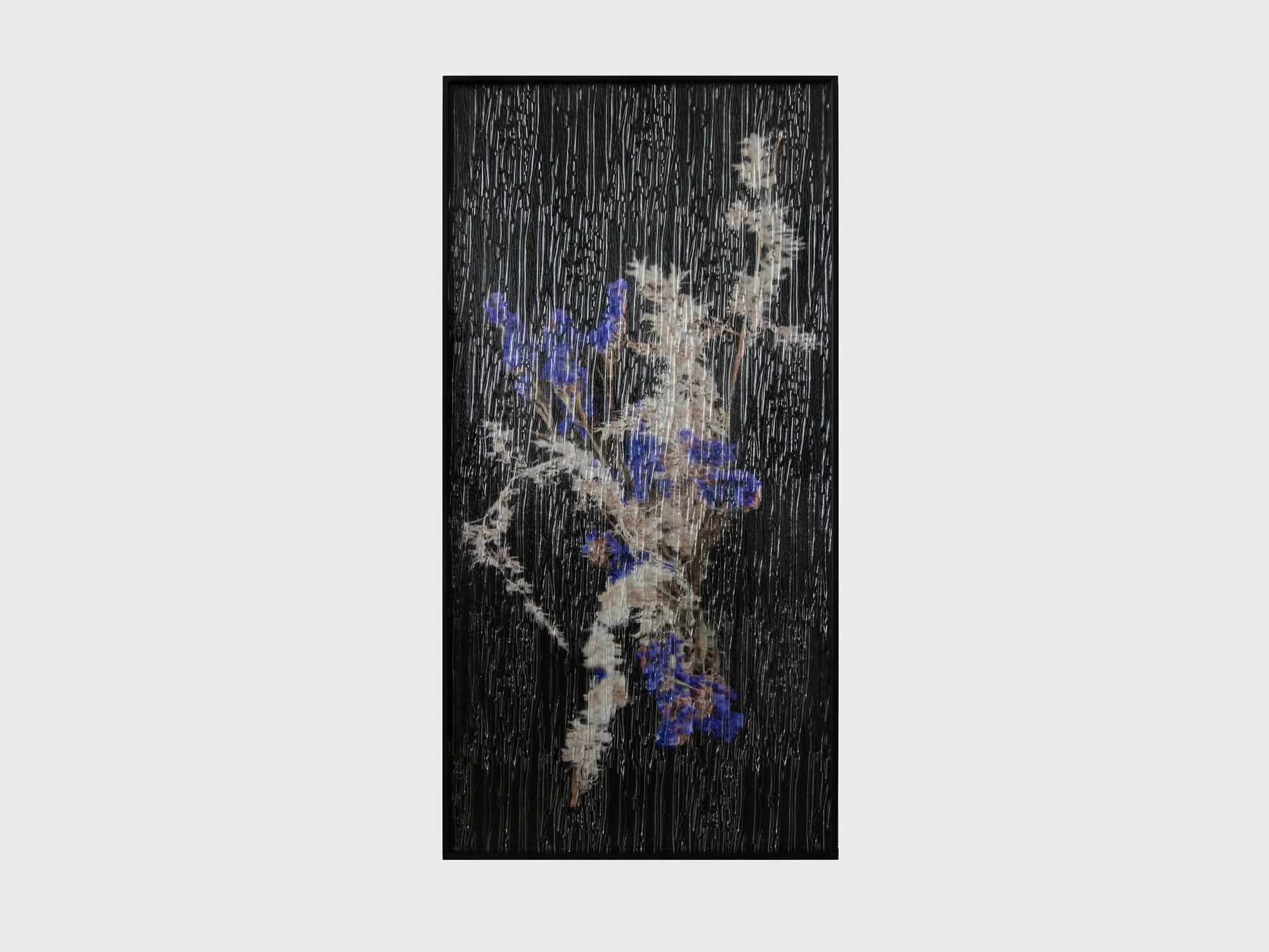
By Sophie de Vos
90 × 45 cm, unique, 2025
Hahnemuhle photo rag pearl, framed in black, niagara glass
From the series A Fragile Shift of Sight
This work by Sophie de Vos unfolds as both an image and a window. Against a deep black background, fragile flowers emerge in the foreground, suspended between clarity and obscurity. They are seen not directly, but through textured glass once part of an actual window frame. Its flowing surface recalls falling rain, transforming the act of looking into something layered and elusive.
For Sophie de Vos, art functions as a window onto another world; a threshold to the imaginary. By placing the photograph behind this glass, she invites the viewer to experience the image as something glimpsed rather than fully grasped - a fleeting vision that is both present and just beyond reach. At the same time, the glass evokes a sense of protection, as if the flowers are shielded in their own fragile space, reminding us of the delicate boundary between distance and intimacy, reality and imagination.
Shipping within the Netherlands and Belgium is on us.
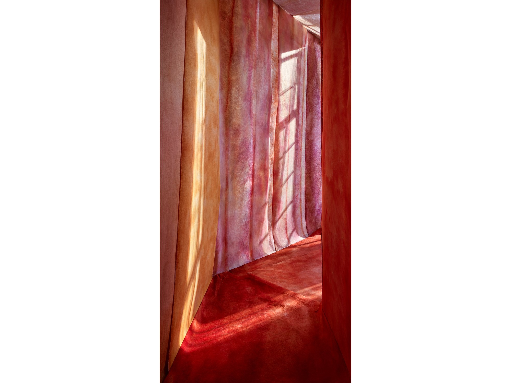
By Jan Theun van Rees
130 × 65 cm, edition 2/3 + 1 AP , 2025
Pigment inkt, op Innova Photorag bright white, op 2 mm museumkarton ‘White Wash’Wenge Veneer with UV 70 Museumglass
(Also available in 90 × 45 cm, edition 2/3)
This work is part of the series Painted Room
In To Catch a Spark of Sunlight, Jan Theun van Rees captures the fleeting moment when light defines space. Built entirely by hand and photographed with precision, the work belongs to his Painted Room series, constructed interiors that exist only for the camera.
This particular composition plays with verticality and contrast, as sunlight appears to slice through the space, catching on surfaces and turning architecture into atmosphere. The title evokes a quiet urgency: the desire to hold onto something ephemeral, to freeze a passing beam of light.
Like much of Van Rees’ work, this image is both real and imagined, rooted in the physicality of construction, but shaped by the artist’s intuition and spatial memory.
Shipping within the Netherlands and Belgium is on us.
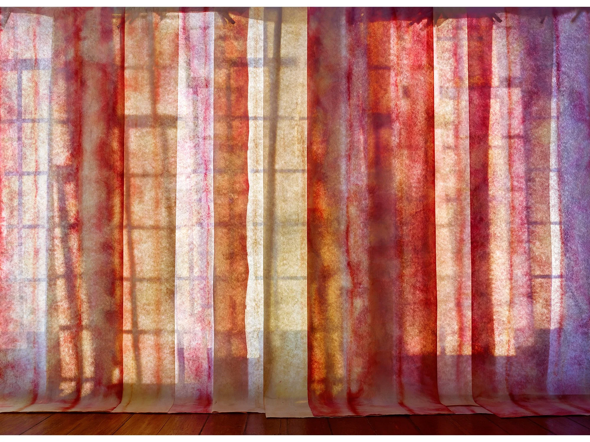
By Jan Theun van Rees
110 × 80 cm, edition 2/3 + 1 AP , 2025
Pigment inkt, op Innova Photorag bright white, op 2 mm museumkarton ‘White Wash’Wenge Veneer with UV 70 Museumglass
(Also available in 40 × 55 cm, edition 2/5)
This work is part of the series Painted Room
In Scrambled Morninglight, Jan Theun van Rees constructs a space where colour, light, and architecture dissolve into pure perception. This large-format work—part of his Painted Room series, is not a depiction of an existing room, but a spatial invention, built solely to explore how light transforms constructed surfaces into image.
The composition is animated by layered tones of red, with flashes of purple, orange, and yellow that appear to scatter like fragments of morning light. The title references both the time of day and the fragmented way in which light and colour are perceived and remembered.
As with all works in the Painted Room series, this space never existed until Van Rees built and photographed it. It is a visual proposition: a way of thinking through architecture, photography, and the physical presence of colour in space.
Shipping within the Netherlands and Belgium is on us.

By Jan Theun van Rees
50 × 40 cm, edition 1/3 + 1 AP , 2025
Pigment ink on Innova Photorag bright white, mounted on 4 mm museum board
Framed in ‘White Wash’ veneer with spacers and UV70 museum glass
(Also available in 25 x 20 cm, edition 10)
This work is part of the series Painted Room
With Red Room, Jan Theun van Rees continues his exploration of how space is perceived and constructed on the flat picture plane. The work is part of the Painted Room series, in which he intuitively builds and photographs entirely constructed environments.
Red Room exists solely to be photographed, a new, not-yet-existing reality created to express a particular spatial quality. The deep red appears to fill the room like a tangible presence, shaped by light and composition.
As in much of his recent work, Van Rees blurs the line between documentation and invention. Red Room invites the viewer to question what space is, how it comes into being, and the role perception plays in its formation.
Shipping within the Netherlands and Belgium is on us.
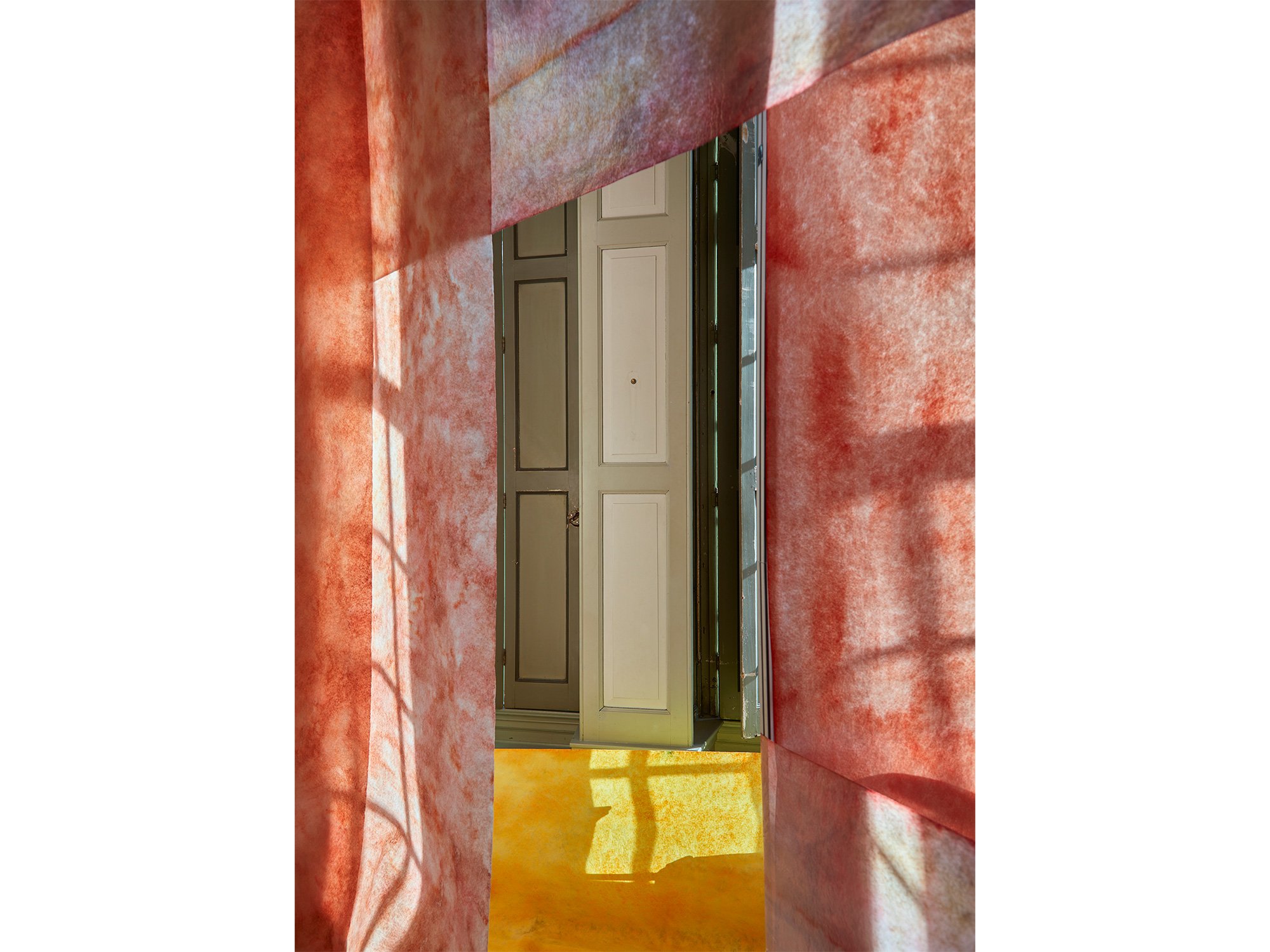
By Jan Theun van Rees
55 × 40 cm, edition 2/5 + 1 AP , 2025
Pigment ink on acid free Innova Soft Textured Bright White - pale wenge wood veneer frame (Nielsen) with Museumglass (UV70)
This work is part of the series Painted Room
In View 1, Jan Theun van Rees constructs a compact, enigmatic space where colour and form suggest more than they reveal. Dominated by deep red tones and punctuated by a single yellow accent, the composition centres around a closed, door-like shape, evoking a sense of tension, as if access is denied or postponed.
Part of the Painted Room series, this image captures a space that exists solely for the camera. It is not a record of reality, but a visual proposition: a space that teases the eye and mind with the suggestion of passage, yet keeps its interior sealed.
View 1 plays with perception, inviting contemplation of what remains hidden just behind the surface.
Shipping within the Netherlands and Belgium is on us.
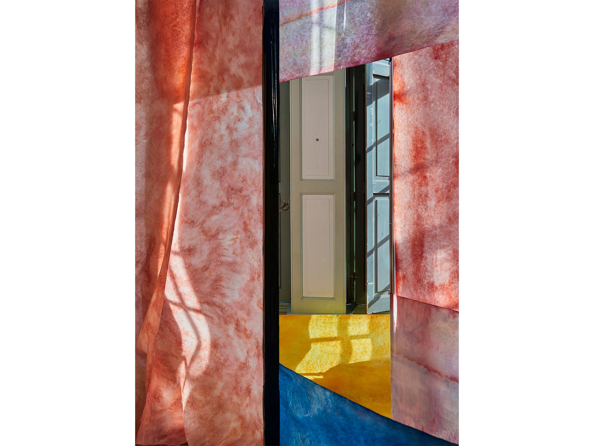
By Jan Theun van Rees
55 × 40 cm, edition 2/5 + 1 AP , 2025
Pigment ink on acid free Innova Soft Textured Bright White - pale wenge wood veneer frame (Nielsen) with Museumglass (UV70)
This work is part of the series Painted Room
In View 2, Jan Theun van Rees continues his exploration of constructed spaces that exist solely to be photographed. Rich red tones dominate the composition, while subtle blue and yellow accents add a sense of spatial tension and visual rhythm.
At the centre, a door-like shape appears slightly ajar, unlike the closed form in View 1. This small shift opens up a new narrative: a hint of access, a glimpse of what might lie beyond.
As with all works in the Painted Room series, View 2 is a visual proposition, suggesting space, movement and meaning through colour, light, and geometry alone.
Shipping within the Netherlands and Belgium is on us.
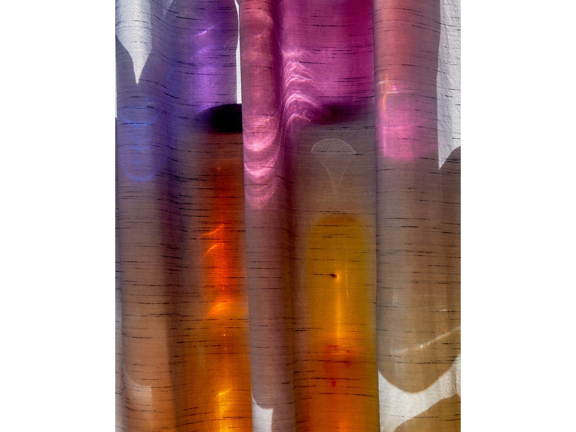
By Jan Theun van Rees
25 x 20 cm, ed. 5/10, 2024
Archival pigment ink on Innova ”Soft Textured BrightWhite Photorag” with nutwood frame and museumglass
This work is part of the series Painted Room
With his art, Jan Theun van Rees focuses on the appearance of space as an image, the perception of that (visualised) space in relation to the space that surrounds us. Through his photographs he tries to visualise the specific qualities of those spaces. “Camera Lucida” is the catch-all term for all his artistic projects that try to visualise a connection between (interior) spaces and the outside world through incoming light. He intervenes in the space, manipulates the incoming light, to emphasise the spatial qualities he experiences. These interventions have become essential to his current practice. He constructs his own spaces, his own versions of a new, not yet existing reality. A certain spatial quality is visualised by constructing a space with the sole purpose to photograph the result.
In his new series Painted Room you can step into a new reality and become mesmerised by the rays of light, colourful surroundings and mystic shadows.
Shipping within the Netherlands and Belgium is on us.

By Sophie de Vos
120 × 90 cm, ed. 1/2, 2024
Hahnemuhle, framed in black, museumglass
From the series Fragments of Clarity
The word ‘reflecting’ carries dual meanings; it can refer to an actual reflection - seeing an image mirrored in a glossy surface like glass - or it can describe the process of deep, thoughtful contemplation.
This photographic series by Sophie de Vos intertwines both interpretations, exploring the intersection between the literal and metaphorical aspects of reflection. In this series, Sophie incorporates glass as a physical and conceptual layer over her subjects, manipulating its positioning to create dynamic visual distortions. By alternating and playing with these layers, she raises profound questions about perception: When we look at something, are we truly seeing it as it is, or are we viewing it through the complex prism of our own experiences, biases, and emotions? Sophie challenges the viewer to consider the nature of clarity itself, suggesting that true understanding may be filtered and refracted by the lenses through which we observe the world.
Through this blending of visual and philosophical reflection, the series becomes not just a study of surfaces and subjects, but a deeper inquiry into the limits of perception and understanding.
Shipping within the Netherlands and Belgium is on us.

By Sophie de Vos
40 x 30 cm, ed. 3/5, 2025
Hahnemuhle, framed in black, museumglass
From the series Fragments of Clarity
The word ‘reflecting’ carries dual meanings; it can refer to an actual reflection — seeing an image mirrored in a glossy surface like glass — or it can describe the process of deep, thoughtful contemplation.
This photographic series by Sophie de Vos intertwines both interpretations, exploring the intersection between the literal and metaphorical aspects of reflection. In this series, Sophie incorporates glass as a physical and conceptual layer over her subjects, manipulating its positioning to create dynamic visual distortions. By alternating and playing with these layers, she raises profound questions about perception: When we look at something, are we truly seeing it as it is, or are we viewing it through the complex prism of our own experiences, biases, and emotions? Sophie challenges the viewer to consider the nature of clarity itself, suggesting that true understanding may be filtered and refracted by the lenses through which we observe the world.
Through this blending of visual and philosophical reflection, the series becomes not just a study of surfaces and subjects, but a deeper inquiry into the limits of perception and understanding.
Shipping within the Netherlands and Belgium is on us.

By Sophie de Vos
40 x 30 cm, ed. 1/5, 2024
Hahnemuhle, framed in black, museumglass
For this work, Sophie de Vos was inspired by the found of her late grandmother's nightgown. Although she never saw her grandmother in this nightgown, she was confronted with a nostalgic sense of familiarity beyond comprehension.
While capturing this intimate image, she noticed an intriguing play of light on the surface of the fabric which shifted her mind to other eras. The abundance of swirling fabrics with beautiful light and shadow areas in paintings from the Renaissance and the fabric draped elegantly over the floor in Roman sculptures. Sophie was fascinated by the ways in which well-known references from our collective visual memory could coincide with the little nostalgic memory her grandmother's nightgown evoked.
Shipping within the Netherlands and Belgium is on us.
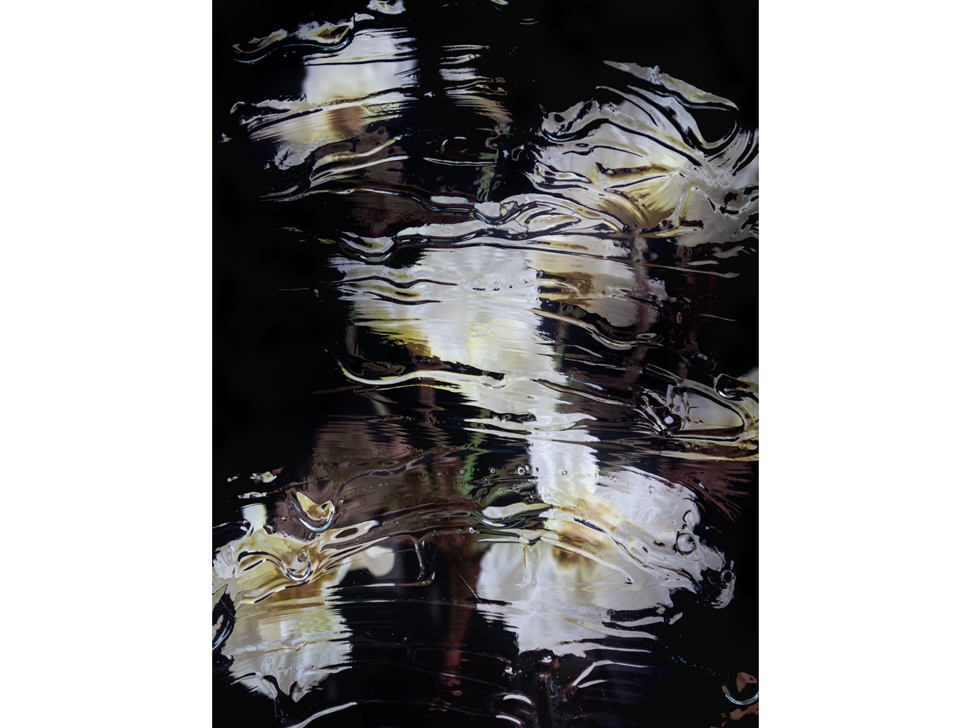
By Sophie de Vos
120 × 90 cm, ed. 1/2, 2024
Hahnemuhle, framed in black, museumglass
Also available in 40 × 30 cm, edition 3/5
From the series Fragments of Clarity
The word ‘reflecting’ carries dual meanings; it can refer to an actual reflection — seeing an image mirrored in a glossy surface like glass — or it can describe the process of deep, thoughtful contemplation.
This photographic series by Sophie de Vos intertwines both interpretations, exploring the intersection between the literal and metaphorical aspects of reflection. In this series, Sophie incorporates glass as a physical and conceptual layer over her subjects, manipulating its positioning to create dynamic visual distortions. By alternating and playing with these layers, she raises profound questions about perception: When we look at something, are we truly seeing it as it is, or are we viewing it through the complex prism of our own experiences, biases, and emotions? Sophie challenges the viewer to consider the nature of clarity itself, suggesting that true understanding may be filtered and refracted by the lenses through which we observe the world.
Through this blending of visual and philosophical reflection, the series becomes not just a study of surfaces and subjects, but a deeper inquiry into the limits of perception and understanding.
Shipping within the Netherlands and Belgium is on us.

By Francisca Snel
26,3 × 14 cm
Glass, copper
Unique
Francisca Snel’s Crystal Clear 22 is a hand-blown glass sculpture built around the fine copper mesh of a cleaning sponge. Red-orange glass encloses the mesh alongside dark and transparent passages, making the familiar structure visible within the sculpture. In direct sunlight, the glass casts a sharp orange reflection onto the surface beneath it. The work belongs to Snel’s Crystal Clear series, which brings an overlooked object associated with domestic work into sustained focus as contemporary glass art.
Delivery in the Netherlands and Belgium is complimentary, carefully arranged in consultation, either in person or securely shipped. We’re happy to advise on placement and presentation.

By Francisca Snel
31,2 × 16,5 cm
Glass, silver
Unique
In Stellar Magnitude 2, Francisca Snel places fine silver wire within a tall, oval form of hand-blown glass. Blue and green layers fold around flashes of red and magenta; the silver catches the light in slender, shifting lines. The work brings together two kinds of brightness: the colour held within the glass and the reflective traces of a metal associated with electrical conduction. Part of Snel’s exploration of light pollution, the sculpture asks how artificial light alters what remains visible in the night sky.
Delivery in the Netherlands and Belgium is complimentary, carefully arranged in consultation, either in person or securely shipped. We’re happy to advise on placement and presentation.

By Francisca Snel
17 x 24 cm
Glass, copper
Unique
In Stellar Magnitude 4, vivid orange, red, pink and blue glass curves around a dark central opening. Copper wire appears within the layers, a material detail that connects the sculpture’s colour and light to the electrical systems that illuminate the night. The saturated glass seems to hold its own glow, while the dark centre keeps the work anchored in shadow. This contrast gives physical form to Francisca Snel’s investigation of light pollution and the gradual loss of darkness from our view of the stars.
Delivery in the Netherlands and Belgium is complimentary, carefully arranged in consultation, either in person or securely shipped. We’re happy to advise on placement and presentation.
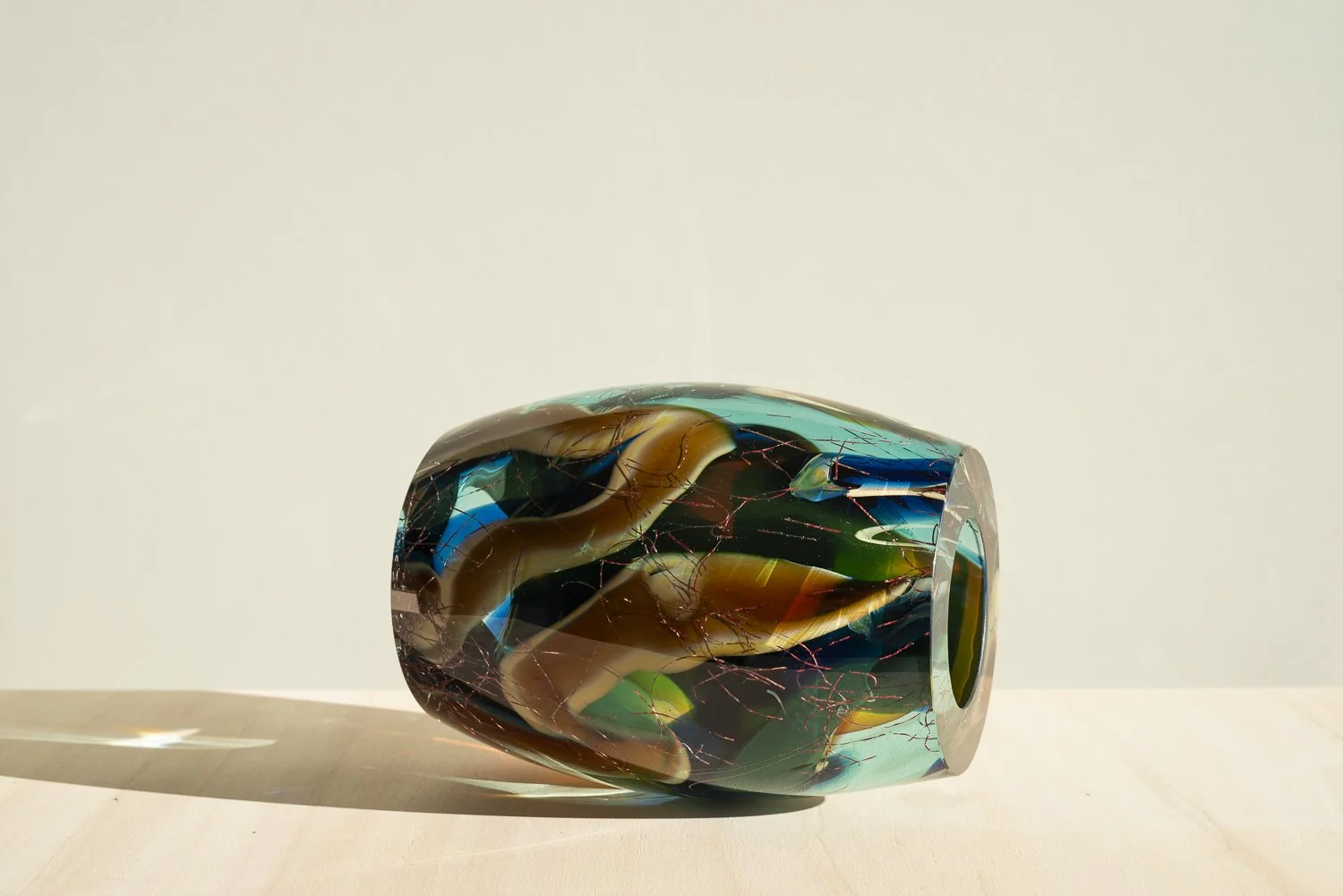
By Francisca Snel
17 × 22,3 cm
Glass, copper
Unique
The horizontal form of Stellar Magnitude 3 draws the eye through layered bands of blue, green and amber glass towards a dark circular centre. Fine copper wire runs through the coloured layers, recalling the conductive systems behind artificial illumination. From the side, the sculpture reads as a sequence of curved colour; from its open end, the darker interior comes into focus. Francisca Snel’s work belongs to Stellar Magnitude, a series shaped by her experience of leaving Rotterdam’s ambient glow for the star-filled darkness of rural Fryslân.
Delivery in the Netherlands and Belgium is complimentary, carefully arranged in consultation, either in person or securely shipped. We’re happy to advise on placement and presentation.
By Francisca Snel
29 × 16,5 cm
Glass, copper
Unique
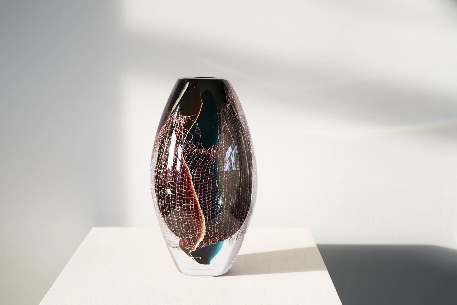
Francisca Snel explores the contrast between darkness and transparency in Crystal Clear #19. Deep red, near-black and subtle turquoise tones surround a delicate copper mesh, inspired by an everyday cleaning sponge. The fine copper structure appears suspended within the blown glass, creating a striking contrast between the solid, substantial form and the intricate material inside.
Viewed from different angles or in changing daylight, the sculpture reveals unexpected colours and layers. Its dark palette gives the work a distinctive presence, while the transparency of the glass allows light to reveal details beneath the surface.
Delivery in the Netherlands and Belgium is complimentary, carefully arranged in consultation, either in person or securely shipped. We’re happy to advise on placement and presentation.

By Lisette Schumacher
25 × 15 × 10 cm, 2026
Solid hand-cast glass, paint, varnish
From the series Spatial Shade
Spatial Shade XVIII is a contemporary glass sculpture by Lisette Schumacher, made from solid, hand-cast Venetian glass, paint and varnish. Upright rectangular glass forms create a compact architectural composition. Blue, turquoise and gold-coloured passages appear through the translucent glass, with one side emphasising deep blue and the other revealing warmer golden tones.
For her Spatial Shade series, Schumacher takes the brick as a building block. Its modular use in modern architecture, including the work of Mies van der Rohe, Alvar Aalto and Le Corbusier, provides a starting point for her exploration of balance, proportion and elementary forms. Replacing stone with glass allows light and transparency to become part of that architectural language.
In Spatial Shade XVIII, painted colour and the substantial depth of the glass interact. Looking through and around the sculpture reveals overlapping surfaces, reflections and changes in the apparent position of colour. The work invites viewing from several sides, each offering a different relationship between its structure and painted composition.
Delivery in the Netherlands and Belgium is complimentary, carefully arranged in consultation, either in person or securely shipped. We’re happy to advise on placement and presentation.
By Lisette Schumacher
28 × 14 × 5,3 cm, 2026
Solid hand-cast glass, paint, varnish
From the series Spatial Shade
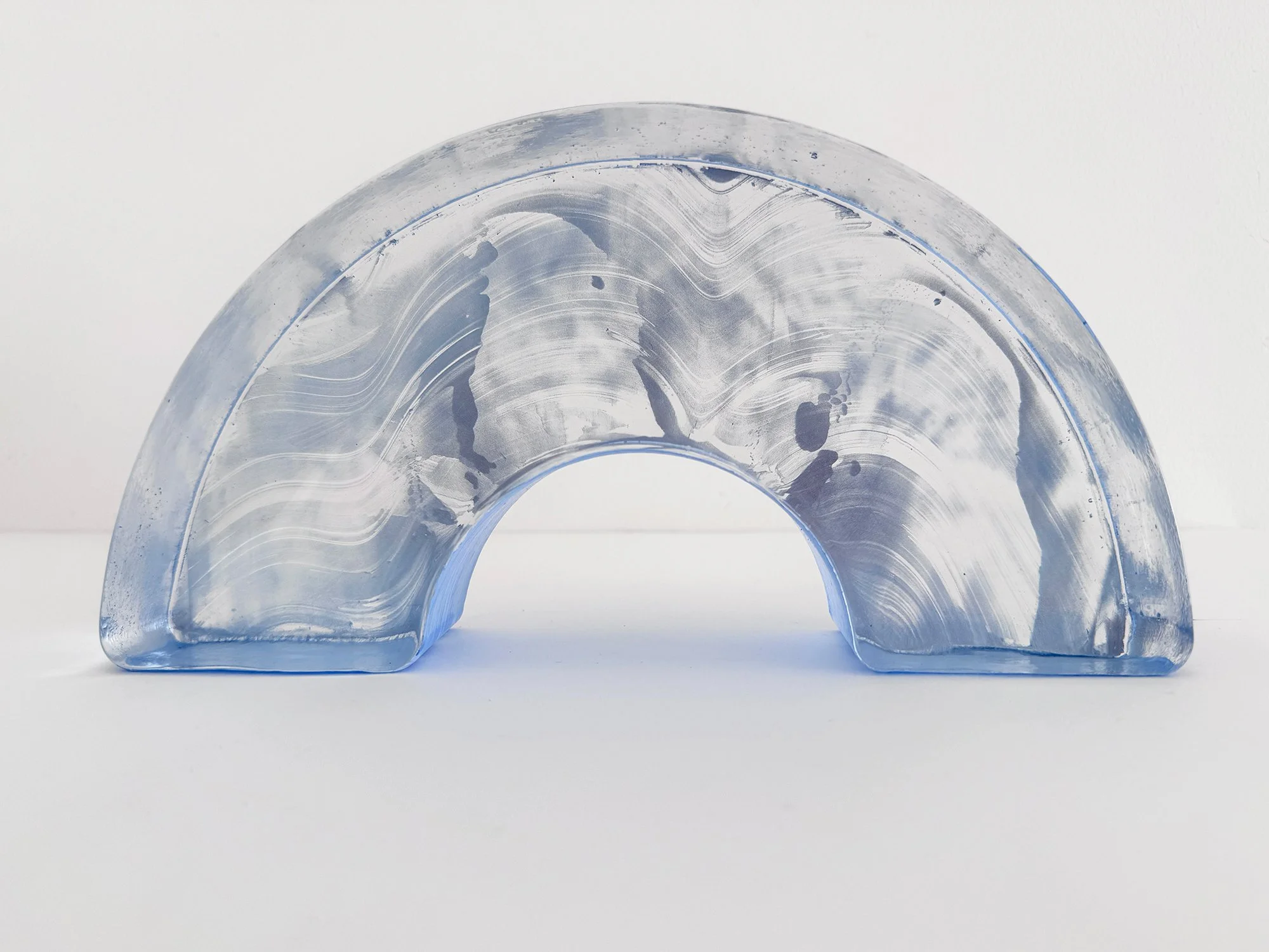
Spatial Shade Arch I is a pale blue glass and mixed-media sculpture by Lisette Schumacher. Its semicircular arch surrounds an open centre, while flowing white markings extend across the translucent form. The substantial glass edges catch the light, giving the architectural shape a changing visual depth.
The work belongs to Spatial Shade — Segment and Arch, a series inspired by the curved brick walls and decorative façade reliefs of the Amsterdamse School. Schumacher draws on the use of brick in the designs of Jo van der Mey, Michel de Klerk and Piet Kramer, translating an architectural building block into solid, hand-cast Venetian glass.
The open arch makes the space around and beneath the sculpture part of the composition. It brings together Schumacher’s interest in architecture, craftsmanship and the relationship between solid material and light.
Delivery in the Netherlands and Belgium is complimentary, carefully arranged in consultation, either in person or securely shipped. We’re happy to advise on placement and presentation.
By Lisette Schumacher
17 × 14 × 5,3 cm, 2026
Solid hand-cast glass, paint, varnish
From the series Spatial Shade
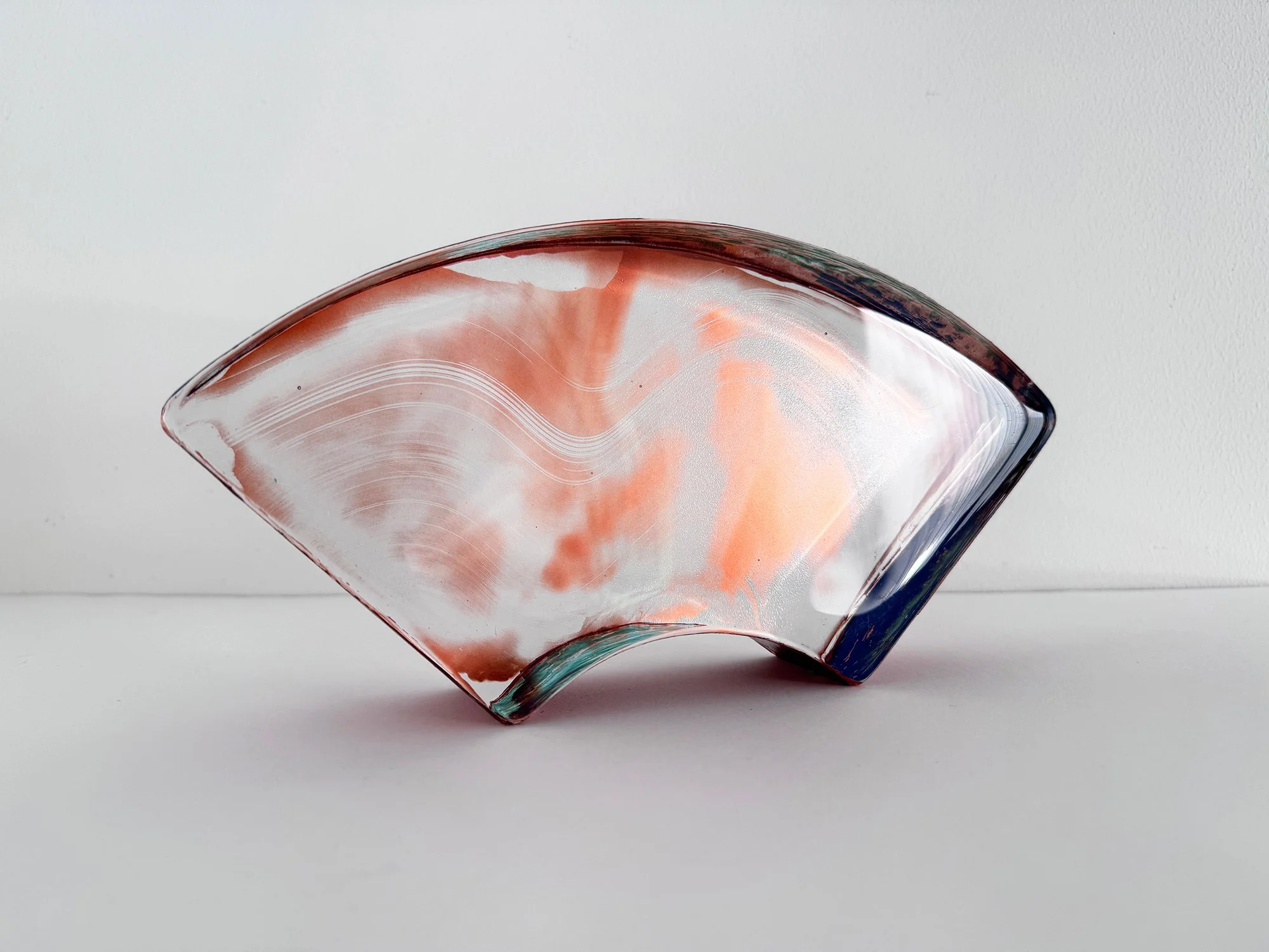
Spatial Shade Segment II is a pink glass and mixed-media sculpture by Lisette Schumacher, inspired by architectural brickwork. Warm rose and reddish-brown tones meet translucent areas and delicate white lines. The glass edges have a subtle green tint, framing the colour within a fan-shaped form.
The sculpture belongs to Spatial Shade — Segment and Arch, a series rooted in the curved brick walls and decorative reliefs of the Amsterdamse School. Schumacher takes the brick as a sculptural building block, referencing the craftsmanship and material sensitivity found in the designs of Jo van der Mey, Michel de Klerk and Piet Kramer.
Rendered in solid, hand-cast Venetian glass, this familiar architectural element acquires transparency and visual depth. Segment II combines the rhythm of its curved outline with soft colour transitions and flowing marks, inviting close attention to the relationship between glass, colour and light.
Delivery in the Netherlands and Belgium is complimentary, carefully arranged in consultation, either in person or securely shipped. We’re happy to advise on placement and presentation.

By Lisette Schumacher
28 × 14 × 5,3 cm, 2026
Solid hand-cast glass, paint, varnish
From the series Spatial Shade
Spatial Shade Arch II is a blue and white glass and mixed-media sculpture by Lisette Schumacher. Its U-shaped form rests on a rounded outer curve, with an open centre facing upwards. Sweeping blue marks and fine white lines follow and cross the curve, bringing movement into the solid architectural shape. Transparent areas reveal the depth of the glass and frame the concentrated colour.
The work belongs to Spatial Shade — Segment and Arch, a series inspired by the curved brickwork and decorative façade reliefs of the Amsterdamse School. Architects Jo van der Mey, Michel de Klerk and Piet Kramer used the brick as both a structural and an expressive element. Schumacher translates this attention to form, material and craftsmanship into solid, hand-cast Venetian glass.
In Arch II, the upward-facing opening gives the architectural arch a different orientation. The flowing blue-and-white composition contrasts with the defined silhouette, connecting a painterly language with the physical presence of glass.
Delivery in the Netherlands and Belgium is complimentary, carefully arranged in consultation, either in person or securely shipped. We’re happy to advise on placement and presentation.
By Lisette Schumacher
17 × 14 × 5,3 cm, 2026
Solid hand-cast glass, paint, varnish
From the series Spatial Shade
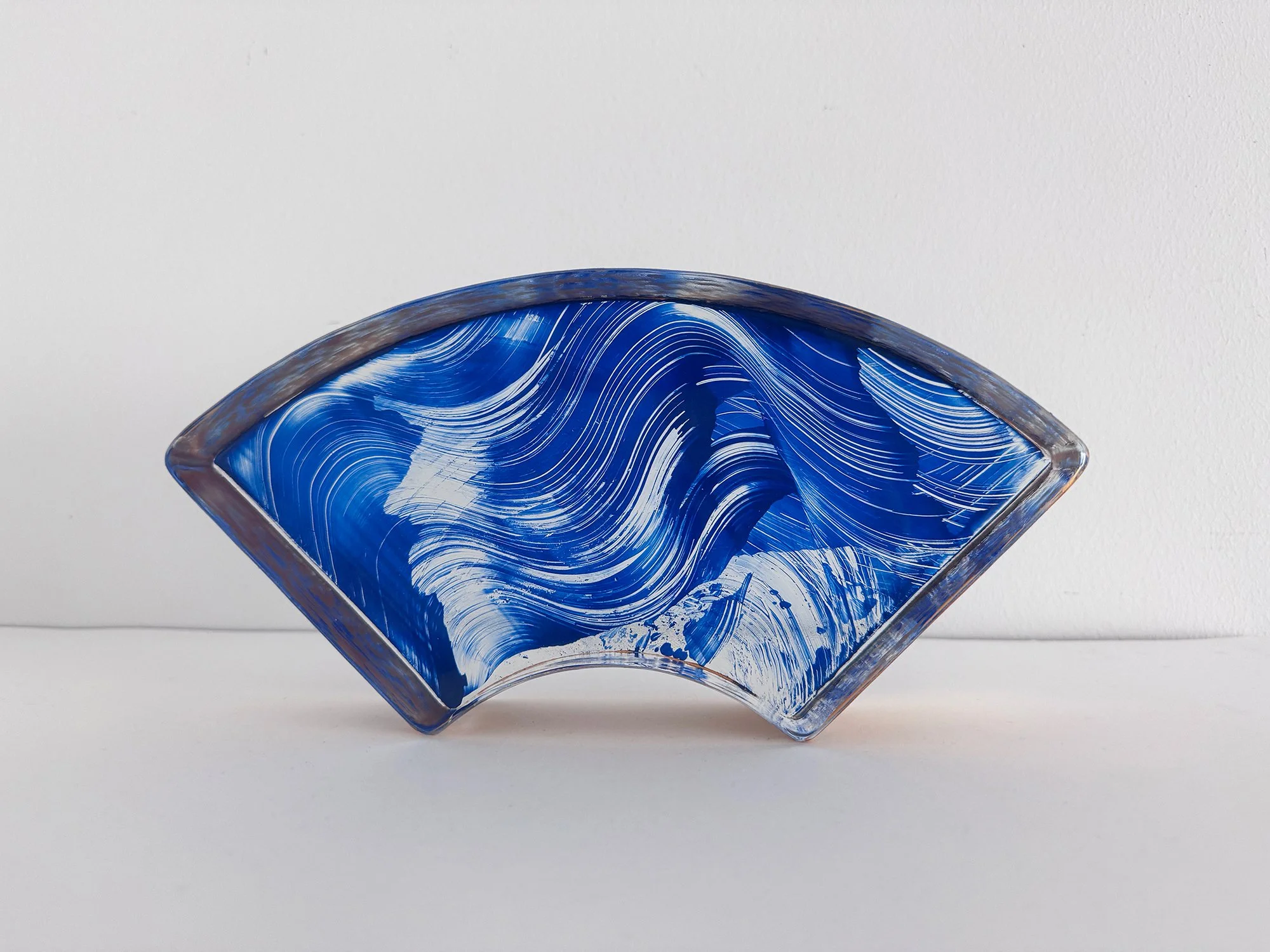
Spatial Shade Segment I is a blue geometric glass and mixed-media sculpture by Lisette Schumacher. A curved upper edge, angled sides and a concave lower edge define its fan-shaped silhouette. Intense blue colour is crossed by fine, flowing white lines, creating a sense of movement within the compact architectural form.
Part of Spatial Shade — Segment and Arch, the sculpture takes its starting point from the shaped brick. The curved brickwork and ornamental façade reliefs of the Amsterdamse School inform the series, with references to architects Jo van der Mey, Michel de Klerk and Piet Kramer.
Schumacher translates this building element into solid, hand-cast Venetian glass. In Segment I, the contrast between the precise outline and the sweeping blue-and-white composition connects architectural structure with an expressive use of colour.
Delivery in the Netherlands and Belgium is complimentary, carefully arranged in consultation, either in person or securely shipped. We’re happy to advise on placement and presentation.
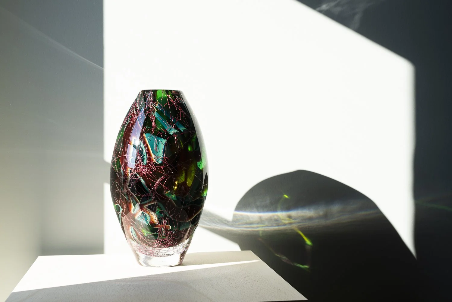
By Francisca Snel
30 × 17,5 cm
Glass, copper
Unique
In this glass sculpture from Stellar·Magnitude, Francisca Snel explores darkness, artificial light and our changing view of the night sky. Layers of deep green, turquoise and transparent glass surround fine traces of copper, which appear suspended like lines or fragments of an unknown celestial body.
The series was inspired by Snel's experience of moving from Rotterdam to rural Friesland and becoming increasingly aware of the contrast between urban light pollution and a truly dark sky. The copper also refers to conductivity, electricity and the technology behind artificial illumination.
As natural light moves through the sculpture, its transparent and coloured layers continually shift, creating an artwork that changes depending on its surroundings and viewing angle.
Delivery in the Netherlands and Belgium is complimentary, carefully arranged in consultation, either in person or securely shipped. We’re happy to advise on placement and presentation.
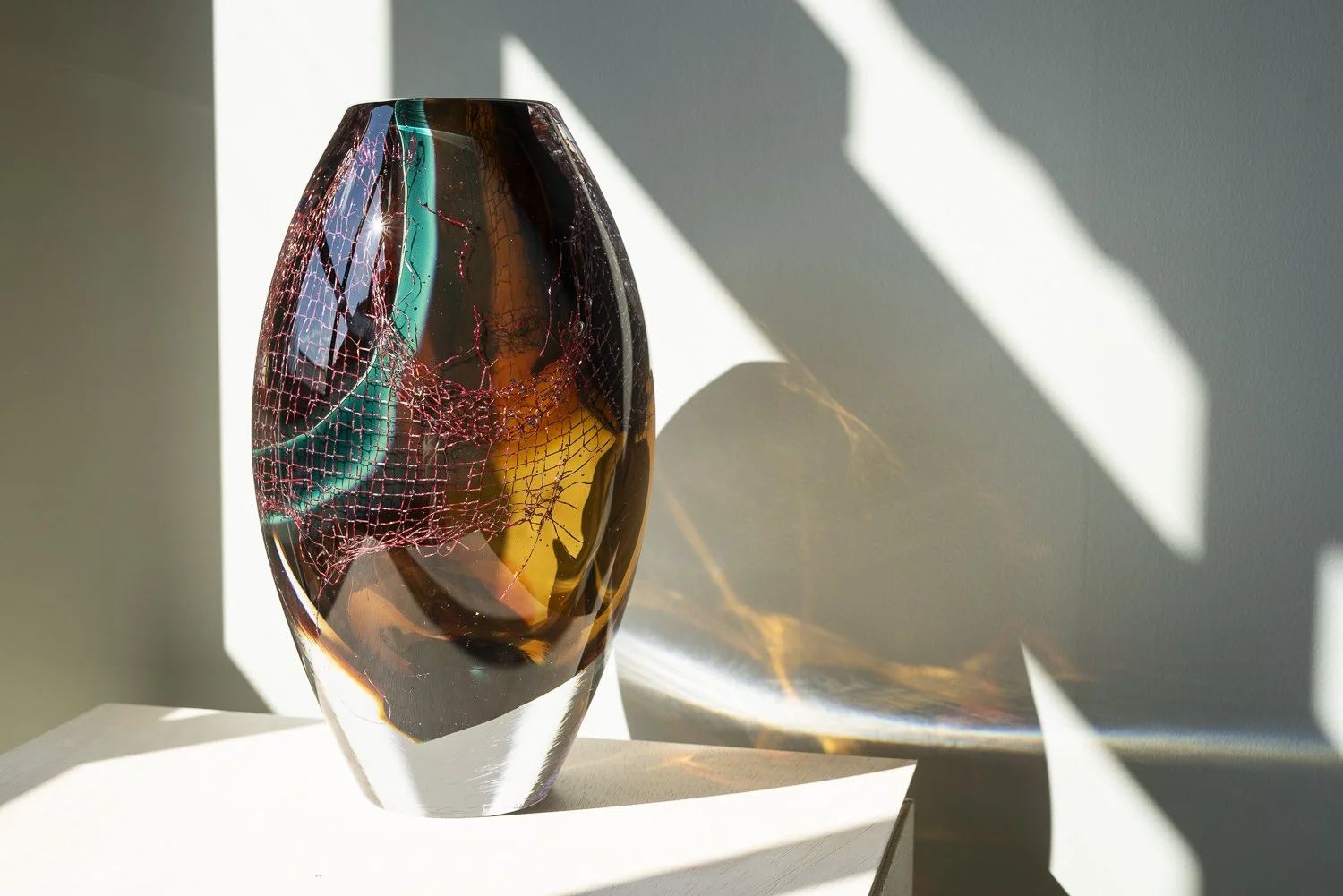
By Francisca Snel
29 × 16 cm
Glass, copper
Unique
The copper mesh takes a prominent role in Crystal Clear #14 by Francisca Snel. Visible through reddish-brown glass, its fine network occupies much of the upright form, while turquoise and amber accents gather towards the lower section.
This sculpture invites close attention to the relationship between its materials. The glass provides a smooth outer surface; the copper introduces folds, openings and an intricate internal texture. An object associated with cleaning becomes something to examine and retain, with its original structure still recognisable within the artwork.
Delivery in the Netherlands and Belgium is complimentary, carefully arranged in consultation, either in person or securely shipped. We’re happy to advise on placement and presentation.
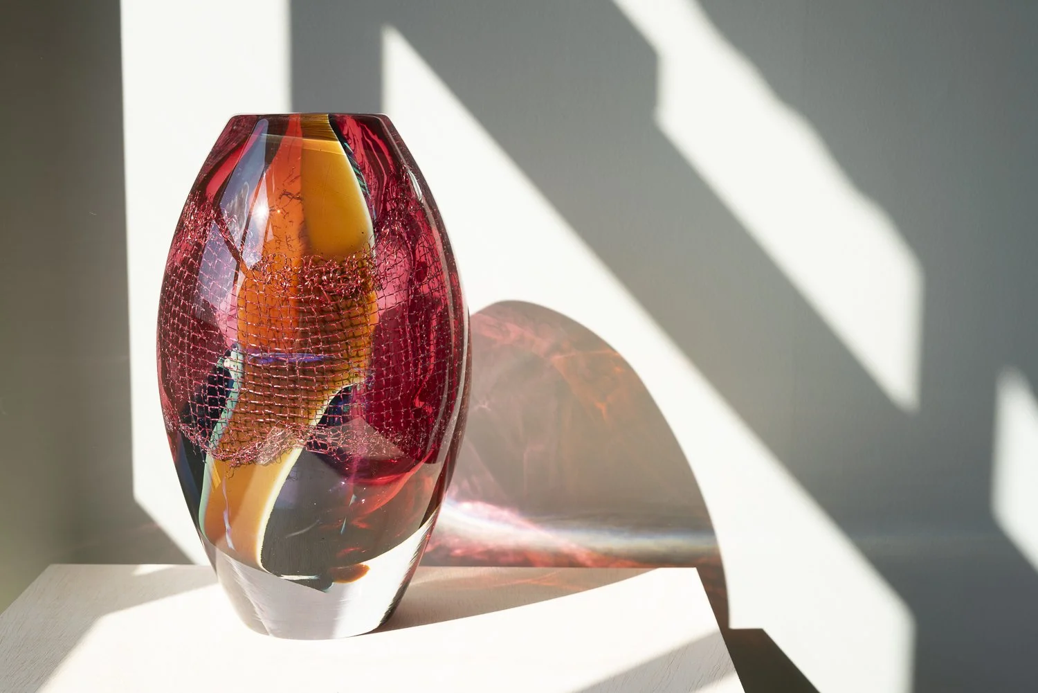
By Francisca Snel
28,5 × 17cm
Glass, copper
Unique
Crystal Clear #11 by Dutch artist Francisca Snel brings red glass and copper together in an upright, rounded sculpture. A clear outer edge surrounds the darker centre, revealing the contrast between the smooth glass surface and the intricate mesh within.
The work belongs to Snel’s Crystal Clear series, which begins with a copper cleaning sponge. Preserved within glass, this everyday object becomes the subject of sustained attention. Its tangled structure remains recognisable, connecting the sculpture’s rich colour to questions of domestic labour, care and the value we assign to ordinary materials.
Delivery in the Netherlands and Belgium is complimentary, carefully arranged in consultation, either in person or securely shipped. We’re happy to advise on placement and presentation.
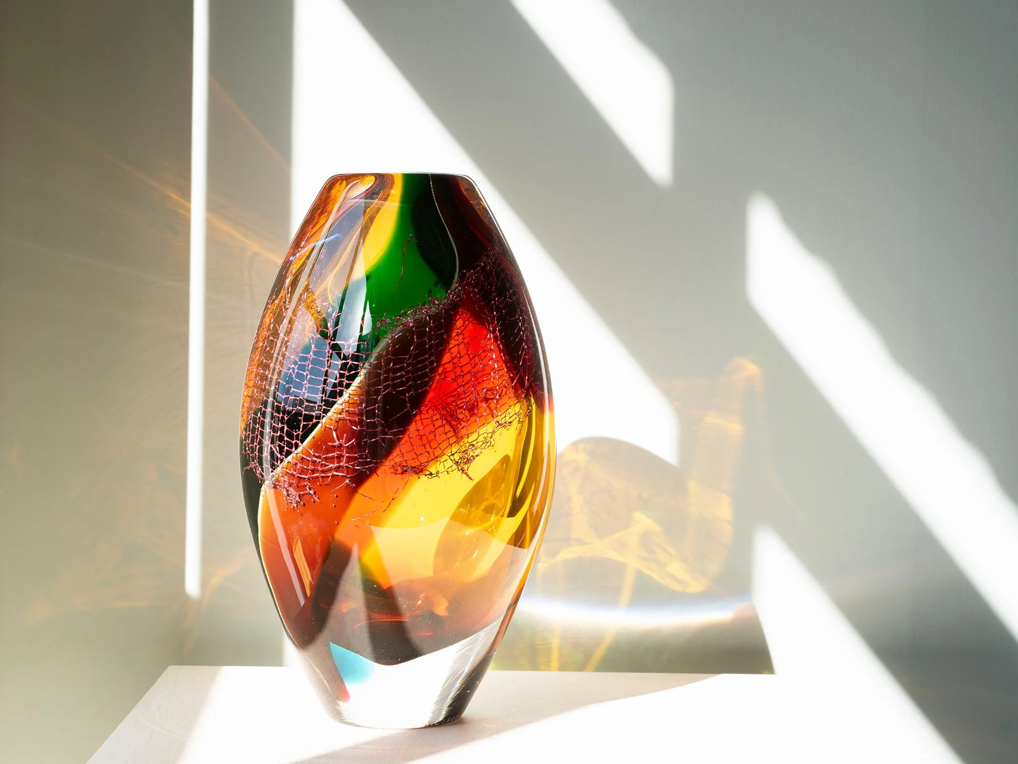
By Francisca Snel
30 × 17,5 cm
Glass, copper
Unique
Francisca Snel combines coloured glass and copper in this sculptural work from Crystal Clear. In natural light, the glass casts shifting colours and reflections onto its surroundings, extending the work beyond the object itself.
Delivery in the Netherlands and Belgium is complimentary, carefully arranged in consultation, either in person or securely shipped. We’re happy to advise on placement and presentation.
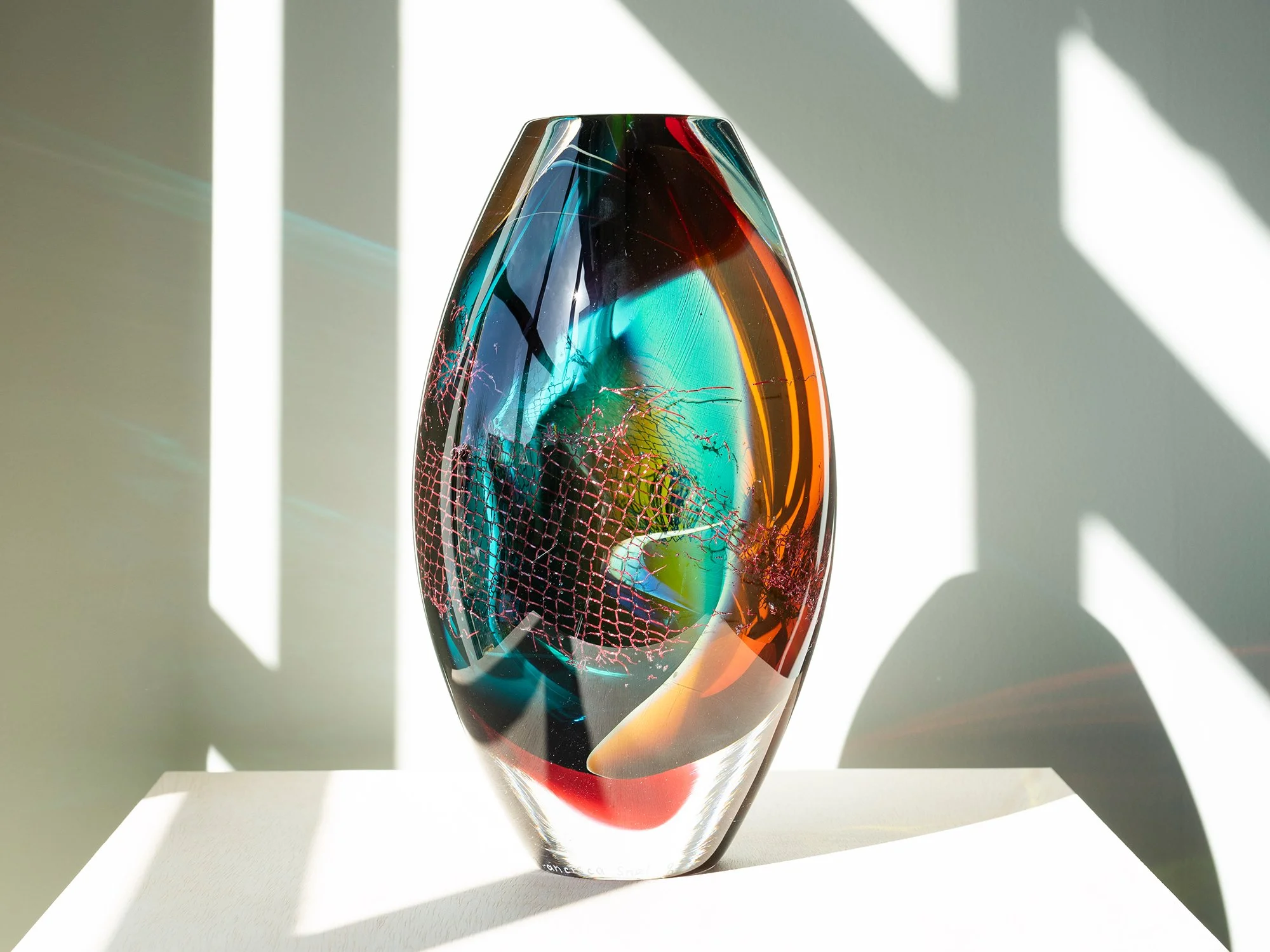
By Francisca Snel
28,5 × 16,5 cm
Glass, copper
Unique
Francisca Snel combines blown glass and copper in this colourful sculpture from her Crystal Clear series. Layers of turquoise, deep green, amber and red surround the fine structure of a copper cleaning sponge, transforming an overlooked household object into contemporary art. Because the colours, transparency and embedded copper change from every angle, the sculpture has no fixed front and can be placed freely in a space.
Delivery in the Netherlands and Belgium is complimentary, carefully arranged in consultation, either in person or securely shipped. We’re happy to advise on placement and presentation.
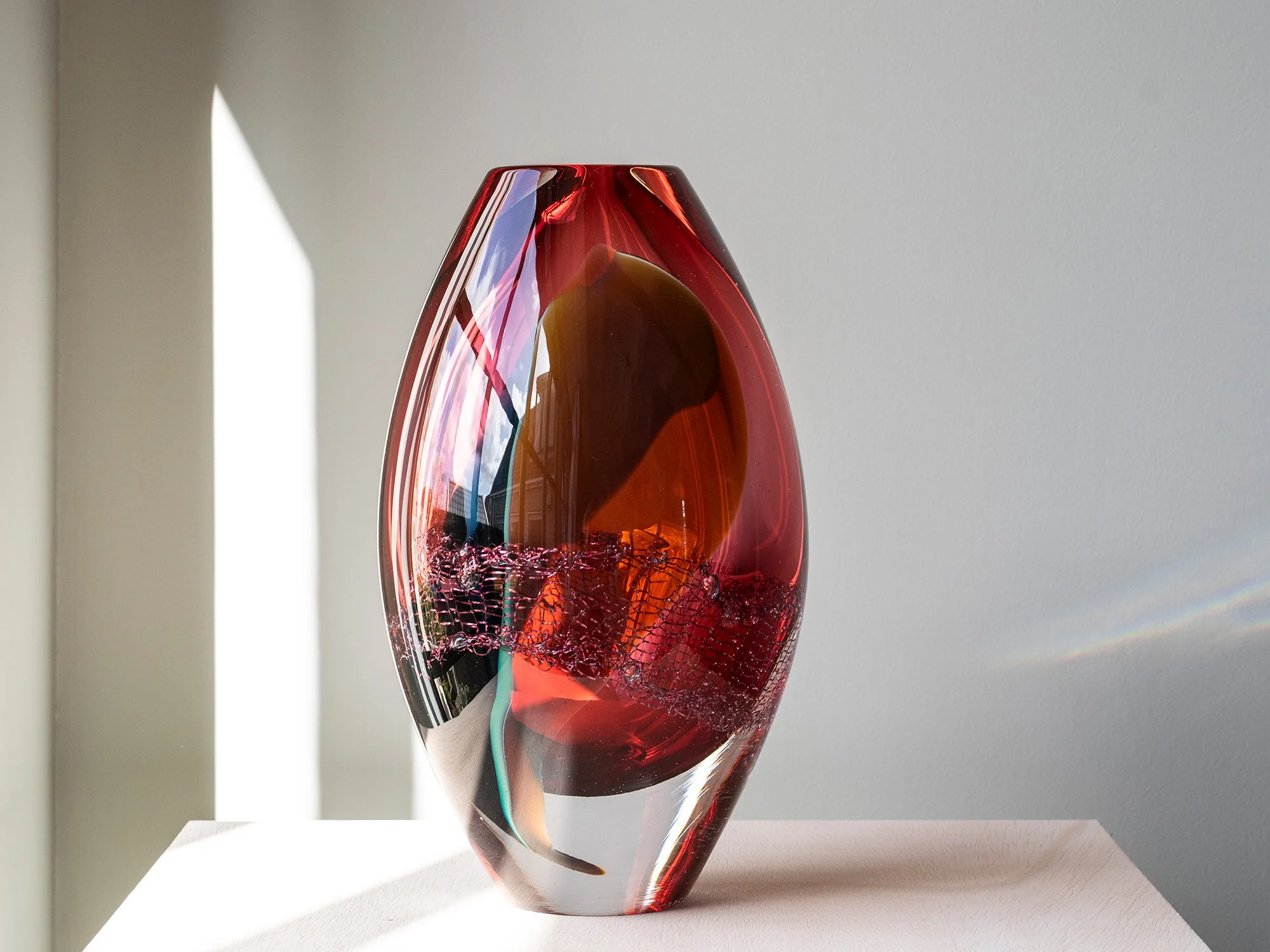
By Francisca Snel
26,5 × 16 cm
Glass, copper
Unique
Francisca Snel brings transparent pink and subtle green glass together with copper in this sculptural work from Crystal Clear. The copper cleaning sponge remains visible within the glass, while daylight passes through the sculpture and reveals changing reflections, colour and depth. Its soft palette gives the work a colourful presence without feeling visually heavy, making it particularly suited to a light, contemporary or minimal interior.
Delivery in the Netherlands and Belgium is complimentary, carefully arranged in consultation, either in person or securely shipped. We’re happy to advise on placement and presentation.

By Lisette Schumacher
25 × 12 × 10 cm, 2026
Solid hand-cast glass, paint, varnish
From the series Spatial Shade
For this series, Lisette Schumacher uses the form of the brick as a fundamental building element. Referencing modernist architects such as Mies van der Rohe, Alvar Aalto and Le Corbusier, the brick is approached not as a static unit, but as a modular structure through which space can be constructed.
In Spatial Shade XV, this architectural logic is translated into solid hand-cast glass. Rather than traditional stone, Schumacher works with glass bricks in varying tones and densities, allowing the material itself to define the work. The sculpture is built around a central void, creating a contained space that shifts through light and perspective. The coloured glass functions as both structure and surface. Its translucent quality introduces depth that is not physically measurable, but optically experienced. Layers of amber, yellow and warm orange tones intensify towards the centre, while edges remain more diffuse, allowing light to enter and disperse through the form. Subtle traces of the casting process - air bubbles, flow lines and internal variations - remain visible, reinforcing the material presence of the work. These elements are not imperfections, but essential to how the sculpture holds light.Balancing between architectural clarity and optical complexity, Spatial Shade XV operates as a compact spatial construction, where mass, colour and transparency continuously interact.
Delivery in the Netherlands and Belgium is complimentary, carefully arranged in consultation, either in person or securely shipped. We’re happy to advise on placement and presentation.

By Lisette Schumacher
25 × 10,5 × 10,5 cm, 2026
Solid hand-cast glass, paint, varnish
From the series Spatial Shade
For this series, Lisette Schumacher approaches the brick as a modular unit to construct space. Referencing modernist architecture, the work builds on the logic of stacking, balancing and repetition to create a compact spatial composition.
In Spatial Shade XIII, this principle becomes more explicitly sculptural. Two volumes are positioned in relation to each other, forming a vertical structure that feels both stable and slightly asymmetrical. The composition reads almost as a distilled architectural form, reduced to its essential elements.
The work is executed in solid hand-cast glass, replacing the traditional stone brick with a material that allows light to pass through and define the structure from within. Layers of cool blue and turquoise tones interact with deeper, more saturated accents, creating a shifting visual depth that changes with the viewer’s position.
The surface carries traces of its making: subtle flow lines, variations in density and small inclusions that emphasise the physical process of casting. These details activate the interior of the work, giving the sculpture a sense of movement within an otherwise precise form.
Rather than describing space, the work constructs it, using colour, mass and transparency as its primary tools.
Delivery in the Netherlands and Belgium is complimentary, carefully arranged in consultation, either in person or securely shipped. We’re happy to advise on placement and presentation.
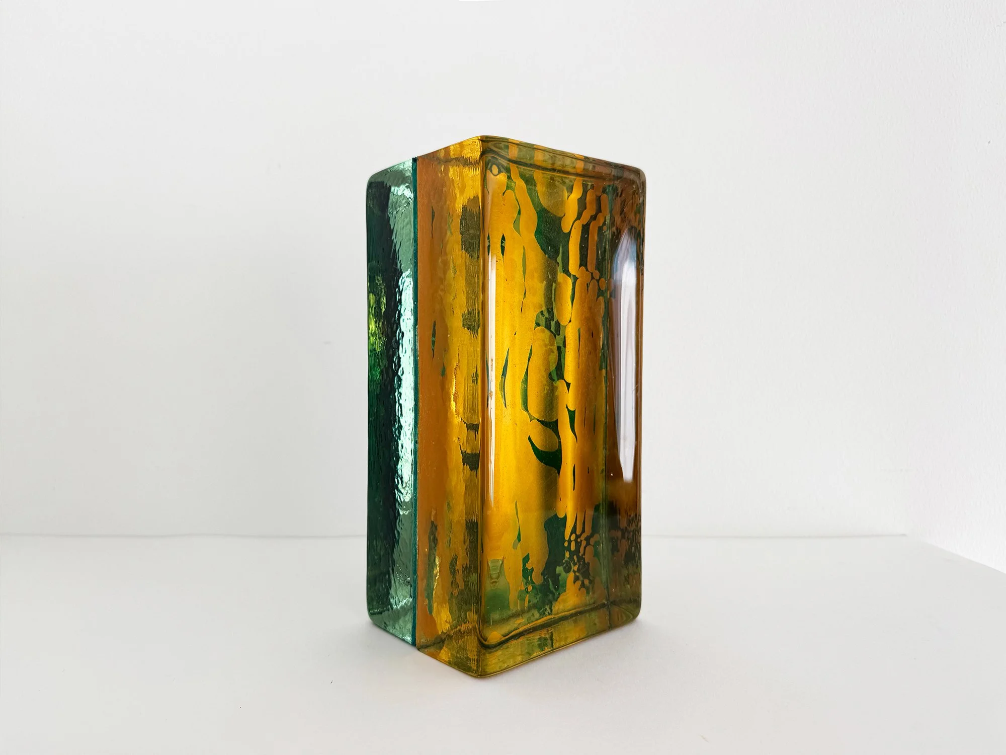
By Lisette Schumacher
25 × 15 × 10 cm, 2025
Solid hand-cast glass, paint, varnish
From the series Spatial Shade
In the Spatial Shade series, Lisette Schumacher creates glass sculptures from solid handcast coloured glass. Each work is carefully composed from individual glass elements, resulting in balanced forms that reveal subtle differences in colour and transparency.
Light plays an essential role in these sculptures. As light moves through the glass, reflections and colour variations appear within the material. The sculpture changes depending on the angle from which it is viewed, revealing different layers and tones.
The compact scale of the work allows for close viewing, where the depth of the glass and the transitions between colours become visible. The weight and clarity of the material give the sculpture a strong physical presence.
Schumacher’s sculptures highlight the qualities of glass as a material, where colour, light and form come together in a single object.
Delivery in the Netherlands and Belgium is complimentary, carefully arranged in consultation, either in person or securely shipped. We’re happy to advise on placement and presentation.

By Lisette Schumacher
35 × 12 × 5 cm, 2025
Solid hand-cast glass, paint, varnish
From the series Spatial Shade
For this series, Lisette Schumacher uses the form of the brick as a building block. Inspired by architects such as Mies van der Rohe, Alvar Aalto and Le Corbusier, she approaches the brick not as a conventional construction material, but as a modular element through which space, balance and rhythm can be composed.
In Spatial Shade V, this idea takes on a more open and vertical form. Three stacked volumes create a slender sculptural composition that feels both stable and precarious, almost like a distilled architectural study. The work balances mass and lightness, geometry and movement.
Rather than working with stone, Schumacher uses solid cast glass bricks in different proportions. This choice transforms the brick from a practical module into a luminous surface. In this work, vibrant blue and turquoise tones move through the glass in layered, fluid patterns, creating a strong sense of internal motion. The colour does not sit on the surface, but appears to unfold within the material itself.
As light enters the sculpture, the work reveals varying densities, lines and optical shifts. Subtle traces of the casting process remain visible, reinforcing the physical nature of the object. At the same time, the flowing colour fields soften the strict geometry of the stacked form.
Spatial Shade V brings together key elements of Schumacher’s practice: modern architecture, modular composition, illusionary depth and the spatial potential of glass. Compact in footprint yet visually expansive, the sculpture changes throughout the day and rewards slow looking.
Delivery in the Netherlands and Belgium is complimentary, carefully arranged in consultation, either in person or securely shipped. We’re happy to advise on placement and presentation.
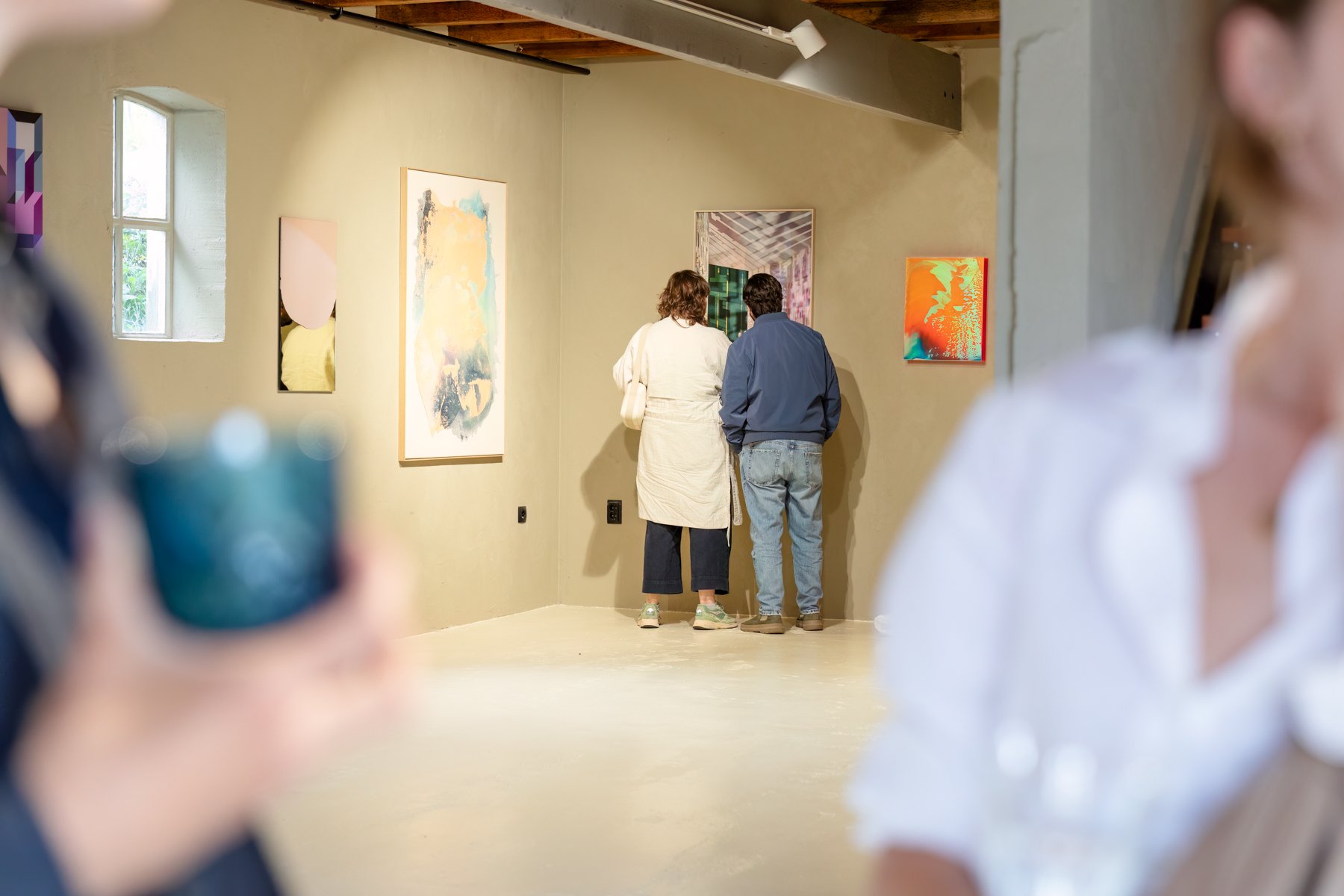
View all the available artworks
Thoughtfully created and carefully selected
Contact
Contact@root.gallery
+31 - 6 23819111
Address
Molendijk 46
2931 SC, Krimpen aan de Lek
The Netherlands
By Karen van de Vliet
85 × 65 cm, 2026
Mixed acrylic paint on cotton, framed
Translucent XVIII by Karen van de Vliet is built around a striking shift in weight. Fine lines of colour descend through pale, translucent paint before being drawn into a dense black form.
Yellow, blue, red and green remain visible within the darker surface, as if the colour continues beneath it. Differences in transparency, gloss and relief give this abstract painting a strong physical presence that becomes especially apparent at close range.
This original work by the Dutch painter measures 85 × 65 cm and is presented in a light wooden frame. It can be viewed by appointment at Root Gallery or acquired online.
Delivery within the Netherlands and Belgium is arranged in consultation, either in person or securely shipped.