
Looking Back: Root Gallery at KunstRAI 2025
One fair, two booths and a week full of energy
This year at KunstRAI, we presented two booths side by side: a focused solo with Lisette Schumacher, and a group presentation featuring new work by Donald Schenkel, Noah Arends, Vera Klaus, Karen van de Vliet and Jan Theun van Rees.

Lisette Schumacher’s solo booth brought together multiple series that each reflect her ongoing fascination with light, architecture and perception. From early supporters to first-time viewers, many took the time to look closely. Several works have since found new homes, and beautiful commissions have been requested. For those who’ve followed our journey together since 2015, it was simply a joy to see these recent bodies of work side by side, a clear reflection of how her practice continues to deepen and expand.


A particular highlight was Jan Theun van Rees’ Painted Room series, presented on a deep grey wall that quietly amplified the intensity of the images. With striking shades of red, purple, and orange, the works drew many visitors in and held their attention.
Throughout the week, we had meaningful conversations about the series, both with collectors and with curious first-time visitors. Jan Theun was present for much of the fair and took the time to speak with people directly, about his process, about building spaces that only exist to be photographed, and about what it means to construct atmosphere rather than capture it.
By the end of the week, eight works had found a new home. A quiet success, and a testament to the strength of the work.
(View the series here)

Photography by Jacqueline Fuijkschot
What else was on view in the group booth? A vivid mix of textures, colours and approaches that played off one another in unexpected ways. Karen van de Vliet brought in softness and wit with her Bubblegum series, sculptural works in light pinks that felt nostalgic and contemporary at once. The entire new series sold out during the fair. Across from her, Noah Arends presented Layers of Pink, a series of large textile works where photographic fragments are reassembled into subtle, layered compositions. Abstract and refined, with a quiet presence. Their calm energy balanced well with the expressive canvases of Donald Schenkel, who never paints with a brush but uses tools he makes himself to push and pull colour across the surface. His new works brought boldness, texture and a sense of movement. Vera Klaus showed new pieces too. Including, for the first time, square-format works that added a different kind of tension to her precise, distilled language.
Together, the booth offered more than just contrast in materials and scale. It was a space full of colour, openness and rhythm, work that brings lightness in a time that can feel heavy.

Photography by Jacqueline Fuijkschot
Thank you to everyone who visited our booths, took the time to look, and shared their thoughts with us. These conversations - thoughtful, unexpected, sometimes wonderfully specific - are what make fairs like this meaningful.
If you’d like to revisit any of the works you saw at KunstRAI, or if you missed us in Amsterdam: you’re very welcome at the gallery. Several works are still available and can also be viewed online.
Schedule your viewing at the gallery.


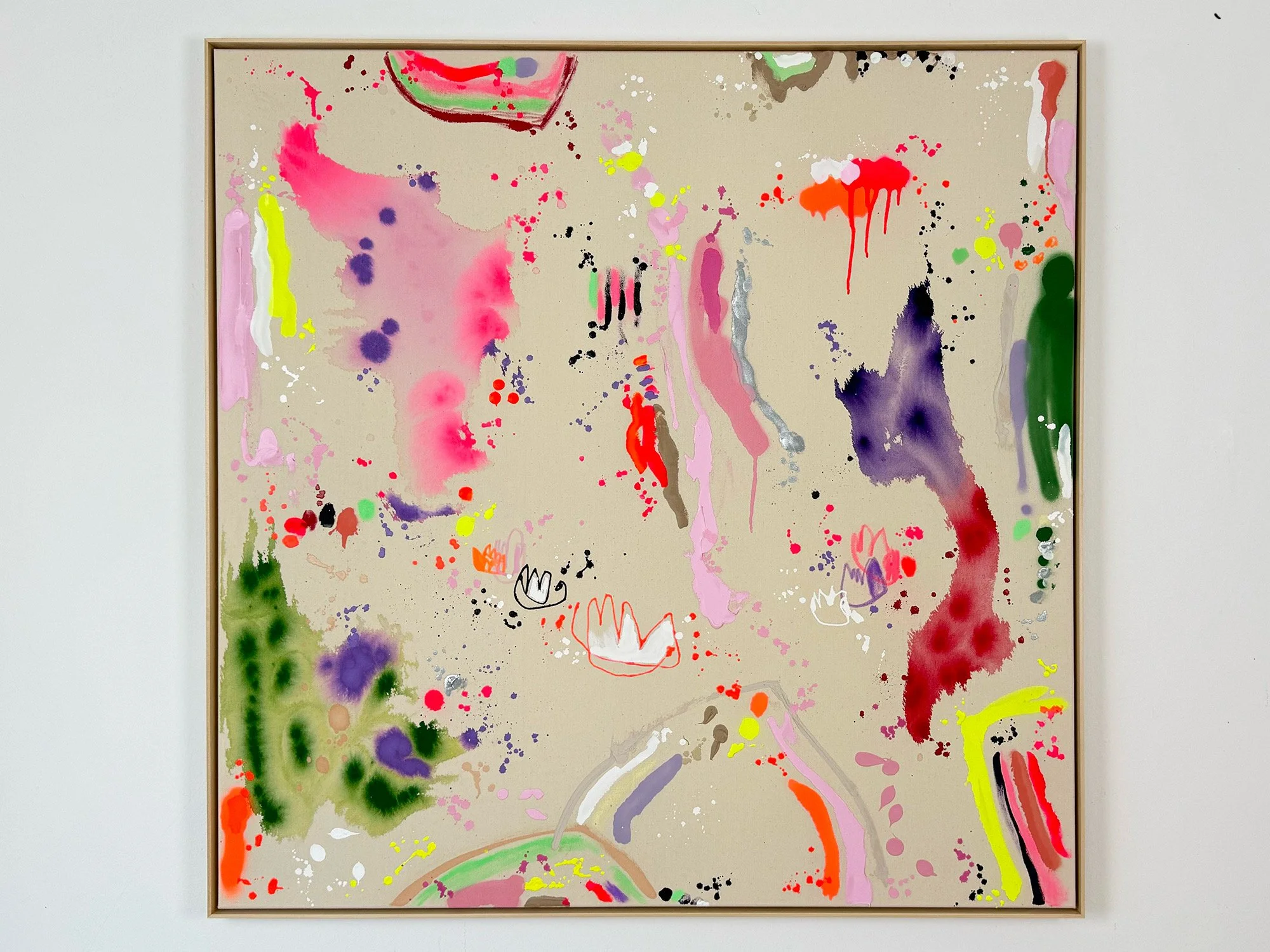
By Vera Klaus
100 × 100 cm, 2026
Mixed Media on canvas, framed
Auszeit (Time Out) is a mixed media painting by Vera Klaus in which vivid colour spreads across raw canvas through spontaneous gestures, drips and fluid paint stains. Bright tones of pink, yellow, orange and deep violet interact with delicate lines and splashes of pigment, creating a composition that feels both energetic and open.
The painting develops through movement rather than structure. Larger colour gestures dissolve into the surface while smaller marks and drawn elements appear between them, forming a lively rhythm across the canvas. Areas of exposed canvas remain visible, allowing the material qualities of the surface to play an important role.
The work carries a sense of pause within movement. Colour gathers and disperses across the canvas, creating a moment of lightness and reflection within the expressive flow of the composition.
Delivery within the Netherlands and Belgium is arranged in consultation, either in person or securely shipped.
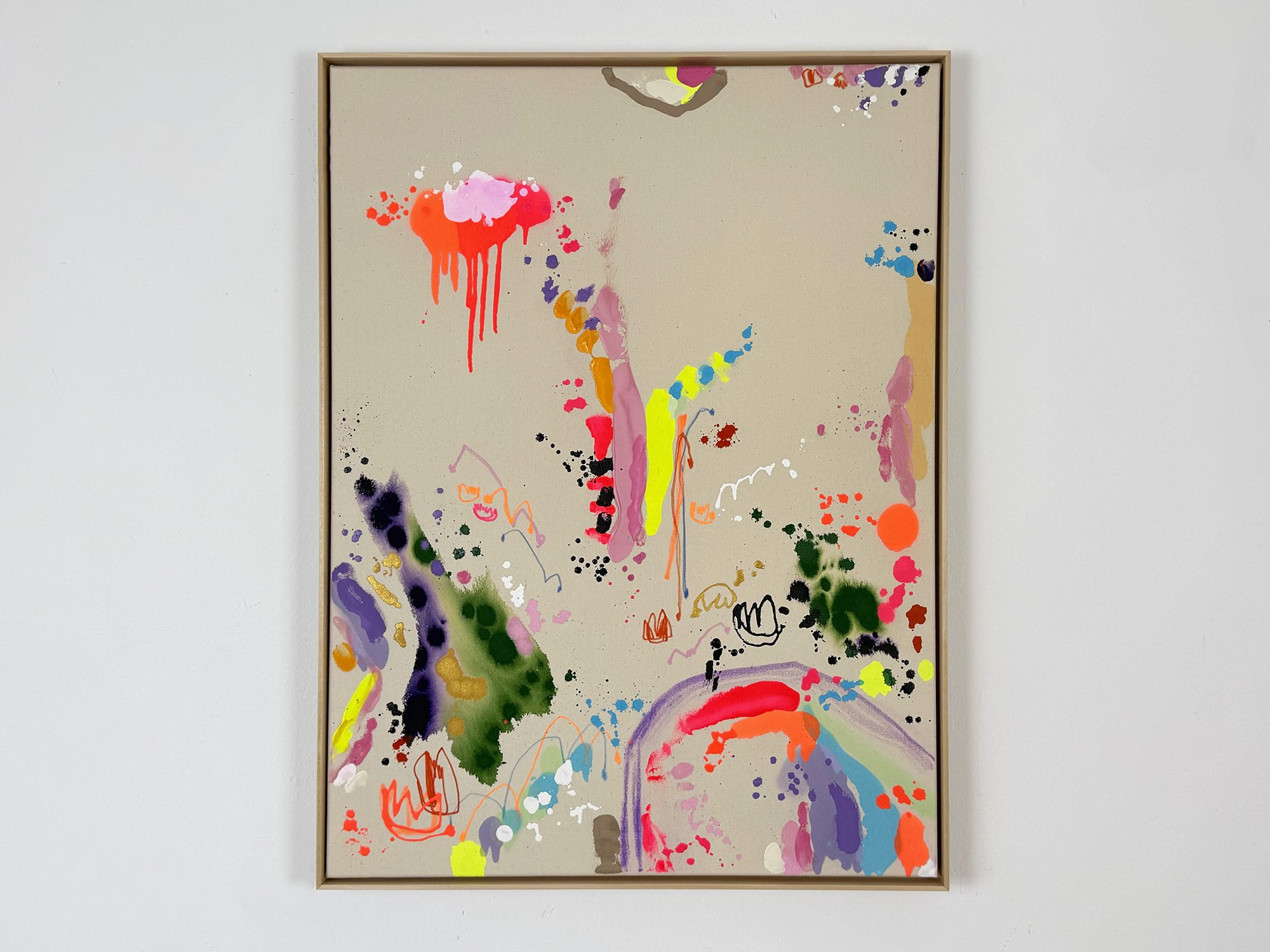
By Vera Klaus
80 × 60 cm, 2026
Mixed Media on canvas, framed
Gutes Gefühl (Good Feeling) is a mixed media painting by Vera Klaus in which colour spreads freely across raw canvas through drips, stains and quick gestural marks. Bright tones of neon pink, orange, yellow and deep green appear to surface organically, interacting with delicate lines and spontaneous splashes of pigment.
The composition unfolds through rhythm rather than structure. Larger colour fields dissolve into soft edges while smaller marks and drawn elements create a lively constellation across the surface. Areas of exposed canvas remain visible, allowing the natural texture of the material to play an active role in the painting.
The result is a work that feels energetic yet balanced, where colour moves lightly across the canvas and moments of intensity are offset by calm, open space. The painting captures the immediacy of the artist’s gesture and the intuitive process through which the composition emerged.
Delivery within the Netherlands and Belgium is arranged in consultation, either in person or securely shipped.
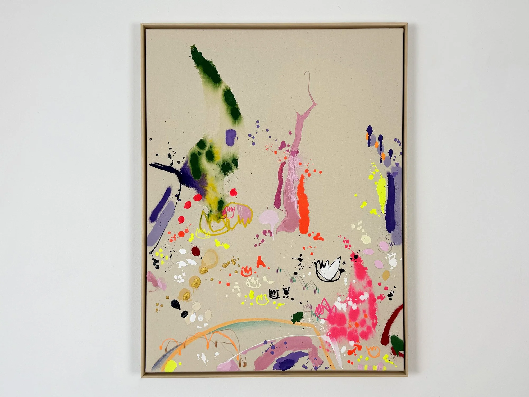
By Vera Klaus
80 × 60 cm, 2026
Mixed Media on canvas, framed
Frühlingstanz (Spring Dance) is a mixed media painting by Vera Klaus in which colour moves freely across raw canvas through splashes, washes and quick gestural marks. Bright pink, neon yellow, deep green and violet appear to surface organically, interacting with small drawn elements and fluid paint stains.
The composition develops through rhythm rather than structure. Areas of exposed canvas keep the material surface visible, while thin lines and small forms appear between the larger gestures, suggesting fragments of plants, movement or fleeting impressions.
The work carries the energy of a landscape coming to life. Colour spreads, dissolves and gathers again across the surface, creating a dynamic balance between spontaneity and control that gives the painting its lively, intuitive character.
Delivery within the Netherlands and Belgium is arranged in consultation, either in person or securely shipped.
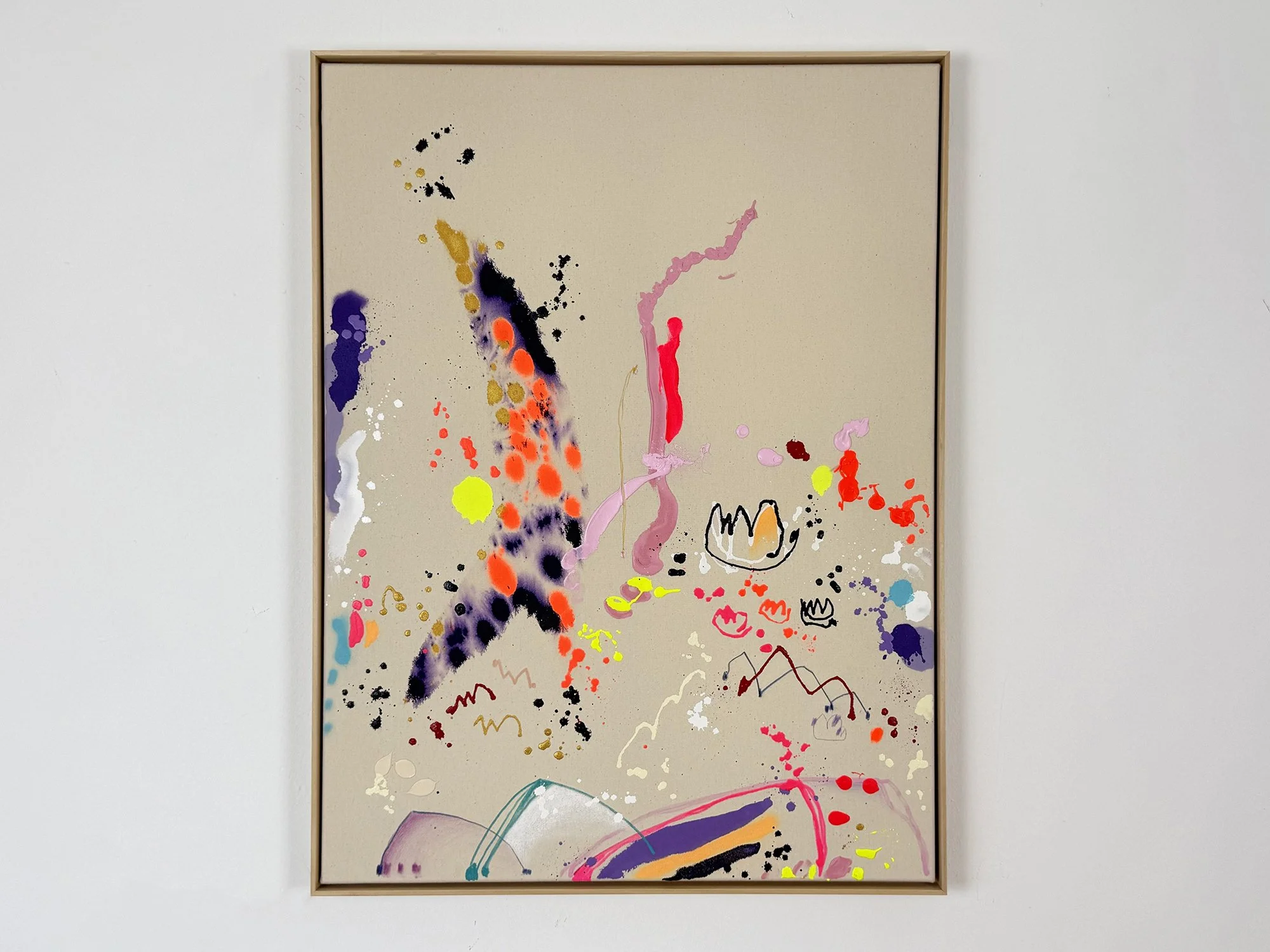
By Vera Klaus
80 × 60 cm, 2026
Mixed Media on canvas, framed
Morgensonne (Morning Sun) is a mixed media painting by Vera Klaus in which vivid colour appears across raw canvas through fluid washes, splashes and spontaneous gestures. Soft violet, bright orange, neon yellow and pink pigments move freely across the surface, forming an open and airy composition.
Rather than building a dense image, the artist allows space to remain visible. The natural tone of the canvas creates calm between the energetic paint marks, while thin lines and small symbolic forms appear among the larger colour gestures.
The painting carries a sense of movement and lightness. Colour seems to drift, gather and dissolve across the surface, creating a rhythm that suggests the quiet energy of a landscape awakening in the early morning.
Delivery within the Netherlands and Belgium is arranged in consultation, either in person or securely shipped.
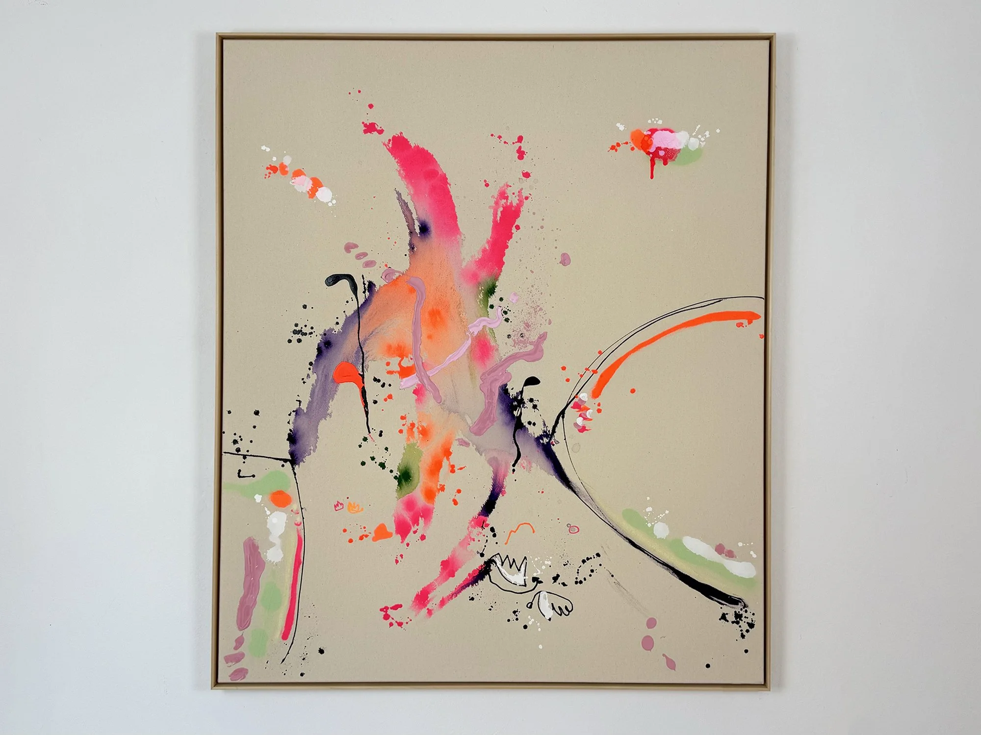
By Vera Klaus
120 × 100 cm, 2026
Mixed Media on canvas, framed
Traumhafte Begegnung (Dreamlike Encounter) is a mixed media painting by Vera Klaus in which luminous colour unfolds across raw canvas through spontaneous paint gestures and fluid pigment stains. Bright pink, neon yellow, green and purple tones move freely across the surface, interacting with thin lines and scattered paint splashes.
Rather than forming a fixed image, the composition emerges through rhythm and balance. Larger colour fields dissolve into the surface while smaller marks appear across the canvas, creating an open and layered structure.
The work carries a sense of encounter and movement, where colour seems to drift, gather and disperse across the canvas, creating an atmosphere that feels both energetic and playful.
Delivery within the Netherlands and Belgium is arranged in consultation, either in person or securely shipped.
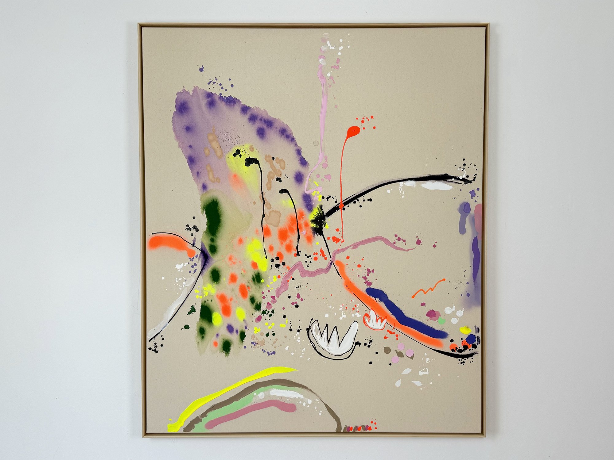
By Vera Klaus
120 × 100 cm, 2026
Mixed Media on canvas, framed
Tanzende Blüten (Dancing Blossoms) is a vibrant mixed media painting by Vera Klaus in which colour moves freely across raw canvas through splashes, stains and gestural marks. Bright pink, yellow, green and violet pigments appear to unfold organically, interacting with quick lines and spontaneous paint drips.
The composition remains open and dynamic. Large colour gestures are balanced by lighter marks and areas of visible canvas, creating a rhythm that feels fluid and energetic. Thin lines and small forms move between the broader strokes, adding moments of structure within the expressive surface.
The painting suggests movement and growth, as if colour is drifting across the canvas like petals carried by the wind. This balance between energy and openness gives the work its lively character.
Delivery within the Netherlands and Belgium is arranged in consultation, either in person or securely shipped.
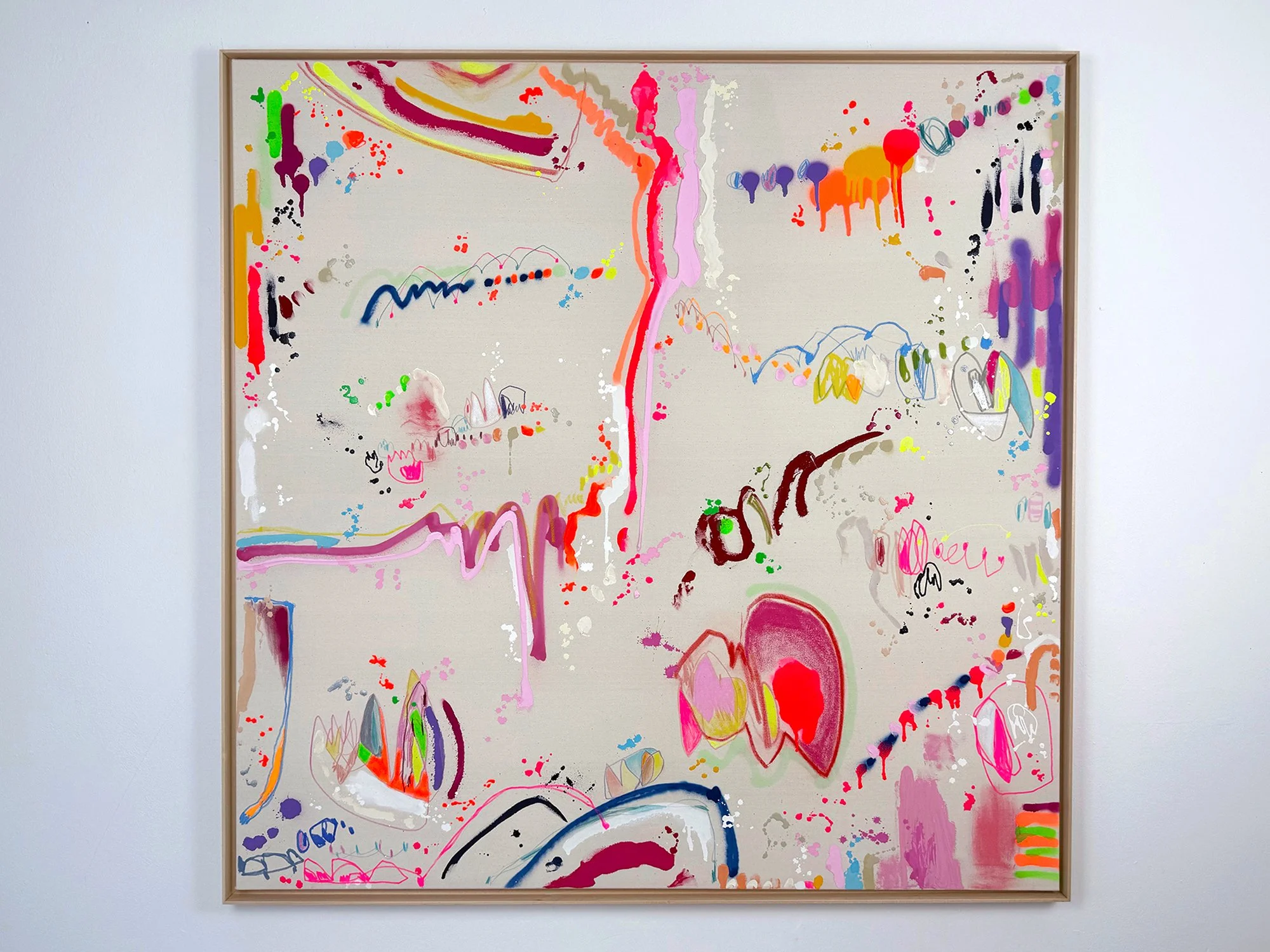
By Vera Klaus
130 × 130 cm, 2025
Mixed Media on canvas, framed
With happy place, Vera Klaus brings together all the elements that define her work: layered gesture, delicate line, confident colour, and a sense of playful freedom. But more than anything, this large-scale piece feels like a landscape of emotion, one you’re invited to walk through.
The title may sound simple, but in this painting it becomes something layered and expansive. Marks appear like echoes of a thought or a mood. Bright reds and oranges flicker beside subtle pastels, soft fades contrast with sharp outlines. There's humour, softness, curiosity, all coexisting in one frame.
As with most of her work, the composition emerged through movement and improvisation, guided by music and mood. There’s no fixed centre here. It’s a place to wander.
Delivery within the Netherlands and Belgium is arranged in consultation, either in person or securely shipped.
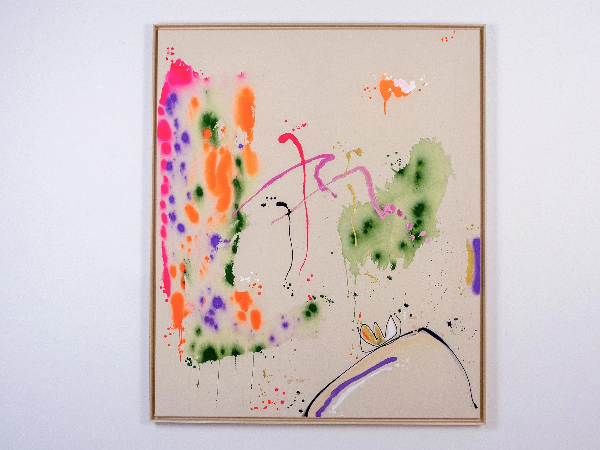
By Vera Klaus
120 × 100 cm, 2025
Mixed Media on canvas, framed
Some feelings speak for themselves. strahlendes Glück - “radiant happiness” - bursts with colour and motion, yet leaves space between the marks. It’s not loud, but undeniably present.
Spray-painted layers in orange, green and purple stretch across the canvas like a moment unfolding. Pink and gold gestures trace a path through it all, while a sketched motif near the bottom corner adds a quiet sense of grounding. The composition feels open, but held together by rhythm and care.
As always, Vera Klaus works from intuition. Sound, movement, materials, all play a role in shaping what happens on the surface. The title doesn’t explain the work, but offers a suggestion: maybe this is what happiness looks like when you stop trying to define it.
Delivery within the Netherlands and Belgium is arranged in consultation, either in person or securely shipped.
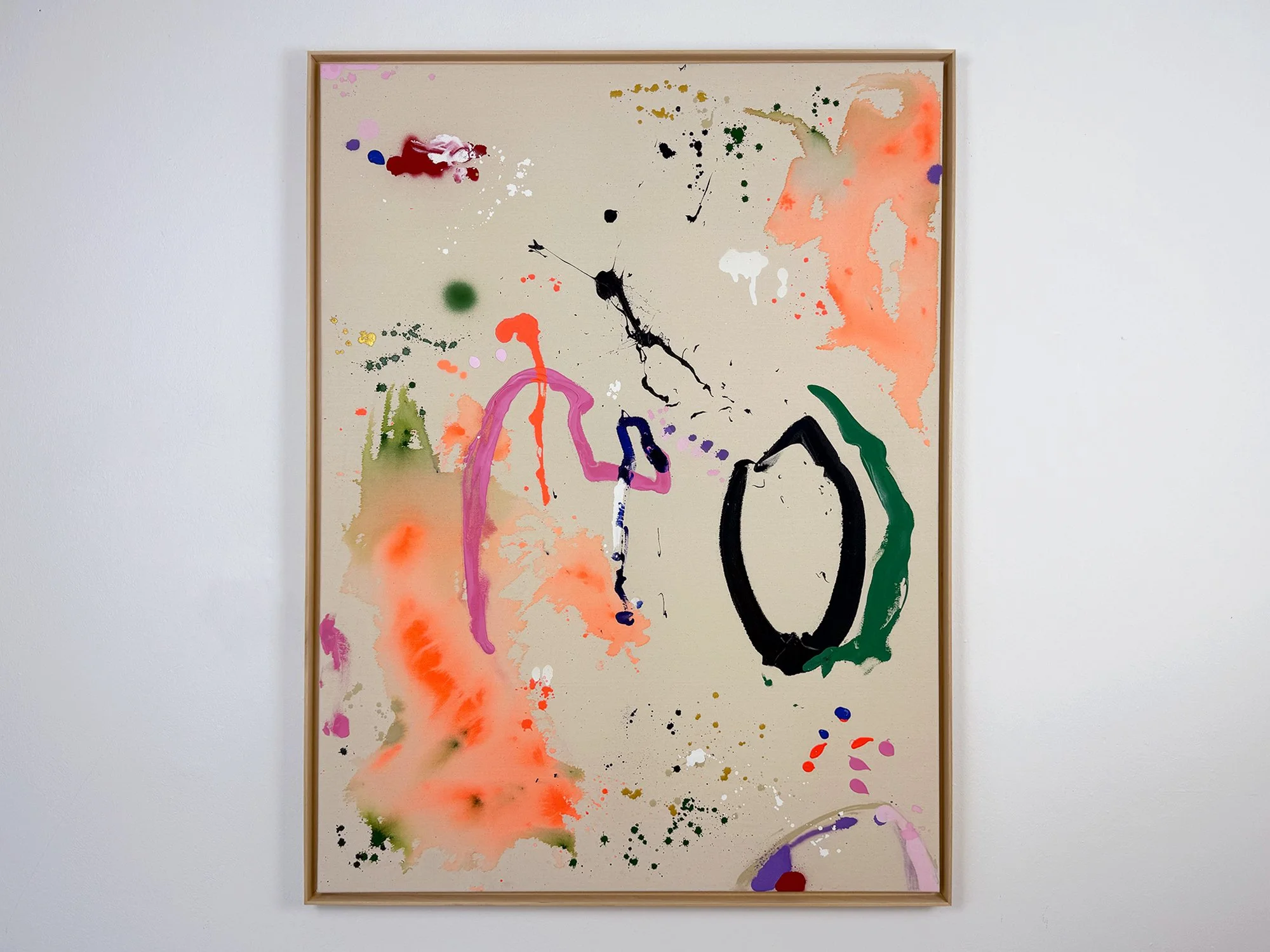
By Vera Klaus
120 × 90 cm, 2025
Mixed Media on canvas, framed
warme Umarmung - “warm embrace” - is one of those works that feels as if it came together in a single breath. Bold, fluid gestures intersect with delicate drips, cloud-like stains and sharp black lines. Together they form a composition that is energetic, raw and surprisingly tender.
The canvas seems to hold a memory of movement. Vera Klaus paints from a place of intuition, allowing the materials to guide her. There is no plan, just response: to sound, to colour, to gesture.
This painting is both open and layered, bright orange washes run into lilac shapes, a thick oval grounds the piece, while unexpected marks keep the viewer’s eye moving. The result is physical and emotional at once: an embrace made visible.
Delivery within the Netherlands and Belgium is arranged in consultation, either in person or securely shipped.
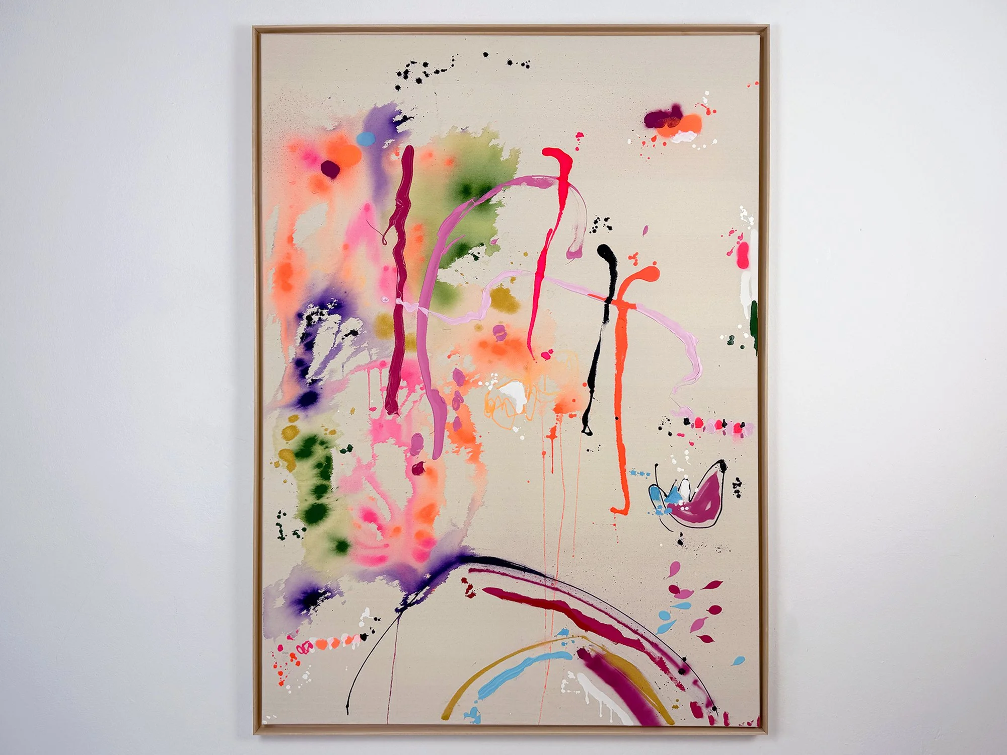
By Vera Klaus
140 × 100 cm, 2025
Mixed media on canvas, framed
The title sorgenfrei - meaning “carefree” - says it all. In this large painting, Vera Klaus allows colour, gesture and rhythm to lead the way. There’s no need for control or resolution, the pleasure lies in the flow itself.
Drips, curves, and sweeping colour shifts fill the canvas, yet nothing feels forced. Marks appear and dissolve. Lines are playful, layered, and full of variation, from a sharp red stroke to a powdery pink blur. There's even a moment of humour in a small drawing tucked near the bottom right.
The painting feels like a dance between spontaneity and attention. Each move responds to the last, guided by instinct, emotion, and sound, as with all of Vera Klaus’ work. What remains is a sense of openness, a kind of visual ease that feels light but grounded.
Delivery within the Netherlands and Belgium is arranged in consultation, either in person or securely shipped.
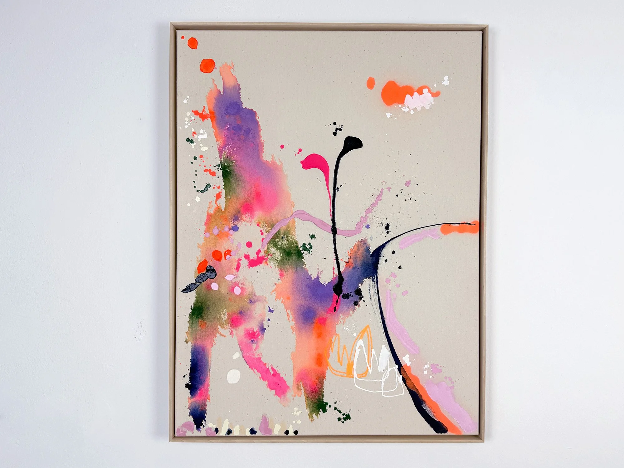
By Vera Klaus
80 × 60 cm, 2025
Mixed Media on canvas, framed
Sometimes, something small holds a kind of magic. kleine Zauberei - “little magic” - captures a fleeting, light-hearted moment where play and intuition take over. A blot of pink, a curious mark, a burst of colour that lands just right. This work feels like a page torn from an afternoon that wasn’t planned, but somehow stayed with you.
Vera Klaus works with acrylics, spray paint, ink and pastel, but lets the material speak as much as the hand. Instead of trying to control the process, she listens. Drops fall, colours run, lines emerge. And slowly, a composition begins to take shape.
The result is open, tactile and full of rhythm. Like most of her paintings, kleine Zauberei was created while listening to music, letting her mood guide each gesture. The title adds a final note: not to explain, but to invite a closer look.
Delivery within the Netherlands and Belgium is arranged in consultation, either in person or securely shipped.

By Vera Klaus
80 × 60 cm, 2025
Mixed Media on canvas, framed
Despite its title, Ozean by Vera Klaus is anything but a traditional seascape. Instead of blues and greys, the canvas pulses with warm tones of orange, deep purple, and soft touches of white. These colours move across the surface like waves of emotion, layered, intuitive, and full of tension.
The work reflects Vera’s characteristic approach: textured, energetic, and guided by process. Each mark is both a response and an offering, revealing glimpses of what lies beneath without ever fully settling into clarity. Ozean captures a sense of movement and depth, not of water, but of thought and feeling. It’s a painting that continues to shift long after you’ve looked away.
Delivery within the Netherlands and Belgium is arranged in consultation, either in person or securely shipped.

By Vera Klaus
80 x 80 cm, 2024
Mixed media on cotton
Vera Klaus creates vibrant and dynamic compositions using diverse materials, including spray paint, acrylic, and chalk. Inspired by music, she channels its flow to evoke joy and positive emotions, seamlessly translating her happiness into her art. Through evocative titles, she enhances the uplifting energy of her works, inviting viewers to share in her inspiration. Everyday moments - like sunlight on your skin, blooming fields, or warm encounters - fuel her creativity, grounding her art in the beauty of the present. Each painting becomes a tangible expression of these fleeting yet profound experiences, radiating a sense of connection and vitality.
Delivery within the Netherlands and Belgium is arranged in consultation, either in person or securely shipped.

By Vera Klaus
80 × 80 cm, 2024
Mixed Media on unprepared cotton
Vera Klaus creates vibrant and dynamic compositions using diverse materials, including spray paint, acrylic, and chalk. Inspired by music, she channels its flow to evoke joy and positive emotions, seamlessly translating her happiness into her art. Through evocative titles, she enhances the uplifting energy of her works, inviting viewers to share in her inspiration. Everyday moments - like sunlight on your skin, blooming fields, or warm encounters - fuel her creativity, grounding her art in the beauty of the present. Each painting becomes a tangible expression of these fleeting yet profound experiences, radiating a sense of connection and vitality.
Delivery within the Netherlands and Belgium is arranged in consultation, either in person or securely shipped.

By Vera Klaus
80 × 60 cm, 2024
Mixed Media on unprepared cotton
Vera Klaus creates vibrant and dynamic compositions using diverse materials, including spray paint, acrylic, and chalk. Inspired by music, she channels its flow to evoke joy and positive emotions, seamlessly translating her happiness into her art. Through evocative titles, she enhances the uplifting energy of her works, inviting viewers to share in her inspiration. Everyday moments - like sunlight on your skin, blooming fields, or warm encounters - fuel her creativity, grounding her art in the beauty of the present. Each painting becomes a tangible expression of these fleeting yet profound experiences, radiating a sense of connection and vitality.
Delivery within the Netherlands and Belgium is arranged in consultation, either in person or securely shipped.
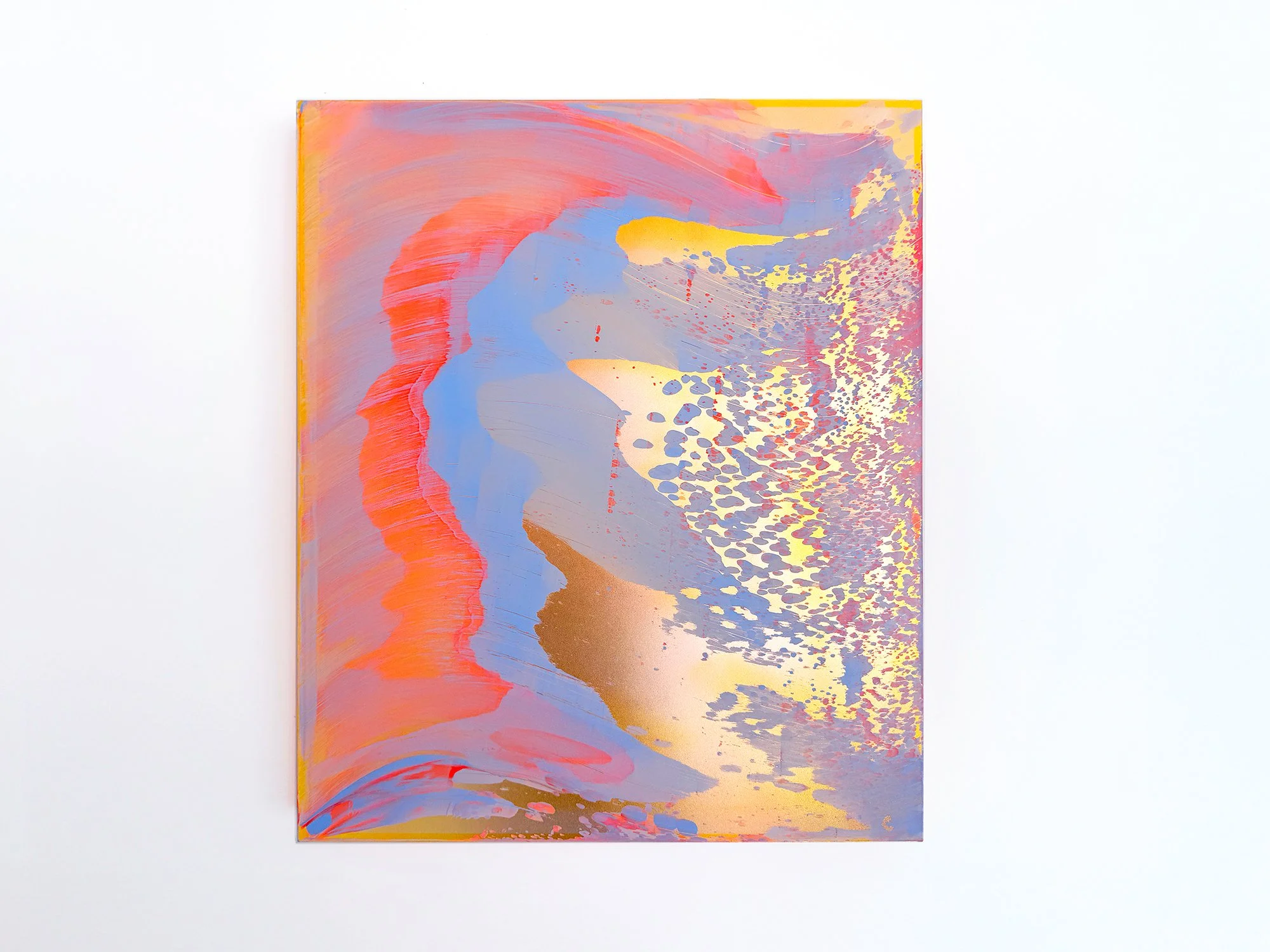
By Lisette Schumacher
60 × 50 x 6 cm, 2026
Mixed media
From the series Coachella views
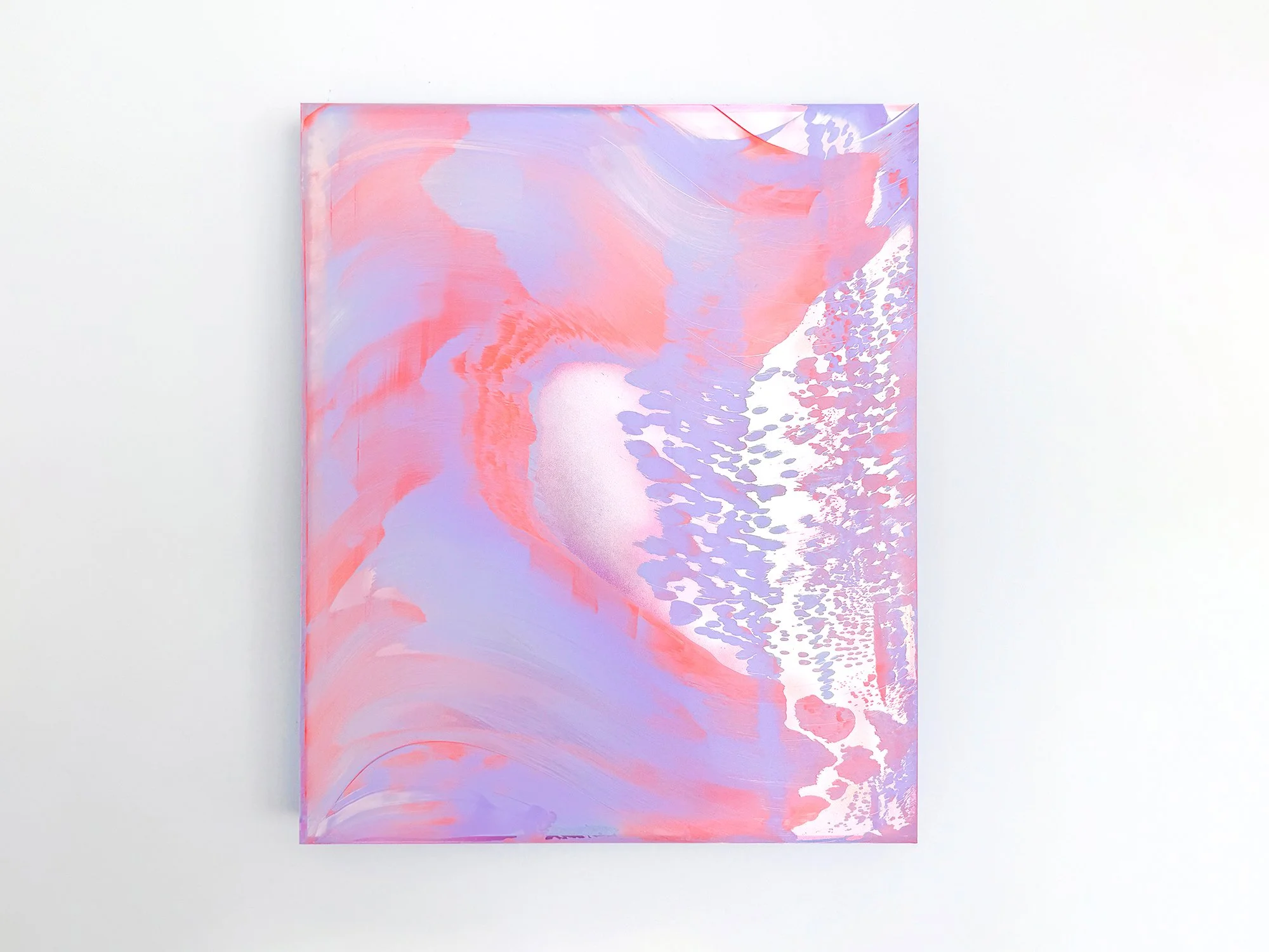
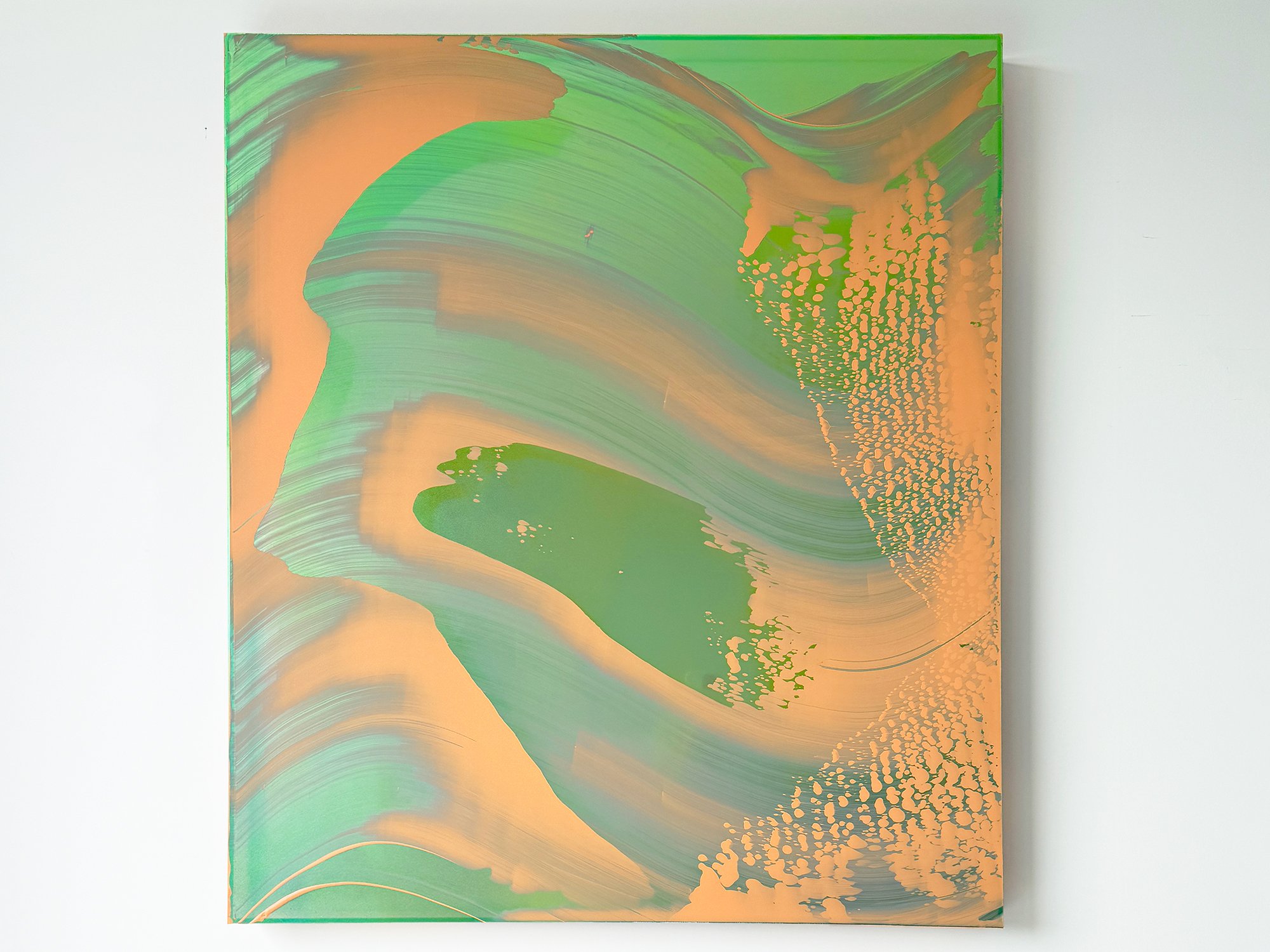
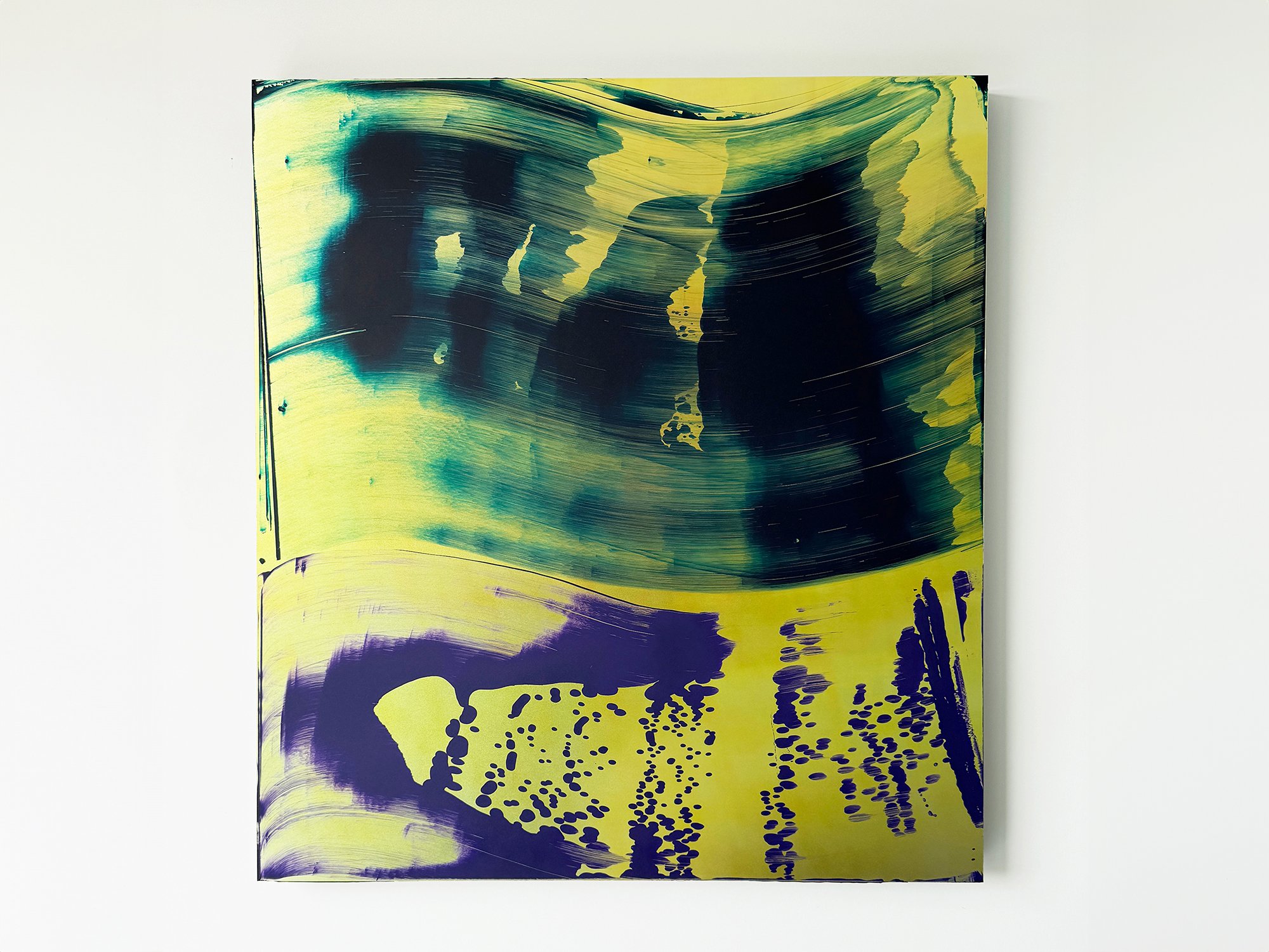
Coachella Views XIV is one of the most contrasting works in Lisette Schumacher’s series. Warm coral and golden yellow meet cooler blue and lilac, recalling the striking opposition between the sunlit Coachella Valley and the snow-capped San Jacinto Mountains beyond it. Broad areas of colour create movement, while an intricate pattern on the right gives the composition a more concentrated intensity.
Schumacher does not reproduce a particular view. Instead, she brings together impressions of heat, distance, wind and rapidly changing colour. The result is a confident abstract artwork with a strong presence: vivid enough to anchor a space, yet layered enough to reveal quieter transitions on closer inspection.
This work will be shipped within the Netherlands and Belgium at no additional cost, securely and with tracking.
By Lisette Schumacher
60 × 50 x 6 cm, 2026
Mixed media
From the series Coachella views
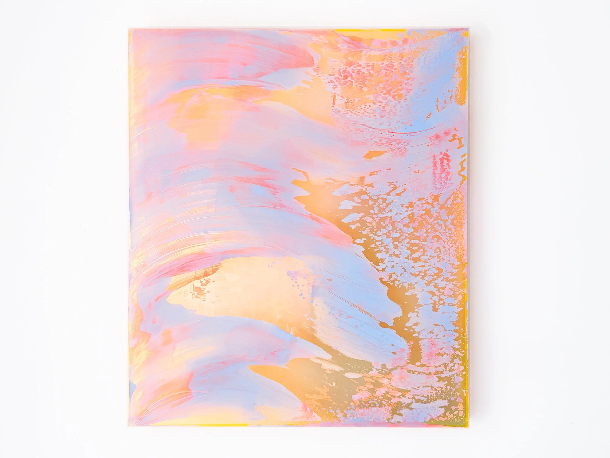
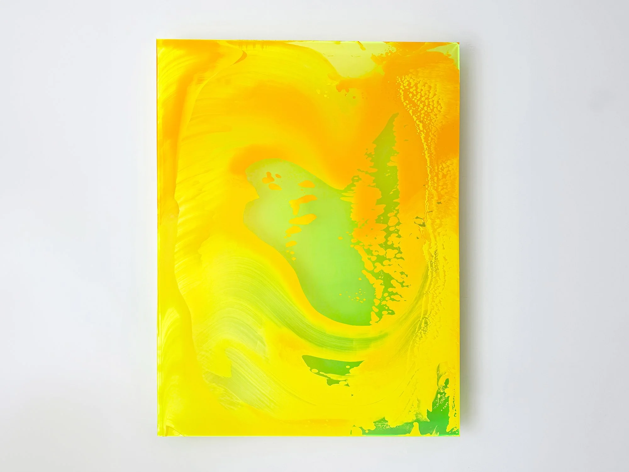
Lisette Schumacher brings coral pink and soft lilac together in Coachella Views XIII. Large, fluid forms are interrupted by a finely patterned area that appears to disperse across the right side of the composition. A pale central opening creates depth, as though a distant light or landscape is briefly visible between the surrounding colours.
The work originates in Schumacher’s observations of the Coachella Valley, where intense sunlight, wind and distance continually alter how the landscape is perceived. Here, that experience becomes an atmospheric composition that feels both open and enveloping. The restrained palette makes the work easy to live with, while its subtle visual shifts continue to reward close attention.
This work will be shipped within the Netherlands and Belgium at no additional cost, securely and with tracking.
By Lisette Schumacher
95 × 80 x 6 cm, 2026
Mixed media
From the series Coachella views
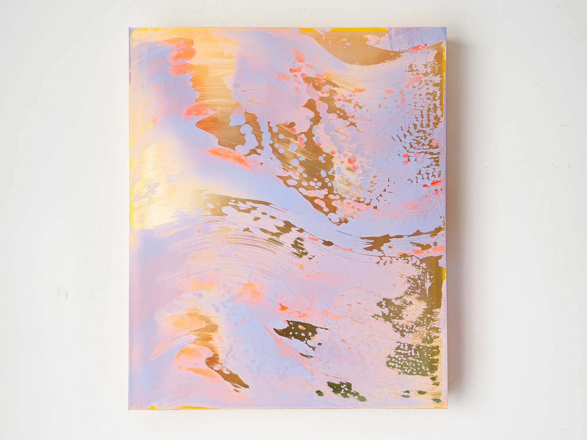
In Coachella Views XII, Lisette Schumacher translates the shifting colours of the California desert into an expansive abstract composition. Pale blue, peach and pink move across the surface in broad, sweeping forms, while warmer golden areas appear between the layers. Finer patterns along the right-hand side introduce contrast and draw the eye further into the work.
The painting was inspired by Schumacher’s journey through Palm Springs, Cathedral City and Desert Hot Springs. Rather than depicting the landscape directly, she captures the experience of colour changing across the Coachella Valley: open, bright and never entirely still. Its generous scale gives the work a strong presence while the nuanced palette keeps the composition balanced.
This work will be shipped within the Netherlands and Belgium at no additional cost, securely and with tracking.
By Lisette Schumacher
60 × 50 x 6 cm, 2026
Mixed media
From the series Coachella views
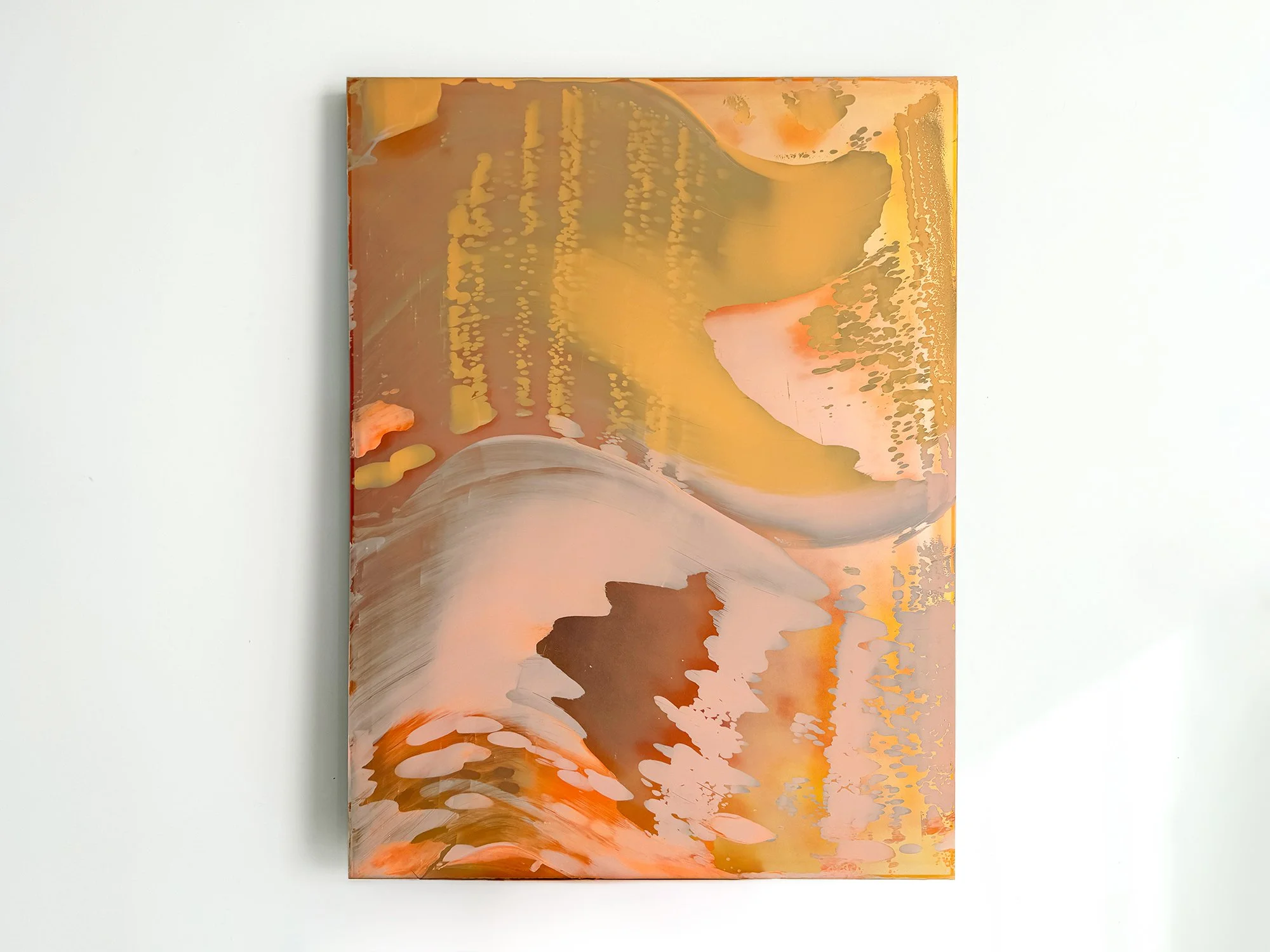
The desert landscapes surrounding Palm Springs are known for their clarity of light and wide horizons. During her visits to the Coachella Valley, Lisette Schumacher experienced how dramatically the atmosphere can shift throughout the day.
Bright sunlight, wind and the vast openness of the desert create a landscape in constant transformation. Colours appear to intensify, fade and re-emerge as the sun moves across the valley.
Schumacher approaches these observations through an intuitive process in which colour and gesture develop gradually across the surface. Soft layers of pink, orange and yellow pigments move across the painting like shifting light fields, occasionally interrupted by reflective passages that recall flashes of sun across the desert terrain.
The composition reflects Lisette Schumacher’s ongoing interest in how landscape, architecture and atmosphere influence the perception of colour. Rather than presenting a fixed view of the desert, the work captures the sensation of light moving through space.
This work will be shipped within the Netherlands and Belgium at no additional cost, securely and with tracking.
By Lisette Schumacher
120 × 100 × 5 cm, 2026
Mixed Media
From the series Desert Modernism
Desert Modernism II continues Lisette Schumacher’s exploration of the Coachella Valley, shifting towards a more fluid and atmospheric approach.
Rather than referencing architecture directly, the work unfolds through movement across the surface. Pigment is guided, displaced and allowed to settle, creating soft transitions, layered transparencies and subtle variations in tone.
Warm desert colours - yellow, sand, orange and brown - dissolve into cooler greys and pale pinks. These transitions echo the changing light conditions Schumacher experienced in Palm Springs, where colour is never fixed but continuously shaped by its surroundings.
The painting is built through a direct, physical process without the use of brushes. This results in a surface that remains active: marks soften, edges dissolve and layers become visible depending on light and viewing distance.
Desert Modernism II is less about structure and more about perception. It captures a moment that feels in motion, where colour, surface and light interact over time.
As a large-scale work, it brings a quieter but immersive presence to a space, particularly in interiors where natural light can move across the surface throughout the day.
Delivery within the Netherlands and Belgium is arranged in consultation, either in person or securely shipped.
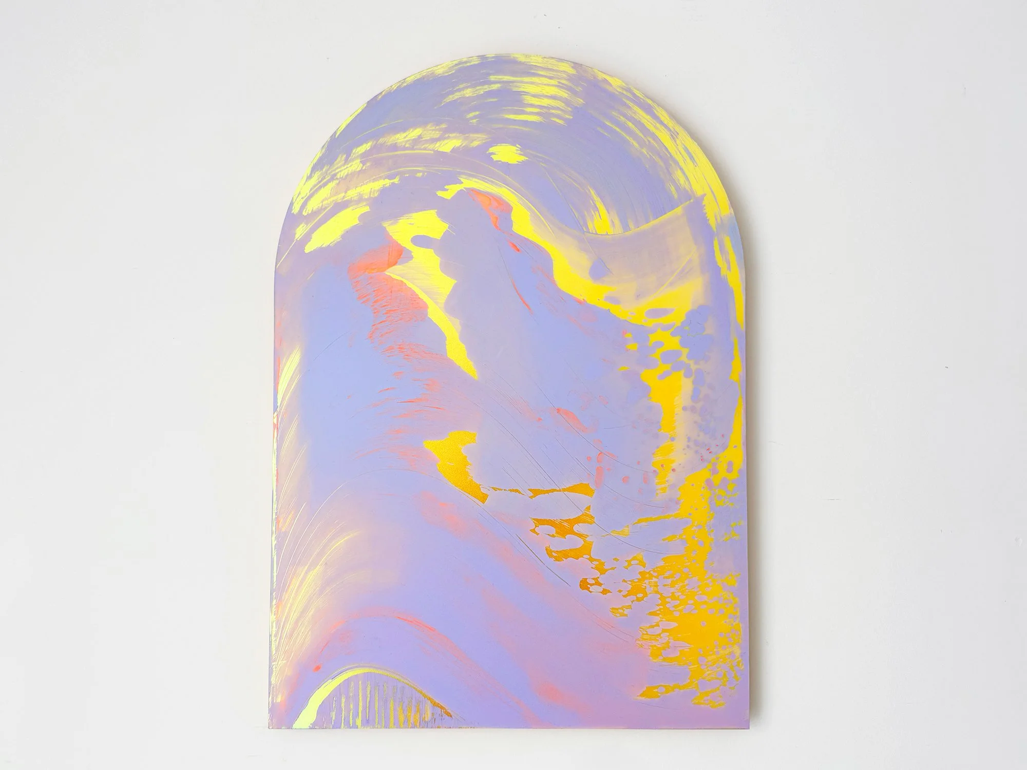
By Lisette Schumacher
50 × 35 × 0,8 cm, 2026
Mixed Media
Lisette Schumacher’s Arch series is based on the architectural form of the arch, a structure with origins in Roman engineering and later developments in Renaissance architecture.
In Arch III, this form is translated into a painting that carries a lighter presence. The curved format still defines the composition, but the softer tones allow the work to sit more quietly within a space, shifting the arch from a structural reference to a spatial gesture.
Delivery within the Netherlands and Belgium is arranged in consultation, either in person or securely shipped.
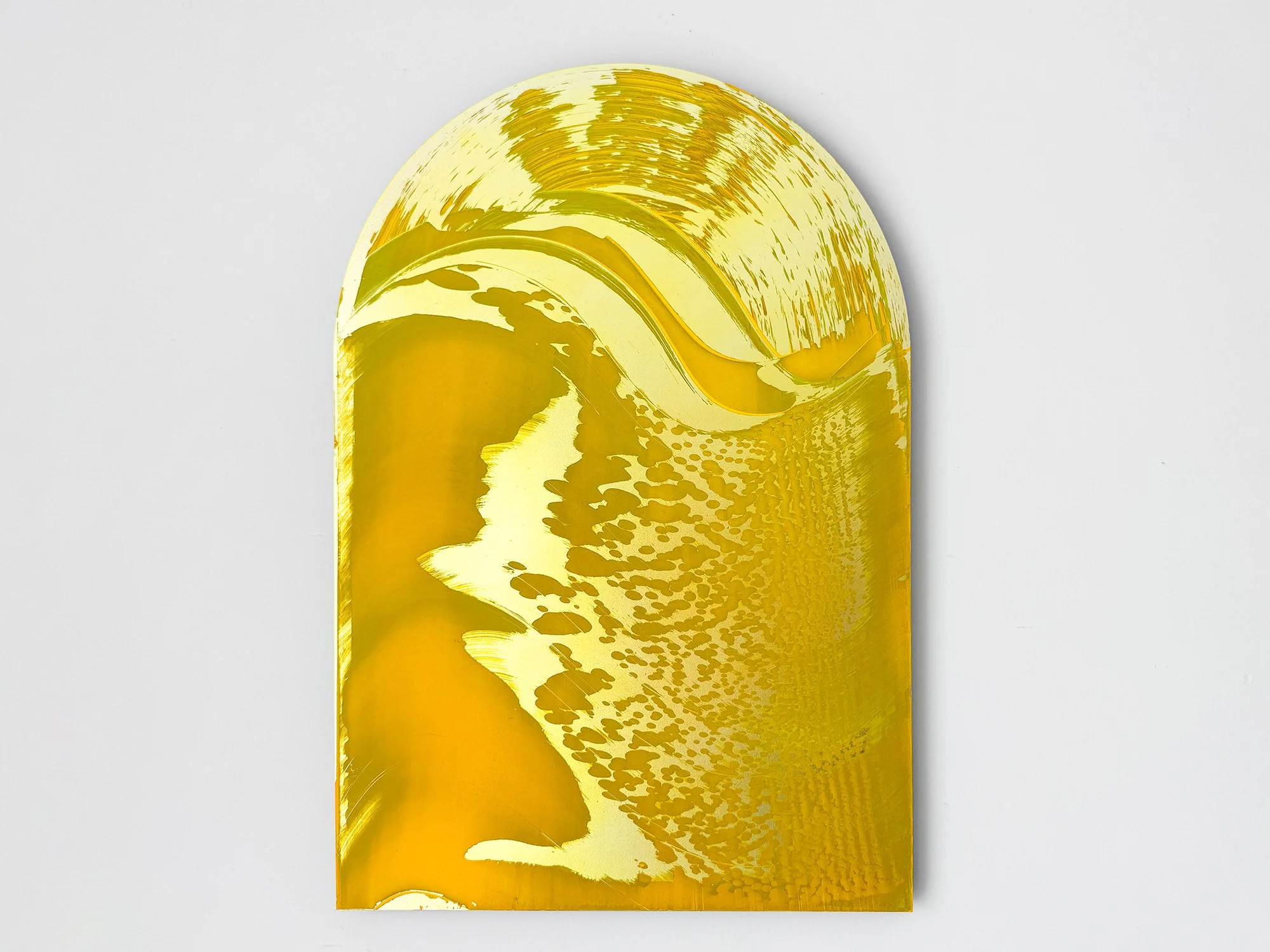
By Lisette Schumacher
50 × 35 × 0,8 cm, 2026
Mixed Media
For this series, Lisette Schumacher works with the shape of the arch as a framing device. Historically used in Roman and Renaissance architecture to construct and articulate space, the arch is no longer structurally necessary in contemporary building methods.
In Arch II, the form is reintroduced within the painting as a visual structure, shifting its function from construction to image.
Delivery within the Netherlands and Belgium is arranged in consultation, either in person or securely shipped.
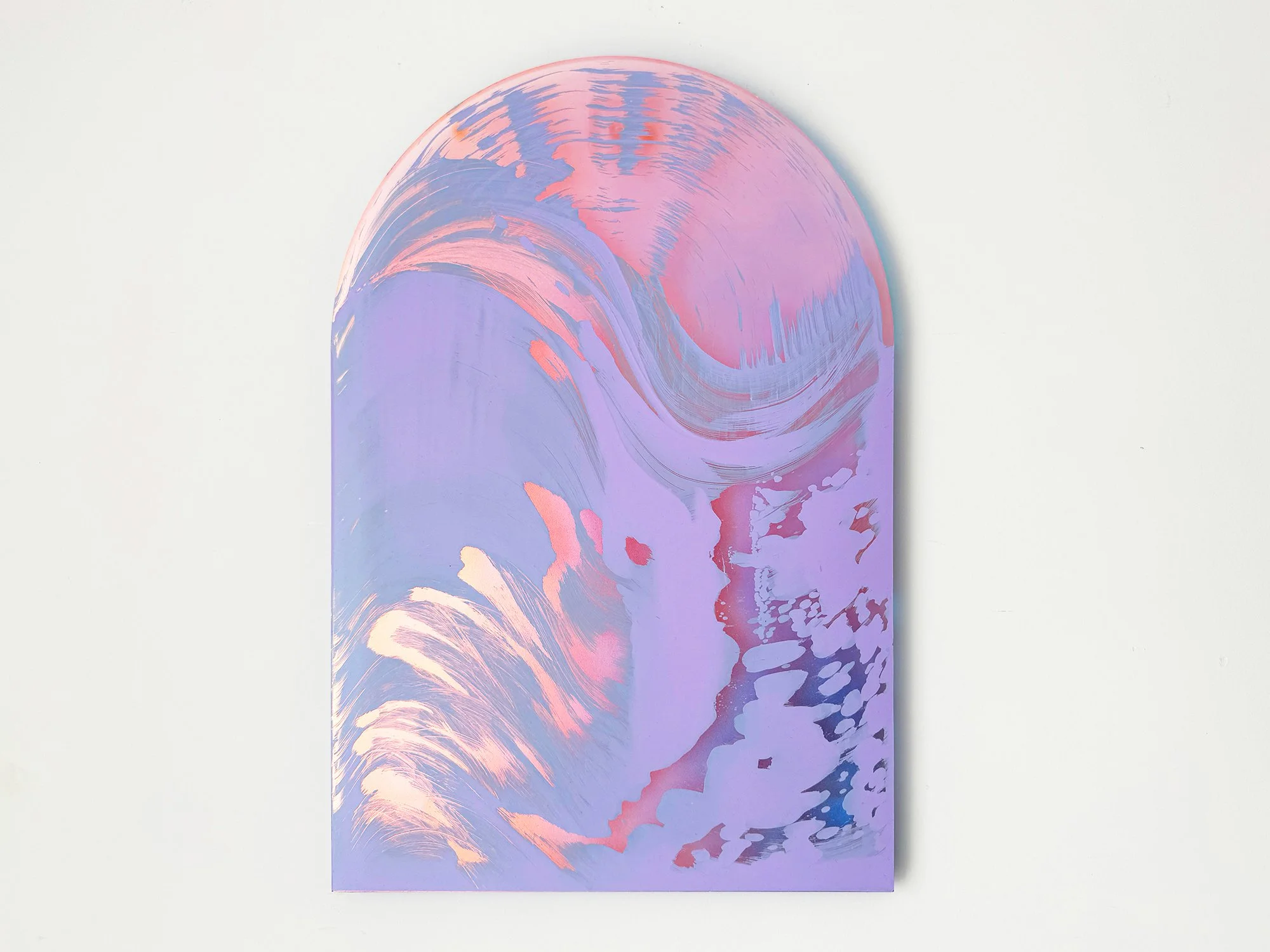
By Lisette Schumacher
50 × 35 × 0,8 cm, 2026
Mixed Media
In this series, Lisette Schumacher uses the shape of the arch to frame the image. The arch originates from Roman architecture, where it functioned as a structural element in large civil and public buildings, and was later refined in Renaissance palaces and courtyards.
In Arch I, this architectural form is translated into a painting format, where the curved contour defines the composition and introduces the arch as a symbolic rather than structural element.
Delivery within the Netherlands and Belgium is arranged in consultation, either in person or securely shipped.
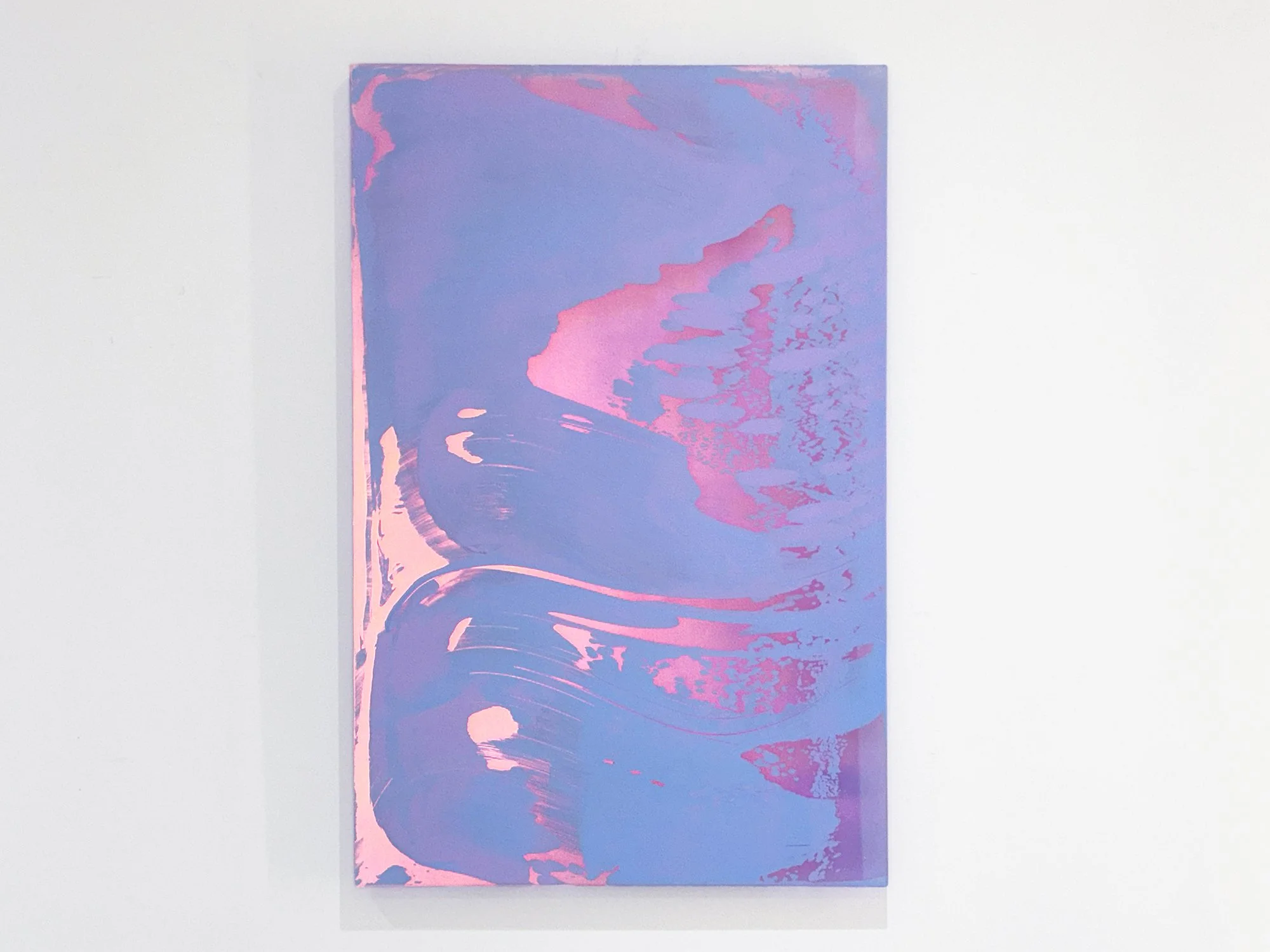
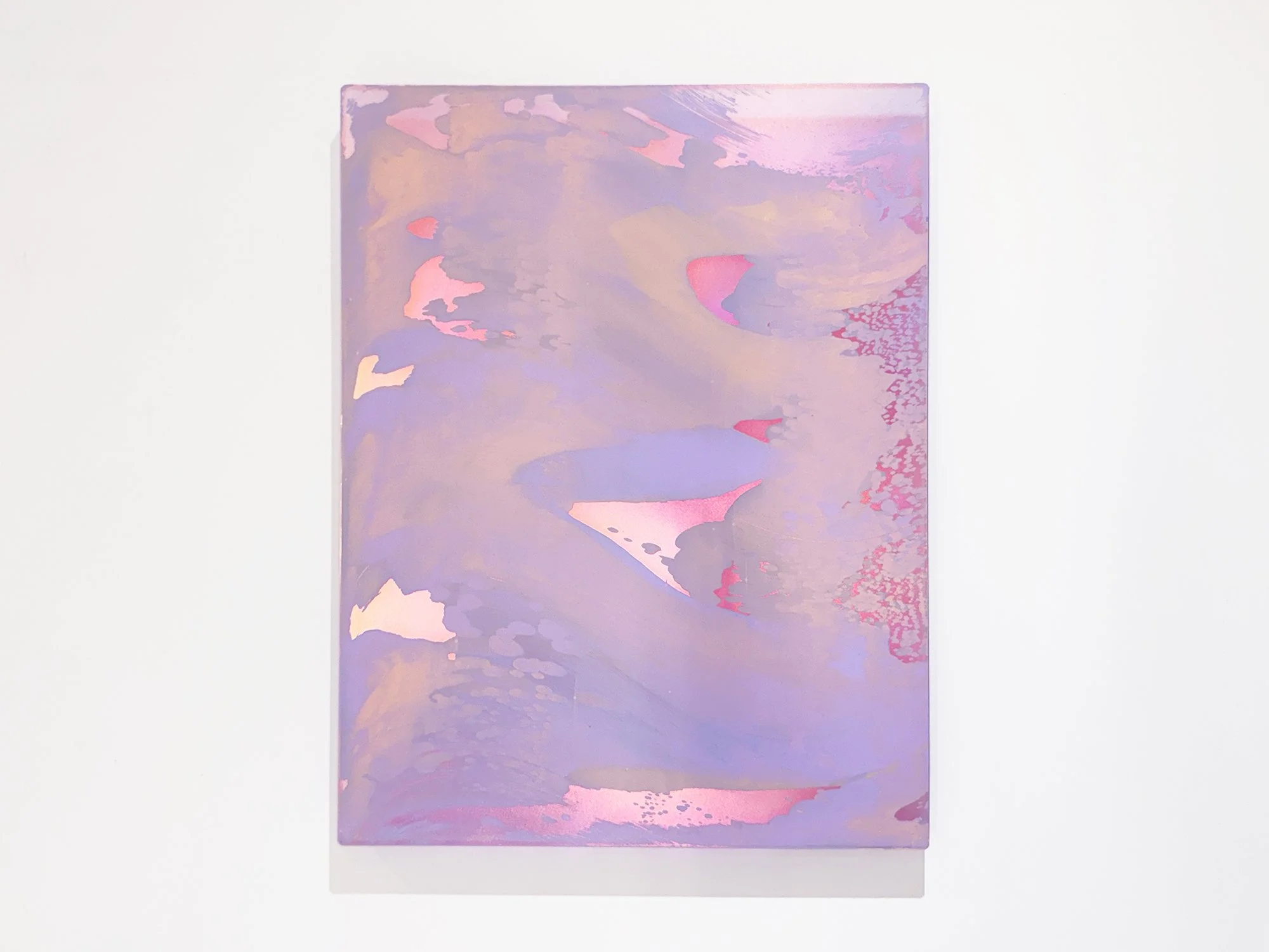
By Lisette Schumacher
87 × 57 × 2 cm, 2025
Mixed Media
In Dawn, Lisette Schumacher continues her exploration of light and perception. Each work captures the fleeting transitions between night and day, where colour and reflection seem to shift with every glance. The soft gradients and translucent layers evoke a sense of calm and movement at once, an abstract translation of the changing light that defines the early hours.
Delivery within the Netherlands and Belgium is arranged in consultation, either in person or securely shipped.
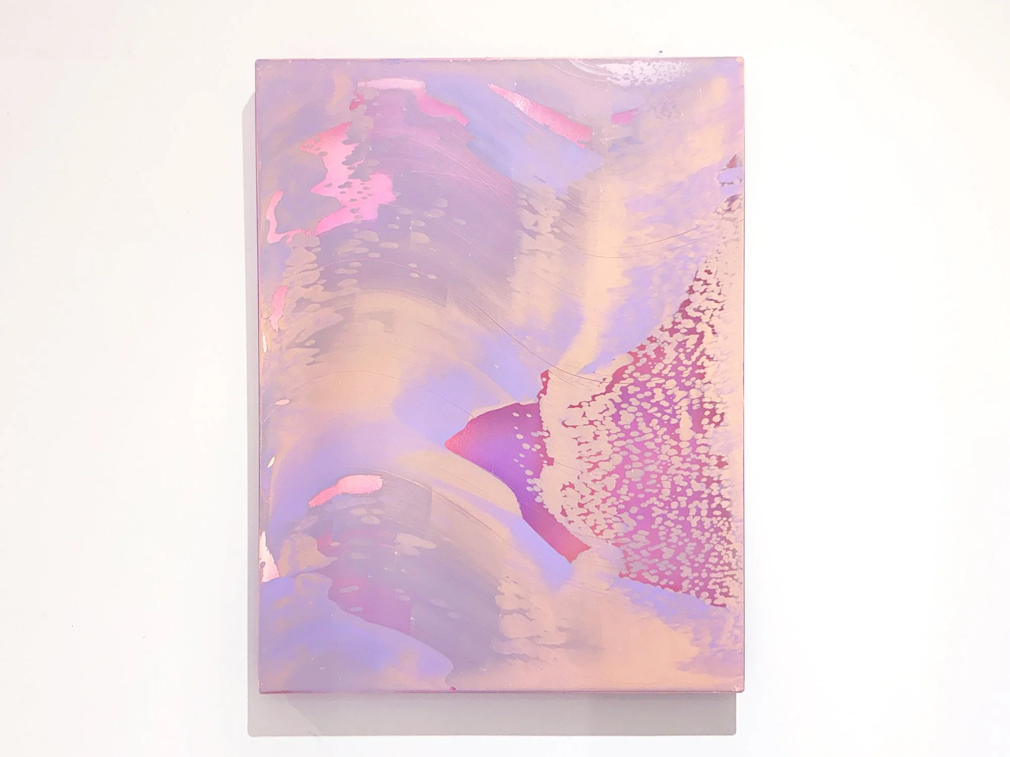
By Lisette Schumacher
50 × 40 × 2 cm, 2025
Mixed Media
Dawn reflects Lisette Schumacher’s ongoing focus on how light shapes perception. Soft layers of colour shift gently across the surface, creating subtle changes depending on where the viewer stands. The work translates the quiet atmosphere of early morning light into a balanced composition of tone, movement and reflection.
Delivery within the Netherlands and Belgium is arranged in consultation, either in person or securely shipped.
By Lisette Schumacher
50 × 40 × 2 cm, 2025
Mixed Media
Dawn captures the gradual shift of early light through soft, layered colour and subtle reflection. The work changes with the viewer’s position, emphasising Lisette Schumacher’s interest in perception and the quiet dynamics of light.
Delivery within the Netherlands and Belgium is arranged in consultation, either in person or securely shipped.

By Lisette Schumacher
90 × 140 × 5 cm, 2025
Mixed Media
This series focuses on sunrises around the iconic Griffith Observatory.
Griffith Observatory’s unique architecture, setting and cinematic exposure have made it one of the most famous landmarks in southern California. Typically identified as Art Deco with both Moderne and Modified Greek influences and a Beaux-Arts influenced plan. The planetarium offers the best view to simply gaze out towards the coast and the heavens. Lisette Schumacher watched the sunrise from the Griffith Observatory on August 20 in 2024.
Inspired by the rich palette of colors unfolding in front of her eyes, from the quiet soft pastel tones right before sunrise to the warm and rich colors of the sun and its reflections on the sides of the skyscrapers in Downtown, Lisette dedicated a series of paintings depicting the various stages of the sunrise drawn up on carriers with landscape frame, enhancing the cinematic viewing experience from the Griffith Observatory.
Delivery within the Netherlands and Belgium is arranged in consultation, either in person or securely shipped.

By Lisette Schumacher
75 × 125 × 5 cm, 2025
Mixed Media
This series focuses on sunrises around the iconic Griffith Observatory.
Griffith Observatory’s unique architecture, setting and cinematic exposure have made it one of the most famous landmarks in southern California. Typically identified as Art Deco with both Moderne and Modified Greek influences and a Beaux-Arts influenced plan. The planetarium offers the best view to simply gaze out towards the coast and the heavens. Lisette Schumacher watched the sunrise from the Griffith Observatory on August 20 in 2024.
Inspired by the rich palette of colors unfolding in front of her eyes, from the quiet soft pastel tones right before sunrise to the warm and rich colors of the sun and its reflections on the sides of the skyscrapers in Downtown, Lisette dedicated a series of paintings depicting the various stages of the sunrise drawn up on carriers with landscape frame, enhancing the cinematic viewing experience from the Griffith Observatory.
Delivery within the Netherlands and Belgium is arranged in consultation, either in person or securely shipped.
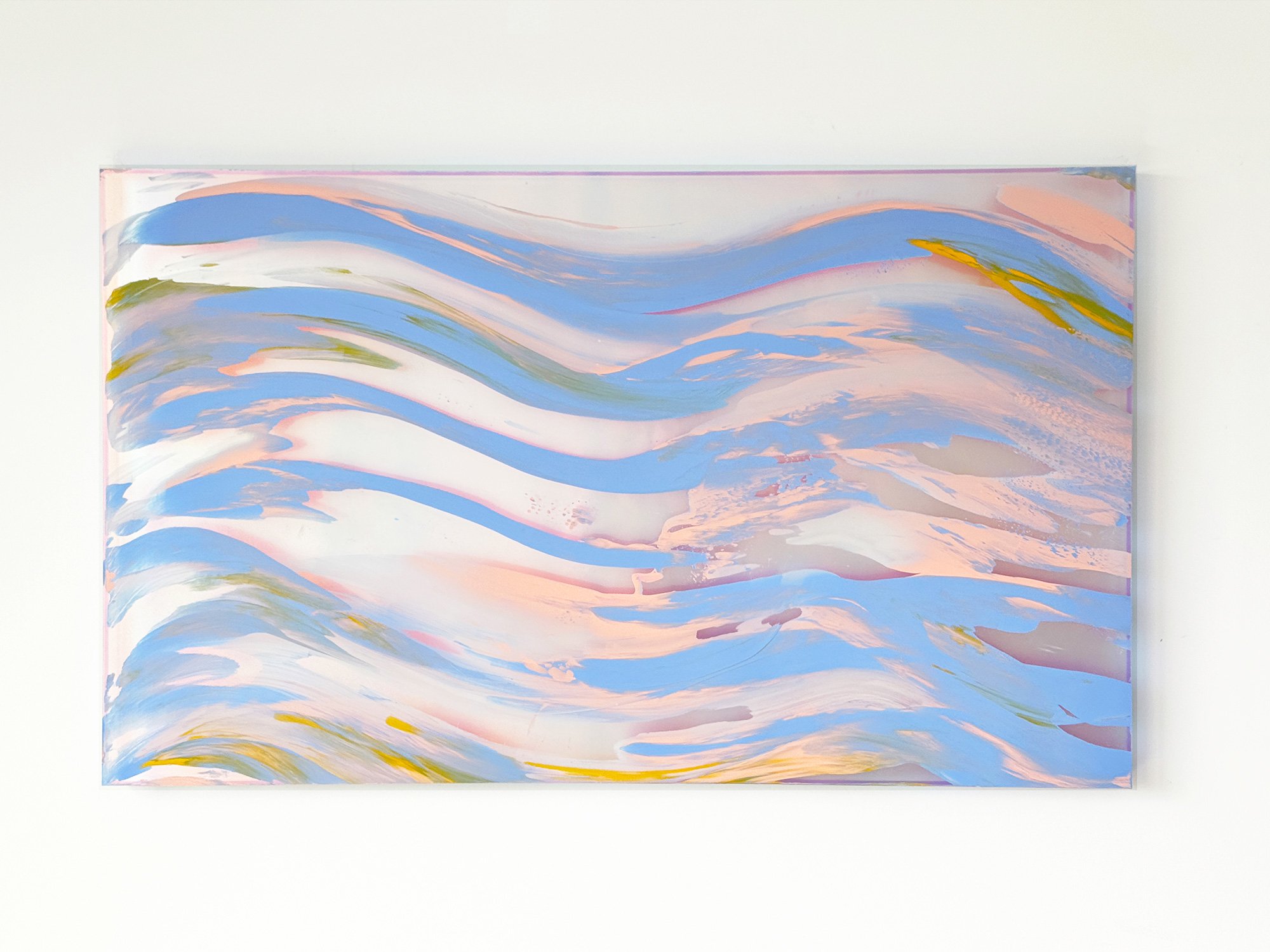
By Lisette Schumacher
75 × 125 × 5 cm, 2025
Mixed Media
This series focuses on sunrises around the iconic Griffith Observatory.
Griffith Observatory’s unique architecture, setting and cinematic exposure have made it one of the most famous landmarks in southern California. Typically identified as Art Deco with both Moderne and Modified Greek influences and a Beaux-Arts influenced plan. The planetarium offers the best view to simply gaze out towards the coast and the heavens. Lisette Schumacher watched the sunrise from the Griffith Observatory on August 20 in 2024.
Inspired by the rich palette of colors unfolding in front of her eyes, from the quiet soft pastel tones right before sunrise to the warm and rich colors of the sun and its reflections on the sides of the skyscrapers in Downtown, Lisette dedicated a series of paintings depicting the various stages of the sunrise drawn up on carriers with landscape frame, enhancing the cinematic viewing experience from the Griffith Observatory.
Delivery within the Netherlands and Belgium is arranged in consultation, either in person or securely shipped.
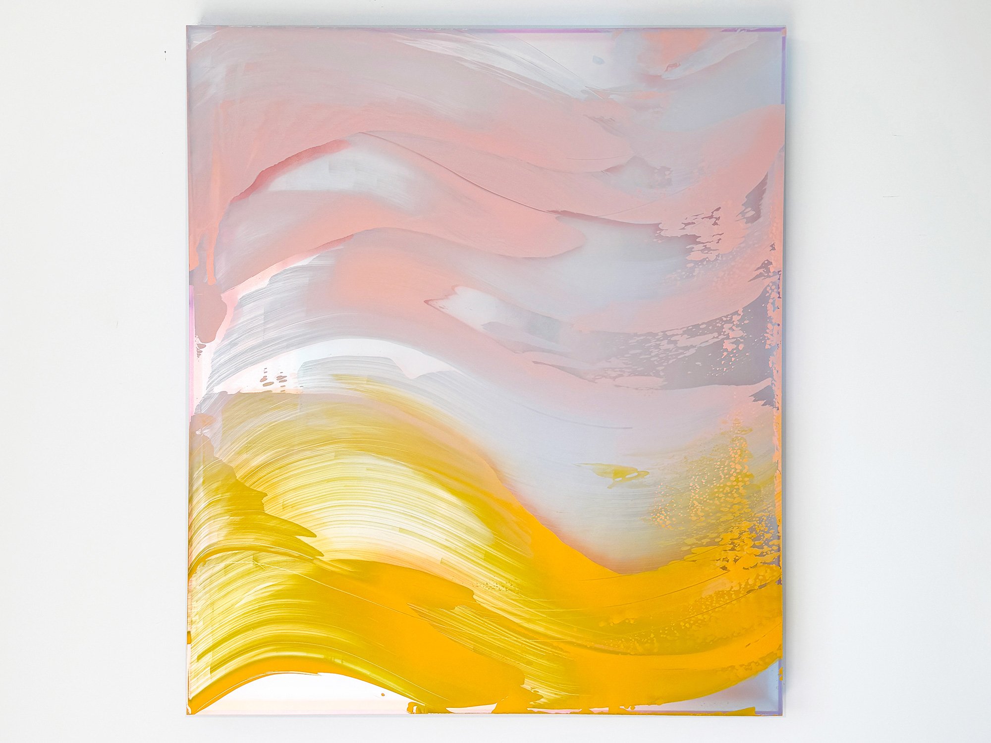
By Lisette Schumacher
100 x 90 x 6 cm, 2025
Mixed Media
This series focuses on sunrises around the iconic Griffith Observatory.
Griffith Observatory’s unique architecture, setting and cinematic exposure have made it one of the most famous landmarks in southern California. Typically identified as Art Deco with both Moderne and Modified Greek influences and a Beaux-Arts influenced plan. The planetarium offers the best view to simply gaze out towards the coast and the heavens. Lisette Schumacher watched the sunrise from the Griffith Observatory on August 20 in 2024.
Inspired by the rich palette of colors unfolding in front of her eyes, from the quiet soft pastel tones right before sunrise to the warm and rich colors of the sun and its reflections on the sides of the skyscrapers in Downtown, Lisette dedicated a series of paintings depicting the various stages of the sunrise drawn up on carriers with landscape frame, enhancing the cinematic viewing experience from the Griffith Observatory.
Delivery within the Netherlands and Belgium is arranged in consultation, either in person or securely shipped.

By Lisette Schumacher
120 × 80 cm, 2025
Mixed Media
Lisette Schumacher’s new series deepens her exploration of light, space, and architecture. Moving beyond her signature ‘boxes,’ she introduces lighter, floating panels that dynamically interact with surrounding light. Inspired by her time in California, she blends modernist ideals with a poetic investigation of perception and temporality. Her works capture the subtleties of natural and artificial light, referencing the fleeting beauty of the daytime moon. This series invites visitors to not just see, but to feel, immersing themselves in a play of light, shadow, and colour.
Personal delivery and installation within the Netherlands and Belgium are included with this work.

By Lisette Schumacher
100 x 90 x 6 cm, 2025
Mixed Media
Lisette Schumacher is a visual artist with a strong interest in modern architecture. She travels to visit architecture with historical value in Europe and the USA. She is currently focussed on mid-century modern architecture in Los Angeles. Her artistic practice revolves mostly around painting, though she explored the realms of sculpture and installation as well. Lisette’s work is part of corporate collections as well as private collections in Europa, United States and Asia.
Delivery within the Netherlands and Belgium is arranged in consultation, either in person or securely shipped.
By Lisette Schumacher
100 x 90 x 6 cm, 2025
Mixed Media
"Mirroring Reflections" by Lisette Schumacher explores the interplay of light and reflections inspired by Los Angeles's iconic Stahl House. Combining mirrors with abstract compositions, her works capture the serene beauty of sunlit glass and water, evoking an almost sculptural depth. This series is a tribute to mid-century architecture, blending California's natural hues with the modernist legacy of glass and steel.
Delivery within the Netherlands and Belgium is arranged in consultation, either in person or securely shipped.
By Lisette Schumacher
90 x 70 x 6 cm, 2024
Mixed Media
Lisette Schumacher’s interest lies in the idea that architecture engenders a basic physical experience prior to also initiating an intellectual interpretation. By observing the location intensely and moving through each room repeatedly, she can both experience the space in a physical way and interpret it intellectually. After studying the site's history and architect, a period of in-depth research into technique, material and colour schemes follows. This results in a series of works that reflect on the site's atmosphere, history and its design.
Delivery within the Netherlands and Belgium is arranged in consultation, either in person or securely shipped.
By Lisette Schumacher
100 x 90 x 6 cm, 2024
Mixed Media
The View on Sunset series reflects Lisette Schumacher’s deep connection with mid-century modern architecture and the captivating sunsets of Los Angeles. Lisette’s interest lies in the idea that architecture engenders a basic physical experience prior to also initiating an intellectual interpretation. By observing the location intensely and moving through each room repeatedly, she can both experience the space in a physical way and interpret it intellectually. After studying the site's history and architect, a period of in-depth research into technique, material and colour schemes follows. This results in a series of works that reflect on the site's atmosphere, history and its design.
Delivery within the Netherlands and Belgium is arranged in consultation, either in person or securely shipped.
By Jan Theun van Rees
20 × 25 cm, ed. 3/10, 2026
Archival pigment ink on Innova ”Soft Textured BrightWhite Photorag” with nutwood frame and museumglass
This work is part of the series Painted Room
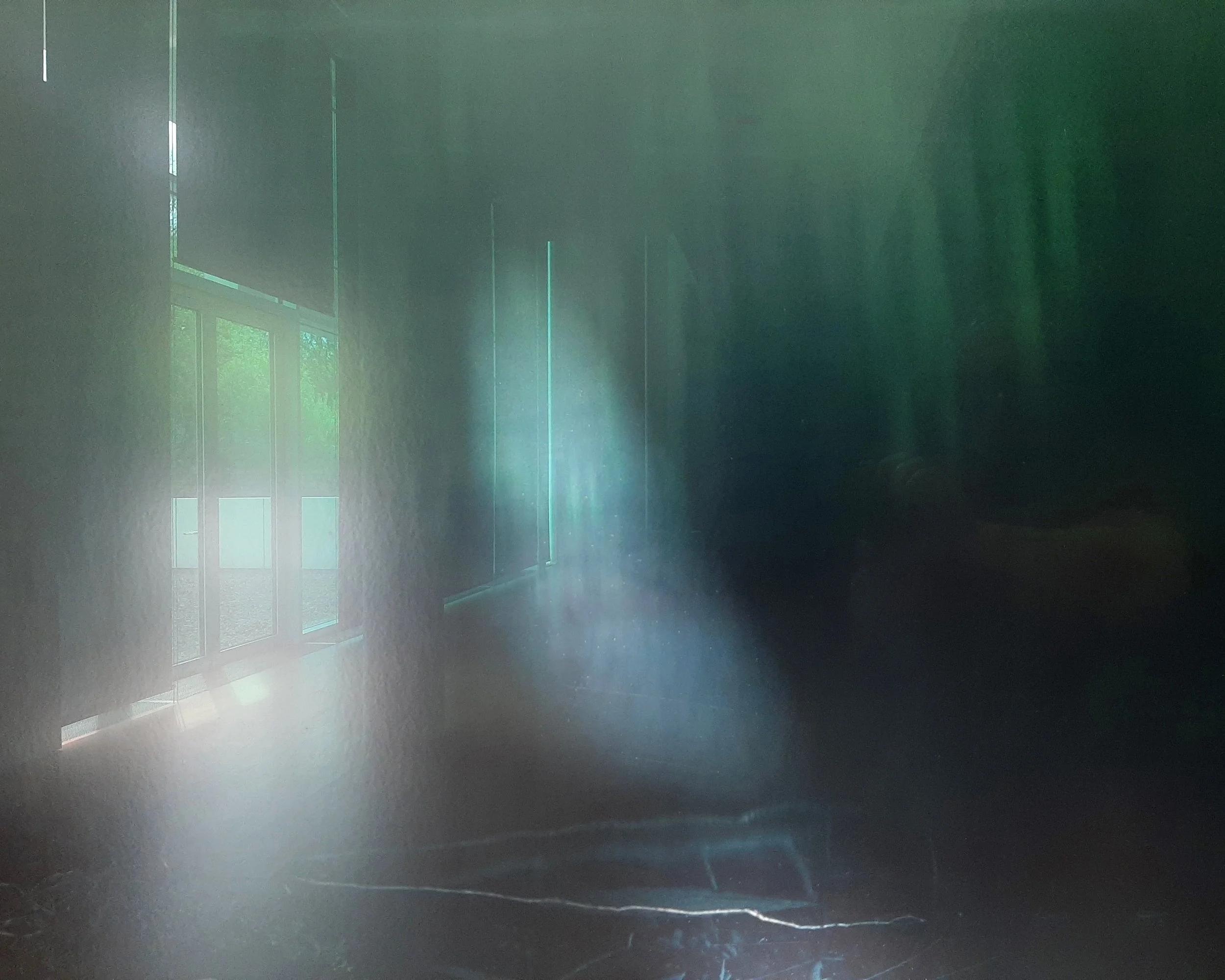
In this series, Jan Theun van Rees explores the relationship between art and the spaces in which it is displayed. He photographs museum interiors through reflections in artworks or the glass of their frames. Blurred fragments of the original work remain visible, merging with the surrounding architecture and creating a new photographic composition.
This small-scale photograph was created at the Arp Museum Bahnhof Rolandseck in Germany during Silent Spaces, a retrospective exhibition of photographer Axel Hütte. The reflection shows how an artwork can shape the atmosphere and perception of the room around it.
Shipping within the Netherlands and Belgium is on us.
By Jan Theun van Rees
122 × 91,5 cm, ed. 3, 2026
Pigment ink on acid free Innova Soft Textured Bright White - frame, raw nutwood with spacers and Museumglass (UV70)
Also available in 60 × 45 cm, ed 2/5, 2026
This work is part of the series Painted Room
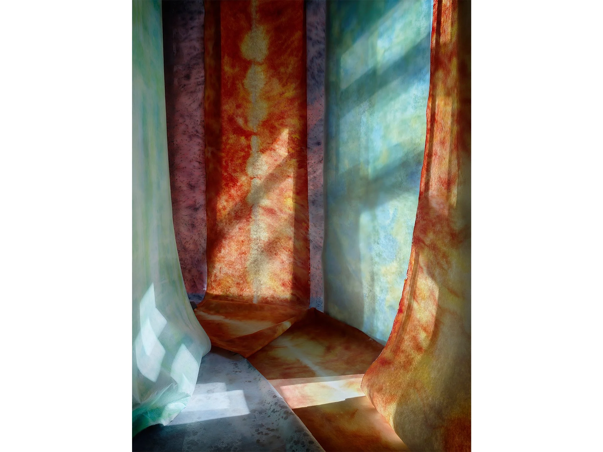
Licht Omloop is part of Jan Theun van Rees' ongoing series Painted Room. Through a process of constructing, observing and continuously repositioning elements in relation to changing daylight, the artist creates photographs in which colour and space remain in constant flux.
In Licht Omloop, warm orange tones are balanced by areas of aqua blue and subtle touche of purple. The image hovers between abstraction and architecture, suggesting depth and movement without revealing the temporary set from which it emerged. Rather than depicting an existing space, the work presents a carefully constructed situation in which light, perspective and colour come together in a single moment.
Shipping within the Netherlands and Belgium is on us.
By Jan Theun van Rees
90 × 90 cm, ed. 3, 2026
Pigment ink on bright white Photorag mounted on museum board, framed with spacer and UV70 museum glass
Also available in 45 × 45 cm, ed 5, 2026
This work is part of the series Painted Room
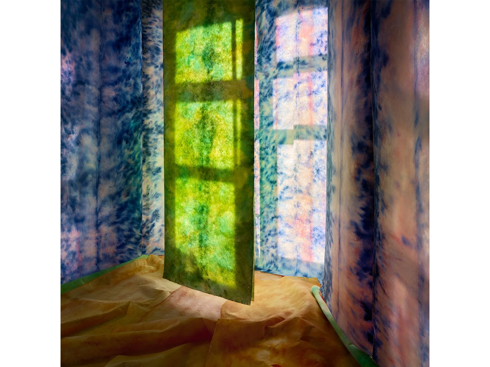
Zeldzaam Groen is part of Jan Theun van Rees' ongoing series Painted Room. Working with temporary constructions, shifting daylight and carefully positioned elements, the artist creates photographs in which colour, space and perspective remain in constant flux.
In this work, a soft green surface and subtle spatial cues create an image that moves between abstraction and architecture. The final composition is not predetermined but emerges through observation, adjustment and photography. What appears to be a simple image reveals itself as a carefully balanced construction, resulting in a photograph that invites a slower way of looking.
Shipping within the Netherlands and Belgium is on us.
By Jan Theun van Rees
122 × 91,5 cm, ed. 3, 2026
Pigment ink on bright white Photorag mounted on museum board, framed with spacer and UV70 museum glass
This work is part of the series Painted Room
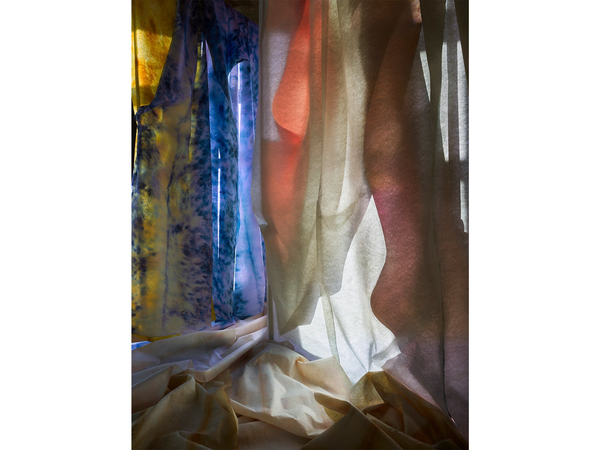
This photograph is part of the ongoing Painted Room series by Jan Theun van Rees, in which temporary architectural spaces are constructed using painted strips of textile. Through the careful interplay of light, colour, material, and perspective, the artist creates compositions that exist only for a brief moment before being transformed into photographic works.
Natural daylight plays a central role in the process. As the light changes throughout the day, shadows shift across the installation, creating visual relationships that are unique to a specific place and moment in time. The installation is continuously adjusted in response to these changing conditions, while the camera position evolves alongside the work.
Rather than documenting a fixed scene, the photograph captures a temporary spatial construction in constant transition. Light, space, material, and viewpoint influence one another throughout the process, resulting in an image whose final outcome remains uncertain until the photographs are reviewed afterwards.
Van Rees' work explores the relationship between photography, architecture, abstraction, and perception. By transforming simple materials into immersive spatial compositions, he challenges the viewer's understanding of depth, scale, and reality.
Shipping within the Netherlands and Belgium is on us.
By Jan Theun van Rees
122 × 91,5 cm, ed. 3, 2026
Pigment ink on bright white Photorag mounted on museum board, framed with spacer and UV70 museum glass
This work is part of the series Painted Room
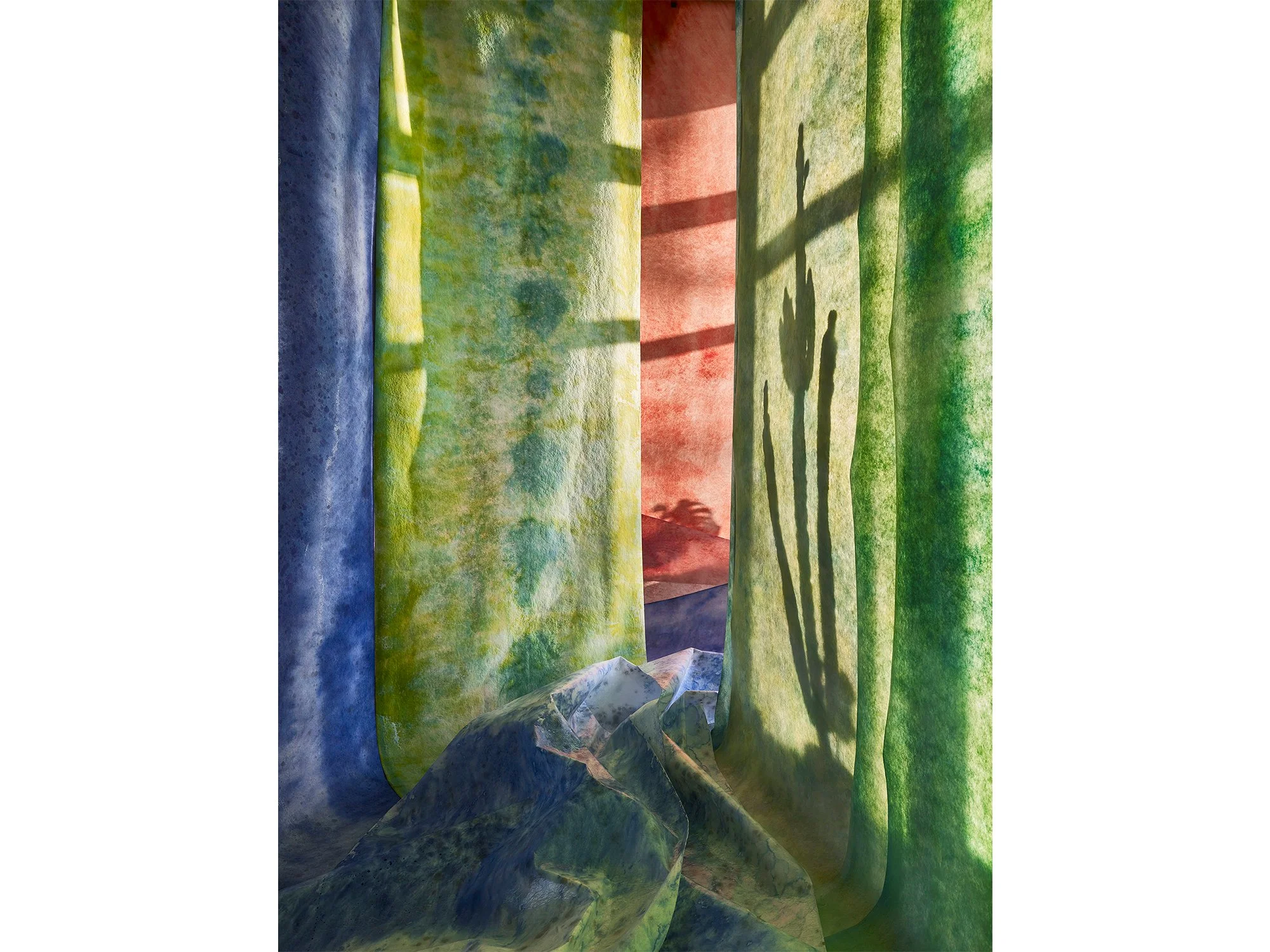
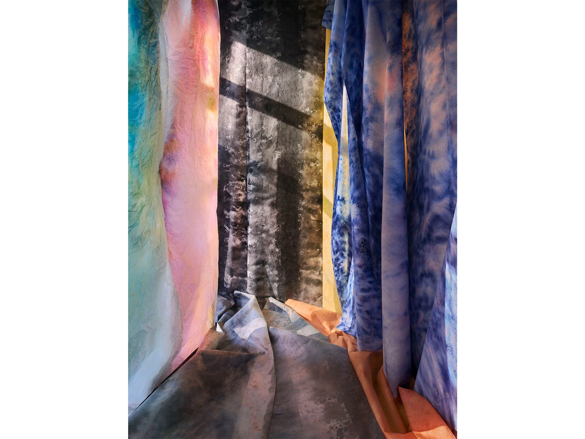
In Painted Room, Jan Theun van Rees constructs a temporary, immersive space using layered materials and painted surfaces, brought together through carefully controlled light. Soft textiles in shifting tones of blue, pink and grey create a spatial composition that feels both architectural and atmospheric. The interplay between shadow and colour blurs the line between physical structure and illusion, inviting the viewer to question depth, perspective and material reality.
This work is part of Van Rees’ ongoing exploration of spatial perception in contemporary photography, where constructed environments become the subject. Through subtle variations in light and surface, Painted Room offers a quiet, contemplative image that evolves with prolonged viewing.
Shipping within the Netherlands and Belgium is on us.
By Jan Theun van Rees
122 × 91,5 cm, ed. 3, 2026
Pigment ink on bright white Photorag mounted on museum board, framed with spacer and UV70 museum glass
This work is part of the series Painted Room
In Painted Room, Jan Theun van Rees constructs a temporary, immersive space using layered materials and painted surfaces, brought together through carefully controlled light. Soft textiles in shifting tones of blue, pink and grey create a spatial composition that feels both architectural and atmospheric. The interplay between shadow and colour blurs the line between physical structure and illusion, inviting the viewer to question depth, perspective and material reality.
This work is part of Van Rees’ ongoing exploration of spatial perception in contemporary photography, where constructed environments become the subject. Through subtle variations in light and surface, Painted Room offers a quiet, contemplative image that evolves with prolonged viewing.
Shipping within the Netherlands and Belgium is on us.

By Jan Theun van Rees
110 × 55 cm, ed. 3, 2025
Pigment ink on bright white Photorag mounted on museum board, framed with spacer and UV70 museum glass
This work is part of the series Painted Room
In Moonlit Corner, Jan Theun van Rees captures the quiet interplay between colour, light and constructed space. Created within his ongoing Painted Room series, the work depicts a temporary environment built and painted specifically for the photograph, a space that ceases to exist once the image is made.
Here, bands of deep blue and warm orange fabric interact with the cool grey tones of the floor, illuminated by a soft, angled light. The composition evokes both architecture and abstraction, balancing material presence with a sense of illusion.
Van Rees explores how light transforms painted surfaces into something ephemeral. Through this process, he turns photography into a form of painting, where each image becomes a moment of stillness, shaped entirely by colour and perception.
Shipping within the Netherlands and Belgium is on us.

By Jan Theun van Rees
50 × 40 cm, ed. 3/5, 2025
Pigment ink on bright white Photorag mounted on museum board, framed with spacer and UV70 museum glass. Also available 115 × 91,5 cm, ed 3.
This work is part of the series Painted Room
With his art, Jan Theun van Rees focuses on the appearance of space as an image, the perception of that (visualised) space in relation to the space that surrounds us. Through his photographs he tries to visualise the specific qualities of those spaces. “Camera Lucida” is the catch-all term for all his artistic projects that try to visualise a connection between (interior) spaces and the outside world through incoming light. He intervenes in the space, manipulates the incoming light, to emphasise the spatial qualities he experiences. These interventions have become essential to his current practice. He constructs his own spaces, his own versions of a new, not yet existing reality. A certain spatial quality is visualised by constructing a space with the sole purpose to photograph the result.
In his new series Painted Room you can step into a new reality and become mesmerised by the rays of light, colourful surroundings and mystic shadows.
Shipping within the Netherlands and Belgium is on us.

By Jan Theun van Rees
55 × 40 cm, ed. 5, 2025
Pigment ink on bright white Photorag mounted on museum board, framed with spacer and UV70 museum glass
This work is part of the series Painted Room
Wintergarden by Dutch artist Jan Theun van Rees continues his exploration of constructed spaces within the Painted Room series. Each work begins as a temporary environment, built, painted, and lit solely to be photographed, then dismantled afterwards.
In this piece, cool tones of blue, grey, and earthy brown merge across painted paper walls, evoking the quiet atmosphere of a winter interior. The folds and shadows suggest architectural depth while remaining entirely painterly.
Through this process, Van Rees turns photography into an act of creation rather than documentation. The result is a meditative image where light, surface, and perception converge, a space that exists only in the moment of being seen.
Shipping within the Netherlands and Belgium is on us.

By Jan Theun van Rees
125 × 76 cm, ed. 3, 2025
Pigment ink on bright white Photorag mounted on museum board, framed with spacer and UV70 museum glass
This work is part of the series Painted Room
In Dented Space, Dutch artist Jan Theun van Rees continues his Painted Room series, in which photography, painting, and architecture merge. The space we see does not truly exist, it is a temporary construction, built and painted solely to be photographed, and dismantled immediately afterwards.
This work captures the momentary play of light across hand-painted fabric walls. The folds and textures suggest both depth and fragility, transforming a constructed scene into something that feels organic and timeless.
Van Rees’s practice explores the perception of space and how light defines form. By painting his environments and then photographing them, he turns the act of observation itself into an artistic process, where what remains is not documentation, but transformation.
Shipping within the Netherlands and Belgium is on us.
By Jan Theun van Rees
130 × 65 cm, edition 2/3 + 1 AP , 2025
Pigment inkt, op Innova Photorag bright white, op 2 mm museumkarton ‘White Wash’Wenge Veneer with UV 70 Museumglass
(Also available in 90 × 45 cm, edition 2/3)
This work is part of the series Painted Room
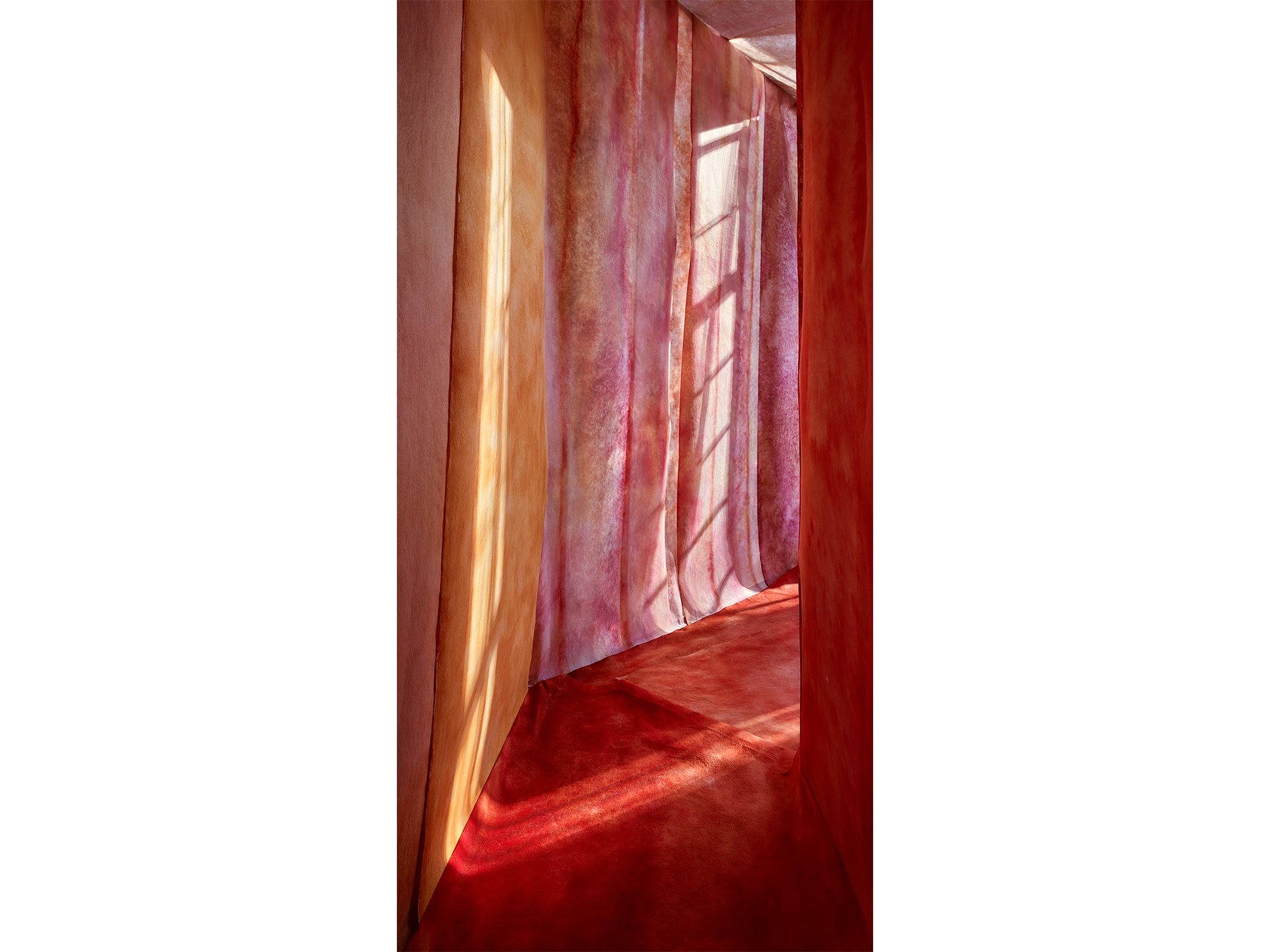
In To Catch a Spark of Sunlight, Jan Theun van Rees captures the fleeting moment when light defines space. Built entirely by hand and photographed with precision, the work belongs to his Painted Room series, constructed interiors that exist only for the camera.
This particular composition plays with verticality and contrast, as sunlight appears to slice through the space, catching on surfaces and turning architecture into atmosphere. The title evokes a quiet urgency: the desire to hold onto something ephemeral, to freeze a passing beam of light.
Like much of Van Rees’ work, this image is both real and imagined, rooted in the physicality of construction, but shaped by the artist’s intuition and spatial memory.
Shipping within the Netherlands and Belgium is on us.
By Jan Theun van Rees
110 × 80 cm, edition 2/3 + 1 AP , 2025
Pigment inkt, op Innova Photorag bright white, op 2 mm museumkarton ‘White Wash’Wenge Veneer with UV 70 Museumglass
(Also available in 40 × 55 cm, edition 2/5)
This work is part of the series Painted Room
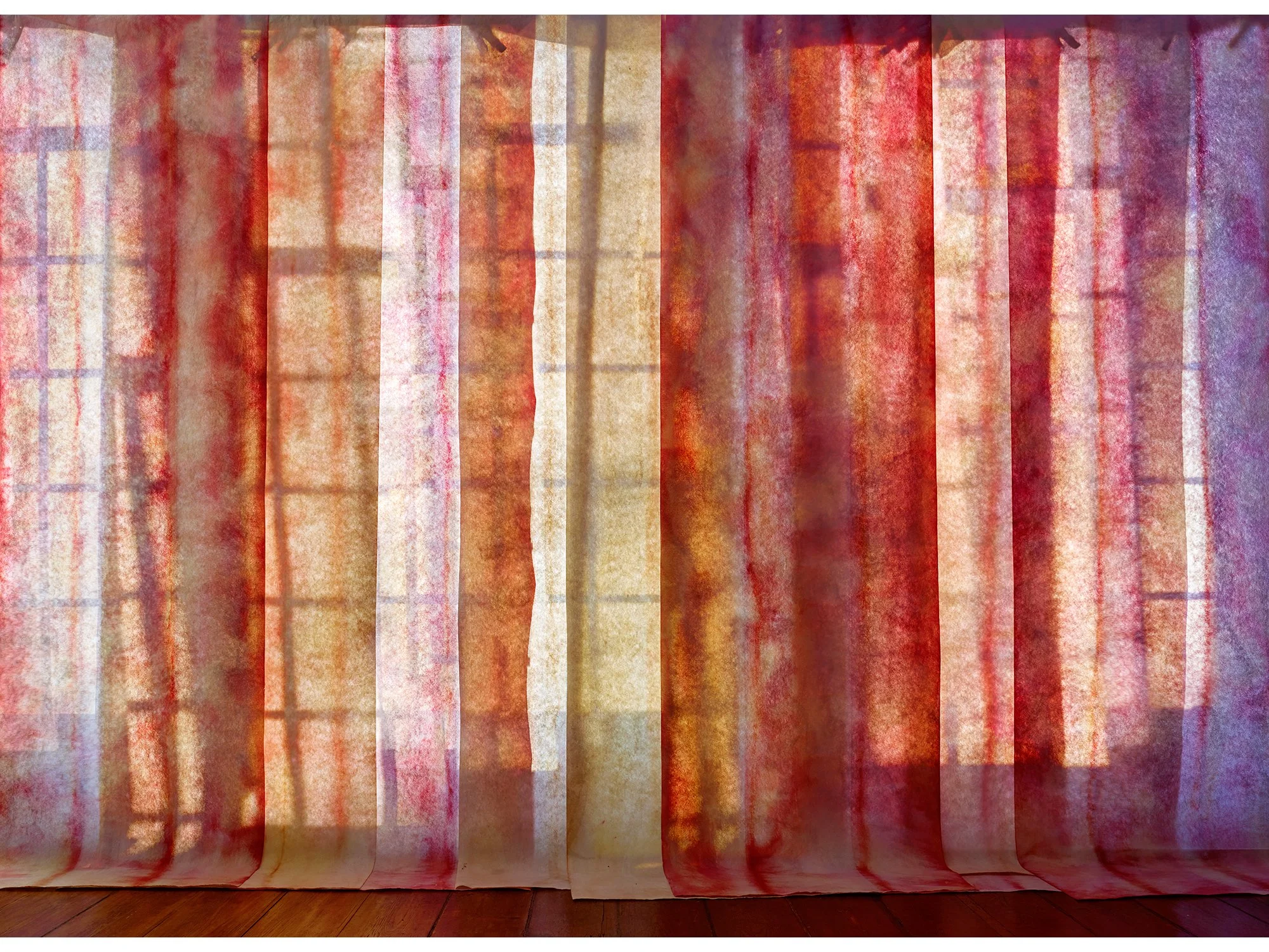
In Scrambled Morninglight, Jan Theun van Rees constructs a space where colour, light, and architecture dissolve into pure perception. This large-format work—part of his Painted Room series, is not a depiction of an existing room, but a spatial invention, built solely to explore how light transforms constructed surfaces into image.
The composition is animated by layered tones of red, with flashes of purple, orange, and yellow that appear to scatter like fragments of morning light. The title references both the time of day and the fragmented way in which light and colour are perceived and remembered.
As with all works in the Painted Room series, this space never existed until Van Rees built and photographed it. It is a visual proposition: a way of thinking through architecture, photography, and the physical presence of colour in space.
Shipping within the Netherlands and Belgium is on us.

By Jan Theun van Rees
50 × 40 cm, edition 1/3 + 1 AP , 2025
Pigment ink on Innova Photorag bright white, mounted on 4 mm museum board
Framed in ‘White Wash’ veneer with spacers and UV70 museum glass
(Also available in 25 x 20 cm, edition 10)
This work is part of the series Painted Room
With Red Room, Jan Theun van Rees continues his exploration of how space is perceived and constructed on the flat picture plane. The work is part of the Painted Room series, in which he intuitively builds and photographs entirely constructed environments.
Red Room exists solely to be photographed, a new, not-yet-existing reality created to express a particular spatial quality. The deep red appears to fill the room like a tangible presence, shaped by light and composition.
As in much of his recent work, Van Rees blurs the line between documentation and invention. Red Room invites the viewer to question what space is, how it comes into being, and the role perception plays in its formation.
Shipping within the Netherlands and Belgium is on us.
By Jan Theun van Rees
55 × 40 cm, edition 2/5 + 1 AP , 2025
Pigment ink on acid free Innova Soft Textured Bright White - pale wenge wood veneer frame (Nielsen) with Museumglass (UV70)
This work is part of the series Painted Room
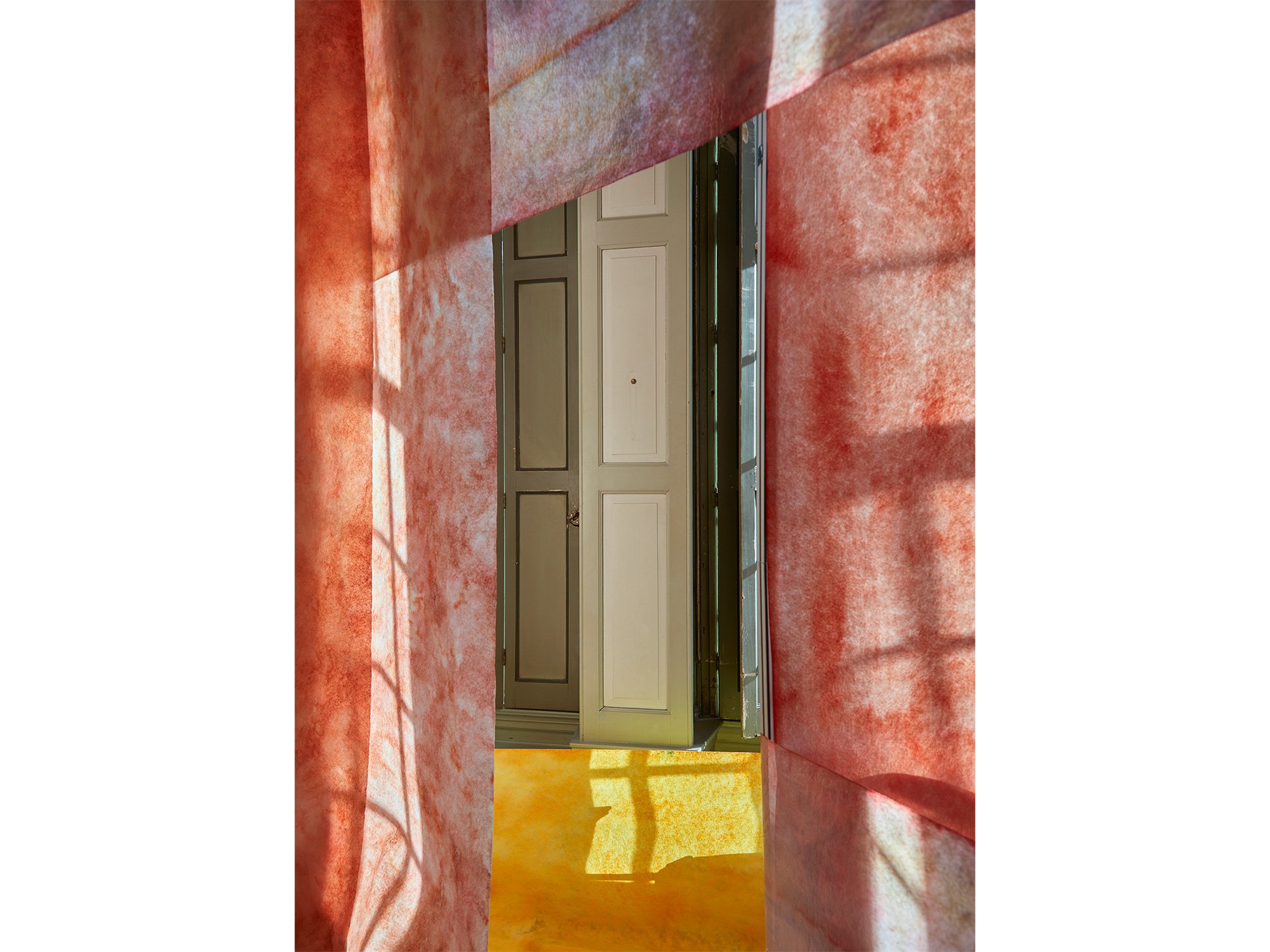
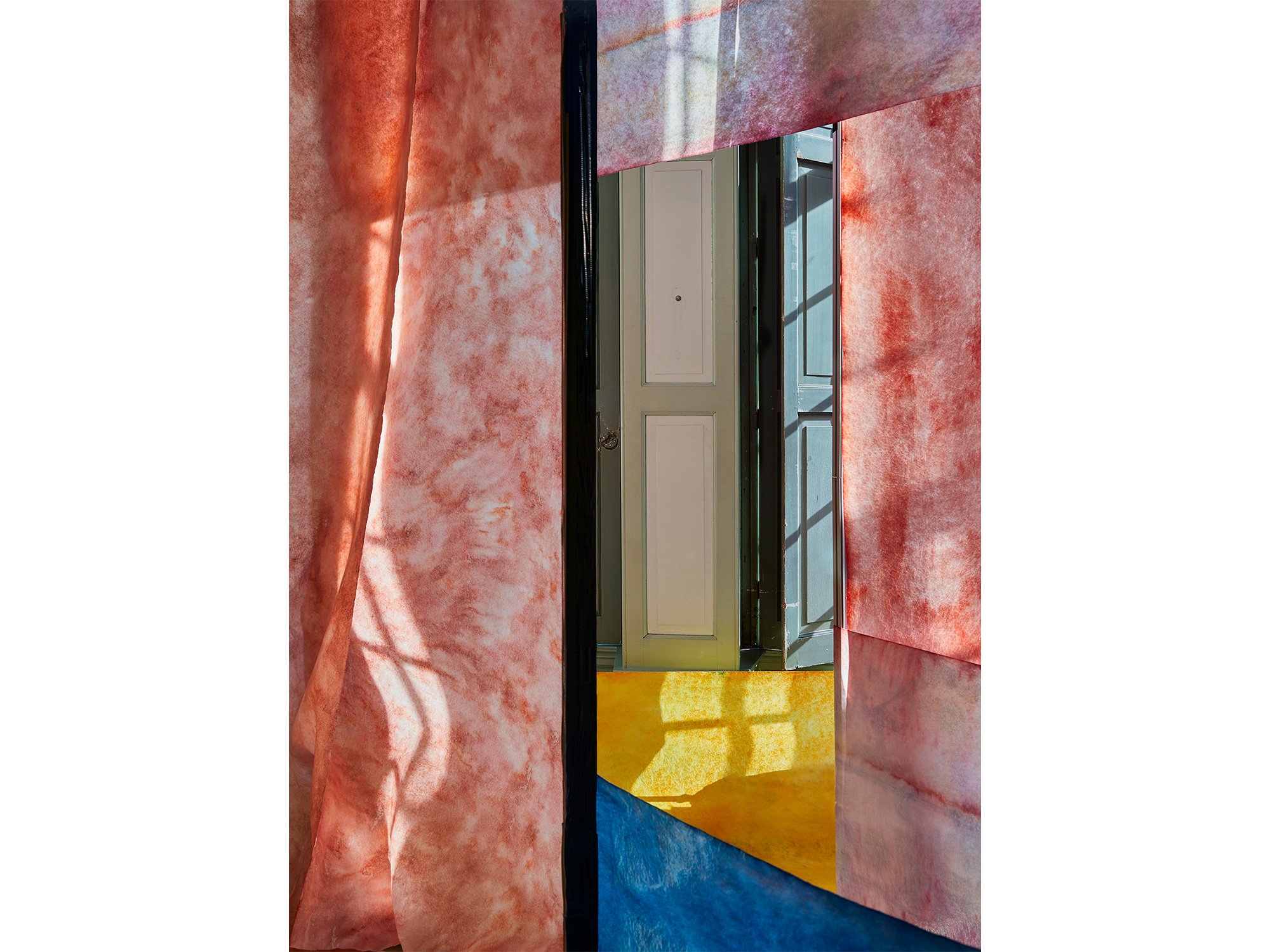
In View 1, Jan Theun van Rees constructs a compact, enigmatic space where colour and form suggest more than they reveal. Dominated by deep red tones and punctuated by a single yellow accent, the composition centres around a closed, door-like shape, evoking a sense of tension, as if access is denied or postponed.
Part of the Painted Room series, this image captures a space that exists solely for the camera. It is not a record of reality, but a visual proposition: a space that teases the eye and mind with the suggestion of passage, yet keeps its interior sealed.
View 1 plays with perception, inviting contemplation of what remains hidden just behind the surface.
Shipping within the Netherlands and Belgium is on us.
By Jan Theun van Rees
55 × 40 cm, edition 2/5 + 1 AP , 2025
Pigment ink on acid free Innova Soft Textured Bright White - pale wenge wood veneer frame (Nielsen) with Museumglass (UV70)
This work is part of the series Painted Room
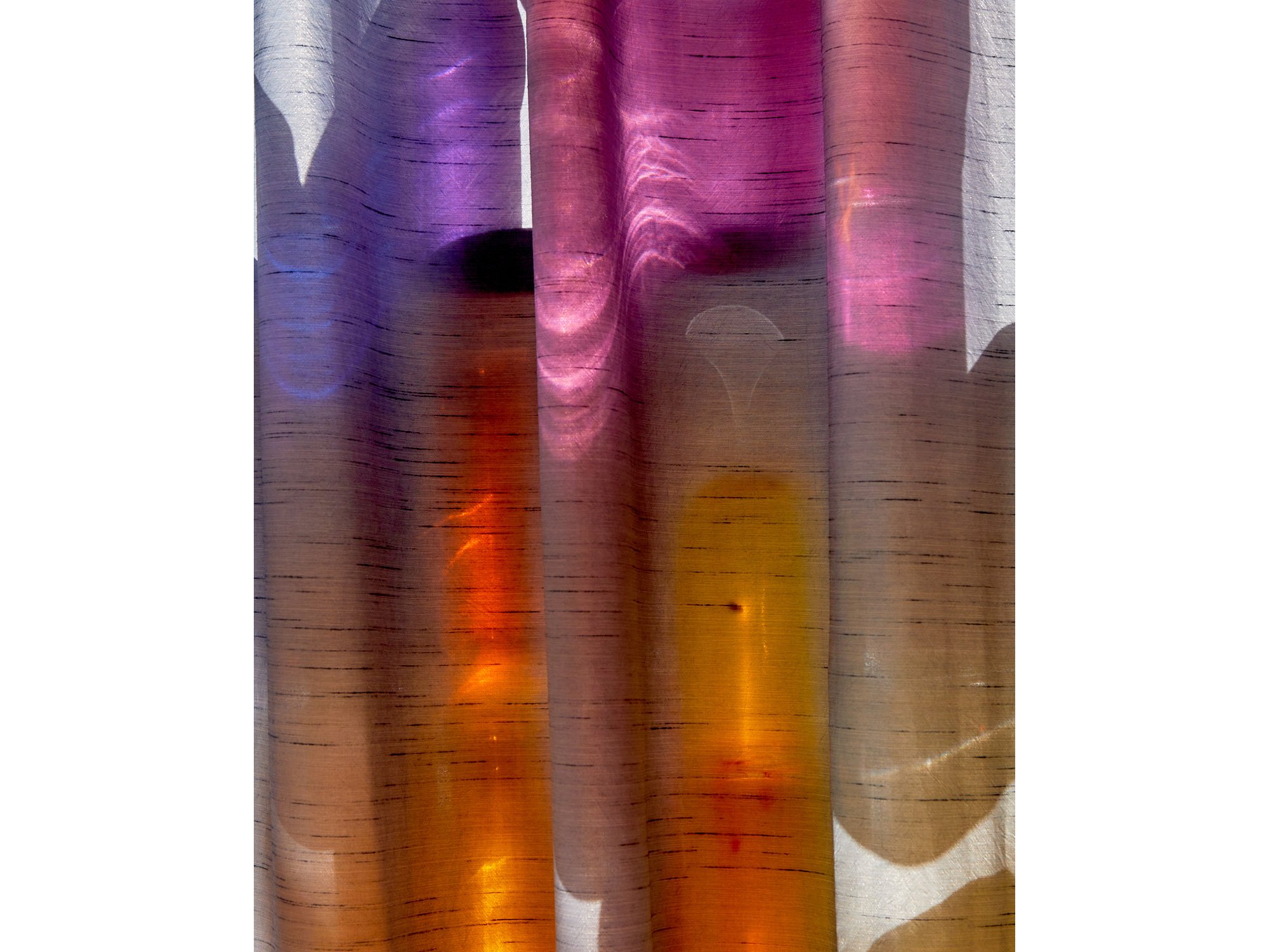
In View 2, Jan Theun van Rees continues his exploration of constructed spaces that exist solely to be photographed. Rich red tones dominate the composition, while subtle blue and yellow accents add a sense of spatial tension and visual rhythm.
At the centre, a door-like shape appears slightly ajar, unlike the closed form in View 1. This small shift opens up a new narrative: a hint of access, a glimpse of what might lie beyond.
As with all works in the Painted Room series, View 2 is a visual proposition, suggesting space, movement and meaning through colour, light, and geometry alone.
Shipping within the Netherlands and Belgium is on us.
By Jan Theun van Rees
25 x 20 cm, ed. 5/10, 2024
Archival pigment ink on Innova ”Soft Textured BrightWhite Photorag” with nutwood frame and museumglass
This work is part of the series Painted Room
With his art, Jan Theun van Rees focuses on the appearance of space as an image, the perception of that (visualised) space in relation to the space that surrounds us. Through his photographs he tries to visualise the specific qualities of those spaces. “Camera Lucida” is the catch-all term for all his artistic projects that try to visualise a connection between (interior) spaces and the outside world through incoming light. He intervenes in the space, manipulates the incoming light, to emphasise the spatial qualities he experiences. These interventions have become essential to his current practice. He constructs his own spaces, his own versions of a new, not yet existing reality. A certain spatial quality is visualised by constructing a space with the sole purpose to photograph the result.
In his new series Painted Room you can step into a new reality and become mesmerised by the rays of light, colourful surroundings and mystic shadows.
Shipping within the Netherlands and Belgium is on us.

By Jan Theun van Rees
75 x 60 cm, ed. 1/5, 2024
Archival pigment ink on Innova ”Soft Textured BrightWhite Photorag” with nutwood frame and museumglass
This work is part of the series Painted Room
With his art, Jan Theun van Rees focuses on the appearance of space as an image, the perception of that (visualised) space in relation to the space that surrounds us. Through his photographs he tries to visualise the specific qualities of those spaces. “Camera Lucida” is the catch-all term for all his artistic projects that try to visualise a connection between (interior) spaces and the outside world through incoming light. He intervenes in the space, manipulates the incoming light, to emphasise the spatial qualities he experiences. These interventions have become essential to his current practice. He constructs his own spaces, his own versions of a new, not yet existing reality. A certain spatial quality is visualised by constructing a space with the sole purpose to photograph the result.
In his new series Painted Room you can step into a new reality and become mesmerised by the rays of light, colourful surroundings and mystic shadows.
Shipping within the Netherlands and Belgium is on us.

By Jan Theun van Rees
75 x 125 cm, ed. 1/3, 2024
Archival pigment ink on Innova ”Soft Textured BrightWhite Photorag” with nutwood frame and museumglass
This work is part of the series Painted Room
With his art, Jan Theun van Rees focuses on the appearance of space as an image, the perception of that (visualised) space in relation to the space that surrounds us. Through his photographs he tries to visualise the specific qualities of those spaces. “Camera Lucida” is the catch-all term for all his artistic projects that try to visualise a connection between (interior) spaces and the outside world through incoming light. He intervenes in the space, manipulates the incoming light, to emphasise the spatial qualities he experiences. These interventions have become essential to his current practice. He constructs his own spaces, his own versions of a new, not yet existing reality. A certain spatial quality is visualised by constructing a space with the sole purpose to photograph the result.
In his new series Painted Room you can step into a new reality and become mesmerised by the rays of light, colourful surroundings and mystic shadows.
Shipping within the Netherlands and Belgium is on us.

By Jan Theun van Rees
70 x 50 cm, ed. 1/5, 2024
Archival pigment ink on Innova ”Soft Textured BrightWhite Photorag” with nutwood frame and museumglass
This work is part of the series Painted Room
With his art, Jan Theun van Rees focuses on the appearance of space as an image, the perception of that (visualised) space in relation to the space that surrounds us. Through his photographs he tries to visualise the specific qualities of those spaces. “Camera Lucida” is the catch-all term for all his artistic projects that try to visualise a connection between (interior) spaces and the outside world through incoming light. He intervenes in the space, manipulates the incoming light, to emphasise the spatial qualities he experiences. These interventions have become essential to his current practice. He constructs his own spaces, his own versions of a new, not yet existing reality. A certain spatial quality is visualised by constructing a space with the sole purpose to photograph the result.
In his new series Painted Room you can step into a new reality and become mesmerised by the rays of light, colourful surroundings and mystic shadows.
Shipping within the Netherlands and Belgium is on us.

By Jan Theun van Rees
60 x 30 cm, ed. 2/5, 2024
Archival pigment ink on Innova ”Soft Textured BrightWhite Photorag” and nutwood frame with museumglass
With his art, Jan Theun van Rees focuses on the appearance of space as an image, the perception of that (visualised) space in relation to the space that surrounds us. Through his photographs he tries to visualise the specific qualities of those spaces. “Camera Lucida” is the catch-all term for all his artistic projects that try to visualise a connection between (interior) spaces and the outside world through incoming light. He intervenes in the space, manipulates the incoming light, to emphasise the spatial qualities he experiences. These interventions have become essential to his current practice. He constructs his own spaces, his own versions of a new, not yet existing reality. A certain spatial quality is visualised by constructing a space with the sole purpose to photograph the result.
In his new series Painted Room you can step into a new reality and become mesmerised by the rays of light, colourful surroundings and mystic shadows.
Shipping within the Netherlands and Belgium is on us.

By Jan Theun van Rees
25 x 20 cm, ed. 1/10, 2024
Archival pigment ink on Innova ”Soft Textured BrightWhite Photorag” with nutwood frame and museumglass
This work is part of the series Painted Room
With his art, Jan Theun van Rees focuses on the appearance of space as an image, the perception of that (visualised) space in relation to the space that surrounds us. Through his photographs he tries to visualise the specific qualities of those spaces. “Camera Lucida” is the catch-all term for all his artistic projects that try to visualise a connection between (interior) spaces and the outside world through incoming light. He intervenes in the space, manipulates the incoming light, to emphasise the spatial qualities he experiences. These interventions have become essential to his current practice. He constructs his own spaces, his own versions of a new, not yet existing reality. A certain spatial quality is visualised by constructing a space with the sole purpose to photograph the result.
In his new series Painted Room you can step into a new reality and become mesmerised by the rays of light, colourful surroundings and mystic shadows.
Shipping within the Netherlands and Belgium is on us.
By Vera Klaus
120 × 120 cm, 2026
Mixed Media on canvas, framed
Großes Abenteuer (Great Adventure) is a large-scale mixed media painting by Vera Klaus in which vibrant colour spreads across raw canvas through energetic splashes, stains and gestural marks. Bright pink, yellow, green and violet pigments appear to move freely across the surface, interacting with spontaneous lines and scattered paint droplets.
The composition develops through an intuitive process in which movement and rhythm guide the placement of colour. Areas of exposed canvas create breathing space between the expressive gestures, allowing the material qualities of the surface to remain visible.
The result is a dynamic painting in which colour appears to travel across the canvas, creating a sense of exploration and discovery within the expressive flow of the work.
Delivery within the Netherlands and Belgium is arranged in consultation, either in person or securely shipped.